The same plot in 14 other libraries — JavaScript: Chart.js, D3.js, Highcharts, MUI X Charts; Python: Altair, Bokeh, lets-plot, Matplotlib, Plotly, plotnine, Pygal, Seaborn; R: ggplot2; Julia: Makie.jl. Compare all 15 side by side: Stacked Area Chart with Confidence Bands in Python, R, Julia and JavaScript.
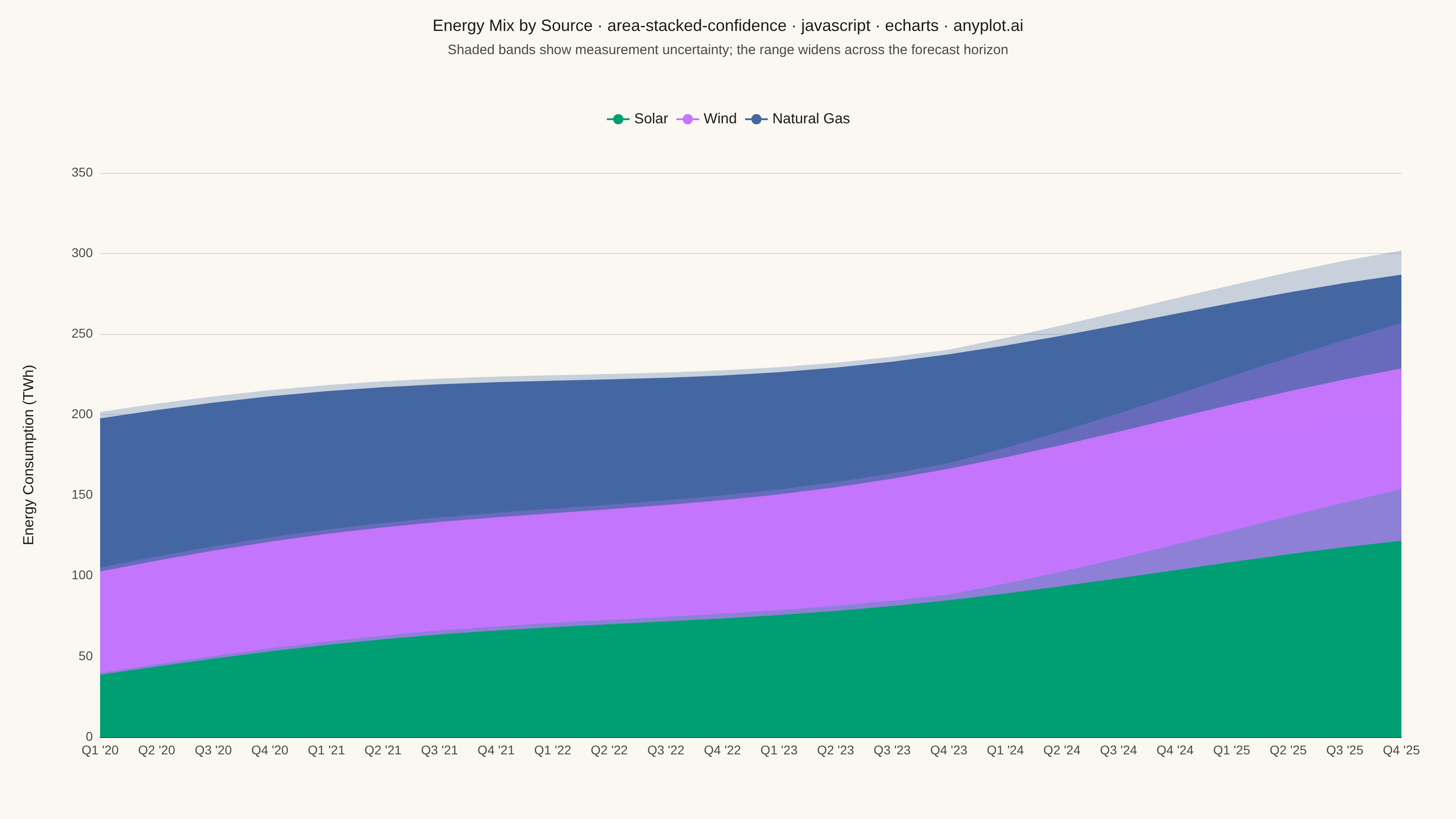
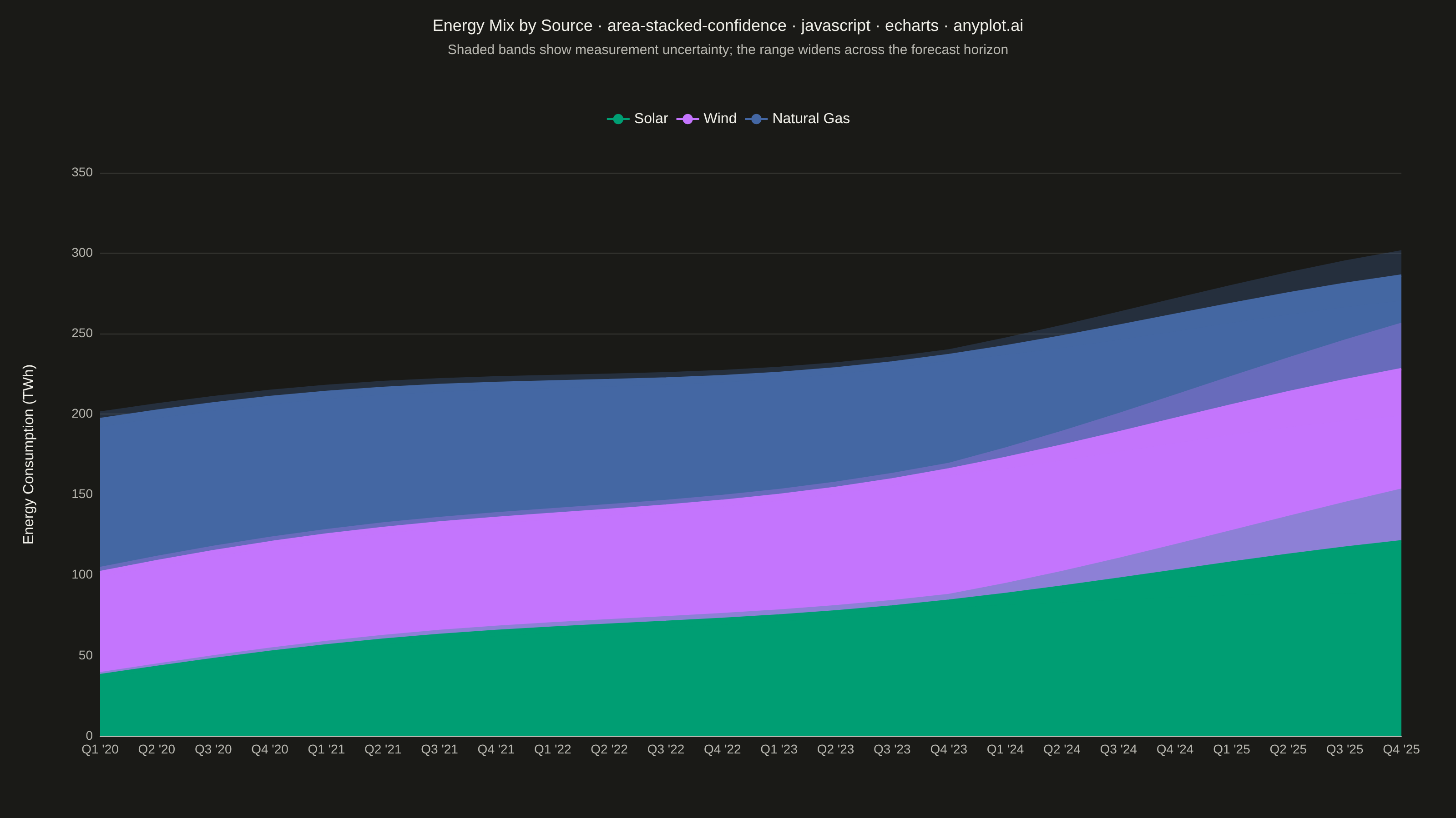
A stacked area chart that displays multiple data series as cumulative areas, with each series surrounded by uncertainty or confidence bands. This visualization combines the composition insight of stacked areas with the statistical rigor of confidence intervals, making it ideal for showing how parts contribute to a whole while simultaneously communicating uncertainty in each component. The bands reveal where estimates are precise versus uncertain across the stacked series.
// anyplot.ai
// area-stacked-confidence: Stacked Area Chart with Confidence Bands
// Library: echarts 6.1.0 | JavaScript 22.23.2
// Quality: 87/100 | Created: 2026-08-26

const t = window.ANYPLOT_TOKENS;

// --- Data (in-memory, deterministic) ----------------------------------------
// Quarterly energy mix by source, TWh. Measurement uncertainty is narrow for
// the historical quarters and widens across the forecast horizon.
const QUARTER_COUNT = 24;
const FORECAST_START = 16;

const quarters = [];
for (let idx = 0; idx < QUARTER_COUNT; idx++) {
  const year = 2020 + Math.floor(idx / 4);
  const quarter = (idx % 4) + 1;
  quarters.push(`Q${quarter} '${String(year).slice(2)}`);
}

const solarCenter = [];
const windCenter = [];
const gasCenter = [];
const uncertaintyPct = [];
for (let idx = 0; idx < QUARTER_COUNT; idx++) {
  solarCenter.push(38 + 3.4 * idx + 5 * Math.sin(idx / 3));
  windCenter.push(58 + 1.9 * idx + 6 * Math.cos(idx / 4));
  gasCenter.push(Math.max(20, 95 - 1.6 * idx));
  uncertaintyPct.push(
    idx < FORECAST_START
      ? 0.05
      : 0.05 + ((idx - (FORECAST_START - 1)) / (QUARTER_COUNT - FORECAST_START)) * 0.22
  );
}

// Cumulative baseline BELOW each series, matching the stacking order used
// for the central areas so each band wraps its own layer of the stack.
const zeroBaseline = new Array(QUARTER_COUNT).fill(0);
const windBaseline = solarCenter;
const gasBaseline = solarCenter.map((v, idx) => v + windCenter[idx]);

const absoluteBand = (center, baseline) => {
  const lower = center.map((v, idx) => baseline[idx] + v * (1 - uncertaintyPct[idx]));
  const upper = center.map((v, idx) => baseline[idx] + v * (1 + uncertaintyPct[idx]));
  const width = upper.map((v, idx) => v - lower[idx]);
  return { lower, width };
};

const seriesDefs = [
  { name: "Solar", color: t.palette[0], center: solarCenter, ...absoluteBand(solarCenter, zeroBaseline) },
  { name: "Wind", color: t.palette[1], center: windCenter, ...absoluteBand(windCenter, windBaseline) },
  { name: "Natural Gas", color: t.palette[2], center: gasCenter, ...absoluteBand(gasCenter, gasBaseline) },
];

// --- Series -------------------------------------------------------------
// Each series contributes 3 ECharts series: an invisible line pinning the
// band's lower edge, a translucent fill spanning up to the band's upper
// edge (both sharing a private stack so the fill floats at the right
// height), and the opaque central stacked area below. ECharts paints all
// z:2 elements above all z:1 elements regardless of series array order, so
// every band (z:2) must outrank every opaque area (z:1) - otherwise a
// later-stacked series' opaque fill (e.g. Wind, Gas) paints over an
// earlier series' band (e.g. Solar's) wherever their height ranges overlap.
const series = [];
seriesDefs.forEach((s, idx) => {
  series.push({
    type: "line",
    stack: `band${idx}`,
    data: s.lower,
    lineStyle: { opacity: 0 },
    symbol: "none",
    silent: true,
    tooltip: { show: false },
    z: 2,
  });
  series.push({
    type: "line",
    stack: `band${idx}`,
    data: s.width,
    lineStyle: { opacity: 0 },
    symbol: "none",
    areaStyle: { color: s.color, opacity: 0.28 },
    silent: true,
    tooltip: { show: false },
    z: 2,
  });
  series.push({
    name: s.name,
    type: "line",
    stack: "total",
    data: s.center,
    symbol: "none",
    itemStyle: { color: s.color },
    lineStyle: { width: 2.5, color: s.color },
    areaStyle: { color: s.color, opacity: 1 },
    z: 1,
  });
});

// --- Title sizing (scales down once the string runs past the 67-char baseline) ---
const TITLE = "Energy Mix by Source · area-stacked-confidence · javascript · echarts · anyplot.ai";
const titleFontSize = Math.max(14, Math.round(22 * Math.min(1, 67 / TITLE.length)));

// --- Init ---------------------------------------------------------------
const chart = echarts.init(document.getElementById("container"));

// --- Option ---------------------------------------------------------------
chart.setOption({
  animation: false,
  color: t.palette,
  backgroundColor: "transparent",
  title: {
    text: TITLE,
    subtext: "Shaded bands show measurement uncertainty; the range widens across the forecast horizon",
    left: "center",
    textStyle: { color: t.ink, fontSize: titleFontSize, fontWeight: 500 },
    subtextStyle: { color: t.inkSoft, fontSize: 15 },
  },
  tooltip: { trigger: "axis" },
  legend: {
    data: seriesDefs.map((s) => s.name),
    top: 118,
    textStyle: { color: t.ink, fontSize: 16 },
  },
  grid: { left: 110, right: 60, top: 190, bottom: 90 },
  xAxis: {
    type: "category",
    data: quarters,
    boundaryGap: false,
    axisLabel: { color: t.inkSoft, fontSize: 14 },
    axisLine: { lineStyle: { color: t.inkSoft } },
    axisTick: { show: false },
    splitLine: { show: false },
  },
  yAxis: {
    type: "value",
    name: "Energy Consumption (TWh)",
    nameLocation: "middle",
    nameGap: 70,
    nameTextStyle: { color: t.ink, fontSize: 16 },
    axisLabel: { color: t.inkSoft, fontSize: 14 },
    axisLine: { show: false },
    axisTick: { show: false },
    splitLine: { lineStyle: { color: t.grid } },
  },
  series,
});
Runnable source as JSON, for any HTTP client: https://api.anyplot.ai/specs/area-stacked-confidence/echarts/code. Any spec id and library id listed in llms-full.txt fit the same URL shape; every URL below is complete and callable.
{
  "spec_id": "area-stacked-confidence",
  "language": "javascript",
  "library": "echarts",
  "page": "https://anyplot.ai/area-stacked-confidence/javascript/echarts",
  "hub": "https://anyplot.ai/area-stacked-confidence",
  "code_json": "https://api.anyplot.ai/specs/area-stacked-confidence/echarts/code",
  "spec_json": "https://api.anyplot.ai/specs/area-stacked-confidence",
  "render_light_png": "https://storage.googleapis.com/anyplot-images/plots/area-stacked-confidence/javascript/echarts/plot-light.png",
  "render_dark_png": "https://storage.googleapis.com/anyplot-images/plots/area-stacked-confidence/javascript/echarts/plot-dark.png",
  "interactive_light_html": "https://storage.googleapis.com/anyplot-images/plots/area-stacked-confidence/javascript/echarts/plot-light.html",
  "interactive_dark_html": "https://storage.googleapis.com/anyplot-images/plots/area-stacked-confidence/javascript/echarts/plot-dark.html",
  "quality_score": 87.0,
  "license": "MIT",
  "guide": "https://anyplot.ai/llms.txt"
}
Part of Stacked Area Chart with Confidence Bands on anyplot.ai.