The same plot in 14 other libraries — JavaScript: Chart.js, D3.js, Apache ECharts, MUI X Charts; Python: Altair, Bokeh, lets-plot, Matplotlib, Plotly, plotnine, Pygal, Seaborn; R: ggplot2; Julia: Makie.jl. Compare all 15 side by side: Stacked Area Chart with Confidence Bands in Python, R, Julia and JavaScript.
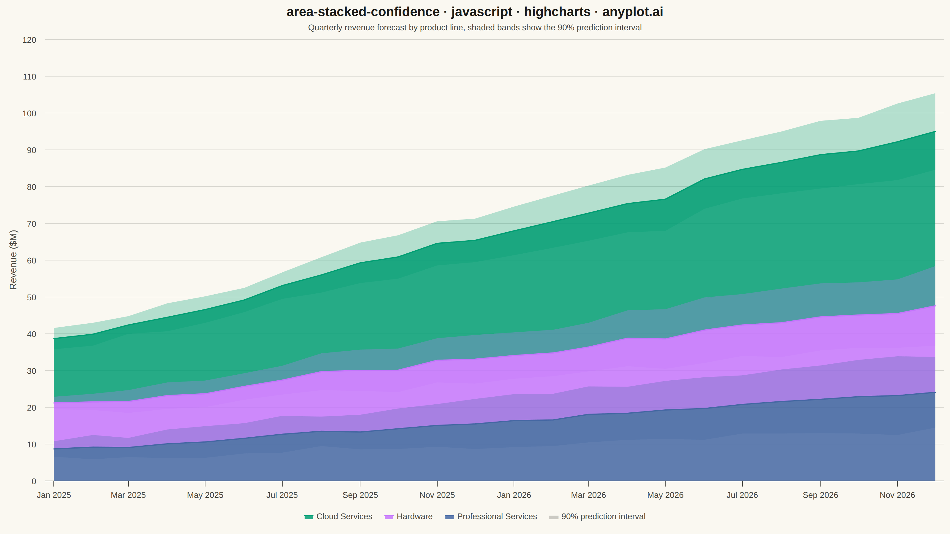
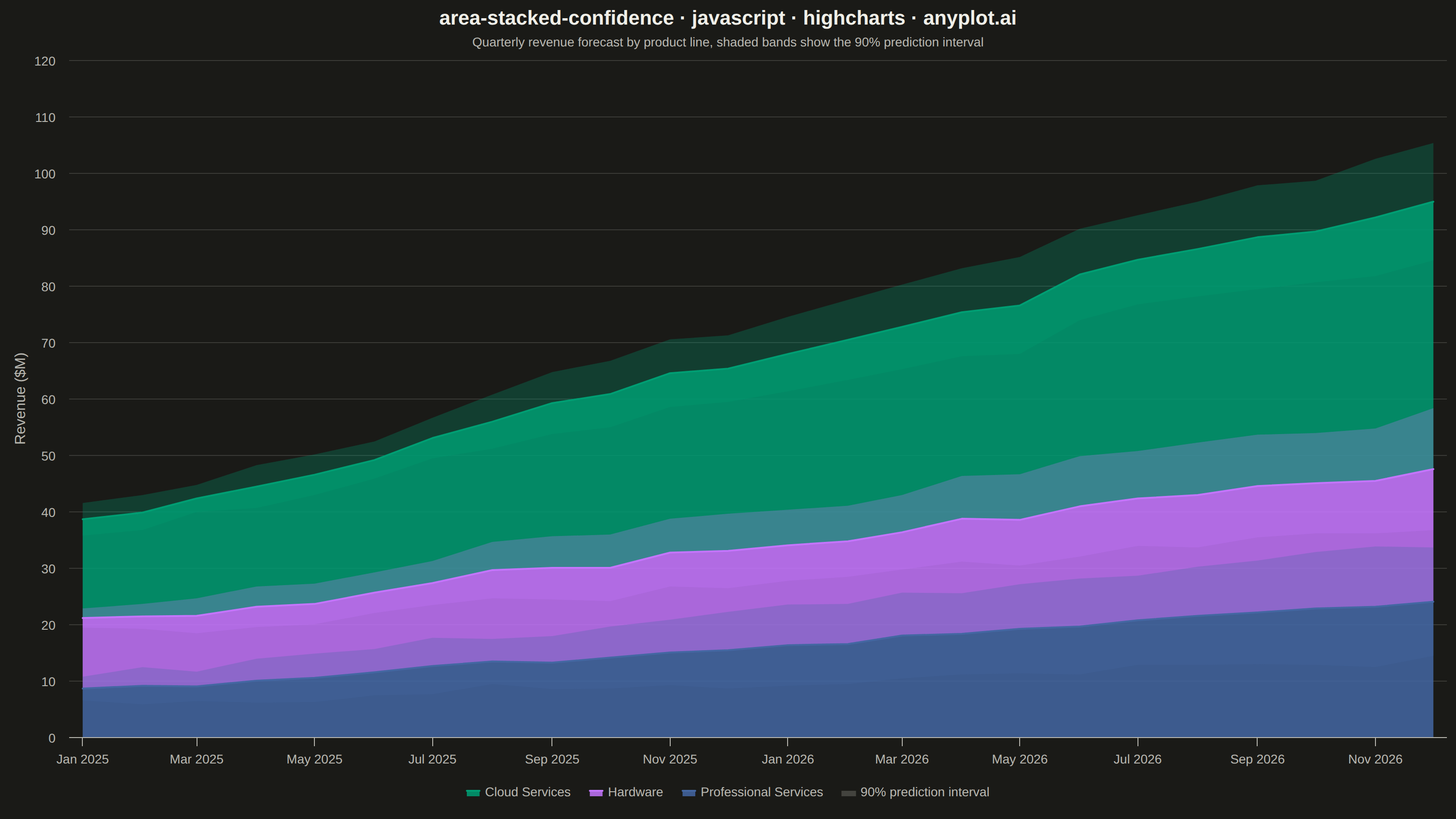
A stacked area chart that displays multiple data series as cumulative areas, with each series surrounded by uncertainty or confidence bands. This visualization combines the composition insight of stacked areas with the statistical rigor of confidence intervals, making it ideal for showing how parts contribute to a whole while simultaneously communicating uncertainty in each component. The bands reveal where estimates are precise versus uncertain across the stacked series.
// anyplot.ai
// area-stacked-confidence: Stacked Area Chart with Confidence Bands
// Library: highcharts 12.6.0 | JavaScript 22.23.2
// Quality: 92/100 | Created: 2026-08-26

const t = window.ANYPLOT_TOKENS;

// --- Data (in-memory, deterministic; tiny LCG for reproducibility) --------
let seed = 42;
function rand() {
  seed = (seed * 1664525 + 1013904223) % 4294967296;
  return seed / 4294967296;
}

const months = Array.from({ length: 24 }, (_, i) => Date.UTC(2025, i, 1));

// Quarterly revenue forecast by product line, with widening 90% prediction
// intervals the further out the forecast horizon extends.
const productLines = [
  { name: "Cloud Services", base: 18, growth: 1.3, noise: 1.1 },
  { name: "Hardware", base: 12, growth: 0.5, noise: 0.9 },
  { name: "Professional Services", base: 8, growth: 0.7, noise: 0.6 },
];

const seriesData = productLines.map((p) => {
  const center = months.map((_, i) => {
    const trend = p.base + p.growth * i;
    const wobble = (rand() - 0.5) * 2 * p.noise;
    return Math.round((trend + wobble) * 10) / 10;
  });
  const halfWidth = months.map((_, i) => Math.round((1.5 + 0.35 * i + rand() * 1.5) * 10) / 10);
  return {
    name: p.name,
    center,
    lower: center.map((v, i) => Math.max(0, v - halfWidth[i])),
    upper: center.map((v, i) => v + halfWidth[i]),
  };
});

// Cumulative center value of every series stacked *below* series i. Highcharts
// stacks 'area' series in reverse insertion order (the first series added
// lands on top), so series i's own layer sits on top of every series that
// comes after it in the array — the band for series i must use that same
// base to align with its rendered position (per spec: bands follow the same
// stack order as the central values).
const cumulativeBelow = seriesData.map((_, i) =>
  months.map((_, idx) => seriesData.slice(i + 1).reduce((sum, s) => sum + s.center[idx], 0))
);

// --- Chart series -----------------------------------------------------------

const centerSeries = seriesData.map((s, i) => ({
  type: "area",
  name: s.name,
  data: s.center.map((v, idx) => [months[idx], v]),
  stack: "revenue",
  stacking: "normal",
  color: t.palette[i],
  fillOpacity: 0.85,
  lineWidth: 2,
  marker: { enabled: false },
}));

const bandSeries = seriesData.flatMap((s, i) => {
  const base = months.map((_, idx) => cumulativeBelow[i][idx] + s.lower[idx]);
  const width = months.map((_, idx) => s.upper[idx] - s.lower[idx]);
  const bandColor = Highcharts.color(t.palette[i]).setOpacity(0.28).get();
  // xAxis.reversedStacks defaults to true, so within a stack the FIRST series
  // added ends up on top — the visible band must be added before its
  // invisible base to land above it, not below.
  return [
    {
      type: "area",
      name: `${s.name} band`,
      data: width.map((v, idx) => [months[idx], v]),
      stack: `band${i}`,
      stacking: "normal",
      color: bandColor,
      fillOpacity: 1,
      lineWidth: 0,
      enableMouseTracking: false,
      showInLegend: false,
      marker: { enabled: false },
    },
    {
      type: "area",
      name: `${s.name} band base`,
      data: base.map((v, idx) => [months[idx], v]),
      stack: `band${i}`,
      stacking: "normal",
      color: "transparent",
      fillOpacity: 0,
      lineWidth: 0,
      enableMouseTracking: false,
      showInLegend: false,
      marker: { enabled: false },
    },
  ];
});

const legendProxy = {
  type: "area",
  name: "90% prediction interval",
  data: [],
  color: Highcharts.color(t.inkSoft).setOpacity(0.35).get(),
  lineWidth: 0,
  enableMouseTracking: false,
  marker: { enabled: false },
};

// --- Chart -------------------------------------------------------------------

Highcharts.chart("container", {
  chart: {
    type: "area",
    backgroundColor: "transparent",
    animation: false,
    style: { fontFamily: "inherit" },
  },
  credits: { enabled: false },
  colors: t.palette,
  title: {
    text: "area-stacked-confidence · javascript · highcharts · anyplot.ai",
    style: { color: t.ink, fontSize: "22px", fontWeight: "600" },
  },
  subtitle: {
    text: "Quarterly revenue forecast by product line, shaded bands show the 90% prediction interval",
    style: { color: t.inkSoft, fontSize: "14px" },
  },
  xAxis: {
    type: "datetime",
    lineColor: t.inkSoft,
    tickColor: t.inkSoft,
    gridLineColor: t.grid,
    labels: { style: { color: t.inkSoft, fontSize: "14px" } },
  },
  yAxis: {
    title: { text: "Revenue ($M)", style: { color: t.inkSoft, fontSize: "16px" } },
    gridLineColor: t.grid,
    labels: { style: { color: t.inkSoft, fontSize: "14px" } },
    min: 0,
  },
  legend: {
    itemStyle: { color: t.inkSoft, fontSize: "14px" },
    itemHoverStyle: { color: t.ink },
  },
  tooltip: {
    shared: true,
    valueSuffix: "M",
    valueDecimals: 1,
  },
  plotOptions: {
    series: { animation: false },
  },
  series: [...centerSeries, ...bandSeries, legendProxy],
});
Runnable source as JSON, for any HTTP client: https://api.anyplot.ai/specs/area-stacked-confidence/highcharts/code. Any spec id and library id listed in llms-full.txt fit the same URL shape; every URL below is complete and callable.
{
  "spec_id": "area-stacked-confidence",
  "language": "javascript",
  "library": "highcharts",
  "page": "https://anyplot.ai/area-stacked-confidence/javascript/highcharts",
  "hub": "https://anyplot.ai/area-stacked-confidence",
  "code_json": "https://api.anyplot.ai/specs/area-stacked-confidence/highcharts/code",
  "spec_json": "https://api.anyplot.ai/specs/area-stacked-confidence",
  "render_light_png": "https://storage.googleapis.com/anyplot-images/plots/area-stacked-confidence/javascript/highcharts/plot-light.png",
  "render_dark_png": "https://storage.googleapis.com/anyplot-images/plots/area-stacked-confidence/javascript/highcharts/plot-dark.png",
  "interactive_light_html": "https://storage.googleapis.com/anyplot-images/plots/area-stacked-confidence/javascript/highcharts/plot-light.html",
  "interactive_dark_html": "https://storage.googleapis.com/anyplot-images/plots/area-stacked-confidence/javascript/highcharts/plot-dark.html",
  "quality_score": 92.0,
  "license": "MIT",
  "guide": "https://anyplot.ai/llms.txt"
}
Part of Stacked Area Chart with Confidence Bands on anyplot.ai.