The same plot in 14 other libraries — Python: Altair, Bokeh, lets-plot, Matplotlib, Plotly, plotnine, Pygal, Seaborn; R: ggplot2; JavaScript: Chart.js, D3.js, Apache ECharts, Highcharts, MUI X Charts. Compare all 15 side by side: Stacked Area Chart with Confidence Bands in Python, R, Julia and JavaScript.
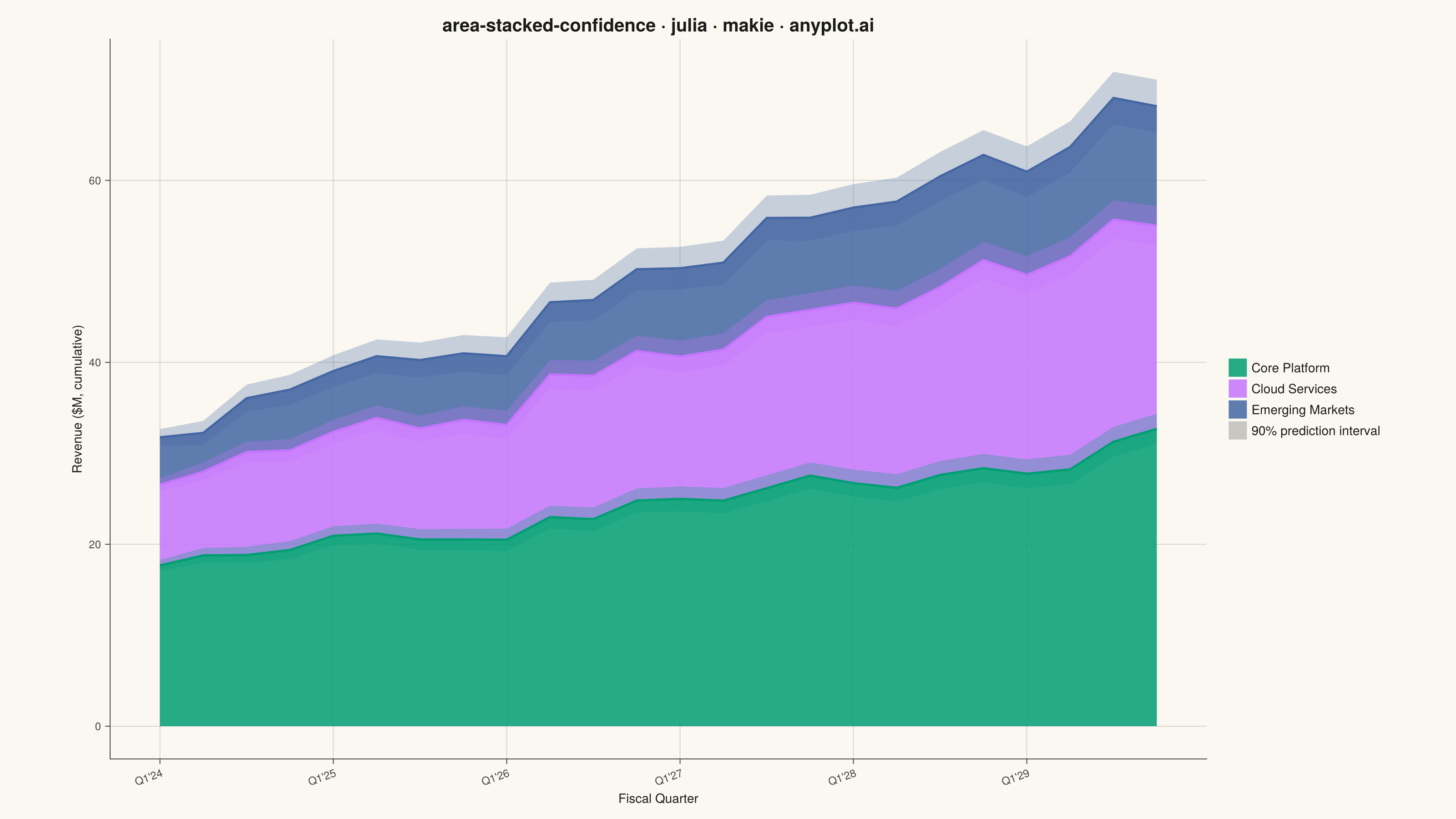
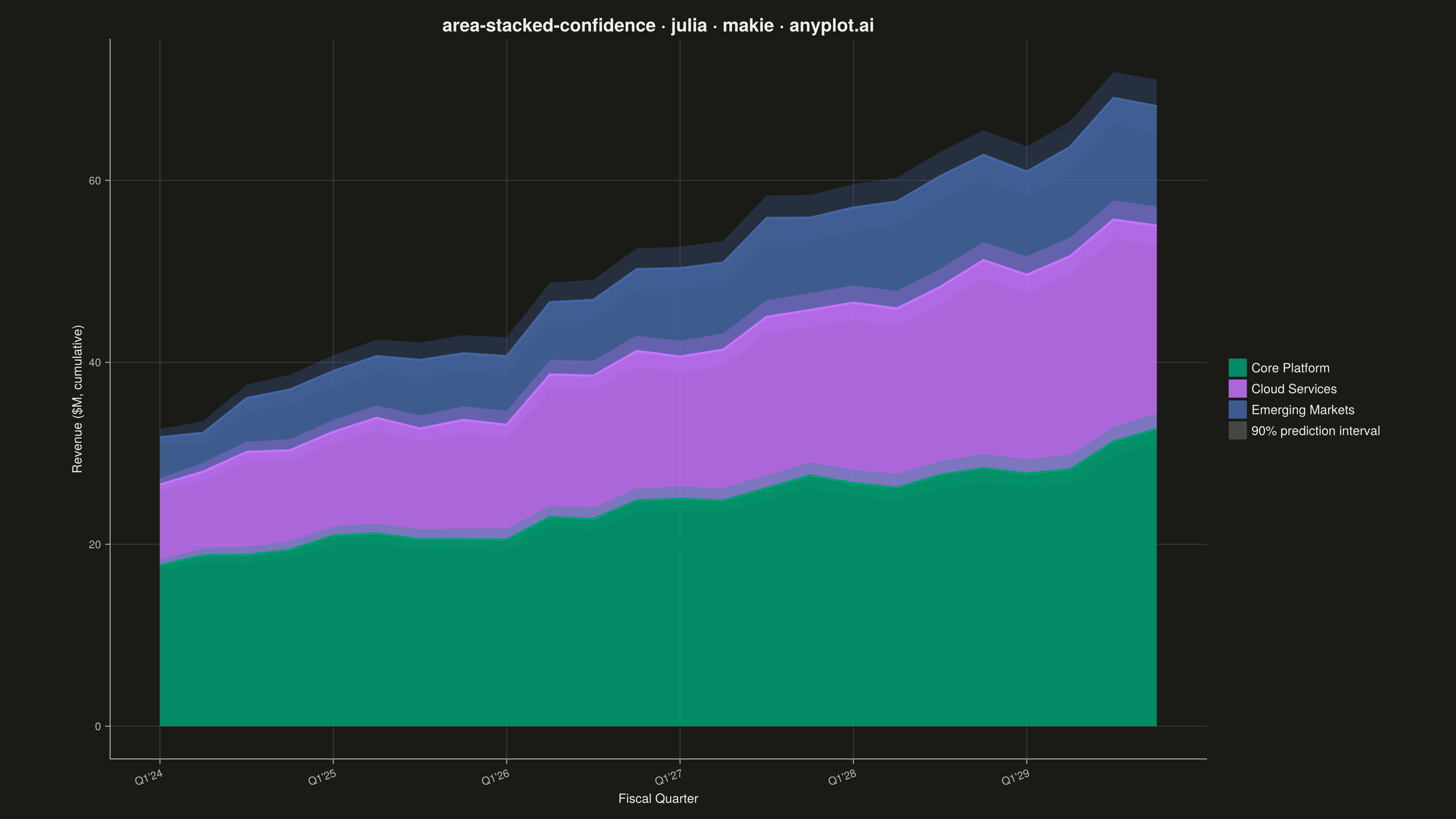
A stacked area chart that displays multiple data series as cumulative areas, with each series surrounded by uncertainty or confidence bands. This visualization combines the composition insight of stacked areas with the statistical rigor of confidence intervals, making it ideal for showing how parts contribute to a whole while simultaneously communicating uncertainty in each component. The bands reveal where estimates are precise versus uncertain across the stacked series.
# anyplot.ai
# area-stacked-confidence: Stacked Area Chart with Confidence Bands
# Library: makie 0.21.9 | Julia 1.11.9
# Quality: 81/100 | Created: 2026-08-26

using CairoMakie
using Colors
using Random

Random.seed!(42)

# --- Theme tokens (see prompts/default-style-guide.md "Theme-adaptive Chrome") ---
const THEME    = get(ENV, "ANYPLOT_THEME", "light")
const PAGE_BG  = THEME == "light" ? colorant"#FAF8F1" : colorant"#1A1A17"
const INK      = THEME == "light" ? colorant"#1A1A17" : colorant"#F0EFE8"
const INK_SOFT = THEME == "light" ? colorant"#4A4A44" : colorant"#B8B7B0"

# Imprint categorical palette — first series is ALWAYS #009E73
const IMPRINT_PALETTE = [
    colorant"#009E73",  # 1 — brand green
    colorant"#C475FD",  # 2 — lavender
    colorant"#4467A3",  # 3 — blue
]

# --- Data: quarterly revenue forecast by product line, 90% prediction interval ---
n_quarters = 24
quarters = collect(1:n_quarters)
product_lines = ["Core Platform", "Cloud Services", "Emerging Markets"]

base_revenue = [18.0, 9.0, 5.0]     # starting quarterly revenue ($M)
trend        = [0.55, 0.65, 0.35]   # quarterly growth ($M)
noise_scale  = [0.9, 0.8, 0.6]
pi_base      = [0.6, 0.7, 0.9]      # starting half-width of the 90% interval ($M)
pi_growth    = [0.22, 0.30, 0.42]   # interval widening rate with forecast horizon

revenue = Matrix{Float64}(undef, n_quarters, 3)
half_width = Matrix{Float64}(undef, n_quarters, 3)
for i in 1:3
    revenue[:, i] = base_revenue[i] .+ trend[i] .* (quarters .- 1) .+
                    noise_scale[i] .* randn(n_quarters)
    half_width[:, i] = pi_base[i] .+ pi_growth[i] .* sqrt.(quarters .- 1)
end

cum_top = cumsum(revenue, dims = 2)
cum_baseline = hcat(zeros(n_quarters), cum_top[:, 1:2])
band_lower = cum_top .- half_width
band_upper = cum_top .+ half_width

quarter_labels = ["Q$(mod1(q, 4))'$(24 + div(q - 1, 4))" for q in quarters]
tick_idx = 1:4:n_quarters

# --- Plot ---------------------------------------------------------------------
fig = Figure(
    resolution      = (1600, 900),
    fontsize        = 14,
    backgroundcolor = PAGE_BG,
)

ax = Axis(
    fig[1, 1];
    title             = "area-stacked-confidence · julia · makie · anyplot.ai",
    titlesize         = 20,
    titlecolor        = INK,
    xlabel            = "Fiscal Quarter",
    ylabel            = "Revenue (\$M, cumulative)",
    xlabelsize        = 14,
    ylabelsize        = 14,
    xlabelcolor       = INK,
    ylabelcolor       = INK,
    xticklabelsize    = 12,
    yticklabelsize    = 12,
    xticklabelcolor   = INK_SOFT,
    yticklabelcolor   = INK_SOFT,
    xtickcolor        = INK_SOFT,
    ytickcolor        = INK_SOFT,
    backgroundcolor   = PAGE_BG,
    topspinevisible    = false,
    rightspinevisible  = false,
    leftspinecolor     = INK_SOFT,
    bottomspinecolor   = INK_SOFT,
    xgridvisible       = false,
    ygridcolor         = RGBAf(INK.r, INK.g, INK.b, 0.15),
    xminorgridvisible  = false,
    yminorgridvisible  = false,
    xticks             = (quarters[tick_idx], quarter_labels[tick_idx]),
    xticklabelrotation = 0.35,
)
hidexdecorations!(ax; grid = false, minorgrid = false)

# Stacked areas drawn first (opaque), then confidence bands overlaid
# (semi-transparent so overlap with the next layer stays legible), then
# boundary lines on top.
for i in 1:3
    band!(ax, quarters, cum_baseline[:, i], cum_top[:, i];
          color = (IMPRINT_PALETTE[i], 0.85))
end
for i in 1:3
    band!(ax, quarters, band_lower[:, i], band_upper[:, i];
          color = (IMPRINT_PALETTE[i], 0.28))
end
for i in 1:3
    lines!(ax, quarters, cum_top[:, i]; color = IMPRINT_PALETTE[i], linewidth = 2.5)
end

legend_elements = vcat(
    [PolyElement(color = (IMPRINT_PALETTE[i], 0.85)) for i in 1:3],
    [PolyElement(color = (INK_SOFT, 0.28))],
)
legend_labels = vcat(product_lines, ["90% prediction interval"])
Legend(
    fig[1, 2], legend_elements, legend_labels;
    framevisible    = false,
    labelcolor      = INK,
    backgroundcolor = PAGE_BG,
)
colsize!(fig.layout, 1, Relative(0.8))

# Second linked Axis: the combined 90% PI half-width across all three stacked
# series, sharing the x-axis with the main plot. This turns the widening
# bands (visible but implicit above) into the chart's explicit headline
# insight, using Makie's native multi-panel `linkxaxes!` layout rather than a
# single fill_between-style band chart.
total_half_width = vec(sum(half_width, dims = 2))

ax2 = Axis(
    fig[2, 1];
    xlabel              = "Fiscal Quarter",
    ylabel              = "Combined 90% PI\nhalf-width (\$M)",
    xlabelsize          = 14,
    ylabelsize          = 12,
    xlabelcolor         = INK,
    ylabelcolor         = INK_SOFT,
    xticklabelsize      = 12,
    yticklabelsize      = 10,
    xticklabelcolor     = INK_SOFT,
    yticklabelcolor     = INK_SOFT,
    xtickcolor          = INK_SOFT,
    ytickcolor          = INK_SOFT,
    backgroundcolor     = PAGE_BG,
    topspinevisible     = false,
    rightspinevisible   = false,
    leftspinecolor      = INK_SOFT,
    bottomspinecolor    = INK_SOFT,
    xgridvisible        = false,
    ygridcolor          = RGBAf(INK.r, INK.g, INK.b, 0.15),
    xminorgridvisible   = false,
    yminorgridvisible   = false,
    xticks              = (quarters[tick_idx], quarter_labels[tick_idx]),
    xticklabelrotation  = 0.35,
)
band!(ax2, quarters, zeros(n_quarters), total_half_width; color = (INK_SOFT, 0.28))
lines!(ax2, quarters, total_half_width; color = INK_SOFT, linewidth = 2)
text!(
    ax2, quarters[end], total_half_width[end] - 0.35;
    text  = "±$(round(total_half_width[end], digits = 1))M by Q1'29",
    align = (:right, :top),
    color = INK,
    fontsize = 12,
)
linkxaxes!(ax, ax2)
rowsize!(fig.layout, 1, Relative(0.74))
rowsize!(fig.layout, 2, Relative(0.26))

# --- Save -----------------------------------------------------------------
save("plot-$(THEME).png", fig; px_per_unit = 2)
Runnable source as JSON, for any HTTP client: https://api.anyplot.ai/specs/area-stacked-confidence/makie/code. Any spec id and library id listed in llms-full.txt fit the same URL shape; every URL below is complete and callable.
{
  "spec_id": "area-stacked-confidence",
  "language": "julia",
  "library": "makie",
  "page": "https://anyplot.ai/area-stacked-confidence/julia/makie",
  "hub": "https://anyplot.ai/area-stacked-confidence",
  "code_json": "https://api.anyplot.ai/specs/area-stacked-confidence/makie/code",
  "spec_json": "https://api.anyplot.ai/specs/area-stacked-confidence",
  "render_light_png": "https://storage.googleapis.com/anyplot-images/plots/area-stacked-confidence/julia/makie/plot-light.png",
  "render_dark_png": "https://storage.googleapis.com/anyplot-images/plots/area-stacked-confidence/julia/makie/plot-dark.png",
  "quality_score": 81.0,
  "license": "MIT",
  "guide": "https://anyplot.ai/llms.txt"
}
Part of Stacked Area Chart with Confidence Bands on anyplot.ai.