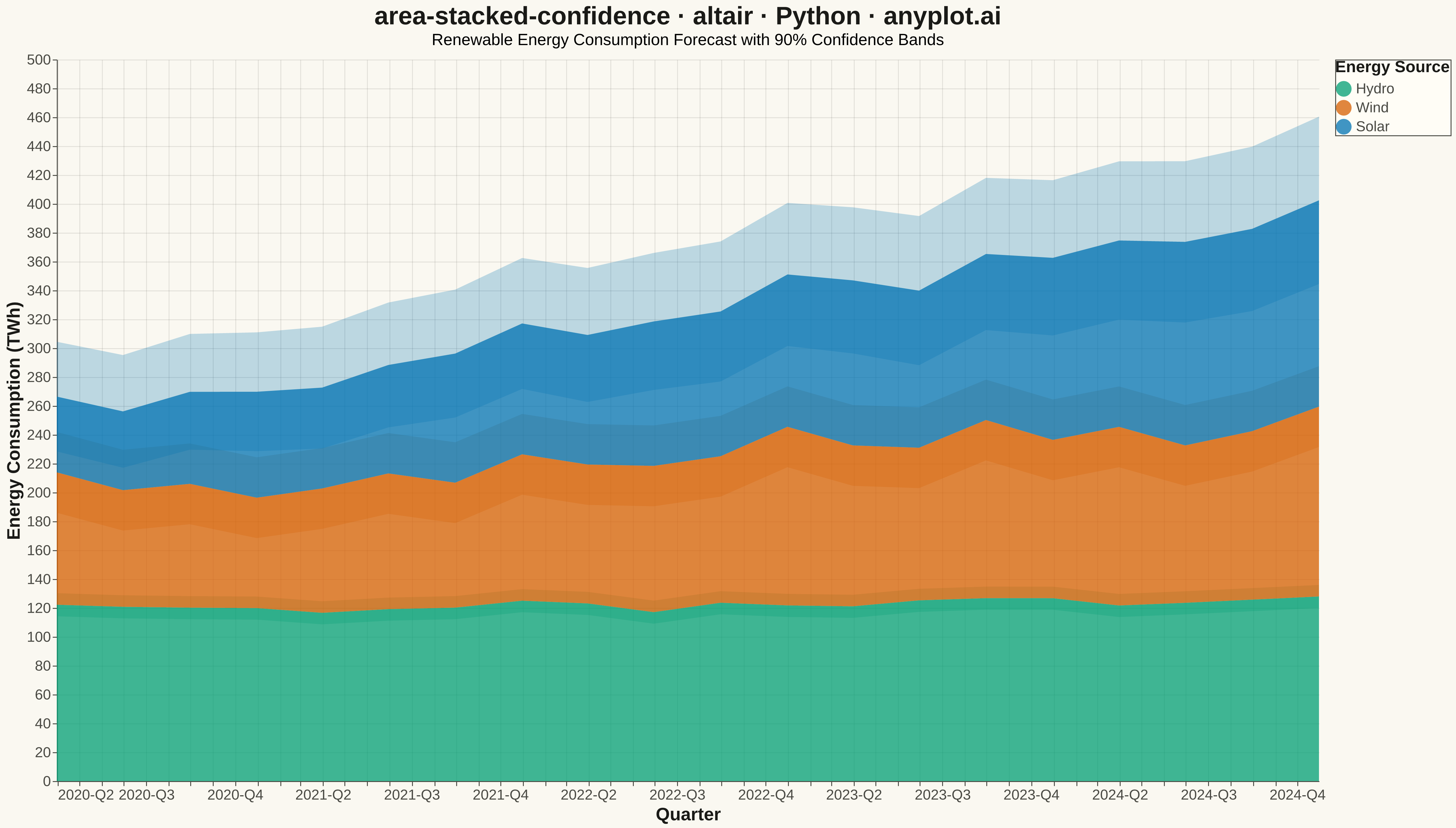
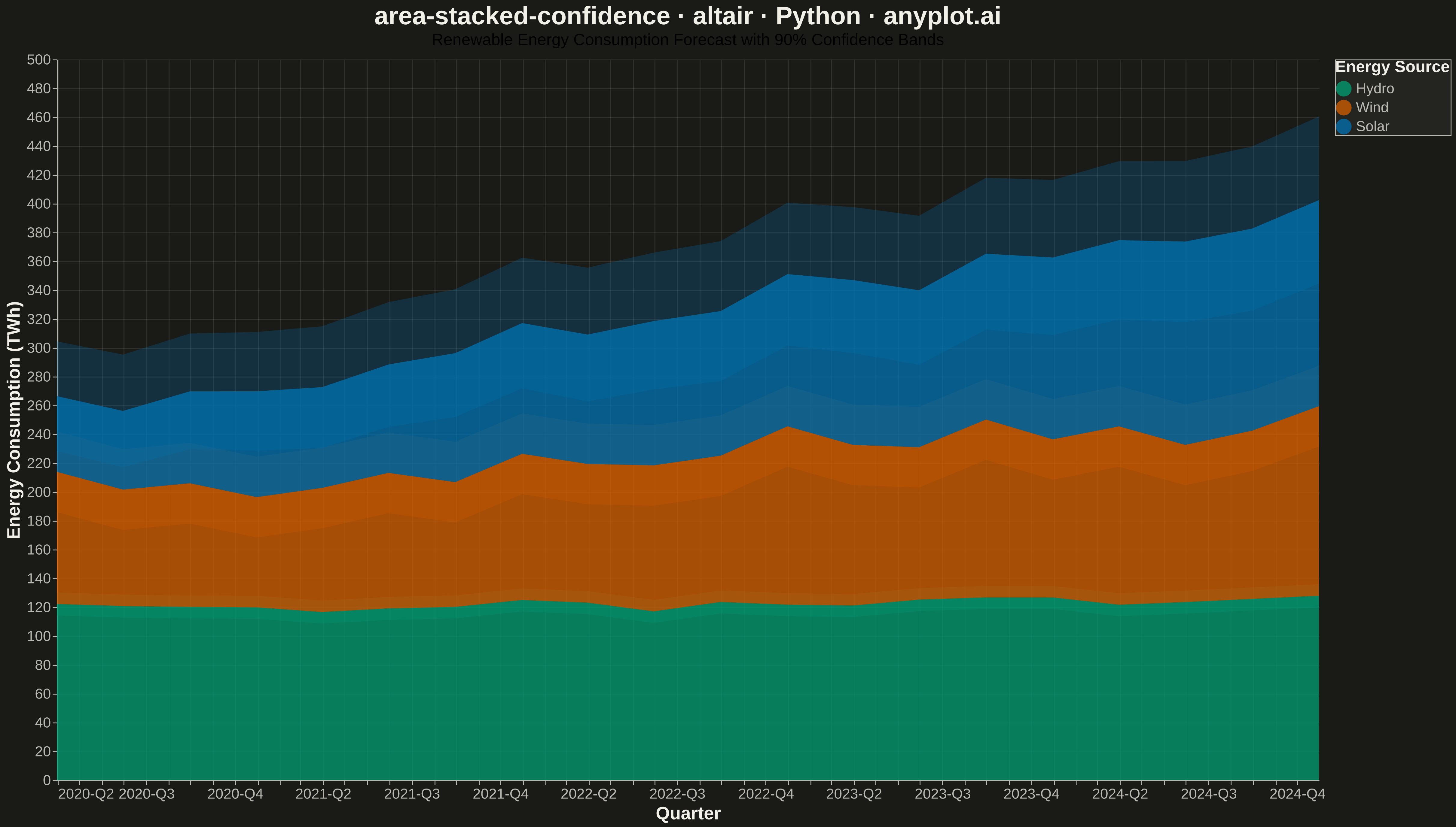
A stacked area chart that displays multiple data series as cumulative areas, with each series surrounded by uncertainty or confidence bands. This visualization combines the composition insight of stacked areas with the statistical rigor of confidence intervals, making it ideal for showing how parts contribute to a whole while simultaneously communicating uncertainty in each component. The bands reveal where estimates are precise versus uncertain across the stacked series.
""" anyplot.ai
area-stacked-confidence: Stacked Area Chart with Confidence Bands
Library: altair 6.1.0 | Python 3.13.13
Quality: 87/100 | Updated: 2026-05-18
"""

import altair as alt
import numpy as np
import pandas as pd


# Data - Quarterly energy consumption by source with uncertainty
np.random.seed(42)
quarters = pd.date_range("2020-01-01", periods=20, freq="QE")

# Generate energy consumption data for 3 sources (in TWh)
# Solar: growing trend with increasing uncertainty
solar_base = np.linspace(50, 150, 20) + np.random.randn(20) * 5
solar_uncertainty = np.linspace(10, 30, 20)

# Wind: moderate growth with steady uncertainty
wind_base = np.linspace(80, 130, 20) + np.random.randn(20) * 8
wind_uncertainty = np.ones(20) * 20

# Hydro: stable with low uncertainty
hydro_base = np.linspace(120, 125, 20) + np.random.randn(20) * 3
hydro_uncertainty = np.ones(20) * 8

# Create DataFrame with stacked values and confidence bands
df = pd.DataFrame({"date": quarters})

# For stacked areas, we need cumulative values
# Stack order: Hydro (bottom) -> Wind (middle) -> Solar (top)
df["hydro"] = hydro_base
df["hydro_lower"] = hydro_base - hydro_uncertainty
df["hydro_upper"] = hydro_base + hydro_uncertainty

df["wind_base"] = wind_base
df["wind"] = df["hydro"] + wind_base
df["wind_lower"] = df["hydro_lower"] + (wind_base - wind_uncertainty)
df["wind_upper"] = df["hydro_upper"] + (wind_base + wind_uncertainty)

df["solar_base"] = solar_base
df["solar"] = df["wind"] + solar_base
df["solar_lower"] = df["wind_lower"] + (solar_base - solar_uncertainty)
df["solar_upper"] = df["wind_upper"] + (solar_base + solar_uncertainty)

# Define colors (Python Blue primary, then complementary)
colors = {"Hydro": "#306998", "Wind": "#4A90D9", "Solar": "#FFD43B"}

# Create long-format data for legend
legend_df = pd.DataFrame(
    {
        "date": list(quarters) * 3,
        "source": ["Hydro"] * 20 + ["Wind"] * 20 + ["Solar"] * 20,
        "y": list(df["hydro"]) + list(df["wind"]) + list(df["solar"]),
        "y0": [0] * 20 + list(df["hydro"]) + list(df["wind"]),
    }
)

# Create base chart
base = alt.Chart(df).encode(x=alt.X("date:T", title="Quarter", axis=alt.Axis(format="%Y-Q%q", labelFontSize=16)))

# Hydro confidence band (bottom layer)
hydro_band = base.mark_area(opacity=0.25, color=colors["Hydro"]).encode(
    y=alt.Y("hydro_lower:Q", title="Energy Consumption (TWh)", axis=alt.Axis(titleFontSize=20, labelFontSize=16)),
    y2=alt.Y2("hydro_upper:Q"),
)

# Wind confidence band (middle layer)
wind_band = base.mark_area(opacity=0.25, color=colors["Wind"]).encode(
    y=alt.Y("wind_lower:Q"), y2=alt.Y2("wind_upper:Q")
)

# Solar confidence band (top layer)
solar_band = base.mark_area(opacity=0.25, color=colors["Solar"]).encode(
    y=alt.Y("solar_lower:Q"), y2=alt.Y2("solar_upper:Q")
)

# Create stacked areas with legend using long-format data
stacked_areas = (
    alt.Chart(legend_df)
    .mark_area(opacity=0.75)
    .encode(
        x=alt.X("date:T", title="Quarter", axis=alt.Axis(format="%Y-Q%q", labelFontSize=16)),
        y=alt.Y("y0:Q", title="Energy Consumption (TWh)"),
        y2=alt.Y2("y:Q"),
        color=alt.Color(
            "source:N",
            scale=alt.Scale(
                domain=["Hydro", "Wind", "Solar"], range=[colors["Hydro"], colors["Wind"], colors["Solar"]]
            ),
            legend=alt.Legend(title="Energy Source", titleFontSize=18, labelFontSize=16, symbolSize=300),
        ),
        order=alt.Order("source:N", sort="ascending"),
    )
)

# Combine bands and stacked areas
chart = (
    alt.layer(hydro_band, wind_band, solar_band, stacked_areas)
    .properties(
        width=1400,
        height=800,
        title=alt.Title(
            "area-stacked-confidence · altair · pyplots.ai",
            fontSize=28,
            subtitle="Renewable Energy Consumption Forecast with 90% Confidence Bands",
            subtitleFontSize=18,
        ),
    )
    .configure_axis(titleFontSize=20, labelFontSize=16)
    .configure_view(strokeWidth=0)
    .configure_legend(titleFontSize=18, labelFontSize=16)
)

# Save outputs
chart.save("plot.png", scale_factor=3.0)
chart.save("plot.html")
Runnable source as JSON, for any HTTP client: https://api.anyplot.ai/specs/area-stacked-confidence/altair/code. Any spec id and library id listed in llms-full.txt fit the same URL shape; every URL below is complete and callable.
{
  "spec_id": "area-stacked-confidence",
  "language": "python",
  "library": "altair",
  "page": "https://anyplot.ai/area-stacked-confidence/python/altair",
  "hub": "https://anyplot.ai/area-stacked-confidence",
  "code_json": "https://api.anyplot.ai/specs/area-stacked-confidence/altair/code",
  "spec_json": "https://api.anyplot.ai/specs/area-stacked-confidence",
  "render_light_png": "https://storage.googleapis.com/anyplot-images/plots/area-stacked-confidence/python/altair/plot-light.png",
  "render_dark_png": "https://storage.googleapis.com/anyplot-images/plots/area-stacked-confidence/python/altair/plot-dark.png",
  "interactive_light_html": "https://storage.googleapis.com/anyplot-images/plots/area-stacked-confidence/python/altair/plot-light.html",
  "interactive_dark_html": "https://storage.googleapis.com/anyplot-images/plots/area-stacked-confidence/python/altair/plot-dark.html",
  "quality_score": 87.0,
  "license": "MIT",
  "guide": "https://anyplot.ai/llms.txt"
}
Part of Stacked Area Chart with Confidence Bands on anyplot.ai.