The same plot in 14 other libraries — JavaScript: Chart.js, D3.js, Apache ECharts, Highcharts; Python: Altair, Bokeh, lets-plot, Matplotlib, Plotly, plotnine, Pygal, Seaborn; R: ggplot2; Julia: Makie.jl. Compare all 15 side by side: Stacked Area Chart with Confidence Bands in Python, R, Julia and JavaScript.
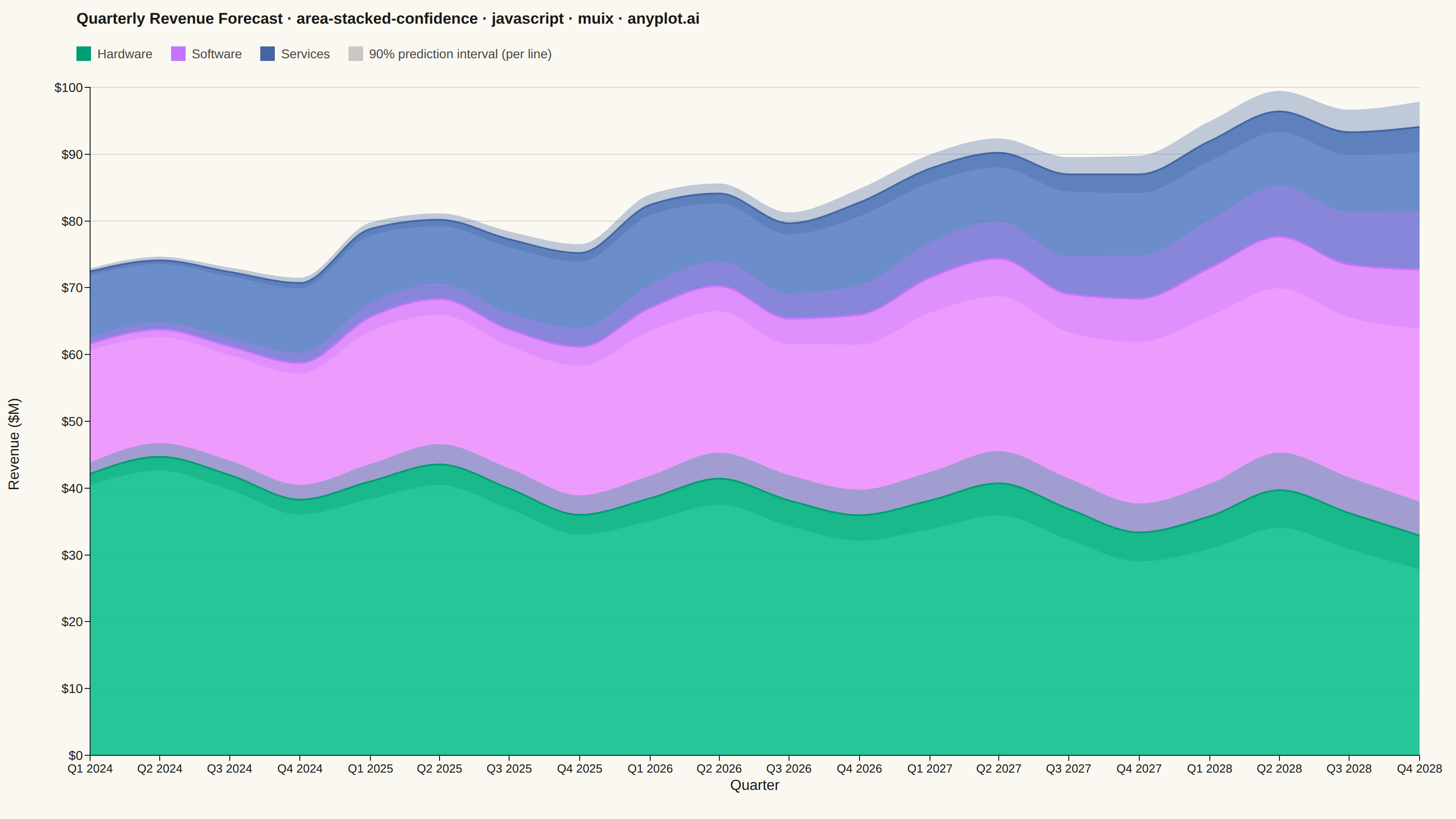
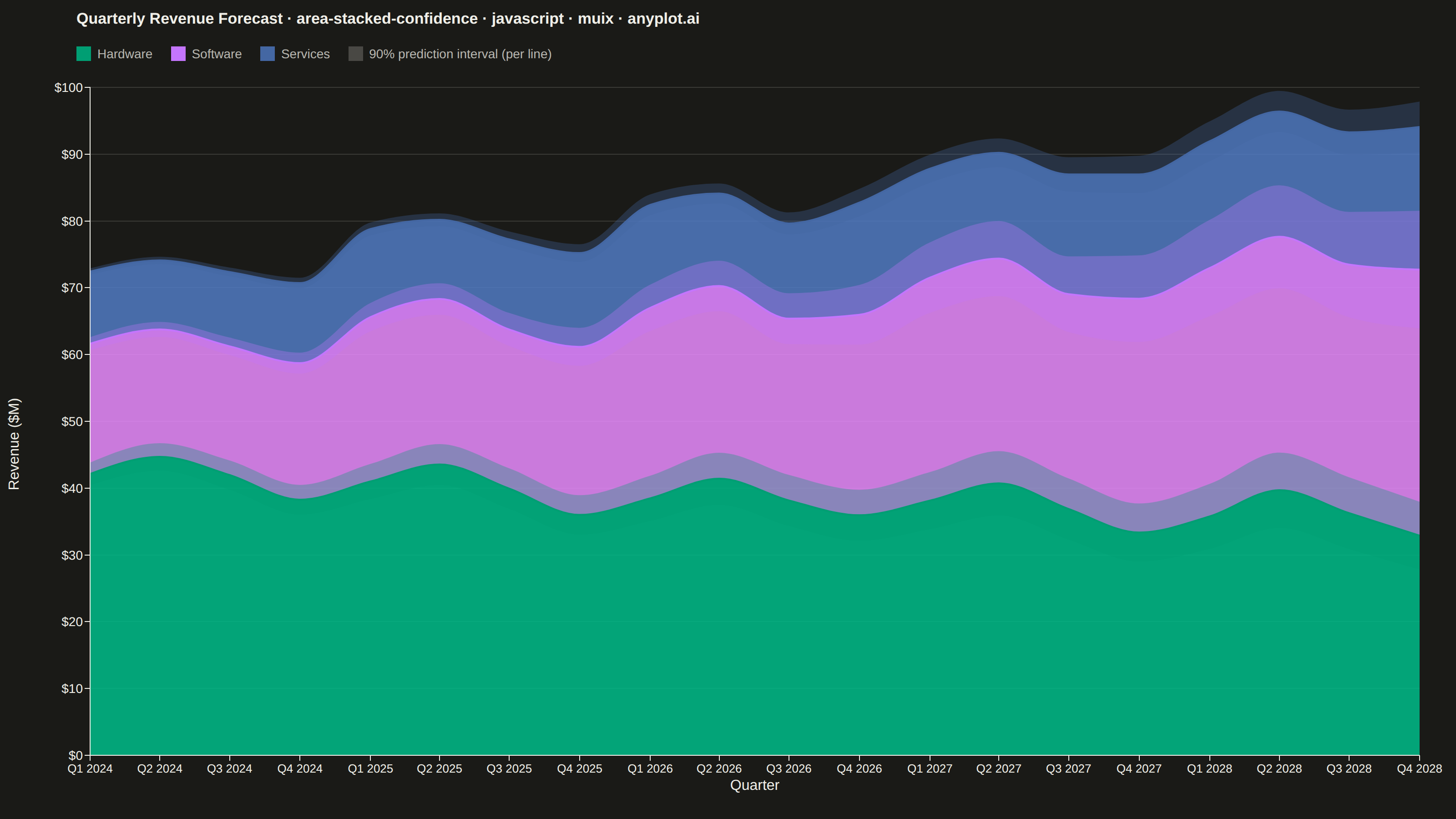
A stacked area chart that displays multiple data series as cumulative areas, with each series surrounded by uncertainty or confidence bands. This visualization combines the composition insight of stacked areas with the statistical rigor of confidence intervals, making it ideal for showing how parts contribute to a whole while simultaneously communicating uncertainty in each component. The bands reveal where estimates are precise versus uncertain across the stacked series.
// anyplot.ai
// area-stacked-confidence: Stacked Area Chart with Confidence Bands
// Library: muix 7.29.1 | JavaScript 22.23.2
// Quality: 90/100 | Created: 2026-08-26
import { LineChart } from "@mui/x-charts/LineChart";

const t = window.ANYPLOT_TOKENS;

// --- Data: quarterly revenue forecast by product line, 5 years (20 quarters) ---
// A 90% prediction interval widens with forecast horizon — the further out a
// quarter is, the less certain the number, the classic "fan out" behavior of
// a real revenue forecast. Ordered largest-revenue-first so Hardware anchors
// the stack base.
function lcg(seed) {
  let state = seed;
  return () => {
    state = (state * 1103515245 + 12345) % 2147483648;
    return state / 2147483648;
  };
}
const random = lcg(42);

const QUARTERS = 20; // Q1 2024 .. Q4 2028
const quarterDates = Array.from(
  { length: QUARTERS },
  (_, i) => new Date(2024 + Math.floor(i / 4), (i % 4) * 3, 1),
);
const quarterLabel = (date) => `Q${Math.floor(date.getMonth() / 3) + 1} ${date.getFullYear()}`;

const PRODUCT_LINES = [
  {
    id: "hardware",
    label: "Hardware",
    paletteIndex: 0,
    base: 42,
    trend: -0.35,
    seasonAmp: 3.0,
    seasonPhase: 0,
    uncertaintyBase: 0.04,
    uncertaintyGrowth: 0.006,
  },
  {
    id: "software",
    label: "Software",
    paletteIndex: 1,
    base: 18,
    trend: 1.15,
    seasonAmp: 1.6,
    seasonPhase: 1.4,
    uncertaintyBase: 0.05,
    uncertaintyGrowth: 0.009,
  },
  {
    id: "services",
    label: "Services",
    paletteIndex: 2,
    base: 10,
    trend: 0.55,
    seasonAmp: 0.9,
    seasonPhase: 2.6,
    uncertaintyBase: 0.045,
    uncertaintyGrowth: 0.007,
  },
];

const seriesData = PRODUCT_LINES.map((line) => {
  const center = Array.from({ length: QUARTERS }, (_, i) =>
    Math.max(
      1,
      line.base +
        line.trend * i +
        line.seasonAmp * Math.sin((i * Math.PI) / 2 + line.seasonPhase) +
        (random() - 0.5) * 1.6,
    ),
  );
  const fraction = Array.from(
    { length: QUARTERS },
    (_, i) => line.uncertaintyBase + i * line.uncertaintyGrowth,
  );
  const lower = center.map((v, i) => v * (1 - fraction[i]));
  const upper = center.map((v, i) => v * (1 + fraction[i]));
  return { ...line, center, lower, upper };
});

// Running cumulative total *below* each layer — the stack offset both the
// central area and its band must share ("stack order consistent between
// central values and their bands").
let cumulativeBelow = new Array(QUARTERS).fill(0);
seriesData.forEach((s) => {
  s.baseBelow = cumulativeBelow;
  cumulativeBelow = cumulativeBelow.map((v, i) => v + s.center[i]);
});

const mainSeries = seriesData.map((s) => ({
  id: s.id,
  label: s.label,
  data: s.center,
  stack: "revenue",
  area: true,
  showMark: false,
  color: t.palette[s.paletteIndex],
  curve: "monotoneX",
}));

// Stacked-band trick (per series): an invisible series carries the offset
// (baseBelow + lower bound), and a second series stacked on top of it
// supplies only the band's own width (upper - lower). The visible area then
// spans exactly [baseBelow + lower, baseBelow + upper] — straddling that
// series' own boundary in the stack, in the same order as the main areas.
const bandSeries = seriesData.flatMap((s) => [
  {
    id: `${s.id}-band-base`,
    data: s.baseBelow.map((v, i) => v + s.lower[i]),
    stack: `band-${s.id}`,
    showMark: false,
    color: t.pageBg,
  },
  {
    id: `${s.id}-band-width`,
    data: s.upper.map((v, i) => v - s.lower[i]),
    stack: `band-${s.id}`,
    area: true,
    showMark: false,
    color: t.palette[s.paletteIndex],
  },
]);

// Per-series sx overrides for the band trick: hide the invisible base line,
// hide the band's own stroke, and set the band fill to a lighter, translucent
// shade of that series' color.
const bandSx = seriesData.reduce((acc, s) => {
  acc[`& .MuiLineElement-series-${s.id}-band-base`] = { display: "none" };
  acc[`& .MuiLineElement-series-${s.id}-band-width`] = { stroke: "none" };
  acc[`& .MuiAreaElement-series-${s.id}-band-width`] = {
    fill: t.palette[s.paletteIndex],
    fillOpacity: 0.32,
  };
  return acc;
}, {});

const TITLE =
  "Quarterly Revenue Forecast · area-stacked-confidence · javascript · muix · anyplot.ai";
const TITLE_FONT_DEFAULT = 22;
const titleFontSize =
  TITLE.length > 67 ? Math.round(TITLE_FONT_DEFAULT * (67 / TITLE.length)) : TITLE_FONT_DEFAULT;
const TITLE_H = 42;
const LEGEND_H = 34;

function Legend() {
  return (
    <div style={{ height: LEGEND_H, display: "flex", alignItems: "center", gap: "20px", flexWrap: "wrap" }}>
      {seriesData.map((s) => (
        <div key={s.id} style={{ display: "flex", alignItems: "center", gap: "7px" }}>
          <span
            style={{
              width: "16px",
              height: "16px",
              backgroundColor: t.palette[s.paletteIndex],
              display: "inline-block",
            }}
          />
          <span style={{ fontSize: "14px", color: t.inkSoft }}>{s.label}</span>
        </div>
      ))}
      <div style={{ display: "flex", alignItems: "center", gap: "7px" }}>
        <span style={{ width: "16px", height: "16px", backgroundColor: t.ink, opacity: 0.22, display: "inline-block" }} />
        <span style={{ fontSize: "14px", color: t.inkSoft }}>90% prediction interval (per line)</span>
      </div>
    </div>
  );
}

// --- Chart (default-exported component — the harness mounts it) ------------
export default function Chart() {
  const { width, height } = window.ANYPLOT_SIZE;
  const chartHeight = height - TITLE_H - LEGEND_H;

  // MUI X's built-in y-axis `label` sits at a fixed offset derived from the
  // deprecated `tickFontSize` prop, not the actual `tickLabelStyle.fontSize`
  // — at this canvas size that formula places the rotated title *inside* the
  // "$NN" tick label text. A hand-rolled label column sidesteps that offset
  // math entirely and guarantees no overlap.
  const Y_LABEL_W = 34;
  const chartWidth = width - Y_LABEL_W;

  return (
    <div style={{ width, height, display: "flex", flexDirection: "column", backgroundColor: t.pageBg }}>
      <div style={{ paddingLeft: "84px" }}>
        <div
          style={{
            height: `${TITLE_H}px`,
            lineHeight: `${TITLE_H}px`,
            fontSize: `${titleFontSize}px`,
            fontWeight: 600,
            color: t.ink,
          }}
        >
          {TITLE}
        </div>
        <Legend />
      </div>
      <div style={{ display: "flex", width, height: chartHeight }}>
        <div
          style={{
            width: Y_LABEL_W,
            display: "flex",
            alignItems: "center",
            justifyContent: "center",
          }}
        >
          <span
            style={{
              display: "inline-block",
              transform: "rotate(-90deg)",
              whiteSpace: "nowrap",
              fontSize: "16px",
              color: t.ink,
            }}
          >
            Revenue ($M)
          </span>
        </div>
        <LineChart
          width={chartWidth}
          height={chartHeight}
          skipAnimation
          grid={{ horizontal: true }}
          xAxis={[
            {
              data: quarterDates,
              scaleType: "time",
              valueFormatter: quarterLabel,
              tickNumber: 10,
              label: "Quarter",
              labelStyle: { fontSize: 16 },
              tickLabelStyle: { fontSize: 13 },
            },
          ]}
          yAxis={[
            {
              min: 0,
              tickLabelStyle: { fontSize: 14 },
              valueFormatter: (v: number) => `$${Math.round(v)}`,
            },
          ]}
          series={[...mainSeries, ...bandSeries]}
          margin={{ top: 20, right: 40, bottom: 70, left: 65 }}
          slotProps={{ legend: { hidden: true } }}
          sx={{
            "& .MuiAreaElement-root": { fillOpacity: 0.85 },
            "& .MuiLineElement-root": { strokeWidth: 2 },
            "& .MuiChartsAxis-tickLabel": { fill: t.inkSoft },
            "& .MuiChartsAxis-line": { stroke: t.inkSoft },
            "& .MuiChartsGrid-line": { stroke: t.grid, strokeWidth: 1 },
            ...bandSx,
          }}
        />
      </div>
    </div>
  );
}
Runnable source as JSON, for any HTTP client: https://api.anyplot.ai/specs/area-stacked-confidence/muix/code. Any spec id and library id listed in llms-full.txt fit the same URL shape; every URL below is complete and callable.
{
  "spec_id": "area-stacked-confidence",
  "language": "javascript",
  "library": "muix",
  "page": "https://anyplot.ai/area-stacked-confidence/javascript/muix",
  "hub": "https://anyplot.ai/area-stacked-confidence",
  "code_json": "https://api.anyplot.ai/specs/area-stacked-confidence/muix/code",
  "spec_json": "https://api.anyplot.ai/specs/area-stacked-confidence",
  "render_light_png": "https://storage.googleapis.com/anyplot-images/plots/area-stacked-confidence/javascript/muix/plot-light.png",
  "render_dark_png": "https://storage.googleapis.com/anyplot-images/plots/area-stacked-confidence/javascript/muix/plot-dark.png",
  "interactive_light_html": "https://storage.googleapis.com/anyplot-images/plots/area-stacked-confidence/javascript/muix/plot-light.html",
  "interactive_dark_html": "https://storage.googleapis.com/anyplot-images/plots/area-stacked-confidence/javascript/muix/plot-dark.html",
  "quality_score": 90.0,
  "license": "MIT",
  "guide": "https://anyplot.ai/llms.txt"
}
Part of Stacked Area Chart with Confidence Bands on anyplot.ai.