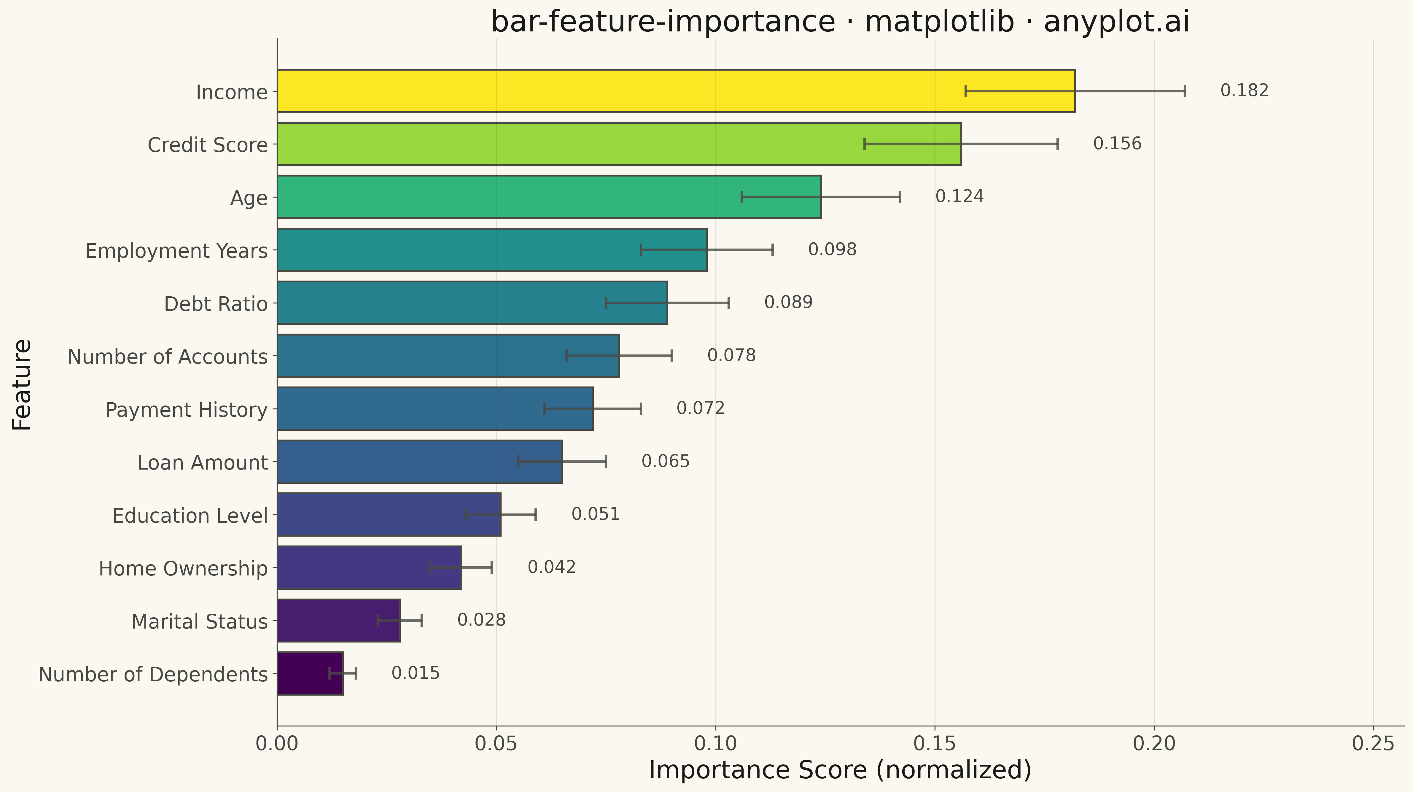
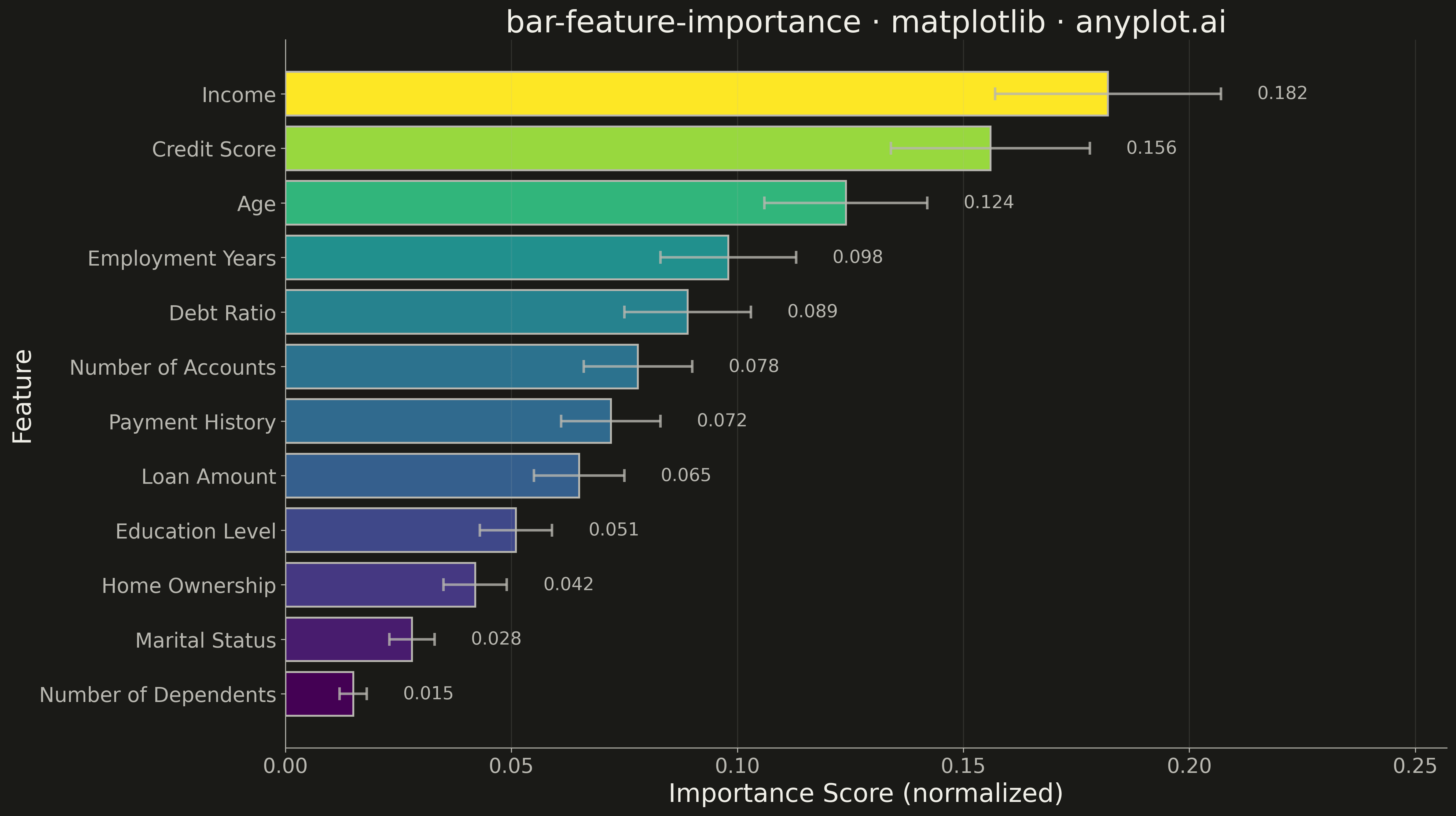
A horizontal bar chart displaying feature importances from machine learning models, with features sorted by importance value and bars colored by a gradient to emphasize relative contribution. This visualization is essential for model interpretability, helping data scientists and stakeholders understand which features drive model predictions. The horizontal orientation allows for readable feature names of varying lengths.
""" anyplot.ai
bar-feature-importance: Feature Importance Bar Chart
Library: matplotlib 3.10.9 | Python 3.13.13
Quality: 90/100 | Updated: 2026-05-10
"""

import os

import matplotlib.pyplot as plt
import numpy as np


# Theme tokens
THEME = os.getenv("ANYPLOT_THEME", "light")
PAGE_BG = "#FAF8F1" if THEME == "light" else "#1A1A17"
ELEVATED_BG = "#FFFDF6" if THEME == "light" else "#242420"
INK = "#1A1A17" if THEME == "light" else "#F0EFE8"
INK_SOFT = "#4A4A44" if THEME == "light" else "#B8B7B0"
INK_MUTED = "#6B6A63" if THEME == "light" else "#A8A79F"

# Data - Feature importances from a machine learning model
np.random.seed(42)
features = [
    "Income",
    "Credit Score",
    "Age",
    "Employment Years",
    "Debt Ratio",
    "Number of Accounts",
    "Payment History",
    "Loan Amount",
    "Education Level",
    "Home Ownership",
    "Marital Status",
    "Number of Dependents",
]

importance = np.array([0.182, 0.156, 0.124, 0.098, 0.089, 0.078, 0.072, 0.065, 0.051, 0.042, 0.028, 0.015])
std = np.array([0.025, 0.022, 0.018, 0.015, 0.014, 0.012, 0.011, 0.010, 0.008, 0.007, 0.005, 0.003])

# Sort by importance (highest at top for horizontal bar chart)
sorted_indices = np.argsort(importance)
features_sorted = [features[i] for i in sorted_indices]
importance_sorted = importance[sorted_indices]
std_sorted = std[sorted_indices]

# Create color gradient mapped to importance values using viridis
cmap = plt.cm.viridis
norm = plt.Normalize(vmin=importance_sorted.min(), vmax=importance_sorted.max())
colors = cmap(norm(importance_sorted))

# Plot
fig, ax = plt.subplots(figsize=(16, 9), facecolor=PAGE_BG)
ax.set_facecolor(PAGE_BG)

bars = ax.barh(
    features_sorted,
    importance_sorted,
    xerr=std_sorted,
    color=colors,
    edgecolor=INK_SOFT,
    linewidth=1.5,
    capsize=5,
    error_kw={"elinewidth": 2, "capthick": 2, "alpha": 0.8, "ecolor": INK_SOFT},
)

# Add value annotations at the end of bars
for bar, val, err in zip(bars, importance_sorted, std_sorted, strict=True):
    ax.text(
        val + err + 0.008,
        bar.get_y() + bar.get_height() / 2,
        f"{val:.3f}",
        va="center",
        ha="left",
        fontsize=14,
        color=INK_SOFT,
    )

# Labels and styling
ax.set_xlabel("Importance Score (normalized)", fontsize=20, color=INK)
ax.set_ylabel("Feature", fontsize=20, color=INK)
ax.set_title("bar-feature-importance · matplotlib · anyplot.ai", fontsize=24, fontweight="medium", color=INK)
ax.tick_params(axis="both", labelsize=16, colors=INK_SOFT)
ax.set_xlim(0, importance_sorted.max() + std_sorted.max() + 0.05)

# Grid
ax.grid(True, axis="x", alpha=0.15, linewidth=0.8, color=INK_SOFT)

# Spines
ax.spines["top"].set_visible(False)
ax.spines["right"].set_visible(False)
ax.spines["left"].set_color(INK_SOFT)
ax.spines["bottom"].set_color(INK_SOFT)

plt.tight_layout()
plt.savefig(f"plot-{THEME}.png", dpi=300, bbox_inches="tight", facecolor=PAGE_BG)
Runnable source as JSON, for any HTTP client: https://api.anyplot.ai/specs/bar-feature-importance/matplotlib/code. Any spec id and library id listed in llms-full.txt fit the same URL shape; every URL below is complete and callable.
{
  "spec_id": "bar-feature-importance",
  "language": "python",
  "library": "matplotlib",
  "page": "https://anyplot.ai/bar-feature-importance/python/matplotlib",
  "hub": "https://anyplot.ai/bar-feature-importance",
  "code_json": "https://api.anyplot.ai/specs/bar-feature-importance/matplotlib/code",
  "spec_json": "https://api.anyplot.ai/specs/bar-feature-importance",
  "render_light_png": "https://storage.googleapis.com/anyplot-images/plots/bar-feature-importance/python/matplotlib/plot-light.png",
  "render_dark_png": "https://storage.googleapis.com/anyplot-images/plots/bar-feature-importance/python/matplotlib/plot-dark.png",
  "quality_score": 90.0,
  "license": "MIT",
  "guide": "https://anyplot.ai/llms.txt"
}
Part of Feature Importance Bar Chart on anyplot.ai.