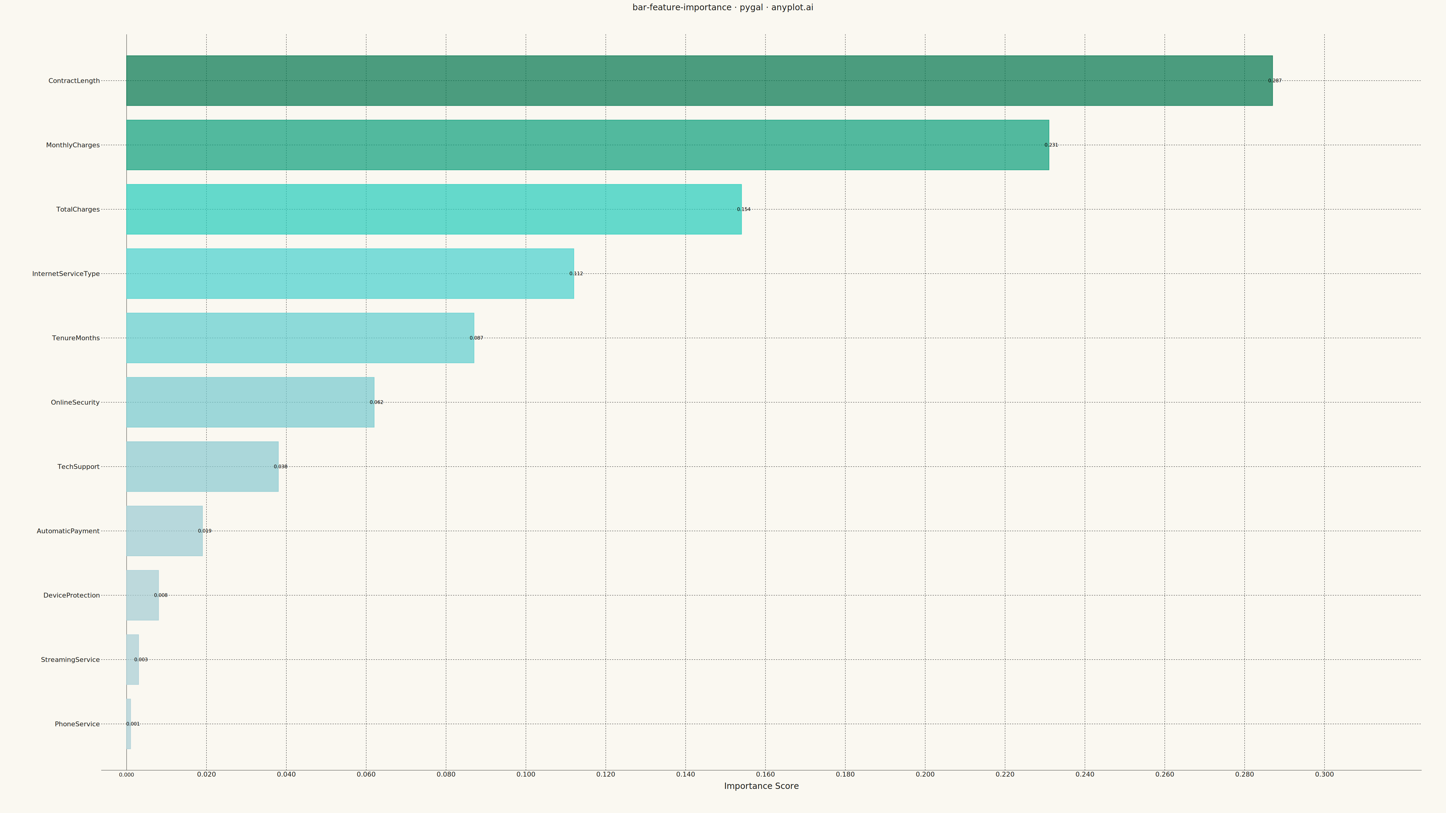
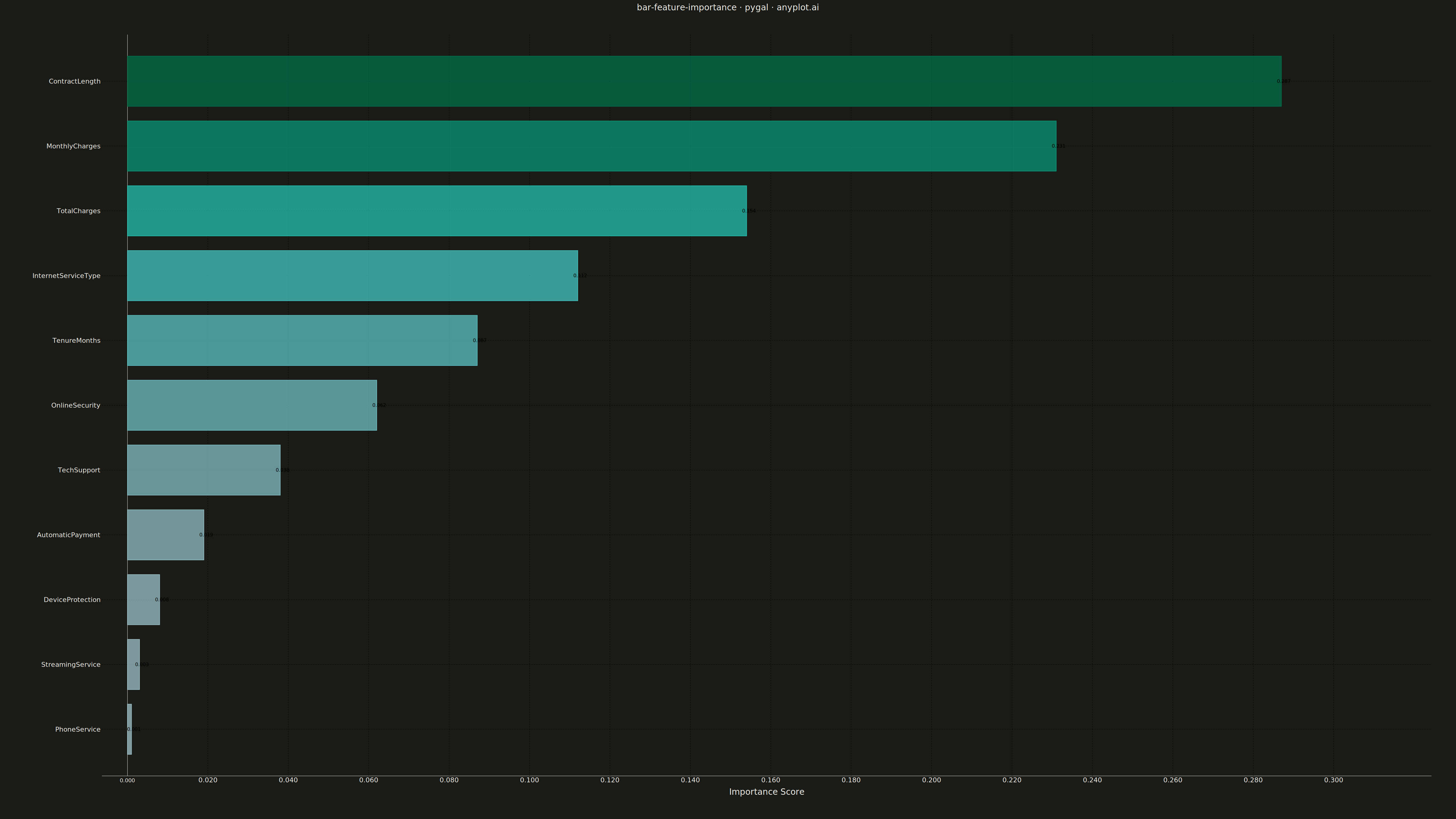
A horizontal bar chart displaying feature importances from machine learning models, with features sorted by importance value and bars colored by a gradient to emphasize relative contribution. This visualization is essential for model interpretability, helping data scientists and stakeholders understand which features drive model predictions. The horizontal orientation allows for readable feature names of varying lengths.
""" anyplot.ai
bar-feature-importance: Feature Importance Bar Chart
Library: pygal 3.1.0 | Python 3.13.13
Quality: 88/100 | Updated: 2026-05-10
"""

import colorsys
import os
import sys


# Avoid shadowing the pygal package by temporarily removing this directory from path during import
_original_path = sys.path.copy()
sys.path = [
    p
    for p in sys.path
    if not p.endswith(("implementations/python", "plots/bar-feature-importance/implementations/python"))
]

try:
    import pygal
    from pygal.style import Style
finally:
    sys.path = _original_path

# Theme tokens from prompts/default-style-guide.md
THEME = os.getenv("ANYPLOT_THEME", "light")
PAGE_BG = "#FAF8F1" if THEME == "light" else "#1A1A17"
INK = "#1A1A17" if THEME == "light" else "#F0EFE8"
INK_SOFT = "#4A4A44" if THEME == "light" else "#B8B7B0"
INK_MUTED = "#6B6A63" if THEME == "light" else "#A8A79F"
BRAND = "#009E73"

# Data - Feature importances from a customer churn prediction model
features = [
    "ContractLength",
    "MonthlyCharges",
    "TotalCharges",
    "InternetServiceType",
    "TenureMonths",
    "OnlineSecurity",
    "TechSupport",
    "AutomaticPayment",
    "DeviceProtection",
    "StreamingService",
    "PhoneService",
]
importances = [0.287, 0.231, 0.154, 0.112, 0.087, 0.062, 0.038, 0.019, 0.008, 0.003, 0.001]

# Sort by importance (ascending for pygal HorizontalBar bottom-to-top rendering)
sorted_pairs = sorted(zip(features, importances, strict=True), key=lambda x: x[1], reverse=False)
sorted_features = [p[0] for p in sorted_pairs]
sorted_importances = [p[1] for p in sorted_pairs]

# Color gradient: low to high importance using HSL-based interpolation (more perceptually uniform)
min_imp = min(sorted_importances)
max_imp = max(sorted_importances)

colors_list = []
for imp in sorted_importances:
    ratio = (imp - min_imp) / (max_imp - min_imp) if max_imp > min_imp else 0.5
    # HSL interpolation: light cyan (h=190, s=35%, l=75%) → brand green (#009E73: h=160, s=100%, l=23%)
    h_start, s_start, light_start = 190, 0.35, 0.75
    h_end, s_end, light_end = 160, 1.0, 0.23
    h = (h_start + ratio * (h_end - h_start)) / 360
    s = s_start + ratio * (s_end - s_start)
    light = light_start + ratio * (light_end - light_start)
    r, g, b = colorsys.hls_to_rgb(h, light, s)
    colors_list.append(f"#{int(r * 255):02x}{int(g * 255):02x}{int(b * 255):02x}")

# Custom style for large canvas
custom_style = Style(
    background=PAGE_BG,
    plot_background=PAGE_BG,
    foreground=INK,
    foreground_strong=INK,
    foreground_subtle=INK_MUTED,
    colors=(BRAND,),
    font_family="sans-serif",
    title_font_size=28,
    label_font_size=22,
    major_label_font_size=18,
    legend_font_size=16,
    value_font_size=16,
    stroke_width=2,
)

# Create horizontal bar chart
chart = pygal.HorizontalBar(
    width=4800,
    height=2700,
    style=custom_style,
    title="bar-feature-importance · pygal · anyplot.ai",
    x_title="Importance Score",
    show_legend=False,
    show_y_guides=False,
    show_x_guides=True,
    print_values=True,
    print_values_position="top",
    value_formatter=lambda x: f"{x:.3f}",
    range=(0, max_imp * 1.1),
    margin=80,
    spacing=6,
    truncate_label=-1,
)

# Set feature names as y-axis labels
chart.x_labels = sorted_features

# Add data with per-bar colors
bar_data = [{"value": imp, "color": color} for imp, color in zip(sorted_importances, colors_list, strict=True)]
chart.add("Importance", bar_data)

# Save outputs for both themes
chart.render_to_file(f"plot-{THEME}.html")
chart.render_to_png(f"plot-{THEME}.png")
Runnable source as JSON, for any HTTP client: https://api.anyplot.ai/specs/bar-feature-importance/pygal/code. Any spec id and library id listed in llms-full.txt fit the same URL shape; every URL below is complete and callable.
{
  "spec_id": "bar-feature-importance",
  "language": "python",
  "library": "pygal",
  "page": "https://anyplot.ai/bar-feature-importance/python/pygal",
  "hub": "https://anyplot.ai/bar-feature-importance",
  "code_json": "https://api.anyplot.ai/specs/bar-feature-importance/pygal/code",
  "spec_json": "https://api.anyplot.ai/specs/bar-feature-importance",
  "render_light_png": "https://storage.googleapis.com/anyplot-images/plots/bar-feature-importance/python/pygal/plot-light.png",
  "render_dark_png": "https://storage.googleapis.com/anyplot-images/plots/bar-feature-importance/python/pygal/plot-dark.png",
  "interactive_light_html": "https://storage.googleapis.com/anyplot-images/plots/bar-feature-importance/python/pygal/plot-light.html",
  "interactive_dark_html": "https://storage.googleapis.com/anyplot-images/plots/bar-feature-importance/python/pygal/plot-dark.html",
  "quality_score": 88.0,
  "license": "MIT",
  "guide": "https://anyplot.ai/llms.txt"
}
Part of Feature Importance Bar Chart on anyplot.ai.