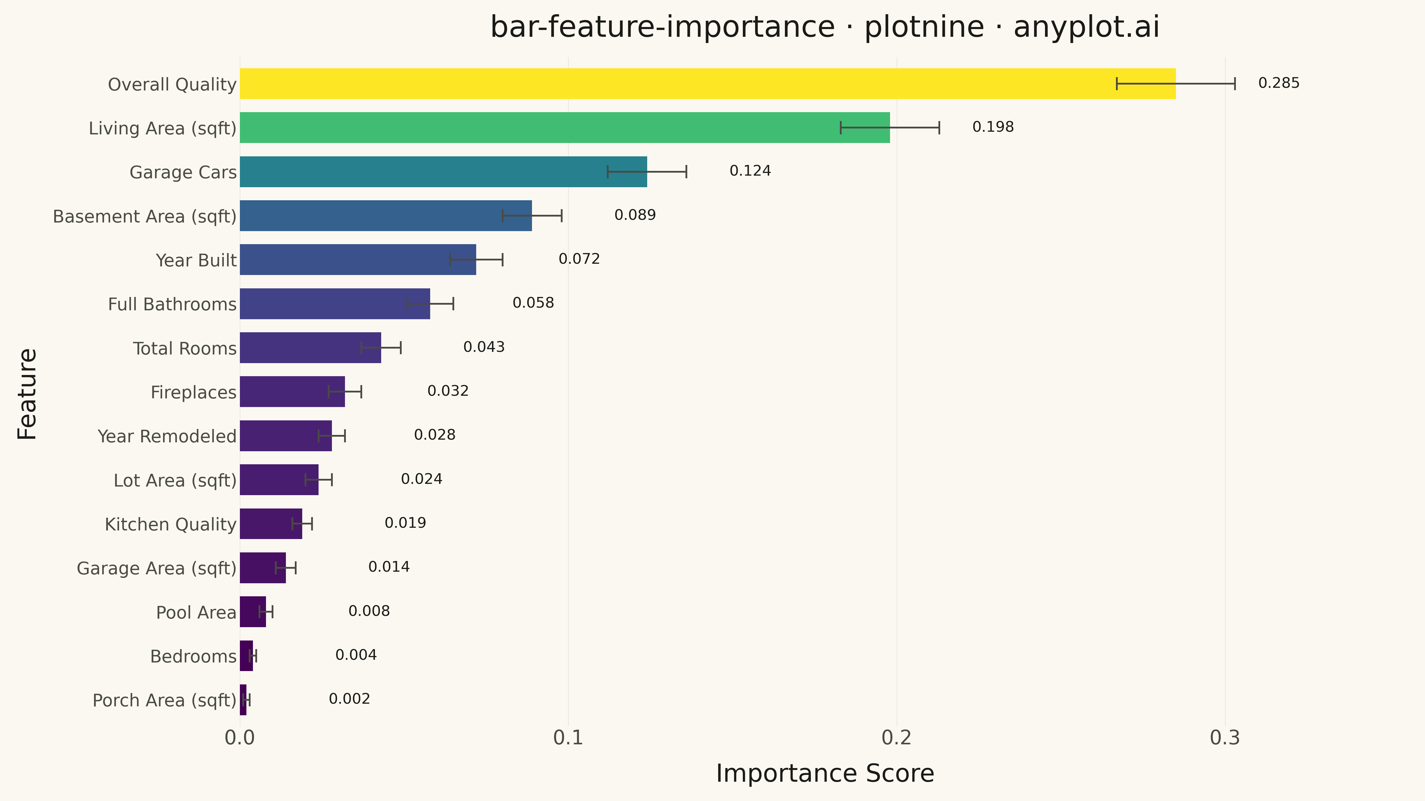
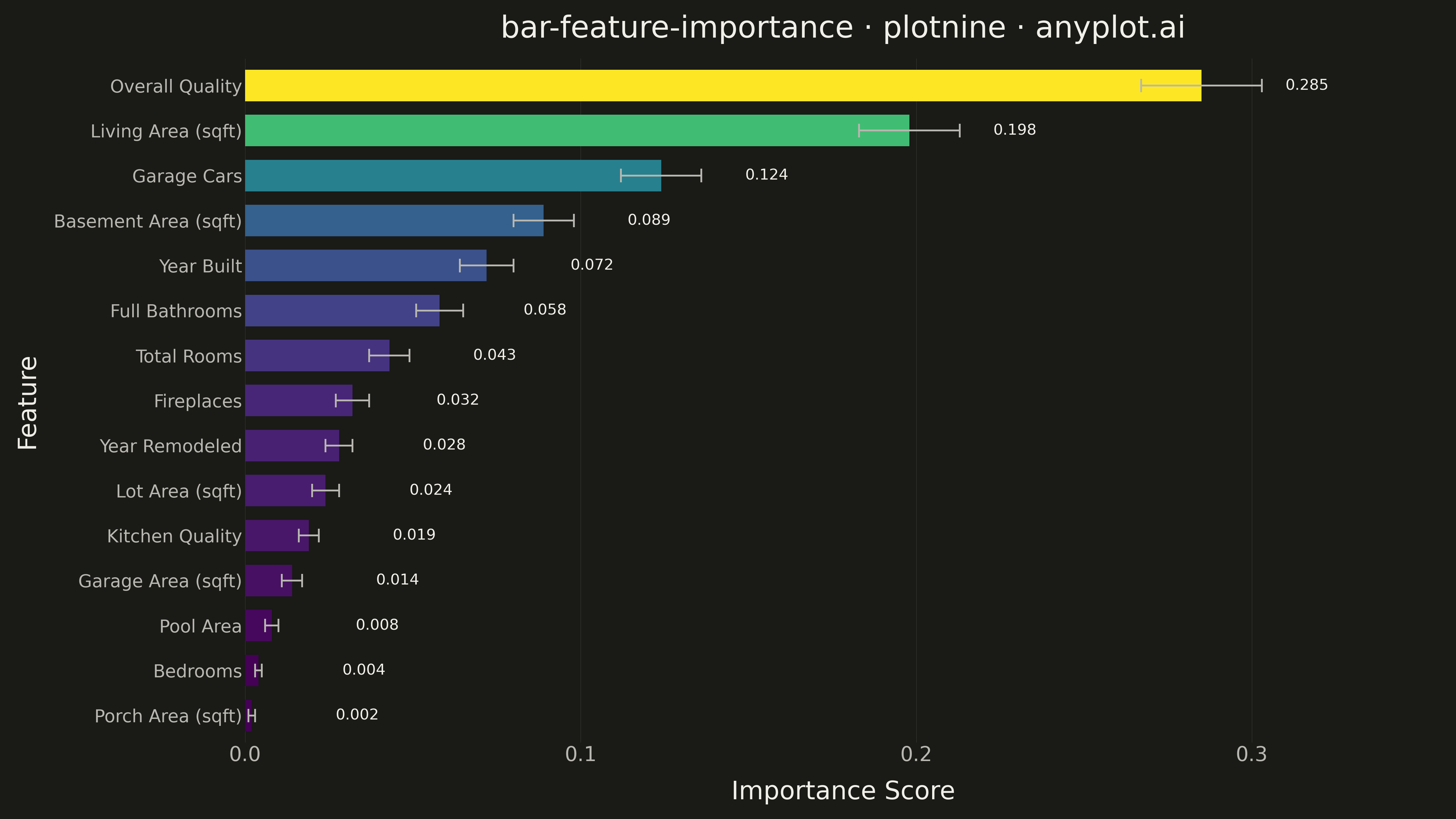
A horizontal bar chart displaying feature importances from machine learning models, with features sorted by importance value and bars colored by a gradient to emphasize relative contribution. This visualization is essential for model interpretability, helping data scientists and stakeholders understand which features drive model predictions. The horizontal orientation allows for readable feature names of varying lengths.
""" anyplot.ai
bar-feature-importance: Feature Importance Bar Chart
Library: plotnine 0.15.4 | Python 3.13.13
Quality: 91/100 | Updated: 2026-05-10
"""

import os

import pandas as pd
from plotnine import (
    aes,
    coord_flip,
    element_line,
    element_rect,
    element_text,
    geom_bar,
    geom_errorbar,
    geom_text,
    ggplot,
    guides,
    labs,
    scale_fill_cmap,
    scale_y_continuous,
    theme,
    theme_minimal,
)


THEME = os.getenv("ANYPLOT_THEME", "light")
PAGE_BG = "#FAF8F1" if THEME == "light" else "#1A1A17"
ELEVATED_BG = "#FFFDF6" if THEME == "light" else "#242420"
INK = "#1A1A17" if THEME == "light" else "#F0EFE8"
INK_SOFT = "#4A4A44" if THEME == "light" else "#B8B7B0"

# Data - Feature importances from a Random Forest model for house price prediction
features = [
    "Overall Quality",
    "Living Area (sqft)",
    "Garage Cars",
    "Basement Area (sqft)",
    "Year Built",
    "Full Bathrooms",
    "Total Rooms",
    "Fireplaces",
    "Year Remodeled",
    "Lot Area (sqft)",
    "Kitchen Quality",
    "Garage Area (sqft)",
    "Pool Area",
    "Bedrooms",
    "Porch Area (sqft)",
]

importances = [0.285, 0.198, 0.124, 0.089, 0.072, 0.058, 0.043, 0.032, 0.028, 0.024, 0.019, 0.014, 0.008, 0.004, 0.002]

# Standard deviations for error bars (from ensemble variability)
stds = [0.018, 0.015, 0.012, 0.009, 0.008, 0.007, 0.006, 0.005, 0.004, 0.004, 0.003, 0.003, 0.002, 0.001, 0.001]

df = pd.DataFrame({"feature": features, "importance": importances, "std": stds})

# Sort by importance and create ordered categorical for proper display
df = df.sort_values("importance", ascending=True)
df["feature"] = pd.Categorical(df["feature"], categories=df["feature"], ordered=True)

# Create plot
plot = (
    ggplot(df, aes(x="feature", y="importance", fill="importance"))
    + geom_bar(stat="identity", width=0.7)
    + geom_errorbar(aes(ymin="importance - std", ymax="importance + std"), width=0.3, color=INK_SOFT, size=0.8)
    + geom_text(aes(label="importance"), format_string="{:.3f}", nudge_y=0.025, size=12, color=INK, ha="left")
    + coord_flip()
    + scale_fill_cmap(cmap_name="viridis")
    + guides(fill=False)
    + scale_y_continuous(expand=(0, 0, 0.15, 0))
    + labs(title="bar-feature-importance · plotnine · anyplot.ai", x="Feature", y="Importance Score")
    + theme_minimal()
    + theme(
        figure_size=(16, 9),
        text=element_text(size=14, color=INK_SOFT),
        axis_title=element_text(size=20, color=INK),
        axis_text=element_text(size=16, color=INK_SOFT),
        axis_text_y=element_text(size=14, color=INK_SOFT),
        plot_title=element_text(size=24, color=INK),
        panel_grid_major_y=element_line(color=INK, size=0.2, alpha=0),
        panel_grid_minor=element_line(alpha=0),
        panel_grid_major_x=element_line(color=INK, size=0.3, alpha=0.15),
        plot_background=element_rect(fill=PAGE_BG, color=PAGE_BG),
        panel_background=element_rect(fill=PAGE_BG),
        legend_background=element_rect(fill=ELEVATED_BG, color=INK_SOFT),
    )
)

# Save plot
plot.save(f"plot-{THEME}.png", dpi=300, verbose=False)
Runnable source as JSON, for any HTTP client: https://api.anyplot.ai/specs/bar-feature-importance/plotnine/code. Any spec id and library id listed in llms-full.txt fit the same URL shape; every URL below is complete and callable.
{
  "spec_id": "bar-feature-importance",
  "language": "python",
  "library": "plotnine",
  "page": "https://anyplot.ai/bar-feature-importance/python/plotnine",
  "hub": "https://anyplot.ai/bar-feature-importance",
  "code_json": "https://api.anyplot.ai/specs/bar-feature-importance/plotnine/code",
  "spec_json": "https://api.anyplot.ai/specs/bar-feature-importance",
  "render_light_png": "https://storage.googleapis.com/anyplot-images/plots/bar-feature-importance/python/plotnine/plot-light.png",
  "render_dark_png": "https://storage.googleapis.com/anyplot-images/plots/bar-feature-importance/python/plotnine/plot-dark.png",
  "quality_score": 91.0,
  "license": "MIT",
  "guide": "https://anyplot.ai/llms.txt"
}
Part of Feature Importance Bar Chart on anyplot.ai.