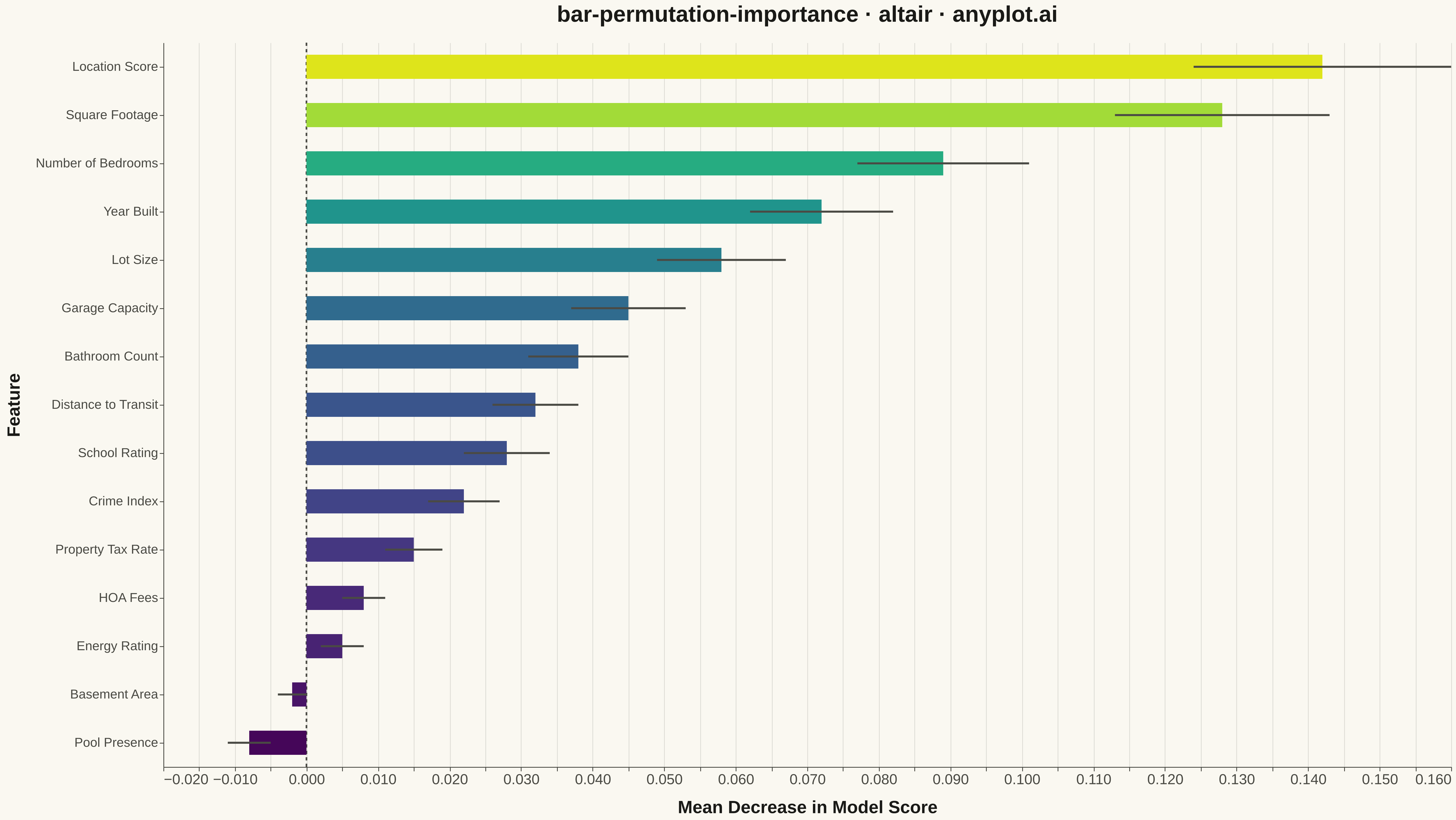
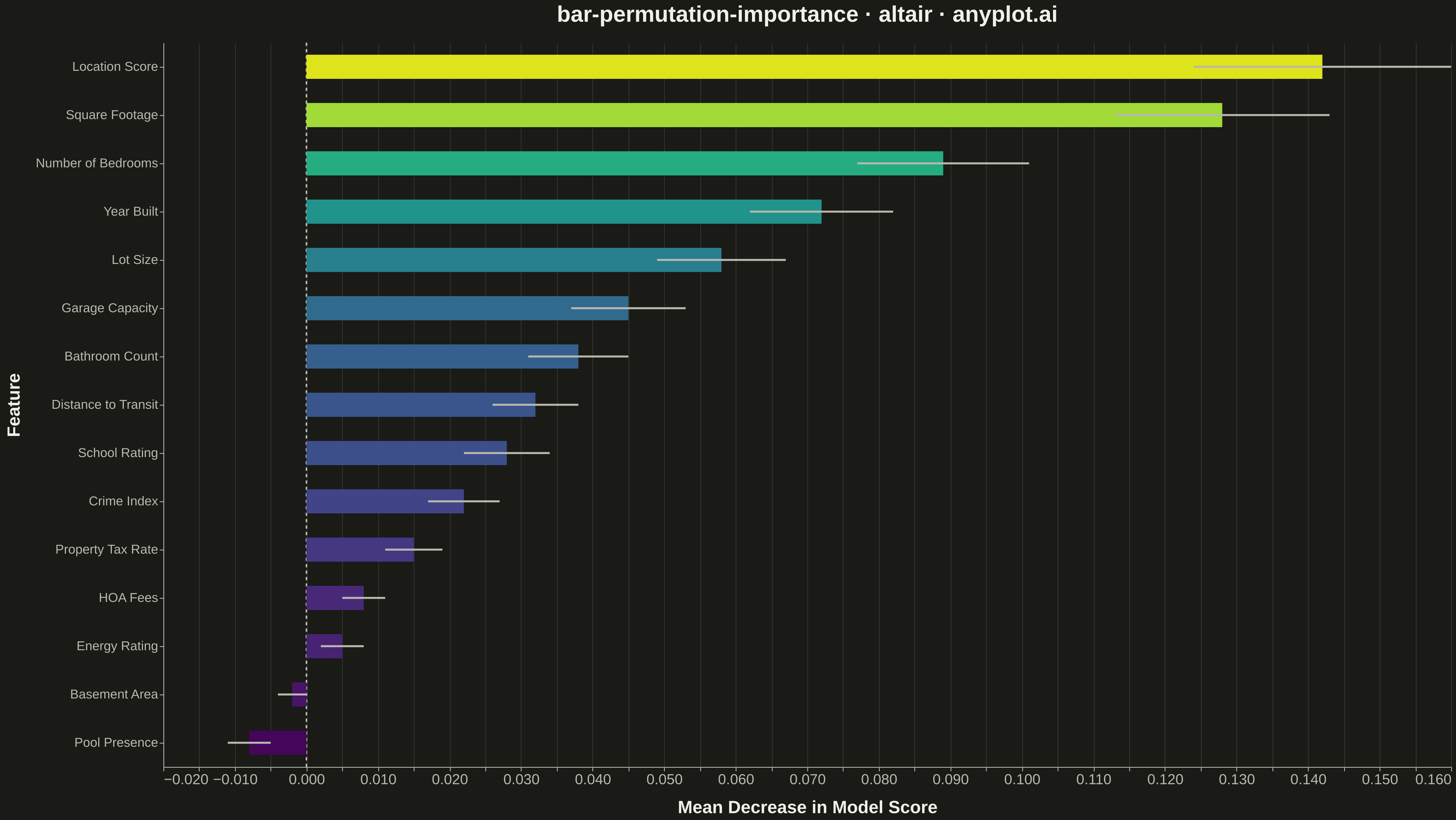
A horizontal bar chart displaying permutation feature importance from machine learning models, showing the decrease in model score when each feature is randomly shuffled. Unlike model-specific feature importances, permutation importance is model-agnostic and measures how much the model's performance degrades when a feature's relationship with the target is broken. Error bars indicate variability across multiple shuffles, providing a confidence measure for each importance score.
""" anyplot.ai
bar-permutation-importance: Permutation Feature Importance Plot
Library: altair 6.1.0 | Python 3.13.13
Quality: 91/100 | Updated: 2026-05-17
"""

import os
import sys


# Work around local file shadowing the altair package
script_dir = os.path.dirname(os.path.abspath(__file__))
if script_dir in sys.path:
    sys.path.remove(script_dir)

import altair as alt
import numpy as np
import pandas as pd


# Theme tokens
THEME = os.getenv("ANYPLOT_THEME", "light")
PAGE_BG = "#FAF8F1" if THEME == "light" else "#1A1A17"
ELEVATED_BG = "#FFFDF6" if THEME == "light" else "#242420"
INK = "#1A1A17" if THEME == "light" else "#F0EFE8"
INK_SOFT = "#4A4A44" if THEME == "light" else "#B8B7B0"

# Data - Simulate permutation importance results from a ML model
np.random.seed(42)

# Feature names (typical ML features for a housing price model)
features = [
    "Location Score",
    "Square Footage",
    "Number of Bedrooms",
    "Year Built",
    "Lot Size",
    "Garage Capacity",
    "Bathroom Count",
    "Distance to Transit",
    "School Rating",
    "Crime Index",
    "Property Tax Rate",
    "HOA Fees",
    "Energy Rating",
    "Basement Area",
    "Pool Presence",
]

# Generate realistic importance values (some high, some medium, some low/negative)
importance_mean = np.array(
    [0.142, 0.128, 0.089, 0.072, 0.058, 0.045, 0.038, 0.032, 0.028, 0.022, 0.015, 0.008, 0.005, -0.002, -0.008]
)

# Standard deviations (higher for more important features, showing variability)
importance_std = np.array(
    [0.018, 0.015, 0.012, 0.010, 0.009, 0.008, 0.007, 0.006, 0.006, 0.005, 0.004, 0.003, 0.003, 0.002, 0.003]
)

# Create DataFrame
df = pd.DataFrame({"feature": features, "importance_mean": importance_mean, "importance_std": importance_std})

# Sort by importance (ascending) for bottom-to-top display
df = df.sort_values("importance_mean", ascending=True).reset_index(drop=True)

# Calculate error bar positions
df["error_min"] = df["importance_mean"] - df["importance_std"]
df["error_max"] = df["importance_mean"] + df["importance_std"]

# Base chart for bars with color gradient based on importance (viridis for perceptual uniformity)
bars = (
    alt.Chart(df)
    .mark_bar(size=30)
    .encode(
        x=alt.X(
            "importance_mean:Q",
            title="Mean Decrease in Model Score",
            axis=alt.Axis(labelFontSize=18, titleFontSize=22, titlePadding=15),
        ),
        y=alt.Y(
            "feature:N",
            sort=alt.EncodingSortField(field="importance_mean", order="descending"),
            title="Feature",
            axis=alt.Axis(labelFontSize=16, titleFontSize=22, titlePadding=15),
        ),
        color=alt.Color("importance_mean:Q", scale=alt.Scale(scheme="viridis", domain=[-0.01, 0.15]), legend=None),
        tooltip=[
            alt.Tooltip("feature:N", title="Feature"),
            alt.Tooltip("importance_mean:Q", title="Mean Importance", format=".4f"),
            alt.Tooltip("importance_std:Q", title="Std Dev", format=".4f"),
        ],
    )
)

# Error bars with theme-adaptive color
error_bars = (
    alt.Chart(df)
    .mark_errorbar(color=INK_SOFT, thickness=2.5)
    .encode(
        x=alt.X("error_min:Q", title=""),
        x2="error_max:Q",
        y=alt.Y("feature:N", sort=alt.EncodingSortField(field="importance_mean", order="descending")),
    )
)

# Vertical reference line at x=0
zero_line = (
    alt.Chart(pd.DataFrame({"x": [0]})).mark_rule(color=INK_SOFT, strokeWidth=2, strokeDash=[4, 4]).encode(x="x:Q")
)

# Combine layers with grid and interactivity
chart = (
    alt.layer(zero_line, bars, error_bars)
    .properties(
        width=1600,
        height=900,
        background=PAGE_BG,
        title=alt.Title("bar-permutation-importance · altair · anyplot.ai", fontSize=28, anchor="middle", offset=20),
    )
    .interactive()
    .configure_view(fill=PAGE_BG, stroke=INK_SOFT, strokeWidth=0)
    .configure_axis(
        domainColor=INK_SOFT,
        tickColor=INK_SOFT,
        gridColor=INK_SOFT,
        gridOpacity=0.15,
        labelColor=INK_SOFT,
        titleColor=INK,
    )
    .configure_title(color=INK, fontSize=28)
    .configure_legend(fillColor=ELEVATED_BG, strokeColor=INK_SOFT, labelColor=INK_SOFT, titleColor=INK)
)

# Save as PNG and HTML with theme-suffixed filenames
chart.save(f"plot-{THEME}.png", scale_factor=3.0)
chart.save(f"plot-{THEME}.html")
Runnable source as JSON, for any HTTP client: https://api.anyplot.ai/specs/bar-permutation-importance/altair/code. Any spec id and library id listed in llms-full.txt fit the same URL shape; every URL below is complete and callable.
{
  "spec_id": "bar-permutation-importance",
  "language": "python",
  "library": "altair",
  "page": "https://anyplot.ai/bar-permutation-importance/python/altair",
  "hub": "https://anyplot.ai/bar-permutation-importance",
  "code_json": "https://api.anyplot.ai/specs/bar-permutation-importance/altair/code",
  "spec_json": "https://api.anyplot.ai/specs/bar-permutation-importance",
  "render_light_png": "https://storage.googleapis.com/anyplot-images/plots/bar-permutation-importance/python/altair/plot-light.png",
  "render_dark_png": "https://storage.googleapis.com/anyplot-images/plots/bar-permutation-importance/python/altair/plot-dark.png",
  "interactive_light_html": "https://storage.googleapis.com/anyplot-images/plots/bar-permutation-importance/python/altair/plot-light.html",
  "interactive_dark_html": "https://storage.googleapis.com/anyplot-images/plots/bar-permutation-importance/python/altair/plot-dark.html",
  "quality_score": 91.0,
  "license": "MIT",
  "guide": "https://anyplot.ai/llms.txt"
}
Part of Permutation Feature Importance Plot on anyplot.ai.