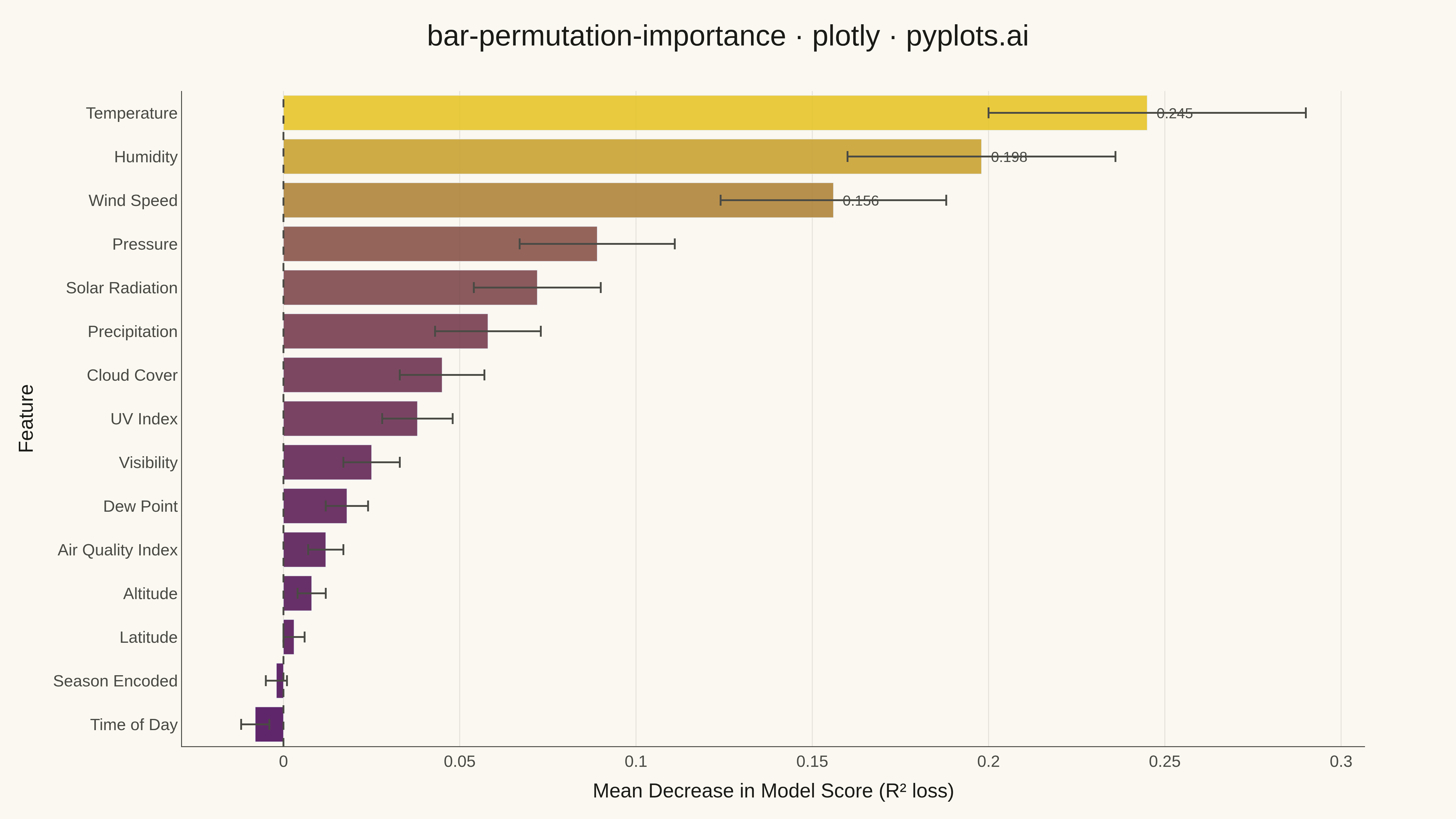
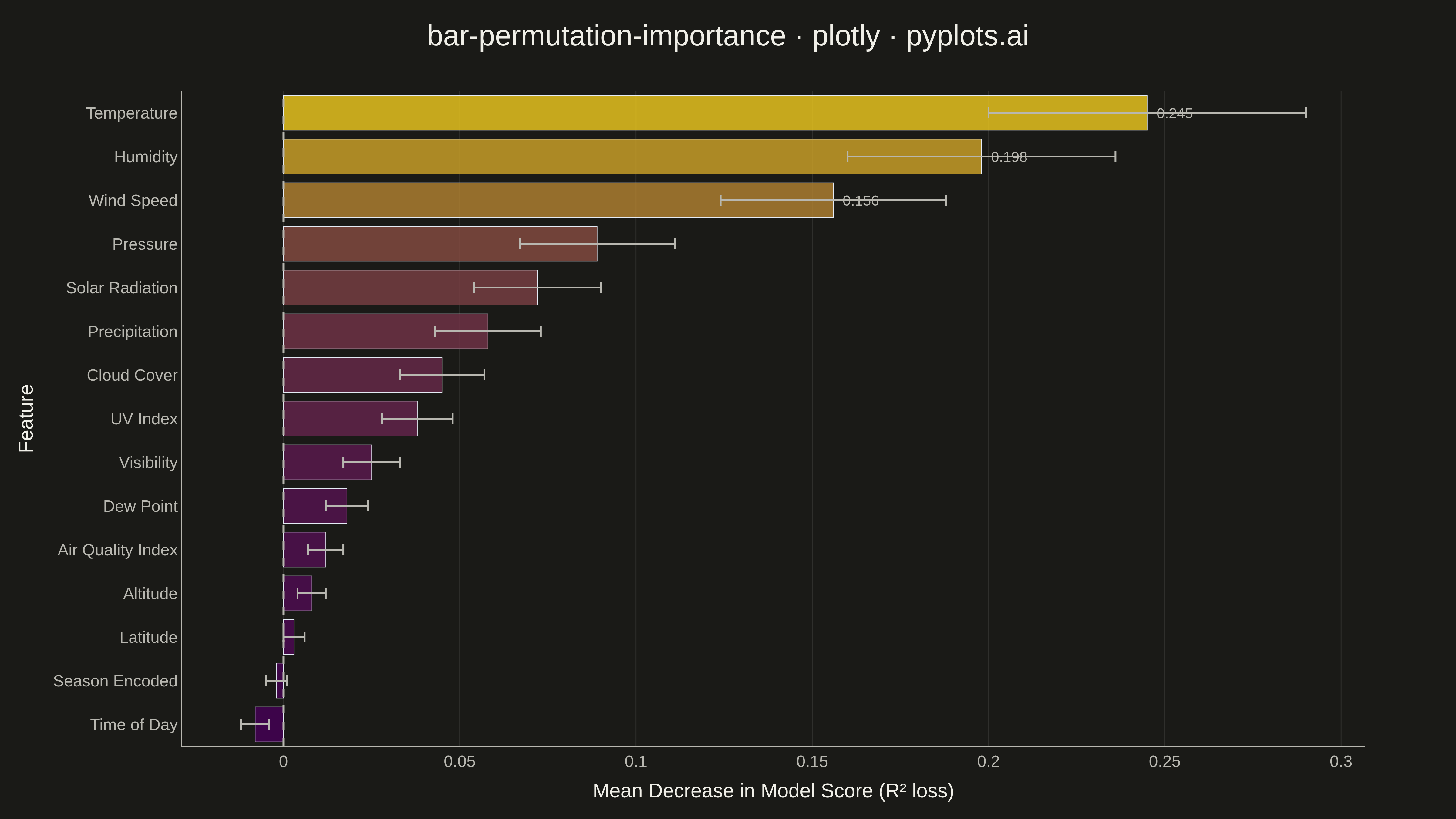
A horizontal bar chart displaying permutation feature importance from machine learning models, showing the decrease in model score when each feature is randomly shuffled. Unlike model-specific feature importances, permutation importance is model-agnostic and measures how much the model's performance degrades when a feature's relationship with the target is broken. Error bars indicate variability across multiple shuffles, providing a confidence measure for each importance score.
""" anyplot.ai
bar-permutation-importance: Permutation Feature Importance Plot
Library: plotly 6.7.0 | Python 3.13.13
Quality: 94/100 | Updated: 2026-05-17
"""

import os

import numpy as np
import pandas as pd
import plotly.graph_objects as go


# Theme configuration
THEME = os.getenv("ANYPLOT_THEME", "light")
PAGE_BG = "#FAF8F1" if THEME == "light" else "#1A1A17"
ELEVATED_BG = "#FFFDF6" if THEME == "light" else "#242420"
INK = "#1A1A17" if THEME == "light" else "#F0EFE8"
INK_SOFT = "#4A4A44" if THEME == "light" else "#B8B7B0"
GRID = "rgba(26,26,23,0.10)" if THEME == "light" else "rgba(240,239,232,0.10)"

# Data - Simulating permutation importance results from a regression model
np.random.seed(42)

# Feature names representing typical ML model features
features = [
    "Temperature",
    "Humidity",
    "Wind Speed",
    "Pressure",
    "Solar Radiation",
    "Precipitation",
    "Cloud Cover",
    "UV Index",
    "Visibility",
    "Dew Point",
    "Air Quality Index",
    "Altitude",
    "Latitude",
    "Season Encoded",
    "Time of Day",
]

n_features = len(features)

# Generate realistic importance values (some high, some low, a couple negative)
importance_mean = np.array(
    [0.245, 0.198, 0.156, 0.089, 0.072, 0.058, 0.045, 0.038, 0.025, 0.018, 0.012, 0.008, 0.003, -0.002, -0.008]
)

# Standard deviations vary - more important features often have higher variability
importance_std = np.array(
    [0.045, 0.038, 0.032, 0.022, 0.018, 0.015, 0.012, 0.010, 0.008, 0.006, 0.005, 0.004, 0.003, 0.003, 0.004]
)

# Create DataFrame and sort by importance (highest first)
df = pd.DataFrame({"feature": features, "importance_mean": importance_mean, "importance_std": importance_std})
df = df.sort_values("importance_mean", ascending=True)  # ascending for horizontal bar layout

# Color using viridis colormap for continuous importance values
min_imp = df["importance_mean"].min()
max_imp = df["importance_mean"].max()
imp_range = max_imp - min_imp

# Normalize importance to [0, 1] range for colormap
normalized_values = (df["importance_mean"] - min_imp) / imp_range if imp_range > 0 else np.zeros(len(df))

# Create viridis-like colors (blue to yellow gradient)
viridis_colors = [
    f"rgba({int(68 + (229 - 68) * v)}, {int(1 + (194 - 1) * v)}, {int(84 + (30 - 84) * v)}, 0.85)"
    for v in normalized_values
]

# Create figure
fig = go.Figure()

# Add horizontal bars with viridis coloring
fig.add_trace(
    go.Bar(
        x=df["importance_mean"],
        y=df["feature"],
        orientation="h",
        marker=dict(color=viridis_colors),
        error_x=dict(type="data", array=df["importance_std"], color=INK_SOFT, thickness=2, width=6),
        hovertemplate="<b>%{y}</b><br>Importance: %{x:.3f}<extra></extra>",
        showlegend=False,
    )
)

# Add vertical reference line at x=0
fig.add_vline(x=0, line=dict(color=INK_SOFT, width=2, dash="dash"))

# Add annotations for top 3 features
top_features_idx = df.nlargest(3, "importance_mean").index
for idx in top_features_idx:
    row = df.loc[idx]
    fig.add_annotation(
        x=row["importance_mean"],
        y=row["feature"],
        text=f"{row['importance_mean']:.3f}",
        showarrow=False,
        xanchor="left",
        xshift=8,
        font=dict(size=16, color=INK_SOFT),
    )

# Update layout with theme-adaptive colors
fig.update_layout(
    title=dict(
        text="bar-permutation-importance · plotly · pyplots.ai", font=dict(size=32, color=INK), x=0.5, xanchor="center"
    ),
    xaxis=dict(
        title=dict(text="Mean Decrease in Model Score (R² loss)", font=dict(size=22, color=INK)),
        tickfont=dict(size=18, color=INK_SOFT),
        gridcolor=GRID,
        gridwidth=1,
        zeroline=False,
        linecolor=INK_SOFT,
        showgrid=True,
    ),
    yaxis=dict(
        title=dict(text="Feature", font=dict(size=22, color=INK)),
        tickfont=dict(size=18, color=INK_SOFT),
        linecolor=INK_SOFT,
        showgrid=False,
    ),
    plot_bgcolor=PAGE_BG,
    paper_bgcolor=PAGE_BG,
    margin=dict(l=200, r=100, t=100, b=80),
    showlegend=False,
    font=dict(color=INK),
)

# Save as PNG (4800x2700 via scale=3)
fig.write_image(f"plot-{THEME}.png", width=1600, height=900, scale=3)

# Save interactive HTML
fig.write_html(f"plot-{THEME}.html", include_plotlyjs="cdn")
Runnable source as JSON, for any HTTP client: https://api.anyplot.ai/specs/bar-permutation-importance/plotly/code. Any spec id and library id listed in llms-full.txt fit the same URL shape; every URL below is complete and callable.
{
  "spec_id": "bar-permutation-importance",
  "language": "python",
  "library": "plotly",
  "page": "https://anyplot.ai/bar-permutation-importance/python/plotly",
  "hub": "https://anyplot.ai/bar-permutation-importance",
  "code_json": "https://api.anyplot.ai/specs/bar-permutation-importance/plotly/code",
  "spec_json": "https://api.anyplot.ai/specs/bar-permutation-importance",
  "render_light_png": "https://storage.googleapis.com/anyplot-images/plots/bar-permutation-importance/python/plotly/plot-light.png",
  "render_dark_png": "https://storage.googleapis.com/anyplot-images/plots/bar-permutation-importance/python/plotly/plot-dark.png",
  "interactive_light_html": "https://storage.googleapis.com/anyplot-images/plots/bar-permutation-importance/python/plotly/plot-light.html",
  "interactive_dark_html": "https://storage.googleapis.com/anyplot-images/plots/bar-permutation-importance/python/plotly/plot-dark.html",
  "quality_score": 94.0,
  "license": "MIT",
  "guide": "https://anyplot.ai/llms.txt"
}
Part of Permutation Feature Importance Plot on anyplot.ai.