The same plot in 14 other libraries — Python: Altair, Bokeh, lets-plot, Matplotlib, Plotly, plotnine, Pygal, Seaborn; Julia: Makie.jl; JavaScript: Chart.js, D3.js, Apache ECharts, Highcharts, MUI X Charts. Compare all 15 side by side: Permutation Feature Importance Plot in Python, R, Julia and JavaScript.
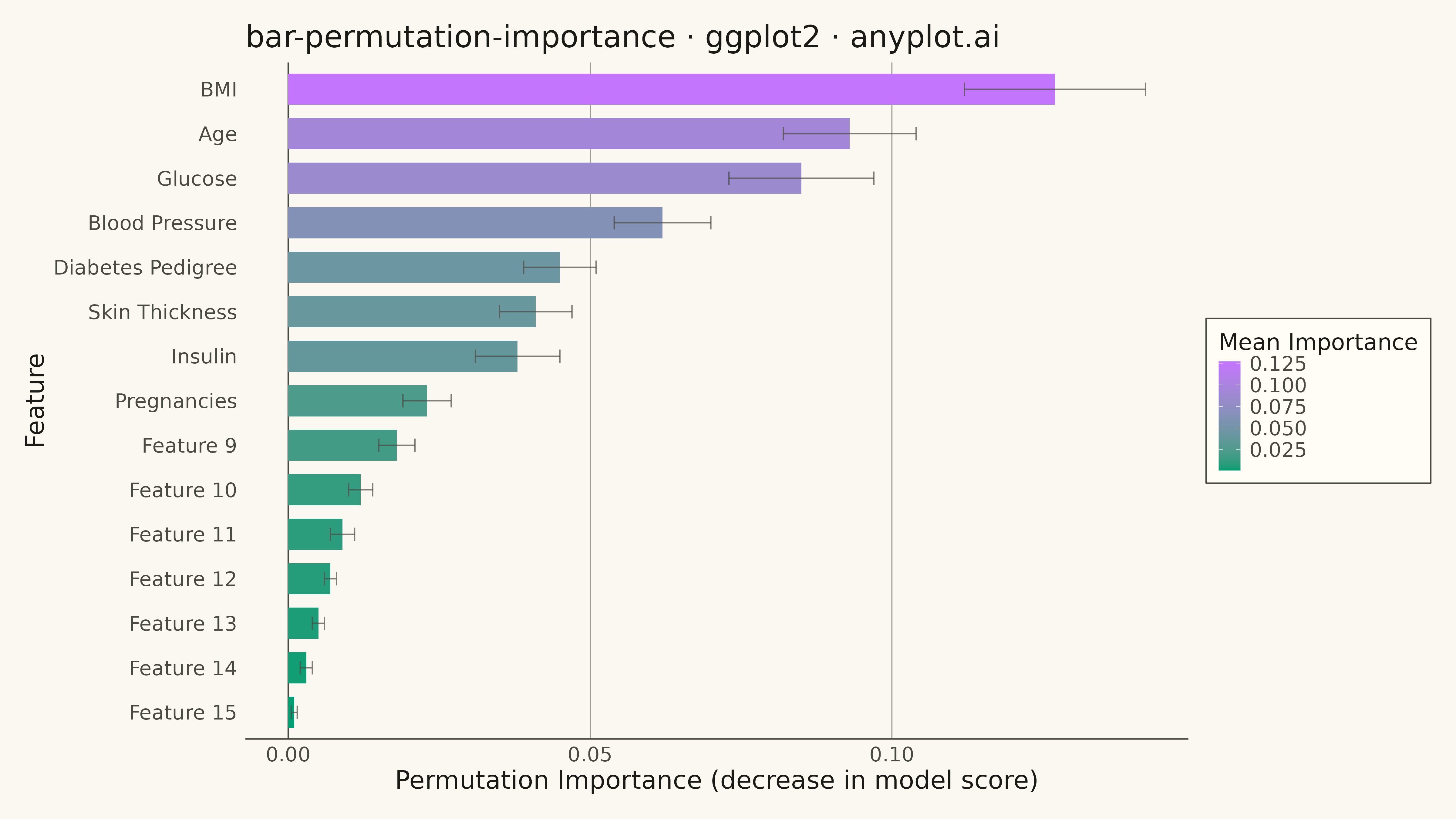
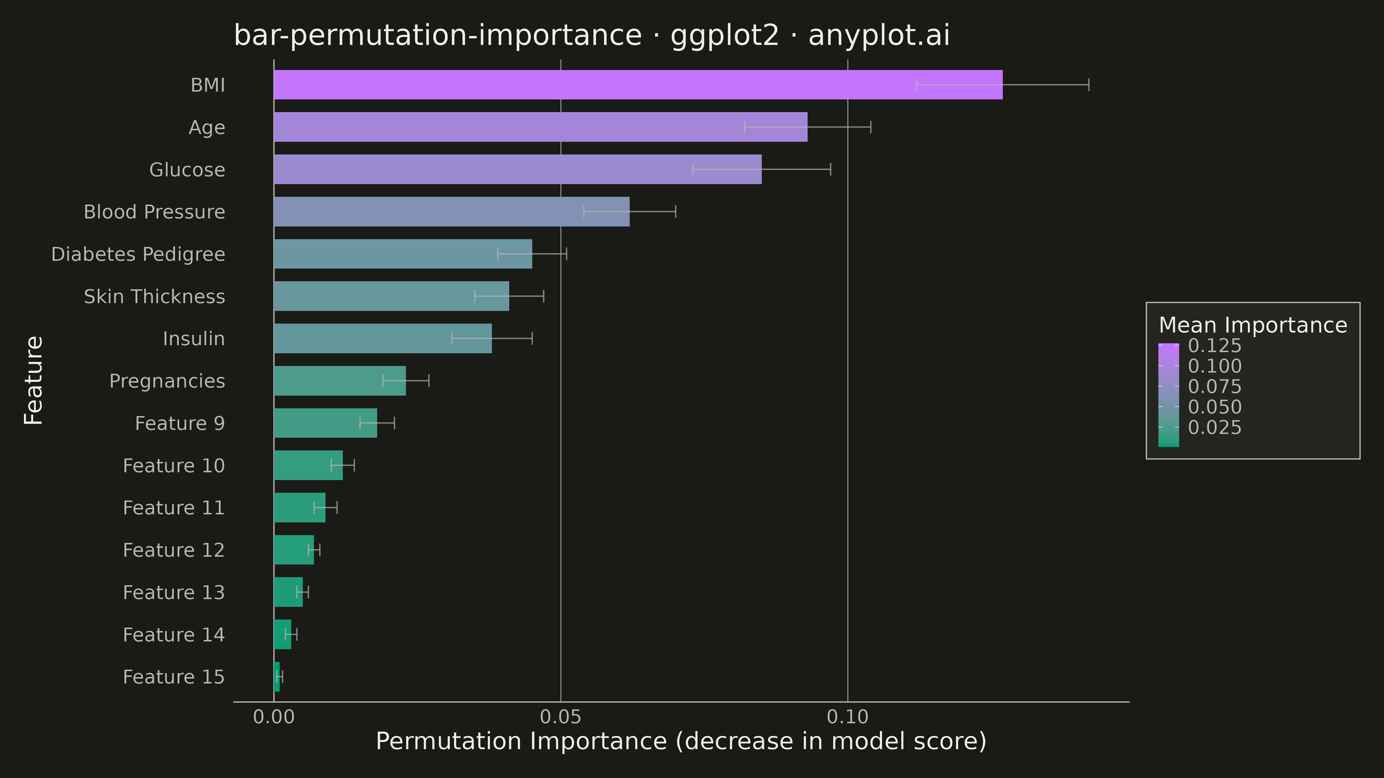
A horizontal bar chart displaying permutation feature importance from machine learning models, showing the decrease in model score when each feature is randomly shuffled. Unlike model-specific feature importances, permutation importance is model-agnostic and measures how much the model's performance degrades when a feature's relationship with the target is broken. Error bars indicate variability across multiple shuffles, providing a confidence measure for each importance score.
#' anyplot.ai
#' bar-permutation-importance: Permutation Feature Importance Plot
#' Library: ggplot2 3.5.1 | R 4.4.1
#' Quality: 94/100 | Created: 2026-05-17

library(ggplot2)
library(dplyr)
library(tidyr)
library(scales)
library(ragg)

set.seed(42)

# --- Theme tokens -----------------------------------------------------------
THEME       <- Sys.getenv("ANYPLOT_THEME", "light")
PAGE_BG     <- if (THEME == "light") "#FAF8F1" else "#1A1A17"
ELEVATED_BG <- if (THEME == "light") "#FFFDF6" else "#242420"
INK         <- if (THEME == "light") "#1A1A17" else "#F0EFE8"
INK_SOFT    <- if (THEME == "light") "#4A4A44" else "#B8B7B0"
INK_MUTED   <- if (THEME == "light") "#6B6A63" else "#A8A79F"
IMPRINT   <- c("#009E73", "#C475FD", "#4467A3", "#BD8233",
                 "#AE3030", "#2ABCCD", "#954477")

# --- Data -------------------------------------------------------------------
# Simulate permutation importance from a machine learning model
# 15 features with realistic importance scores and variability
features <- c(
  "Glucose", "Blood Pressure", "Skin Thickness", "Insulin", "BMI",
  "Diabetes Pedigree", "Age", "Pregnancies", "Feature 9", "Feature 10",
  "Feature 11", "Feature 12", "Feature 13", "Feature 14", "Feature 15"
)

importance_mean <- c(
  0.085, 0.062, 0.041, 0.038, 0.127,
  0.045, 0.093, 0.023, 0.018, 0.012,
  0.009, 0.007, 0.005, 0.003, 0.001
)

importance_std <- c(
  0.012, 0.008, 0.006, 0.007, 0.015,
  0.006, 0.011, 0.004, 0.003, 0.002,
  0.002, 0.001, 0.001, 0.001, 0.0005
)

df <- tibble::tibble(
  feature = factor(features, levels = rev(features[order(importance_mean)])),
  importance_mean = importance_mean,
  importance_std = importance_std
) %>%
  arrange(desc(importance_mean))

# --- Plot -------------------------------------------------------------------
anyplot_theme <- theme_minimal(base_size = 14) +
  theme(
    plot.background   = element_rect(fill = PAGE_BG, color = PAGE_BG),
    panel.background  = element_rect(fill = PAGE_BG, color = NA),
    panel.grid.major.x = element_line(color = INK_SOFT, linewidth = 0.3, linetype = "solid"),
    panel.grid.major.y = element_blank(),
    panel.grid.minor  = element_blank(),
    panel.border      = element_blank(),
    axis.title        = element_text(color = INK, size = 20),
    axis.text.x       = element_text(color = INK_SOFT, size = 16),
    axis.text.y       = element_text(color = INK_SOFT, size = 16),
    axis.line.x       = element_line(color = INK_SOFT, linewidth = 0.5),
    axis.line.y       = element_blank(),
    axis.ticks.y      = element_blank(),
    plot.title        = element_text(color = INK, size = 24, face = "plain"),
    plot.margin       = margin(t = 20, r = 20, b = 20, l = 20)
  )

p <- ggplot(df, aes(x = importance_mean, y = reorder(feature, importance_mean))) +
  # Vertical reference line at x=0
  geom_vline(xintercept = 0, color = INK_SOFT, linewidth = 0.5, linetype = "solid") +
  # Bars with color gradient based on importance
  geom_col(
    aes(fill = importance_mean),
    width = 0.7,
    color = NA
  ) +
  # Error bars showing variability
  geom_errorbarh(
    aes(xmin = importance_mean - importance_std,
        xmax = importance_mean + importance_std),
    height = 0.3,
    color = INK_SOFT,
    linewidth = 0.5,
    alpha = 0.7
  ) +
  # Continuous color gradient for importance
  scale_fill_gradient(
    low = IMPRINT[1],
    high = IMPRINT[2],
    name = "Mean Importance",
    labels = label_number(accuracy = 0.001)
  ) +
  labs(
    x = "Permutation Importance (decrease in model score)",
    y = "Feature",
    title = "bar-permutation-importance · ggplot2 · anyplot.ai"
  ) +
  anyplot_theme +
  theme(
    legend.position = "right",
    legend.background = element_rect(fill = ELEVATED_BG, color = INK_SOFT, linewidth = 0.5),
    legend.text = element_text(color = INK_SOFT, size = 16),
    legend.title = element_text(color = INK, size = 18),
    legend.margin = margin(t = 10, r = 10, b = 10, l = 10)
  )

# --- Save -------------------------------------------------------------------
ggsave(
  filename = sprintf("plot-%s.png", THEME),
  plot     = p,
  device   = ragg::agg_png,
  width    = 16,
  height   = 9,
  units    = "in",
  dpi      = 300
)
Runnable source as JSON, for any HTTP client: https://api.anyplot.ai/specs/bar-permutation-importance/ggplot2/code. Any spec id and library id listed in llms-full.txt fit the same URL shape; every URL below is complete and callable.
{
  "spec_id": "bar-permutation-importance",
  "language": "r",
  "library": "ggplot2",
  "page": "https://anyplot.ai/bar-permutation-importance/r/ggplot2",
  "hub": "https://anyplot.ai/bar-permutation-importance",
  "code_json": "https://api.anyplot.ai/specs/bar-permutation-importance/ggplot2/code",
  "spec_json": "https://api.anyplot.ai/specs/bar-permutation-importance",
  "render_light_png": "https://storage.googleapis.com/anyplot-images/plots/bar-permutation-importance/r/ggplot2/plot-light.png",
  "render_dark_png": "https://storage.googleapis.com/anyplot-images/plots/bar-permutation-importance/r/ggplot2/plot-dark.png",
  "quality_score": 94.0,
  "license": "MIT",
  "guide": "https://anyplot.ai/llms.txt"
}
Part of Permutation Feature Importance Plot on anyplot.ai.