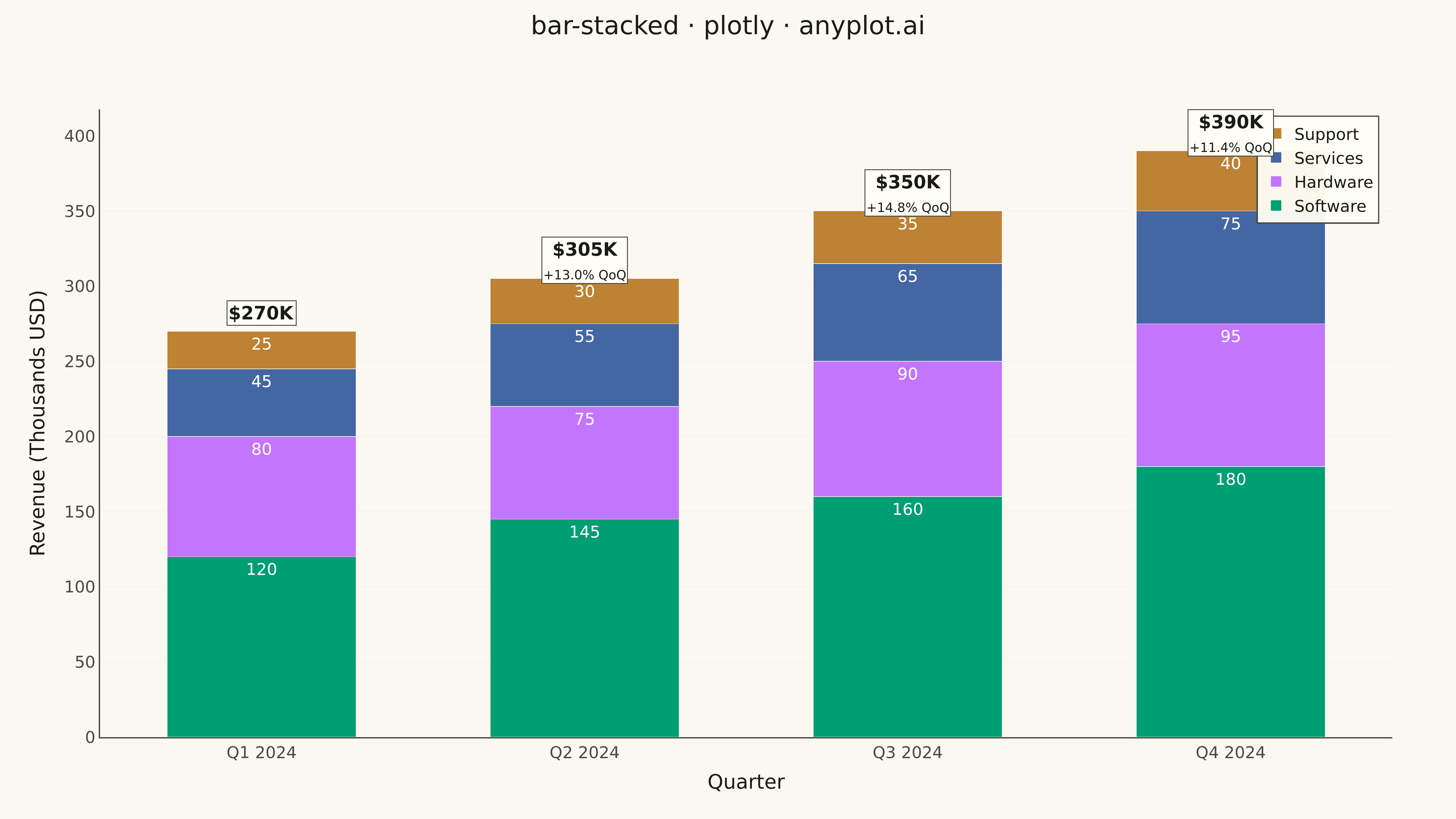
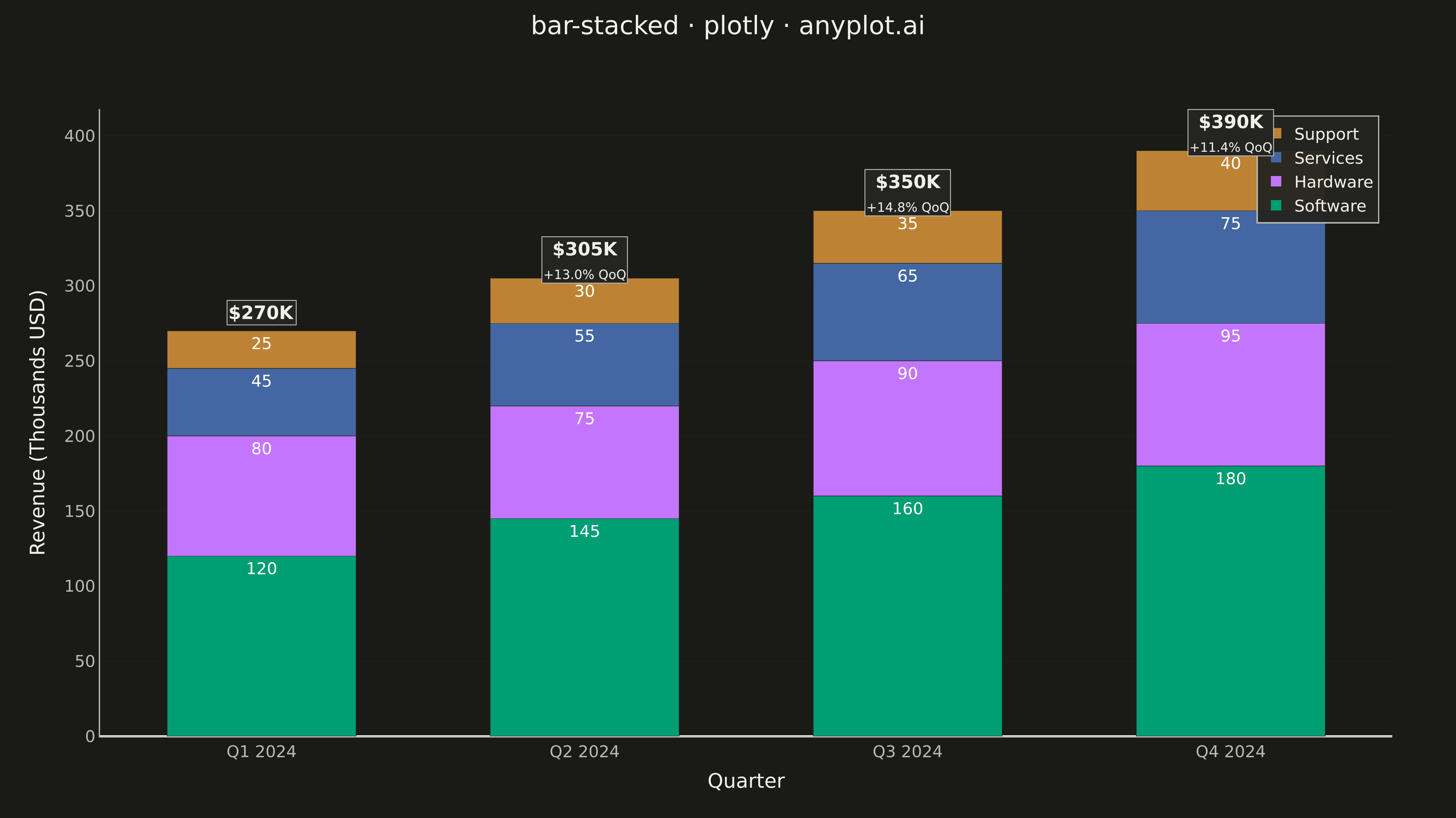
A stacked bar chart that displays multiple data series stacked on top of each other within each category, showing both individual component values and their cumulative totals. This visualization excels at revealing part-to-whole relationships while maintaining the ability to compare totals across categories. Stacked bar charts are particularly effective for composition analysis, where understanding how different components contribute to a whole is as important as comparing totals.
""" anyplot.ai
bar-stacked: Stacked Bar Chart
Library: plotly 6.7.0 | Python 3.13.13
Quality: 93/100 | Updated: 2026-05-09
"""

import os

import plotly.graph_objects as go


# Theme tokens
THEME = os.getenv("ANYPLOT_THEME", "light")
PAGE_BG = "#FAF8F1" if THEME == "light" else "#1A1A17"
ELEVATED_BG = "#FFFDF6" if THEME == "light" else "#242420"
INK = "#1A1A17" if THEME == "light" else "#F0EFE8"
INK_SOFT = "#4A4A44" if THEME == "light" else "#B8B7B0"
GRID = "rgba(26,26,23,0.08)" if THEME == "light" else "rgba(240,239,232,0.08)"
GRID_SUBTLE = "rgba(26,26,23,0.04)" if THEME == "light" else "rgba(240,239,232,0.04)"

# Okabe-Ito palette (first series always #009E73)
COLORS = ["#009E73", "#C475FD", "#4467A3", "#BD8233"]

# Data - Quarterly revenue by product category
quarters = ["Q1 2024", "Q2 2024", "Q3 2024", "Q4 2024"]
categories = ["Software", "Hardware", "Services", "Support"]

# Revenue in thousands USD for each product category
software = [120, 145, 160, 180]
hardware = [80, 75, 90, 95]
services = [45, 55, 65, 75]
support = [25, 30, 35, 40]

all_data = [software, hardware, services, support]

# Calculate totals and per-component percentages for storytelling
totals = [s + h + sv + sp for s, h, sv, sp in zip(software, hardware, services, support, strict=True)]

# Create figure with enhanced styling
fig = go.Figure()

# Add stacked bars with custom hover templates for better storytelling
for category, data, color in zip(categories, all_data, COLORS, strict=True):
    percentages = [f"{v / total * 100:.0f}%" for v, total in zip(data, totals, strict=True)]

    custom_hover = [
        f"<b>{category}</b><br>" + f"Quarter: {q}<br>" + f"Revenue: ${v}K<br>" + f"% of Total: {pct}<extra></extra>"
        for q, v, pct in zip(quarters, data, percentages, strict=True)
    ]

    fig.add_trace(
        go.Bar(
            name=category,
            x=quarters,
            y=data,
            marker=dict(color=color, line=dict(color=ELEVATED_BG, width=0.5)),
            text=data,
            textposition="inside",
            textfont={"size": 18, "color": "white"},
            customdata=custom_hover,
            hovertemplate="%{customdata}",
        )
    )

# Enhanced total annotations with visual emphasis
for idx, (quarter, total) in enumerate(zip(quarters, totals, strict=True)):
    growth_rate = ""
    if idx > 0:
        growth = ((total - totals[idx - 1]) / totals[idx - 1]) * 100
        growth_rate = f"<br><span style='font-size:14px;'>+{growth:.1f}% QoQ</span>"

    fig.add_annotation(
        x=quarter,
        y=total + 12,
        text=f"<b>${total}K</b>{growth_rate}",
        showarrow=False,
        font={"size": 20, "color": INK},
        bgcolor=ELEVATED_BG,
        bordercolor=INK_SOFT,
        borderwidth=1,
    )

# Update layout with sophisticated design refinements
fig.update_layout(
    title={
        "text": "bar-stacked · plotly · anyplot.ai",
        "font": {"size": 28, "color": INK},
        "x": 0.5,
        "xanchor": "center",
        "y": 0.98,
        "yanchor": "top",
    },
    xaxis=dict(
        title={"text": "Quarter", "font": {"size": 22, "color": INK}},
        tickfont={"size": 18, "color": INK_SOFT},
        showgrid=False,
        showline=True,
        linewidth=1.5,
        linecolor=INK_SOFT,
        mirror=False,
    ),
    yaxis=dict(
        title={"text": "Revenue (Thousands USD)", "font": {"size": 22, "color": INK}},
        tickfont={"size": 18, "color": INK_SOFT},
        gridcolor=GRID_SUBTLE,
        gridwidth=0.5,
        showline=True,
        linewidth=1.5,
        linecolor=INK_SOFT,
        mirror=False,
    ),
    barmode="stack",
    bargap=0.35,
    bargroupgap=0.1,
    paper_bgcolor=PAGE_BG,
    plot_bgcolor=PAGE_BG,
    font={"color": INK, "family": "system-ui, -apple-system, sans-serif"},
    legend=dict(
        orientation="v",
        yanchor="top",
        y=0.99,
        xanchor="right",
        x=0.99,
        font={"size": 18, "color": INK},
        bgcolor="rgba(255,253,246,0.95)" if THEME == "light" else "rgba(36,36,32,0.95)",
        bordercolor=INK_SOFT,
        borderwidth=1.5,
    ),
    margin={"l": 110, "r": 70, "t": 120, "b": 90},
    width=1600,
    height=900,
)

# Save as PNG (4800 x 2700 px)
fig.write_image(f"plot-{THEME}.png", width=1600, height=900, scale=3)

# Save as HTML for interactivity
fig.write_html(f"plot-{THEME}.html", include_plotlyjs="cdn")
Runnable source as JSON, for any HTTP client: https://api.anyplot.ai/specs/bar-stacked/plotly/code. Any spec id and library id listed in llms-full.txt fit the same URL shape; every URL below is complete and callable.
{
  "spec_id": "bar-stacked",
  "language": "python",
  "library": "plotly",
  "page": "https://anyplot.ai/bar-stacked/python/plotly",
  "hub": "https://anyplot.ai/bar-stacked",
  "code_json": "https://api.anyplot.ai/specs/bar-stacked/plotly/code",
  "spec_json": "https://api.anyplot.ai/specs/bar-stacked",
  "render_light_png": "https://storage.googleapis.com/anyplot-images/plots/bar-stacked/python/plotly/plot-light.png",
  "render_dark_png": "https://storage.googleapis.com/anyplot-images/plots/bar-stacked/python/plotly/plot-dark.png",
  "interactive_light_html": "https://storage.googleapis.com/anyplot-images/plots/bar-stacked/python/plotly/plot-light.html",
  "interactive_dark_html": "https://storage.googleapis.com/anyplot-images/plots/bar-stacked/python/plotly/plot-dark.html",
  "quality_score": 93.0,
  "license": "MIT",
  "guide": "https://anyplot.ai/llms.txt"
}
Part of Stacked Bar Chart on anyplot.ai.