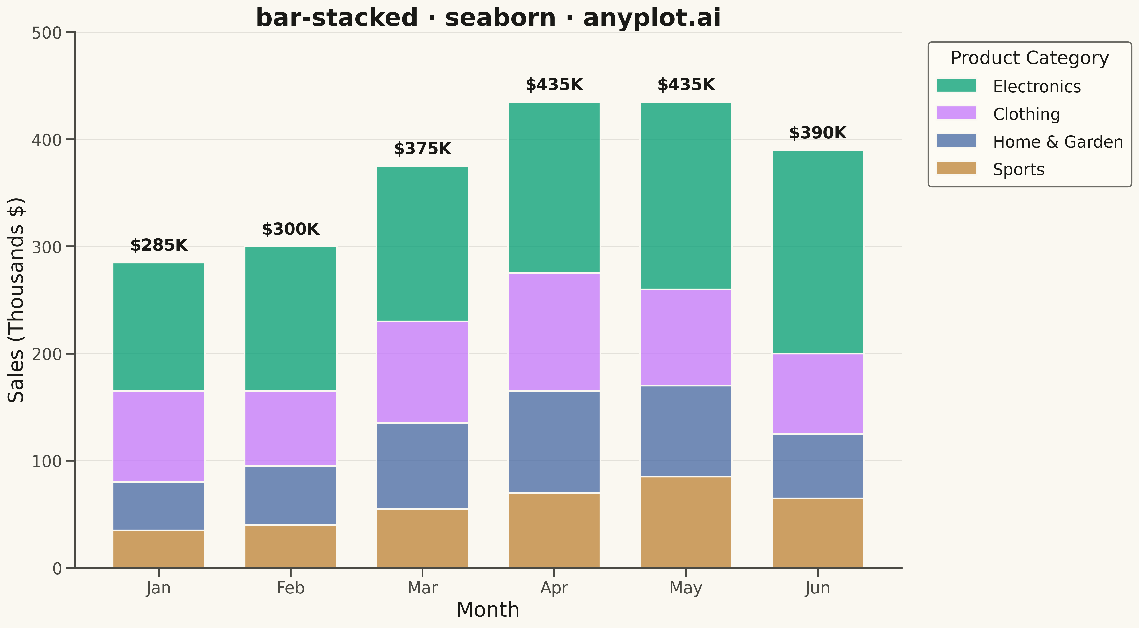
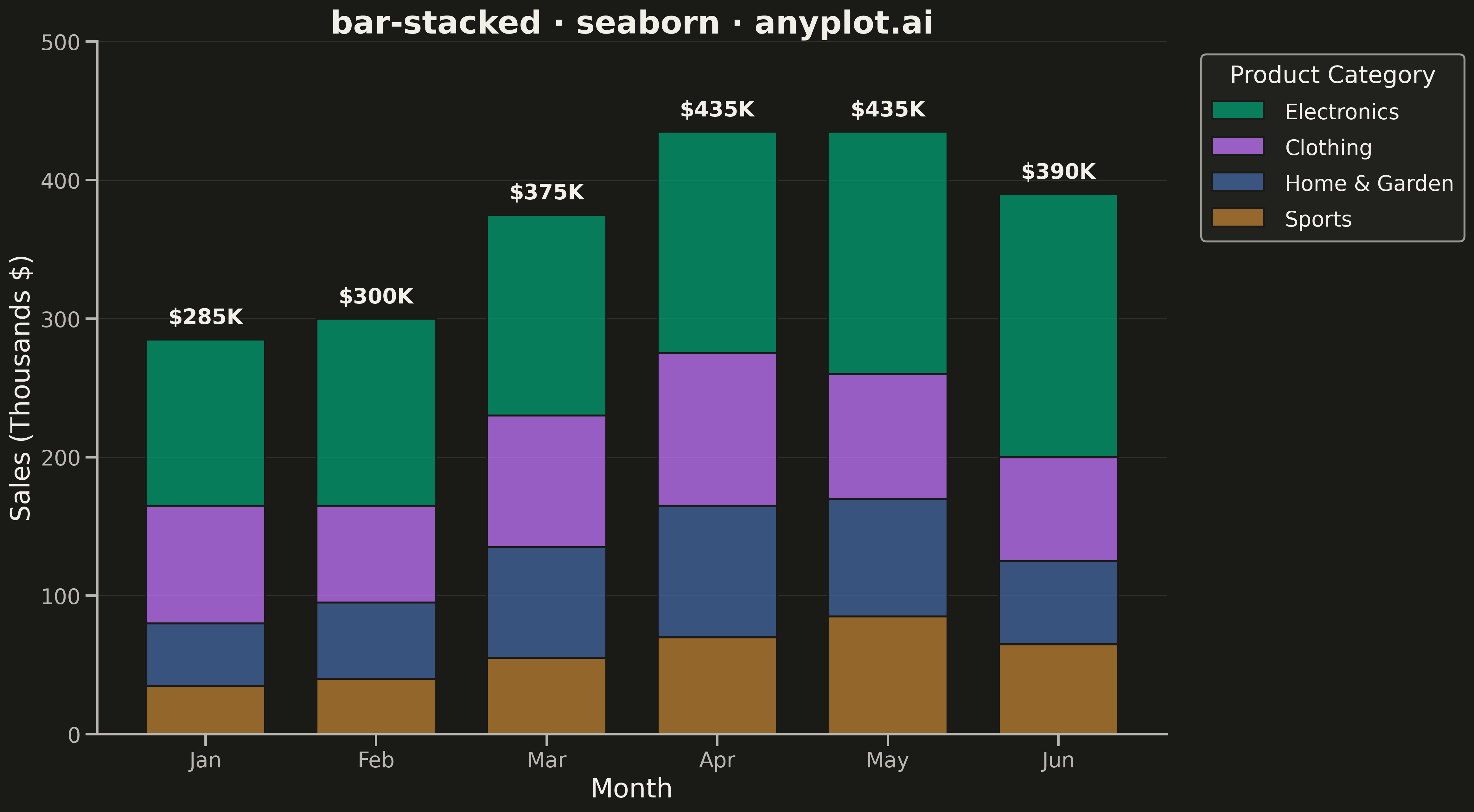
A stacked bar chart that displays multiple data series stacked on top of each other within each category, showing both individual component values and their cumulative totals. This visualization excels at revealing part-to-whole relationships while maintaining the ability to compare totals across categories. Stacked bar charts are particularly effective for composition analysis, where understanding how different components contribute to a whole is as important as comparing totals.
""" anyplot.ai
bar-stacked: Stacked Bar Chart
Library: seaborn 0.13.2 | Python 3.13.13
Quality: 84/100 | Updated: 2026-05-09
"""

import os

import matplotlib.pyplot as plt
import numpy as np
import pandas as pd
import seaborn as sns


# Theme tokens
THEME = os.getenv("ANYPLOT_THEME", "light")
PAGE_BG = "#FAF8F1" if THEME == "light" else "#1A1A17"
ELEVATED_BG = "#FFFDF6" if THEME == "light" else "#242420"
INK = "#1A1A17" if THEME == "light" else "#F0EFE8"
INK_SOFT = "#4A4A44" if THEME == "light" else "#B8B7B0"

# Okabe-Ito palette (first series always #009E73)
IMPRINT = ["#009E73", "#C475FD", "#4467A3", "#BD8233"]

# Data - Monthly sales by product category
np.random.seed(42)
categories = ["Jan", "Feb", "Mar", "Apr", "May", "Jun"]
products = ["Electronics", "Clothing", "Home & Garden", "Sports"]

data = {
    "Month": categories * len(products),
    "Product": [p for p in products for _ in categories],
    "Sales": [
        # Electronics - highest, growing trend
        120,
        135,
        145,
        160,
        175,
        190,
        # Clothing - seasonal variation
        85,
        70,
        95,
        110,
        90,
        75,
        # Home & Garden - spring/summer peak
        45,
        55,
        80,
        95,
        85,
        60,
        # Sports - summer peak
        35,
        40,
        55,
        70,
        85,
        65,
    ],
}

df = pd.DataFrame(data)

# Preserve category order
df["Month"] = pd.Categorical(df["Month"], categories=categories, ordered=True)
# Order products by total sales (largest at bottom of stack)
product_totals = df.groupby("Product")["Sales"].sum().sort_values(ascending=False)
ordered_products = product_totals.index.tolist()
df["Product"] = pd.Categorical(df["Product"], categories=ordered_products, ordered=True)

# Set theme and styling
sns.set_theme(
    style="ticks",
    rc={
        "figure.facecolor": PAGE_BG,
        "axes.facecolor": PAGE_BG,
        "axes.edgecolor": INK_SOFT,
        "axes.labelcolor": INK,
        "text.color": INK,
        "xtick.color": INK_SOFT,
        "ytick.color": INK_SOFT,
        "grid.color": INK,
        "grid.alpha": 0.10,
        "legend.facecolor": ELEVATED_BG,
        "legend.edgecolor": INK_SOFT,
    },
)
sns.set_context("talk", font_scale=1.2)

fig, ax = plt.subplots(figsize=(16, 9), facecolor=PAGE_BG)

# Create color map for products
product_colors = {p: IMPRINT[i] for i, p in enumerate(ordered_products)}
colors = [product_colors[p] for p in ordered_products]

# Plot stacked bar chart using histplot
sns.histplot(
    data=df,
    x="Month",
    weights="Sales",
    hue="Product",
    multiple="stack",
    palette=colors,
    shrink=0.7,
    edgecolor=PAGE_BG,
    linewidth=1.5,
    ax=ax,
)

# Calculate totals for labels on top of stacks
totals = df.groupby("Month", observed=True)["Sales"].sum()
for i, (_month, total) in enumerate(totals.items()):
    ax.text(i, total + 8, f"${int(total)}K", ha="center", va="bottom", fontsize=16, fontweight="bold", color=INK)

# Styling
ax.set_xlabel("Month", fontsize=20, color=INK)
ax.set_ylabel("Sales (Thousands $)", fontsize=20, color=INK)
ax.set_title("bar-stacked · seaborn · anyplot.ai", fontsize=24, fontweight="bold", color=INK)
ax.tick_params(axis="both", labelsize=16, colors=INK_SOFT)

# Legend
legend = ax.get_legend()
legend.set_title("Product Category")
legend.get_title().set_fontsize(18)
legend.get_title().set_color(INK)
for text in legend.get_texts():
    text.set_fontsize(16)
    text.set_color(INK)
legend.set_bbox_to_anchor((1.02, 1))
legend.set_loc("upper left")
legend.get_frame().set_facecolor(ELEVATED_BG)
legend.get_frame().set_edgecolor(INK_SOFT)

# Grid styling
ax.yaxis.grid(True, alpha=0.10, linewidth=0.8)
ax.xaxis.grid(False)
ax.set_axisbelow(True)

# Spine styling
for spine in ["top", "right"]:
    ax.spines[spine].set_visible(False)
for spine in ["left", "bottom"]:
    ax.spines[spine].set_color(INK_SOFT)

# Adjust y-axis to accommodate total labels
ax.set_ylim(0, totals.max() * 1.15)

plt.tight_layout()
plt.savefig(f"plot-{THEME}.png", dpi=300, bbox_inches="tight", facecolor=PAGE_BG)
Runnable source as JSON, for any HTTP client: https://api.anyplot.ai/specs/bar-stacked/seaborn/code. Any spec id and library id listed in llms-full.txt fit the same URL shape; every URL below is complete and callable.
{
  "spec_id": "bar-stacked",
  "language": "python",
  "library": "seaborn",
  "page": "https://anyplot.ai/bar-stacked/python/seaborn",
  "hub": "https://anyplot.ai/bar-stacked",
  "code_json": "https://api.anyplot.ai/specs/bar-stacked/seaborn/code",
  "spec_json": "https://api.anyplot.ai/specs/bar-stacked",
  "render_light_png": "https://storage.googleapis.com/anyplot-images/plots/bar-stacked/python/seaborn/plot-light.png",
  "render_dark_png": "https://storage.googleapis.com/anyplot-images/plots/bar-stacked/python/seaborn/plot-dark.png",
  "quality_score": 84.0,
  "license": "MIT",
  "guide": "https://anyplot.ai/llms.txt"
}
Part of Stacked Bar Chart on anyplot.ai.