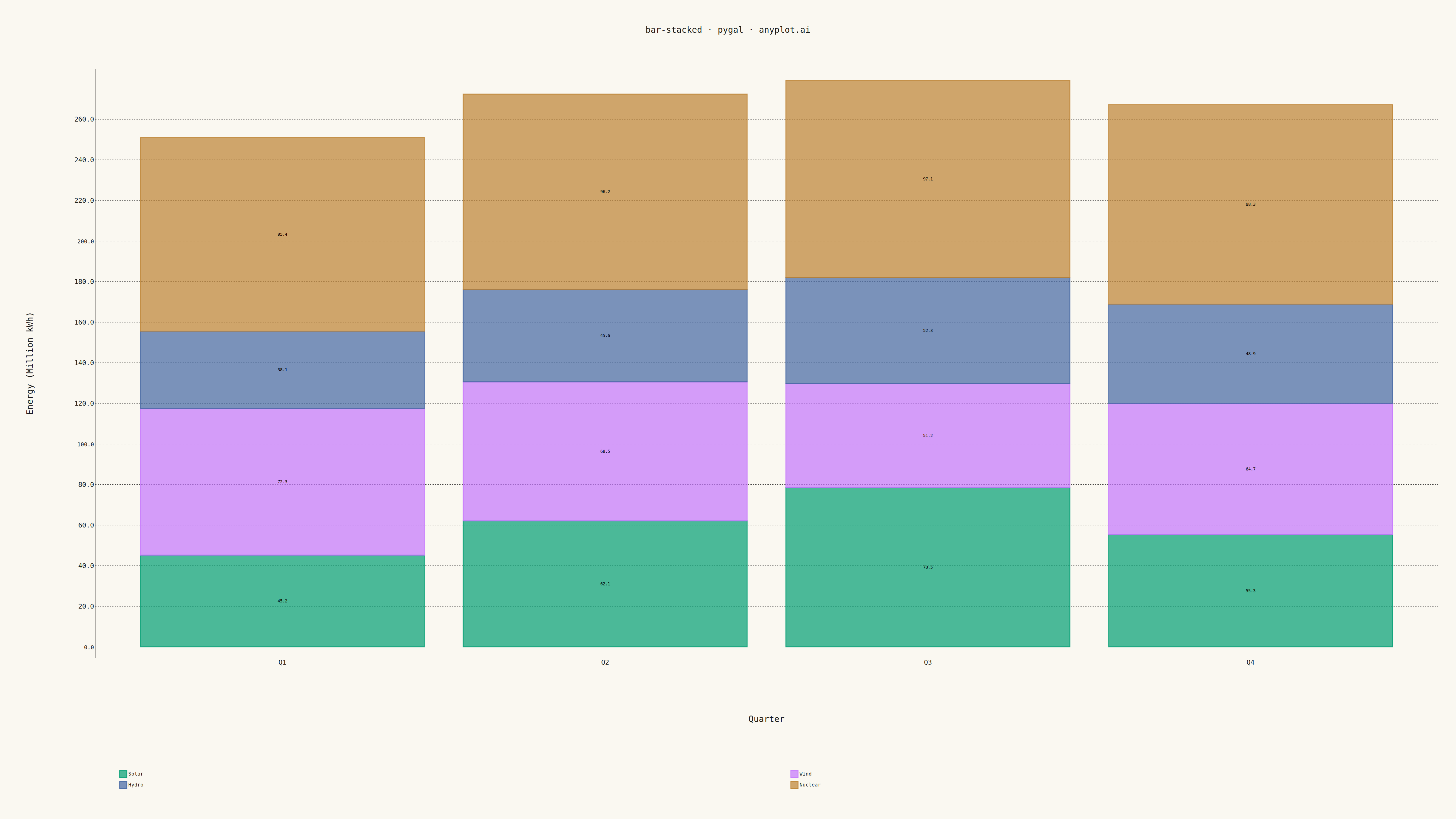
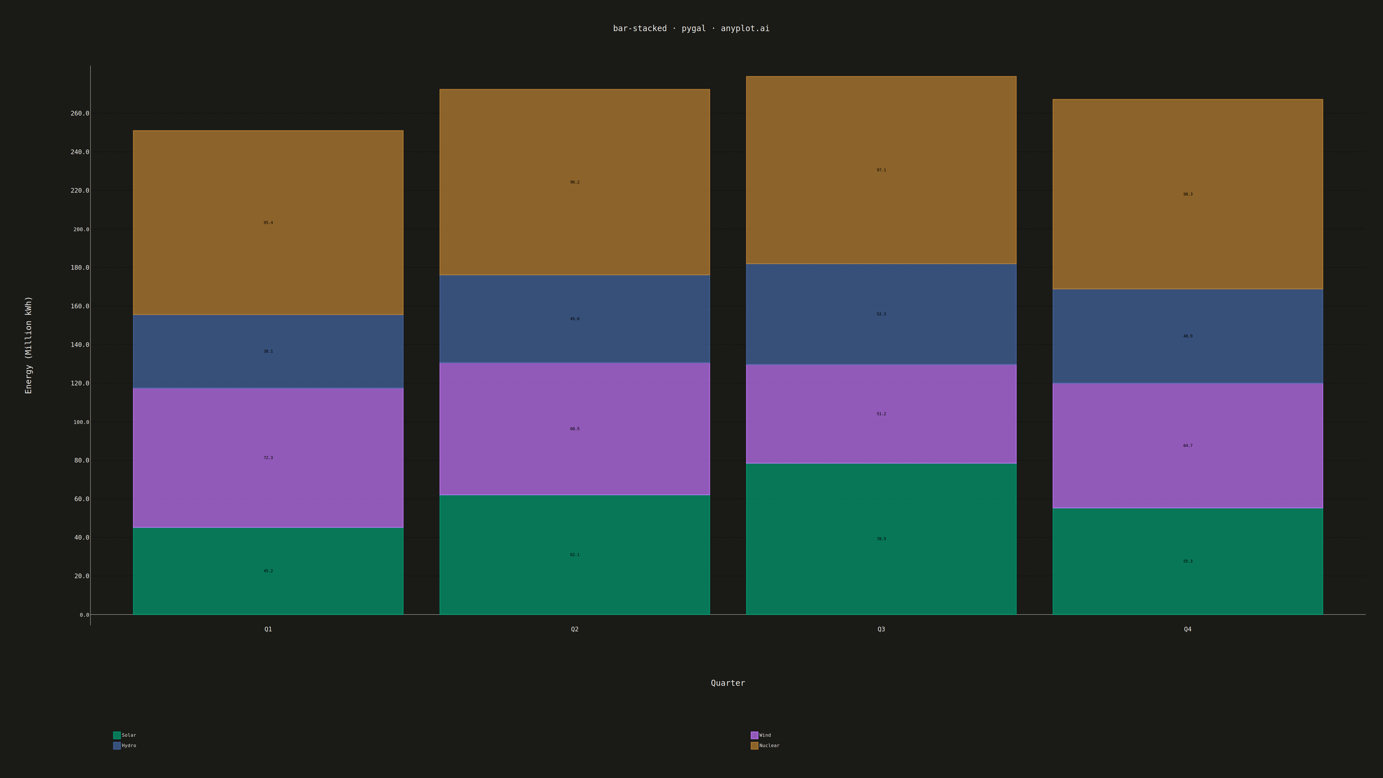
A stacked bar chart that displays multiple data series stacked on top of each other within each category, showing both individual component values and their cumulative totals. This visualization excels at revealing part-to-whole relationships while maintaining the ability to compare totals across categories. Stacked bar charts are particularly effective for composition analysis, where understanding how different components contribute to a whole is as important as comparing totals.
""" anyplot.ai
bar-stacked: Stacked Bar Chart
Library: pygal 3.1.0 | Python 3.13.13
Quality: 94/100 | Updated: 2026-05-09
"""

import os
import sys


script_dir = os.path.dirname(os.path.abspath(__file__))
for path in ("", ".", script_dir):
    if path in sys.path:
        sys.path.remove(path)

import pygal
from pygal.style import Style


# Theme tokens from default-style-guide.md
THEME = os.getenv("ANYPLOT_THEME", "light")
PAGE_BG = "#FAF8F1" if THEME == "light" else "#1A1A17"
INK = "#1A1A17" if THEME == "light" else "#F0EFE8"
INK_MUTED = "#6B6A63" if THEME == "light" else "#A8A79F"

# Okabe-Ito palette: first series always #009E73
IMPRINT = (
    "#009E73",  # bluish green (brand)
    "#C475FD",  # vermillion
    "#4467A3",  # blue
    "#BD8233",  # reddish purple
    "#AE3030",  # orange
)

# Data: Energy consumption by source across quarters (in millions of kWh)
categories = ["Q1", "Q2", "Q3", "Q4"]
sources = {
    "Solar": [45.2, 62.1, 78.5, 55.3],
    "Wind": [72.3, 68.5, 51.2, 64.7],
    "Hydro": [38.1, 45.6, 52.3, 48.9],
    "Nuclear": [95.4, 96.2, 97.1, 98.3],
}

# Custom style for 4800x2700 canvas with proper theme-adaptive colors
custom_style = Style(
    background=PAGE_BG,
    plot_background=PAGE_BG,
    foreground=INK,
    foreground_strong=INK,
    foreground_subtle=INK_MUTED,
    colors=IMPRINT,
    title_font_size=28,
    label_font_size=22,
    major_label_font_size=18,
    legend_font_size=16,
    value_font_size=14,
    stroke_width=3,
)

# Create stacked bar chart with visible grid lines
chart = pygal.StackedBar(
    width=4800,
    height=2700,
    style=custom_style,
    title="bar-stacked · pygal · anyplot.ai",
    x_title="Quarter",
    y_title="Energy (Million kWh)",
    show_y_guides=True,
    show_x_guides=False,
    legend_at_bottom=True,
    legend_box_size=24,
    spacing=80,
    margin=60,
    margin_top=120,
    margin_bottom=180,
    print_values=True,
    print_values_position="center",
    value_formatter=lambda x: f"{x:.1f}",
    show_legend=True,
    truncate_legend=-1,
)

# Set x-axis labels
chart.x_labels = categories

# Add data series (stacked components)
for source_name, values in sources.items():
    chart.add(source_name, values)

os.chdir(script_dir)
chart.render_to_png(f"plot-{THEME}.png")
chart.render_to_file(f"plot-{THEME}.html")
Runnable source as JSON, for any HTTP client: https://api.anyplot.ai/specs/bar-stacked/pygal/code. Any spec id and library id listed in llms-full.txt fit the same URL shape; every URL below is complete and callable.
{
  "spec_id": "bar-stacked",
  "language": "python",
  "library": "pygal",
  "page": "https://anyplot.ai/bar-stacked/python/pygal",
  "hub": "https://anyplot.ai/bar-stacked",
  "code_json": "https://api.anyplot.ai/specs/bar-stacked/pygal/code",
  "spec_json": "https://api.anyplot.ai/specs/bar-stacked",
  "render_light_png": "https://storage.googleapis.com/anyplot-images/plots/bar-stacked/python/pygal/plot-light.png",
  "render_dark_png": "https://storage.googleapis.com/anyplot-images/plots/bar-stacked/python/pygal/plot-dark.png",
  "interactive_light_html": "https://storage.googleapis.com/anyplot-images/plots/bar-stacked/python/pygal/plot-light.html",
  "interactive_dark_html": "https://storage.googleapis.com/anyplot-images/plots/bar-stacked/python/pygal/plot-dark.html",
  "quality_score": 94.0,
  "license": "MIT",
  "guide": "https://anyplot.ai/llms.txt"
}
Part of Stacked Bar Chart on anyplot.ai.