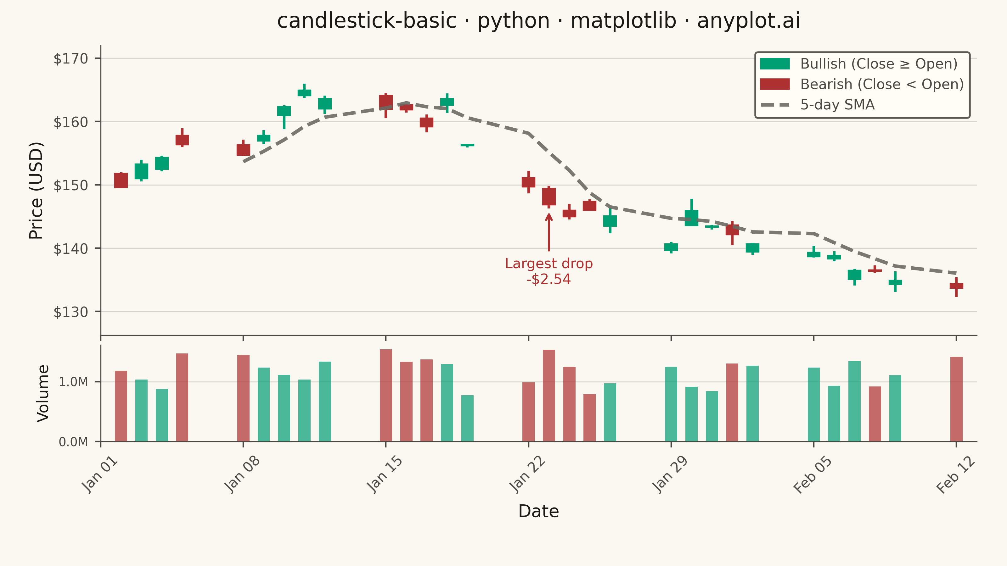
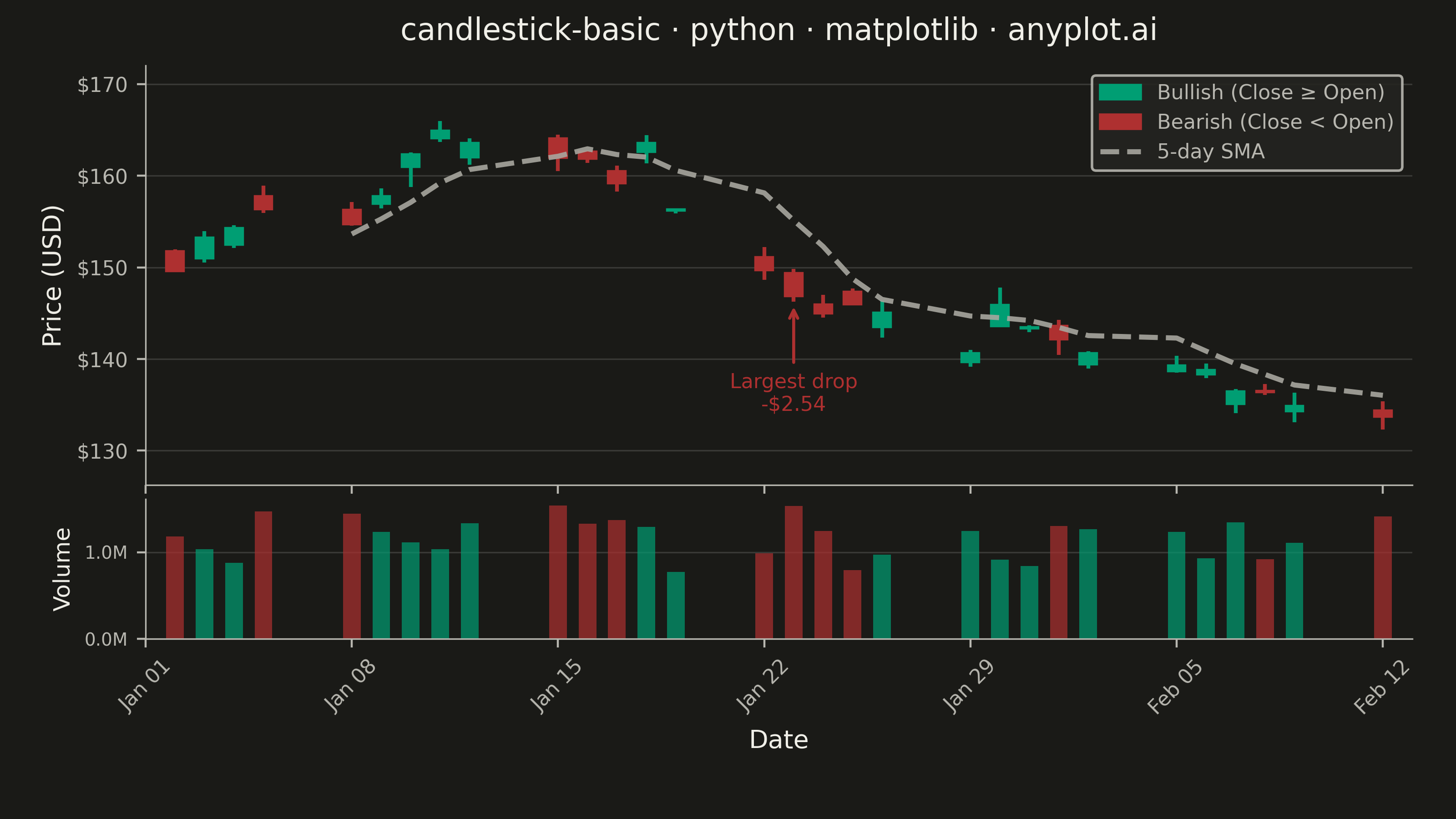
A candlestick chart displays open, high, low, and close (OHLC) price data for financial instruments over time. Each candlestick shows the price range within a specific period, with the body indicating the open-close range and the wicks (shadows) showing the high-low range. Color coding distinguishes bullish (price increase) from bearish (price decrease) periods, making it easy to identify trends and price patterns at a glance.
""" anyplot.ai
candlestick-basic: Basic Candlestick Chart
Library: matplotlib 3.10.9 | Python 3.13.13
Quality: 91/100 | Updated: 2026-05-30
"""

import os

import matplotlib.dates as mdates
import matplotlib.patches as mpatches
import matplotlib.pyplot as plt
import matplotlib.ticker as mticker
import numpy as np
import pandas as pd


# Theme tokens
THEME = os.getenv("ANYPLOT_THEME", "light")
PAGE_BG = "#FAF8F1" if THEME == "light" else "#1A1A17"
ELEVATED_BG = "#FFFDF6" if THEME == "light" else "#242420"
INK = "#1A1A17" if THEME == "light" else "#F0EFE8"
INK_SOFT = "#4A4A44" if THEME == "light" else "#B8B7B0"
INK_MUTED = "#6B6A63" if THEME == "light" else "#A8A79F"

# Imprint palette — semantic exception: finance profit/loss → green/red
COLOR_UP = "#009E73"  # Imprint position 1 (brand green) — bullish / gain
COLOR_DOWN = "#AE3030"  # Imprint position 5 (matte red) — bearish / loss

# Data
np.random.seed(42)
n_days = 30
dates = pd.bdate_range(start="2024-01-02", periods=n_days)

# Random walk prices starting at $150
returns = np.random.randn(n_days) * 0.02
price_series = 150 * np.exp(np.cumsum(returns))

# Generate OHLC from base prices
open_prices = price_series * (1 + np.random.uniform(-0.005, 0.005, n_days))
close_prices = price_series * (1 + np.random.uniform(-0.015, 0.015, n_days))
intraday_ranges = price_series * np.random.uniform(0.01, 0.03, n_days)
low_prices = np.minimum(open_prices, close_prices) - np.random.uniform(0, 0.5, n_days) * intraday_ranges
high_prices = np.maximum(open_prices, close_prices) + np.random.uniform(0, 0.5, n_days) * intraday_ranges

df = pd.DataFrame({"date": dates, "open": open_prices, "high": high_prices, "low": low_prices, "close": close_prices})

# Volume data — correlated with daily price range (higher volatility → more trading)
daily_range_pct = (df["high"] - df["low"]) / price_series
df["volume"] = (1_000_000 * (1 + daily_range_pct * 10) * np.random.uniform(0.7, 1.3, n_days)).astype(int)

# 5-day simple moving average for trend context
df["sma5"] = df["close"].rolling(window=5).mean()

# Pre-compute price range for proportional minimum body height
y_min_data, y_max_data = df["low"].min(), df["high"].max()
min_body = (y_max_data - y_min_data) * 0.004  # scales with axis range; avoids invisible doji bodies

# Plot with gridspec: main candlestick panel (75%) + volume panel (25%)
fig = plt.figure(figsize=(8, 4.5), dpi=400, facecolor=PAGE_BG)
gs = fig.add_gridspec(2, 1, height_ratios=[3, 1], hspace=0.05)
ax = fig.add_subplot(gs[0])
ax_vol = fig.add_subplot(gs[1], sharex=ax)

ax.set_facecolor(PAGE_BG)
ax_vol.set_facecolor(PAGE_BG)

bullish = df["close"] >= df["open"]
colors = np.where(bullish, COLOR_UP, COLOR_DOWN)
date_nums = mdates.date2num(df["date"])
width = 0.6

# Wicks — thin lines for high-low range (behind bodies)
ax.vlines(date_nums, df["low"], df["high"], colors=colors, linewidth=1.5, zorder=1)

# Bodies — bars for open-close range (in front of wicks)
body_bottoms = np.where(bullish, df["open"], df["close"])
body_heights = np.abs(df["close"] - df["open"])
body_heights = np.where(body_heights < min_body, min_body, body_heights)
ax.bar(
    date_nums, body_heights, bottom=body_bottoms, width=width, color=colors, edgecolor=colors, linewidth=0.8, zorder=2
)

# 5-day SMA — dashed to distinguish from structural chrome
sma_mask = df["sma5"].notna()
ax.plot(date_nums[sma_mask], df["sma5"][sma_mask], color=INK_MUTED, linewidth=2.0, linestyle="--", alpha=0.9, zorder=3)

# Annotate largest single-day price drop
daily_change = df["close"] - df["open"]
biggest_drop_idx = daily_change.idxmin()
drop_val = daily_change[biggest_drop_idx]
ax.annotate(
    f"Largest drop\n-${abs(drop_val):.2f}",
    xy=(date_nums[biggest_drop_idx], df["low"].iloc[biggest_drop_idx]),
    xytext=(0, -28),
    textcoords="offset points",
    fontsize=8,
    fontweight="medium",
    color=COLOR_DOWN,
    ha="center",
    va="top",
    arrowprops={"arrowstyle": "->", "color": COLOR_DOWN, "lw": 1.2},
    zorder=4,
)

# Volume bars in lower panel — color-coded to match candle direction
ax_vol.bar(date_nums, df["volume"], width=width, color=colors, alpha=0.7, zorder=2)

# Date formatting on lower panel (x-axis labels hidden on upper via sharex)
ax_vol.xaxis.set_major_locator(mdates.WeekdayLocator(byweekday=mdates.MO))
ax_vol.xaxis.set_major_formatter(mdates.DateFormatter("%b %d"))
ax_vol.tick_params(which="minor", length=0)  # suppress daily minor tick clutter
ax_vol.tick_params(axis="x", rotation=45, labelsize=8, colors=INK_SOFT, labelcolor=INK_SOFT)
ax_vol.tick_params(axis="y", labelsize=7, colors=INK_SOFT, labelcolor=INK_SOFT)
plt.setp(ax.get_xticklabels(), visible=False)

# Style — main panel
title = "candlestick-basic · python · matplotlib · anyplot.ai"
title_fontsize = max(8, round(12 * 67 / len(title))) if len(title) > 67 else 12

ax.set_ylabel("Price (USD)", fontsize=10, color=INK)
ax.set_title(title, fontsize=title_fontsize, fontweight="medium", color=INK, pad=10)
ax.tick_params(axis="both", labelsize=8, colors=INK_SOFT, labelcolor=INK_SOFT)
ax.tick_params(which="minor", length=0)  # suppress daily minor tick clutter

ax.spines["top"].set_visible(False)
ax.spines["right"].set_visible(False)
ax.spines["left"].set_linewidth(0.6)
ax.spines["left"].set_color(INK_SOFT)
ax.spines["bottom"].set_linewidth(0.6)
ax.spines["bottom"].set_color(INK_SOFT)

ax.yaxis.set_major_formatter(mticker.FormatStrFormatter("$%.0f"))
ax.yaxis.grid(True, alpha=0.15, linewidth=0.6, color=INK)
ax.set_axisbelow(True)

# Style — volume panel
ax_vol.set_ylabel("Volume", fontsize=9, color=INK)
ax_vol.set_xlabel("Date", fontsize=10, color=INK)
ax_vol.spines["top"].set_visible(False)
ax_vol.spines["right"].set_visible(False)
ax_vol.spines["left"].set_linewidth(0.6)
ax_vol.spines["left"].set_color(INK_SOFT)
ax_vol.spines["bottom"].set_linewidth(0.6)
ax_vol.spines["bottom"].set_color(INK_SOFT)
ax_vol.yaxis.set_major_formatter(mticker.FuncFormatter(lambda x, _: f"{x / 1e6:.1f}M"))
ax_vol.yaxis.grid(True, alpha=0.15, linewidth=0.6, color=INK)
ax_vol.set_axisbelow(True)

# Legend on main panel
legend_handles = [
    mpatches.Patch(color=COLOR_UP, label="Bullish (Close ≥ Open)"),
    mpatches.Patch(color=COLOR_DOWN, label="Bearish (Close < Open)"),
    plt.Line2D([0], [0], color=INK_MUTED, linewidth=2.0, linestyle="--", alpha=0.9, label="5-day SMA"),
]
leg = ax.legend(
    handles=legend_handles, fontsize=8, loc="upper right", framealpha=0.9, edgecolor=INK_SOFT, facecolor=ELEVATED_BG
)
for t in leg.get_texts():
    t.set_color(INK_SOFT)

# Axis limits with padding
y_pad = (y_max_data - y_min_data) * 0.18
ax.set_ylim(y_min_data - y_pad, y_max_data + y_pad)
x_min = mdates.date2num(df["date"].min())
x_max = mdates.date2num(df["date"].max())
ax.set_xlim(x_min - 1, x_max + 1)

fig.subplots_adjust(left=0.10, right=0.97, top=0.92, bottom=0.22)

# Save
plt.savefig(f"plot-{THEME}.png", dpi=400, facecolor=PAGE_BG)
Runnable source as JSON, for any HTTP client: https://api.anyplot.ai/specs/candlestick-basic/matplotlib/code. Any spec id and library id listed in llms-full.txt fit the same URL shape; every URL below is complete and callable.
{
  "spec_id": "candlestick-basic",
  "language": "python",
  "library": "matplotlib",
  "page": "https://anyplot.ai/candlestick-basic/python/matplotlib",
  "hub": "https://anyplot.ai/candlestick-basic",
  "code_json": "https://api.anyplot.ai/specs/candlestick-basic/matplotlib/code",
  "spec_json": "https://api.anyplot.ai/specs/candlestick-basic",
  "render_light_png": "https://storage.googleapis.com/anyplot-images/plots/candlestick-basic/python/matplotlib/plot-light.png",
  "render_dark_png": "https://storage.googleapis.com/anyplot-images/plots/candlestick-basic/python/matplotlib/plot-dark.png",
  "quality_score": 91.0,
  "license": "MIT",
  "guide": "https://anyplot.ai/llms.txt"
}
Part of Basic Candlestick Chart on anyplot.ai.