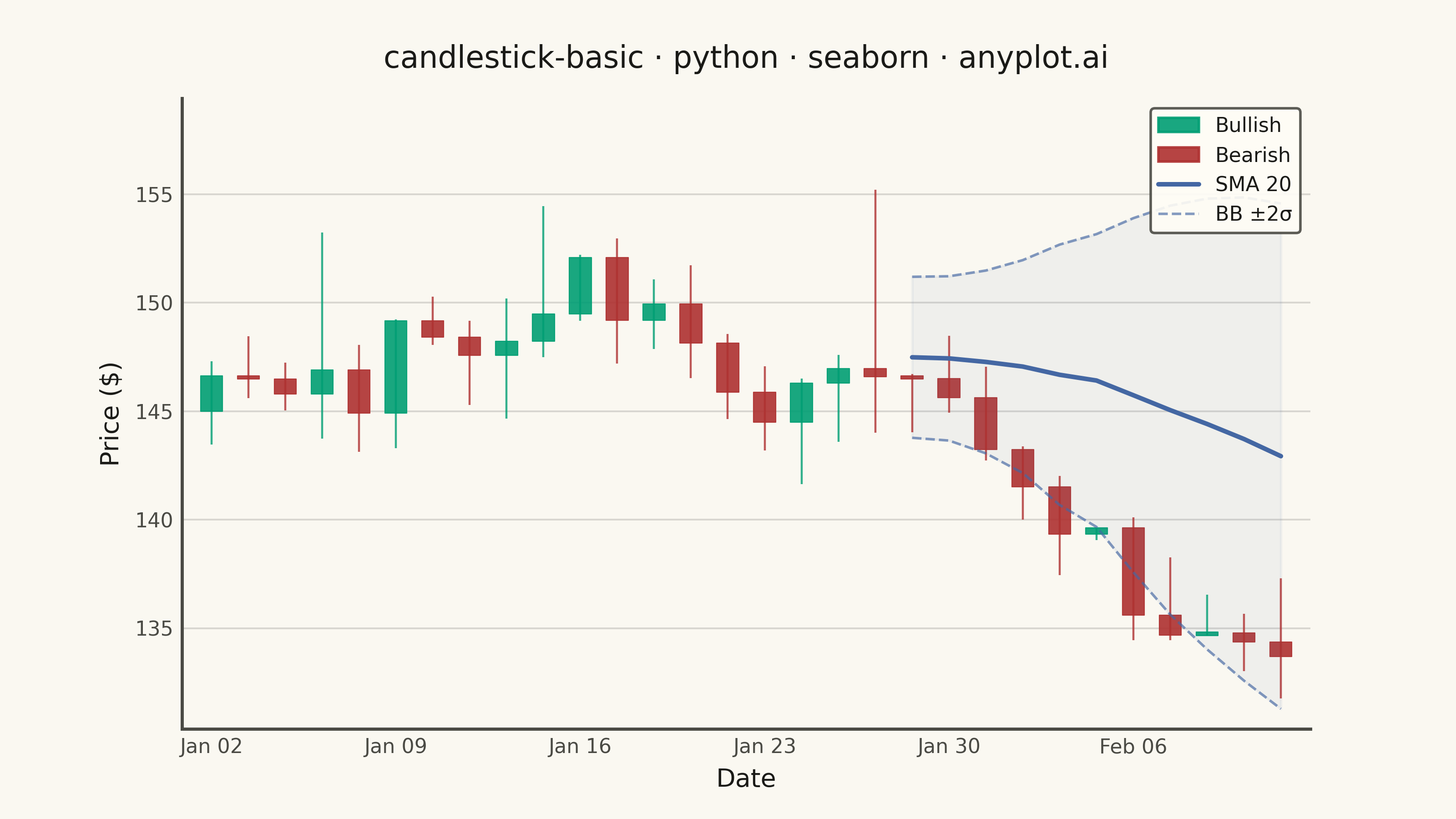
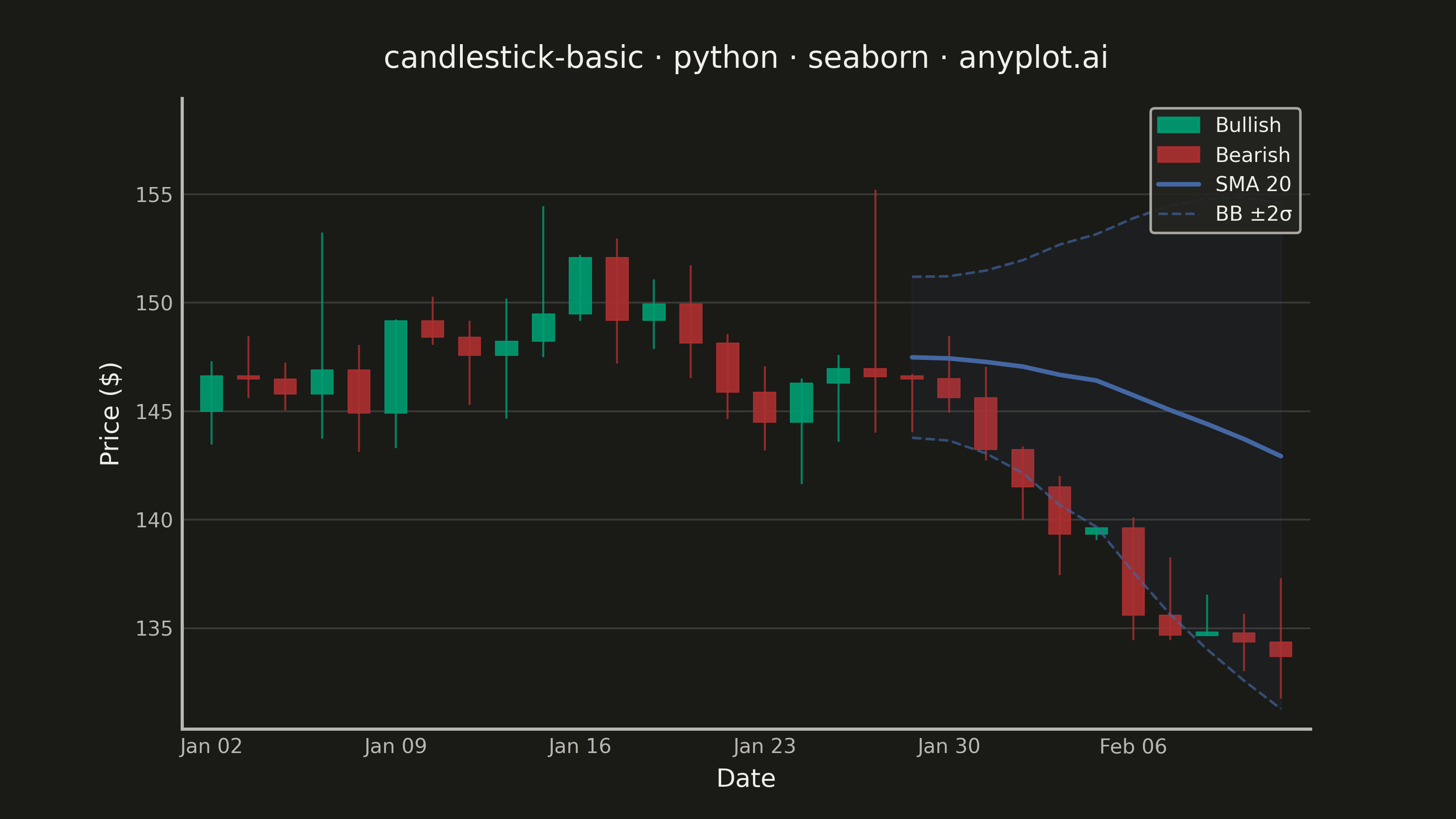
A candlestick chart displays open, high, low, and close (OHLC) price data for financial instruments over time. Each candlestick shows the price range within a specific period, with the body indicating the open-close range and the wicks (shadows) showing the high-low range. Color coding distinguishes bullish (price increase) from bearish (price decrease) periods, making it easy to identify trends and price patterns at a glance.
""" anyplot.ai
candlestick-basic: Basic Candlestick Chart
Library: seaborn 0.13.2 | Python 3.13.13
Quality: 90/100 | Updated: 2026-05-30
"""

import os

import matplotlib.pyplot as plt
import numpy as np
import pandas as pd
import seaborn as sns
from matplotlib.collections import PatchCollection
from matplotlib.lines import Line2D
from matplotlib.patches import Patch, Rectangle


THEME = os.getenv("ANYPLOT_THEME", "light")

# Theme-adaptive chrome tokens
PAGE_BG = "#FAF8F1" if THEME == "light" else "#1A1A17"
ELEVATED_BG = "#FFFDF6" if THEME == "light" else "#242420"
INK = "#1A1A17" if THEME == "light" else "#F0EFE8"
INK_SOFT = "#4A4A44" if THEME == "light" else "#B8B7B0"

# Imprint palette — finance semantic exception: profit/up→green, loss/down→red
BULLISH_COLOR = "#009E73"  # Imprint position 1 (brand green)
BEARISH_COLOR = "#AE3030"  # Imprint position 5 (matte red)
BB_COLOR = "#4467A3"  # Imprint position 3 (blue) — Bollinger Bands

sns.set_theme(
    style="ticks",
    rc={
        "figure.facecolor": PAGE_BG,
        "axes.facecolor": PAGE_BG,
        "axes.edgecolor": INK_SOFT,
        "axes.labelcolor": INK,
        "text.color": INK,
        "xtick.color": INK_SOFT,
        "ytick.color": INK_SOFT,
        "grid.color": INK,
        "grid.alpha": 0.15,
        "legend.facecolor": ELEVATED_BG,
        "legend.edgecolor": INK_SOFT,
    },
)

# Data — 30 trading days: rally phase then reversal/selloff
np.random.seed(42)
n_days = 30
dates = pd.date_range("2024-01-02", periods=n_days, freq="B")

price = 145.0
drift = np.concatenate(
    [
        np.linspace(0.4, 0.8, 12),  # Uptrend phase
        np.linspace(-0.1, -0.6, 18),  # Reversal and selloff
    ]
)
opens, highs, lows, closes = [], [], [], []
for i in range(n_days):
    change = drift[i] + np.random.randn() * 2.5
    volatility = abs(np.random.randn()) * 1.5 + 0.8
    open_price = price
    close_price = price + change
    high_price = max(open_price, close_price) + abs(np.random.randn()) * volatility
    low_price = min(open_price, close_price) - abs(np.random.randn()) * volatility
    opens.append(open_price)
    highs.append(high_price)
    lows.append(low_price)
    closes.append(close_price)
    price = close_price

df = pd.DataFrame({"date": dates, "open": opens, "high": highs, "low": lows, "close": closes})
df["bullish"] = df["close"] >= df["open"]
df["x"] = range(n_days)

# Bollinger Bands: 20-day SMA ± 2σ
window = 20
df["sma20"] = df["close"].rolling(window=window).mean()
df["std20"] = df["close"].rolling(window=window).std()
df["bb_upper"] = df["sma20"] + 2 * df["std20"]
df["bb_lower"] = df["sma20"] - 2 * df["std20"]

# Canvas: 3200×1800 px (landscape 16:9)
fig, ax = plt.subplots(figsize=(8, 4.5), dpi=400)

# Wicks (high-low range)
wick_colors = [BULLISH_COLOR if b else BEARISH_COLOR for b in df["bullish"]]
ax.vlines(df["x"], df["low"], df["high"], colors=wick_colors, linewidth=0.8, alpha=0.8)

# Candle bodies (open-close range)
body_width = 0.6
rects, fcolors = [], []
for _, row in df.iterrows():
    body_lo = min(row["open"], row["close"])
    body_hi = max(row["open"], row["close"])
    height = max(body_hi - body_lo, 0.15)
    if body_hi - body_lo < 0.15:
        body_lo = (row["open"] + row["close"]) / 2 - 0.075
    rects.append(Rectangle((row["x"] - body_width / 2, body_lo), body_width, height))
    fcolors.append(BULLISH_COLOR if row["bullish"] else BEARISH_COLOR)

bodies = PatchCollection(rects, facecolors=fcolors, edgecolors=fcolors, linewidths=0.4, alpha=0.9)
ax.add_collection(bodies)

# Bollinger Bands overlay via seaborn lineplot
bb_valid = df.dropna(subset=["sma20"])
sns.lineplot(data=bb_valid, x="x", y="sma20", color=BB_COLOR, linewidth=1.8, ax=ax, legend=False)
sns.lineplot(
    data=bb_valid, x="x", y="bb_upper", color=BB_COLOR, linewidth=1.0, linestyle="--", alpha=0.65, ax=ax, legend=False
)
sns.lineplot(
    data=bb_valid, x="x", y="bb_lower", color=BB_COLOR, linewidth=1.0, linestyle="--", alpha=0.65, ax=ax, legend=False
)
ax.fill_between(bb_valid["x"], bb_valid["bb_lower"], bb_valid["bb_upper"], color=BB_COLOR, alpha=0.06)

# X-axis date ticks
tick_positions = list(range(0, n_days, 5))
ax.set_xticks(tick_positions)
ax.set_xticklabels([dates[i].strftime("%b %d") for i in tick_positions])

ax.set_xlabel("Date", fontsize=10)
ax.set_ylabel("Price ($)", fontsize=10)
ax.set_title("candlestick-basic · python · seaborn · anyplot.ai", fontsize=12, fontweight="medium", pad=12)
ax.tick_params(axis="both", labelsize=8, length=0)

ax.spines["top"].set_visible(False)
ax.spines["right"].set_visible(False)

ax.yaxis.grid(True, alpha=0.15, linewidth=0.7, color=INK)
ax.xaxis.grid(False)
ax.set_axisbelow(True)

legend_handles = [
    Patch(facecolor=BULLISH_COLOR, edgecolor=BULLISH_COLOR, alpha=0.9, label="Bullish"),
    Patch(facecolor=BEARISH_COLOR, edgecolor=BEARISH_COLOR, alpha=0.9, label="Bearish"),
    Line2D([0], [0], color=BB_COLOR, linewidth=1.8, label="SMA 20"),
    Line2D([0], [0], color=BB_COLOR, linewidth=1.0, linestyle="--", alpha=0.65, label="BB ±2σ"),
]
ax.legend(
    handles=legend_handles,
    fontsize=8,
    loc="upper right",
    framealpha=0.9,
    edgecolor=INK_SOFT,
    facecolor=ELEVATED_BG,
    labelcolor=INK,
)

ax.set_xlim(-0.8, n_days - 0.2)
y_range = df["high"].max() - df["low"].min()
y_pad = y_range * 0.06
ax.set_ylim(df["low"].min() - y_pad, df["high"].max() + y_pad * 3.0)

plt.savefig(f"plot-{THEME}.png", dpi=400, facecolor=PAGE_BG)
plt.close()
Runnable source as JSON, for any HTTP client: https://api.anyplot.ai/specs/candlestick-basic/seaborn/code. Any spec id and library id listed in llms-full.txt fit the same URL shape; every URL below is complete and callable.
{
  "spec_id": "candlestick-basic",
  "language": "python",
  "library": "seaborn",
  "page": "https://anyplot.ai/candlestick-basic/python/seaborn",
  "hub": "https://anyplot.ai/candlestick-basic",
  "code_json": "https://api.anyplot.ai/specs/candlestick-basic/seaborn/code",
  "spec_json": "https://api.anyplot.ai/specs/candlestick-basic",
  "render_light_png": "https://storage.googleapis.com/anyplot-images/plots/candlestick-basic/python/seaborn/plot-light.png",
  "render_dark_png": "https://storage.googleapis.com/anyplot-images/plots/candlestick-basic/python/seaborn/plot-dark.png",
  "quality_score": 90.0,
  "license": "MIT",
  "guide": "https://anyplot.ai/llms.txt"
}
Part of Basic Candlestick Chart on anyplot.ai.