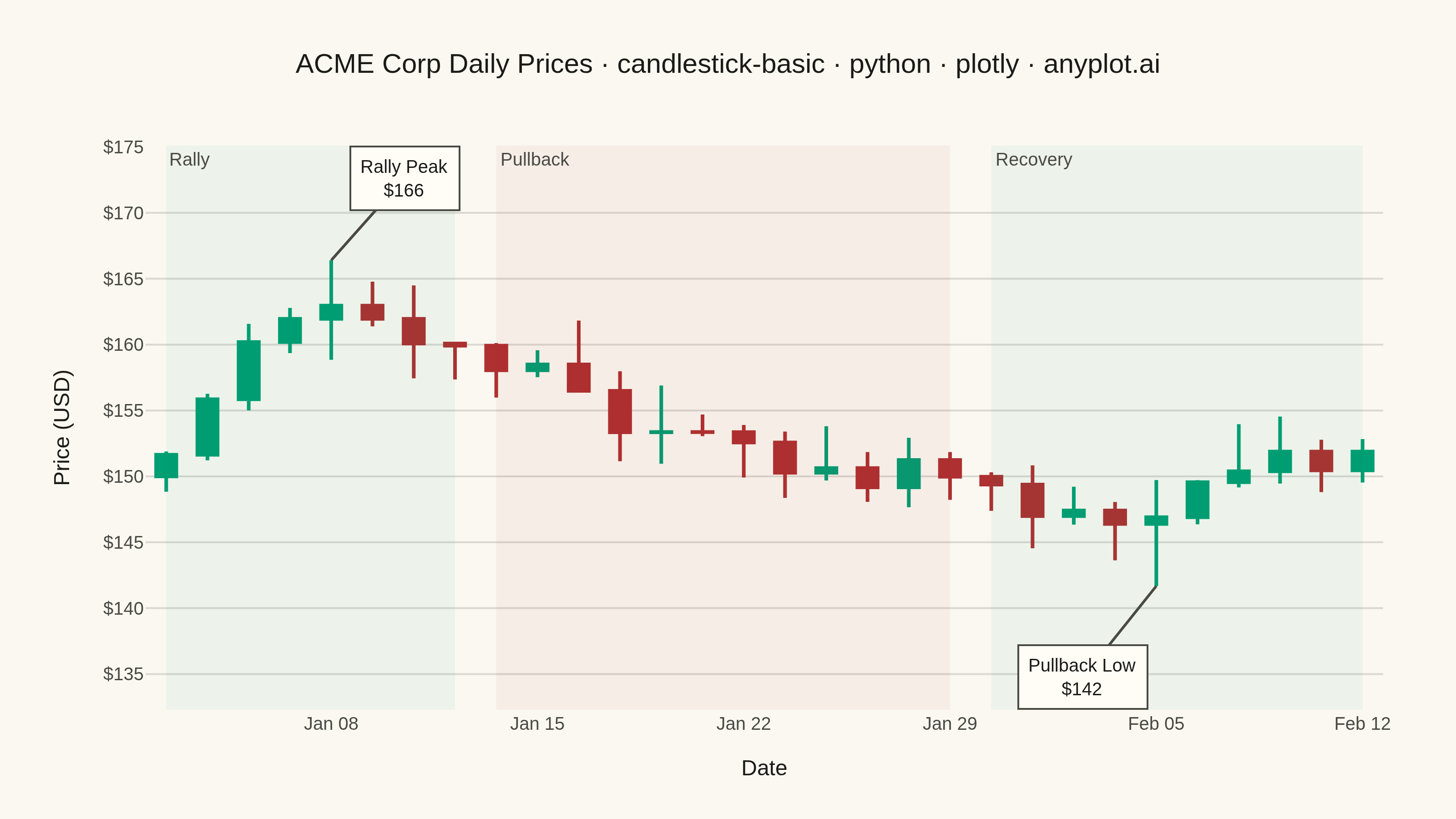
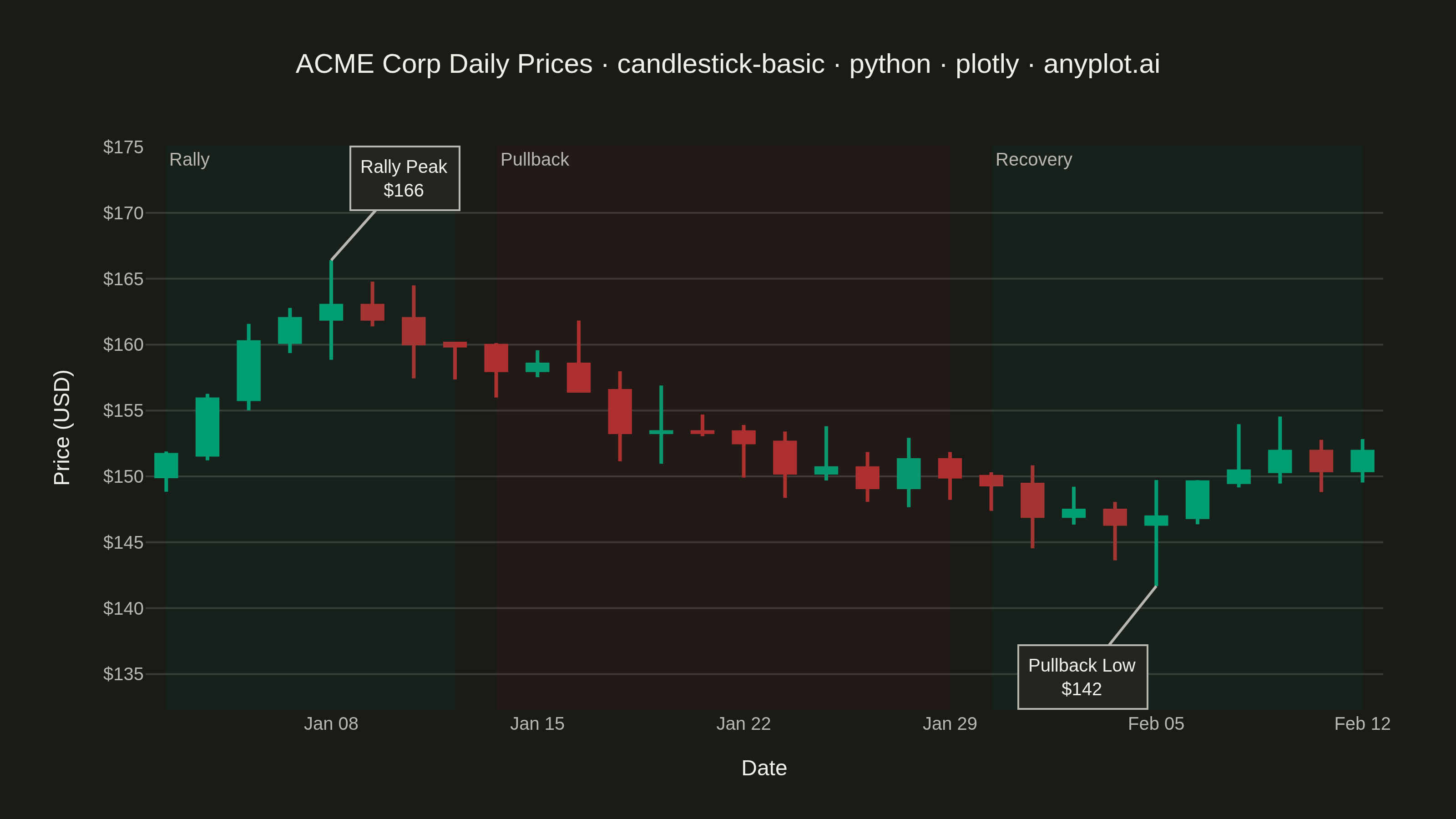
A candlestick chart displays open, high, low, and close (OHLC) price data for financial instruments over time. Each candlestick shows the price range within a specific period, with the body indicating the open-close range and the wicks (shadows) showing the high-low range. Color coding distinguishes bullish (price increase) from bearish (price decrease) periods, making it easy to identify trends and price patterns at a glance.
""" anyplot.ai
candlestick-basic: Basic Candlestick Chart
Library: plotly 6.7.0 | Python 3.13.13
Quality: 93/100 | Updated: 2026-05-30
"""

import os

import numpy as np
import pandas as pd
import plotly.graph_objects as go


# Theme tokens (Imprint palette chrome)
THEME = os.getenv("ANYPLOT_THEME", "light")
PAGE_BG = "#FAF8F1" if THEME == "light" else "#1A1A17"
ELEVATED_BG = "#FFFDF6" if THEME == "light" else "#242420"
INK = "#1A1A17" if THEME == "light" else "#F0EFE8"
INK_SOFT = "#4A4A44" if THEME == "light" else "#B8B7B0"
GRID = "rgba(26,26,23,0.15)" if THEME == "light" else "rgba(240,239,232,0.15)"

# Imprint semantic colors: finance gain→green, loss→red
BULL_COLOR = "#009E73"  # Imprint position 1
BEAR_COLOR = "#AE3030"  # Imprint position 5

# Data — 30 trading days of ACME Corp simulated prices
np.random.seed(42)
dates = pd.date_range(start="2024-01-02", periods=30, freq="B")

price = 150.0
drift = [0.4] * 8 + [-0.5] * 12 + [0.6] * 10  # rally, pullback, stronger recovery
opens, highs, lows, closes = [], [], [], []

for i in range(30):
    open_price = price
    change = np.random.randn() * 2.5 + drift[i]
    close_price = open_price + change
    high_price = max(open_price, close_price) + abs(np.random.randn()) * 1.8
    low_price = min(open_price, close_price) - abs(np.random.randn()) * 1.8
    opens.append(open_price)
    highs.append(high_price)
    lows.append(low_price)
    closes.append(close_price)
    price = close_price

df = pd.DataFrame({"date": dates.strftime("%Y-%m-%d"), "open": opens, "high": highs, "low": lows, "close": closes})
peak_idx = df["high"].idxmax()
low_idx = df["low"].idxmin()

# Title with length-scaled fontsize (default 16px at 67 chars)
title_text = "ACME Corp Daily Prices · candlestick-basic · python · plotly · anyplot.ai"
title_fs = max(round(16 * 67 / len(title_text)), 11)

# Candlestick trace
fig = go.Figure(
    data=[
        go.Candlestick(
            x=df["date"],
            open=df["open"],
            high=df["high"],
            low=df["low"],
            close=df["close"],
            increasing={"line": {"color": BULL_COLOR, "width": 2}, "fillcolor": BULL_COLOR},
            decreasing={"line": {"color": BEAR_COLOR, "width": 2}, "fillcolor": BEAR_COLOR},
            hovertemplate=(
                "<b>%{x|%b %d, %Y}</b><br>"
                "Open: $%{open:.2f}<br>"
                "High: $%{high:.2f}<br>"
                "Low: $%{low:.2f}<br>"
                "Close: $%{close:.2f}<br>"
                "<extra></extra>"
            ),
        )
    ]
)

# Key price annotations
ann_font = {"size": 10, "color": INK, "family": "Arial"}
fig.add_annotation(
    x=df.loc[peak_idx, "date"],
    y=df.loc[peak_idx, "high"],
    text=f"Rally Peak<br>${df.loc[peak_idx, 'high']:.0f}",
    showarrow=True,
    arrowhead=0,
    arrowwidth=1.5,
    arrowcolor=INK_SOFT,
    ax=40,
    ay=-45,
    font=ann_font,
    bgcolor=ELEVATED_BG,
    bordercolor=INK_SOFT,
    borderwidth=1,
    borderpad=5,
)
fig.add_annotation(
    x=df.loc[low_idx, "date"],
    y=df.loc[low_idx, "low"],
    text=f"Pullback Low<br>${df.loc[low_idx, 'low']:.0f}",
    showarrow=True,
    arrowhead=0,
    arrowwidth=1.5,
    arrowcolor=INK_SOFT,
    ax=-40,
    ay=50,
    font=ann_font,
    bgcolor=ELEVATED_BG,
    bordercolor=INK_SOFT,
    borderwidth=1,
    borderpad=5,
)

# Market phase shaded regions
phase_font = {"size": 10, "color": INK_SOFT, "family": "Arial"}
date_strs = df["date"].tolist()
fig.add_vrect(
    x0=date_strs[0],
    x1=date_strs[7],
    fillcolor=BULL_COLOR,
    opacity=0.05,
    line_width=0,
    annotation_text="Rally",
    annotation_position="top left",
    annotation_font=phase_font,
)
fig.add_vrect(
    x0=date_strs[8],
    x1=date_strs[19],
    fillcolor=BEAR_COLOR,
    opacity=0.05,
    line_width=0,
    annotation_text="Pullback",
    annotation_position="top left",
    annotation_font=phase_font,
)
fig.add_vrect(
    x0=date_strs[20],
    x1=date_strs[29],
    fillcolor=BULL_COLOR,
    opacity=0.05,
    line_width=0,
    annotation_text="Recovery",
    annotation_position="top left",
    annotation_font=phase_font,
)

fig.update_layout(
    autosize=False,
    template="plotly_white",
    paper_bgcolor=PAGE_BG,
    plot_bgcolor=PAGE_BG,
    font={"family": "Arial", "color": INK},
    title={
        "text": title_text,
        "font": {"size": title_fs, "color": INK, "family": "Arial"},
        "x": 0.5,
        "xanchor": "center",
    },
    xaxis={
        "title": {"text": "Date", "font": {"size": 12, "color": INK, "family": "Arial"}},
        "tickfont": {"size": 10, "color": INK_SOFT, "family": "Arial"},
        "tickformat": "%b %d",
        "rangeslider": {"visible": False},
        "rangebreaks": [{"bounds": ["sat", "mon"]}],
        "showgrid": False,
        "showline": False,
        "zeroline": False,
    },
    yaxis={
        "title": {"text": "Price (USD)", "font": {"size": 12, "color": INK, "family": "Arial"}},
        "tickfont": {"size": 10, "color": INK_SOFT, "family": "Arial"},
        "tickprefix": "$",
        "gridcolor": GRID,
        "gridwidth": 1,
        "zeroline": False,
        "showline": False,
    },
    margin={"l": 80, "r": 40, "t": 80, "b": 60},
    hoverlabel={"bgcolor": ELEVATED_BG, "font_size": 10, "bordercolor": INK_SOFT},
)

# Save — 3200×1800 landscape (width=800 × scale=4)
fig.write_image(f"plot-{THEME}.png", width=800, height=450, scale=4)
fig.write_html(f"plot-{THEME}.html", include_plotlyjs="cdn")
Runnable source as JSON, for any HTTP client: https://api.anyplot.ai/specs/candlestick-basic/plotly/code. Any spec id and library id listed in llms-full.txt fit the same URL shape; every URL below is complete and callable.
{
  "spec_id": "candlestick-basic",
  "language": "python",
  "library": "plotly",
  "page": "https://anyplot.ai/candlestick-basic/python/plotly",
  "hub": "https://anyplot.ai/candlestick-basic",
  "code_json": "https://api.anyplot.ai/specs/candlestick-basic/plotly/code",
  "spec_json": "https://api.anyplot.ai/specs/candlestick-basic",
  "render_light_png": "https://storage.googleapis.com/anyplot-images/plots/candlestick-basic/python/plotly/plot-light.png",
  "render_dark_png": "https://storage.googleapis.com/anyplot-images/plots/candlestick-basic/python/plotly/plot-dark.png",
  "interactive_light_html": "https://storage.googleapis.com/anyplot-images/plots/candlestick-basic/python/plotly/plot-light.html",
  "interactive_dark_html": "https://storage.googleapis.com/anyplot-images/plots/candlestick-basic/python/plotly/plot-dark.html",
  "quality_score": 93.0,
  "license": "MIT",
  "guide": "https://anyplot.ai/llms.txt"
}
Part of Basic Candlestick Chart on anyplot.ai.