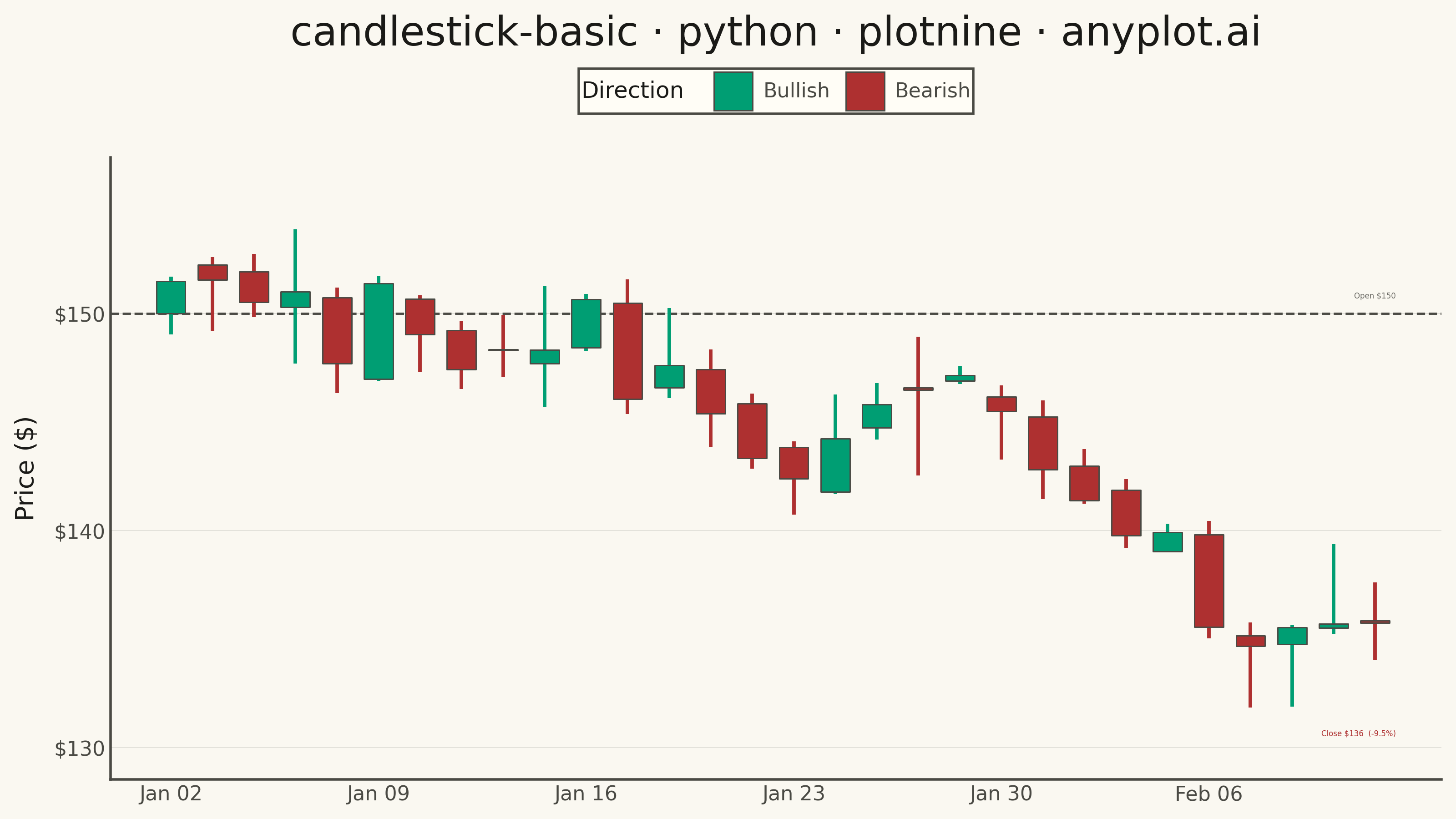
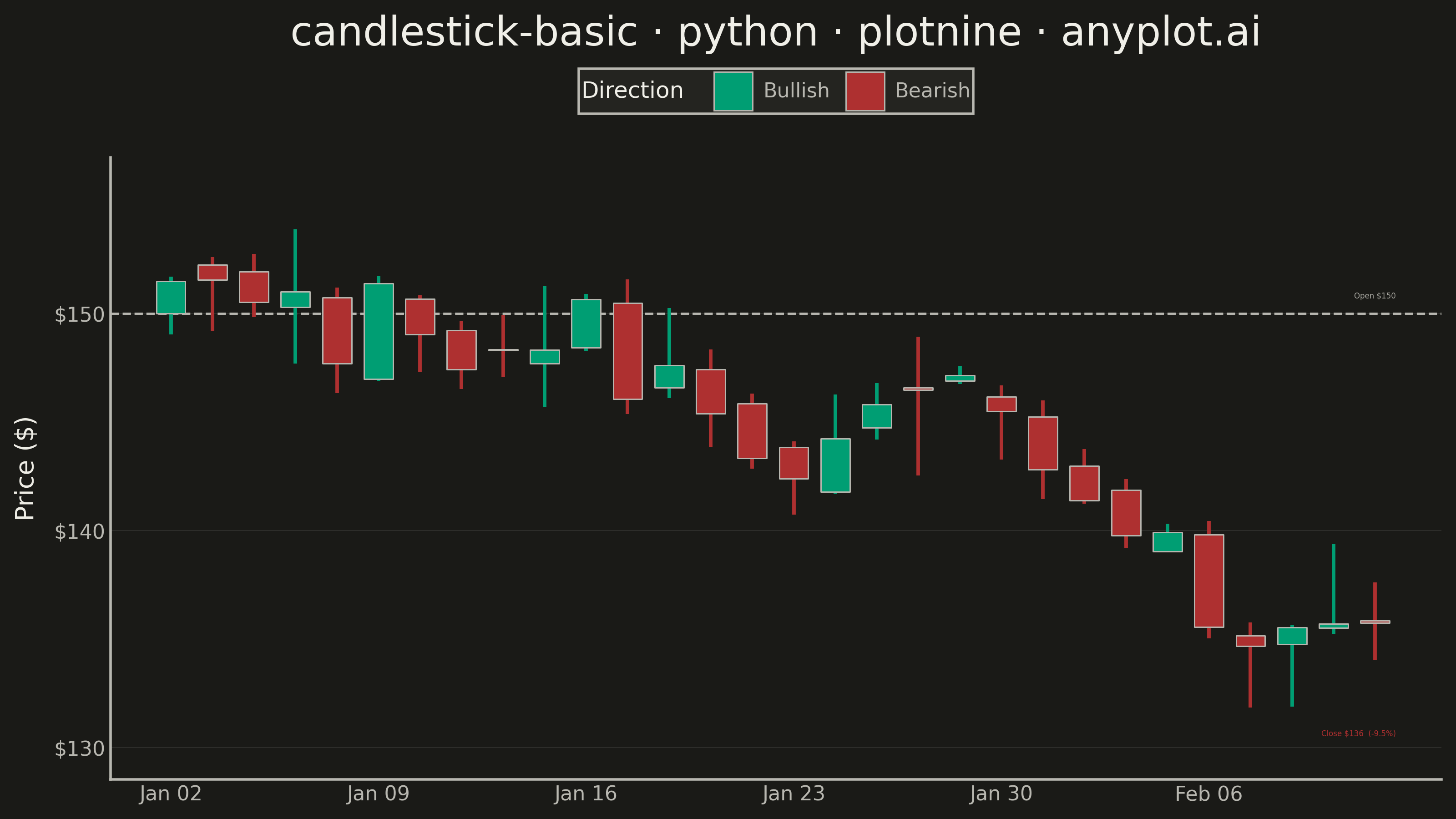
A candlestick chart displays open, high, low, and close (OHLC) price data for financial instruments over time. Each candlestick shows the price range within a specific period, with the body indicating the open-close range and the wicks (shadows) showing the high-low range. Color coding distinguishes bullish (price increase) from bearish (price decrease) periods, making it easy to identify trends and price patterns at a glance.
""" anyplot.ai
candlestick-basic: Basic Candlestick Chart
Library: plotnine 0.15.4 | Python 3.13.13
Quality: 90/100 | Updated: 2026-05-30
"""

import os
import sys


# Prevent self-import: script filename matches the library name, so remove script dir from path
if sys.path and sys.path[0] not in (None,):
    del sys.path[0]

import numpy as np
import pandas as pd
from plotnine import (
    aes,
    annotate,
    coord_cartesian,
    element_blank,
    element_line,
    element_rect,
    element_text,
    geom_hline,
    geom_rect,
    geom_segment,
    ggplot,
    labs,
    scale_color_manual,
    scale_fill_manual,
    scale_x_continuous,
    scale_y_continuous,
    theme,
    theme_minimal,
)


# Theme tokens (Imprint palette + adaptive chrome)
THEME = os.getenv("ANYPLOT_THEME", "light")
PAGE_BG = "#FAF8F1" if THEME == "light" else "#1A1A17"
ELEVATED_BG = "#FFFDF6" if THEME == "light" else "#242420"
INK = "#1A1A17" if THEME == "light" else "#F0EFE8"
INK_SOFT = "#4A4A44" if THEME == "light" else "#B8B7B0"
INK_MUTED = "#6B6A63" if THEME == "light" else "#A8A79F"

# Imprint palette — semantic exception: green=bullish (gain/profit), red=bearish (loss/decline)
BULL_COLOR = "#009E73"  # Imprint pos 1 — profit / gain / up
BEAR_COLOR = "#AE3030"  # Imprint pos 5 — loss / decline (deferred semantic red anchor)
palette = {"Bullish": BULL_COLOR, "Bearish": BEAR_COLOR}

# Data — 30 trading days, random walk starting at $150
np.random.seed(42)
n_days = 30
dates = pd.date_range(start="2024-01-02", periods=n_days, freq="B")

price = 150.0
opens, highs, lows, closes = [], [], [], []
for _ in range(n_days):
    open_price = price
    change = np.random.randn() * 3
    close_price = open_price + change
    high_price = max(open_price, close_price) + abs(np.random.randn() * 1.5)
    low_price = min(open_price, close_price) - abs(np.random.randn() * 1.5)
    opens.append(open_price)
    highs.append(high_price)
    lows.append(low_price)
    closes.append(close_price)
    price = close_price + np.random.randn() * 0.5

df = pd.DataFrame({"date": dates, "open": opens, "high": highs, "low": lows, "close": closes})
df["day"] = np.arange(len(df))
df["direction"] = pd.Categorical(
    np.where(df["close"] >= df["open"], "Bullish", "Bearish"), categories=["Bullish", "Bearish"]
)
df["body_top"] = df[["open", "close"]].max(axis=1)
df["body_bottom"] = df[["open", "close"]].min(axis=1)

# X-axis tick labels (every 5th trading day)
tick_indices = list(range(0, n_days, 5))
tick_labels = [dates[i].strftime("%b %d") for i in tick_indices]

# Reference prices for storytelling annotations
open_first = df["open"].iloc[0]
close_last = df["close"].iloc[-1]
close_dir_color = BULL_COLOR if close_last >= open_first else BEAR_COLOR
net_pct = (close_last - open_first) / open_first * 100

# Title — 50 chars < 67 baseline, so default 12pt applies
title = "candlestick-basic · python · plotnine · anyplot.ai"
title_size = max(8, round(12 * 67 / len(title)))

# Plot
plot = (
    ggplot(df)
    # Reference line at period opening price
    + geom_hline(yintercept=open_first, linetype="dashed", color=INK_SOFT, size=0.5)
    # Wicks colored by direction for visual coherence
    + geom_segment(aes(x="day", xend="day", y="low", yend="high", color="direction"), size=0.8)
    # Candle bodies — fill by direction, static INK_SOFT edge for definition
    + geom_rect(
        aes(xmin="day - 0.35", xmax="day + 0.35", ymin="body_bottom", ymax="body_top", fill="direction"),
        color=INK_SOFT,
        size=0.3,
    )
    + scale_fill_manual(values=palette, name="Direction")
    + scale_color_manual(values=palette, guide=None)
    # Annotate reference line label
    + annotate(
        "text", x=n_days - 0.5, y=open_first + 0.8, label=f"Open ${open_first:.0f}", size=3, color=INK_MUTED, ha="right"
    )
    # Annotate net change at bottom
    + annotate(
        "text",
        x=n_days - 0.5,
        y=df["low"].min() - 1.2,
        label=f"Close ${close_last:.0f}  ({net_pct:+.1f}%)",
        size=3,
        color=close_dir_color,
        ha="right",
    )
    + scale_x_continuous(breaks=tick_indices, labels=tick_labels, expand=(0.02, 0.5))
    + scale_y_continuous(labels=lambda vals: [f"${v:,.0f}" for v in vals])
    + coord_cartesian(ylim=(df["low"].min() - 2, df["high"].max() + 2))
    + labs(x="", y="Price ($)", title=title)
    + theme_minimal()
    + theme(
        figure_size=(8, 4.5),
        text=element_text(size=7),
        plot_title=element_text(size=title_size, color=INK),
        axis_title=element_text(size=10, color=INK),
        axis_text=element_text(size=8, color=INK_SOFT),
        plot_background=element_rect(fill=PAGE_BG, color=PAGE_BG),
        panel_background=element_rect(fill=PAGE_BG),
        panel_grid_major_x=element_blank(),
        panel_grid_minor_x=element_blank(),
        panel_grid_major_y=element_line(color=INK_SOFT, size=0.3, alpha=0.15),
        panel_grid_minor_y=element_blank(),
        axis_line=element_line(color=INK_SOFT),
        legend_position="top",
        legend_title=element_text(size=9, color=INK),
        legend_text=element_text(size=8, color=INK_SOFT),
        legend_background=element_rect(fill=ELEVATED_BG, color=INK_SOFT),
    )
)

plot.save(f"plot-{THEME}.png", dpi=400, width=8, height=4.5, units="in", verbose=False)
Runnable source as JSON, for any HTTP client: https://api.anyplot.ai/specs/candlestick-basic/plotnine/code. Any spec id and library id listed in llms-full.txt fit the same URL shape; every URL below is complete and callable.
{
  "spec_id": "candlestick-basic",
  "language": "python",
  "library": "plotnine",
  "page": "https://anyplot.ai/candlestick-basic/python/plotnine",
  "hub": "https://anyplot.ai/candlestick-basic",
  "code_json": "https://api.anyplot.ai/specs/candlestick-basic/plotnine/code",
  "spec_json": "https://api.anyplot.ai/specs/candlestick-basic",
  "render_light_png": "https://storage.googleapis.com/anyplot-images/plots/candlestick-basic/python/plotnine/plot-light.png",
  "render_dark_png": "https://storage.googleapis.com/anyplot-images/plots/candlestick-basic/python/plotnine/plot-dark.png",
  "quality_score": 90.0,
  "license": "MIT",
  "guide": "https://anyplot.ai/llms.txt"
}
Part of Basic Candlestick Chart on anyplot.ai.