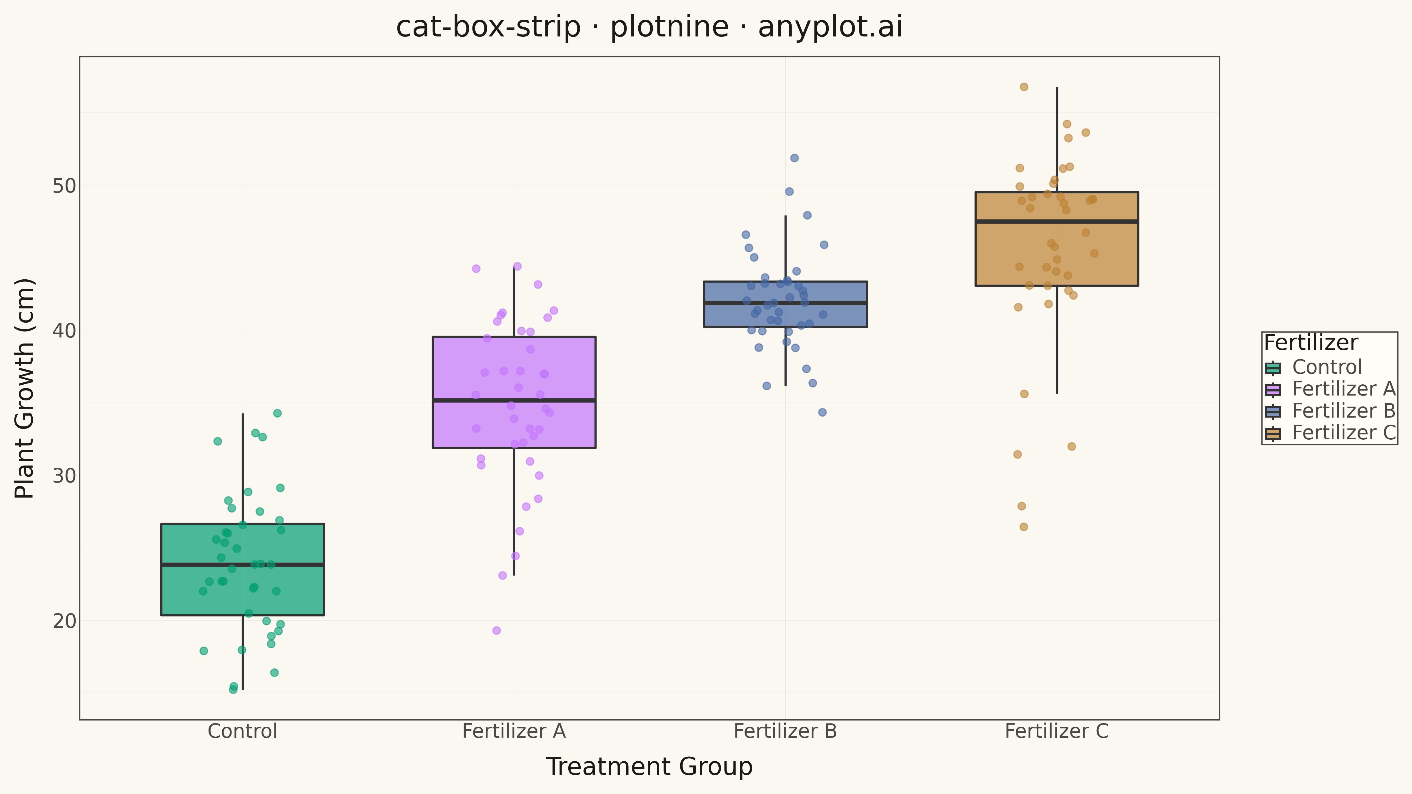
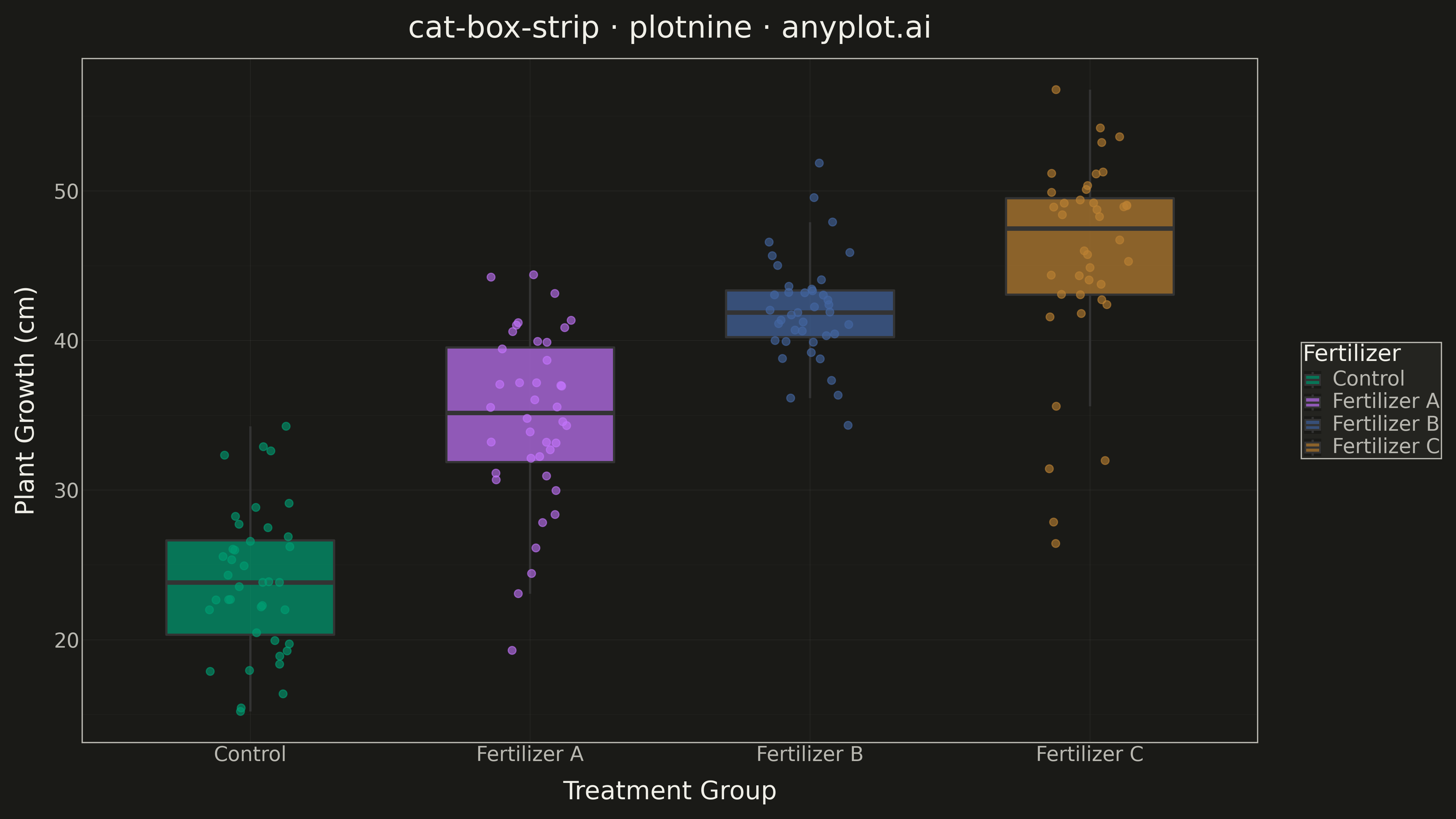
A combined visualization that overlays individual data points (strip plot) on top of a box plot. This provides both summary statistics (median, quartiles, whiskers) and visibility of the actual data distribution.
""" anyplot.ai
cat-box-strip: Box Plot with Strip Overlay
Library: plotnine 0.15.4 | Python 3.13.13
Quality: 85/100 | Updated: 2026-05-13
"""

import os
import sys


# Remove current directory from path to avoid shadowing plotnine library
if sys.path and sys.path[0]:
    sys.path.pop(0)

import numpy as np
import pandas as pd
from plotnine import (
    aes,
    element_line,
    element_rect,
    element_text,
    geom_boxplot,
    geom_jitter,
    ggplot,
    labs,
    scale_color_manual,
    scale_fill_manual,
    theme,
    theme_minimal,
)


THEME = os.getenv("ANYPLOT_THEME", "light")
PAGE_BG = "#FAF8F1" if THEME == "light" else "#1A1A17"
ELEVATED_BG = "#FFFDF6" if THEME == "light" else "#242420"
INK = "#1A1A17" if THEME == "light" else "#F0EFE8"
INK_SOFT = "#4A4A44" if THEME == "light" else "#B8B7B0"

IMPRINT = ["#009E73", "#C475FD", "#4467A3", "#BD8233"]

# Data - Plant growth measurements across fertilizer types
np.random.seed(42)

categories = ["Control", "Fertilizer A", "Fertilizer B", "Fertilizer C"]
n_per_group = 40

data = []
# Control: lower values, moderate spread
control = np.random.normal(loc=25, scale=5, size=n_per_group)
# Fertilizer A: moderate improvement
fert_a = np.random.normal(loc=35, scale=6, size=n_per_group)
# Fertilizer B: good improvement, tighter distribution
fert_b = np.random.normal(loc=42, scale=4, size=n_per_group)
# Fertilizer C: best results but with outliers (bimodal)
fert_c = np.concatenate(
    [np.random.normal(loc=48, scale=4, size=n_per_group - 5), np.random.normal(loc=30, scale=3, size=5)]
)

for cat, vals in zip(categories, [control, fert_a, fert_b, fert_c], strict=True):
    for v in vals:
        data.append({"Fertilizer": cat, "Growth (cm)": v})

df = pd.DataFrame(data)
df["Fertilizer"] = pd.Categorical(df["Fertilizer"], categories=categories, ordered=True)

# Plot
plot = (
    ggplot(df, aes(x="Fertilizer", y="Growth (cm)", fill="Fertilizer"))
    + geom_boxplot(alpha=0.7, width=0.6, outlier_shape="", size=1)
    + geom_jitter(aes(color="Fertilizer"), width=0.15, alpha=0.6, size=3, show_legend=False)
    + scale_fill_manual(values=IMPRINT)
    + scale_color_manual(values=IMPRINT)
    + labs(x="Treatment Group", y="Plant Growth (cm)", title="cat-box-strip · plotnine · anyplot.ai")
    + theme_minimal()
    + theme(
        figure_size=(16, 9),
        plot_background=element_rect(fill=PAGE_BG, color=PAGE_BG),
        panel_background=element_rect(fill=PAGE_BG),
        panel_grid_major=element_line(color=INK, size=0.3, alpha=0.10),
        panel_grid_minor=element_line(color=INK, size=0.2, alpha=0.05),
        panel_border=element_rect(color=INK_SOFT, fill=None),
        axis_title=element_text(size=20, color=INK),
        axis_text=element_text(size=16, color=INK_SOFT),
        axis_line=element_line(color=INK_SOFT),
        plot_title=element_text(size=24, color=INK),
        text=element_text(size=14),
        legend_background=element_rect(fill=ELEVATED_BG, color=INK_SOFT),
        legend_text=element_text(size=16, color=INK_SOFT),
        legend_title=element_text(size=18, color=INK),
        legend_position="right",
    )
)

# Save
plot.save(f"plot-{THEME}.png", dpi=300, verbose=False)
Runnable source as JSON, for any HTTP client: https://api.anyplot.ai/specs/cat-box-strip/plotnine/code. Any spec id and library id listed in llms-full.txt fit the same URL shape; every URL below is complete and callable.
{
  "spec_id": "cat-box-strip",
  "language": "python",
  "library": "plotnine",
  "page": "https://anyplot.ai/cat-box-strip/python/plotnine",
  "hub": "https://anyplot.ai/cat-box-strip",
  "code_json": "https://api.anyplot.ai/specs/cat-box-strip/plotnine/code",
  "spec_json": "https://api.anyplot.ai/specs/cat-box-strip",
  "render_light_png": "https://storage.googleapis.com/anyplot-images/plots/cat-box-strip/python/plotnine/plot-light.png",
  "render_dark_png": "https://storage.googleapis.com/anyplot-images/plots/cat-box-strip/python/plotnine/plot-dark.png",
  "quality_score": 85.0,
  "license": "MIT",
  "guide": "https://anyplot.ai/llms.txt"
}
Part of Box Plot with Strip Overlay on anyplot.ai.