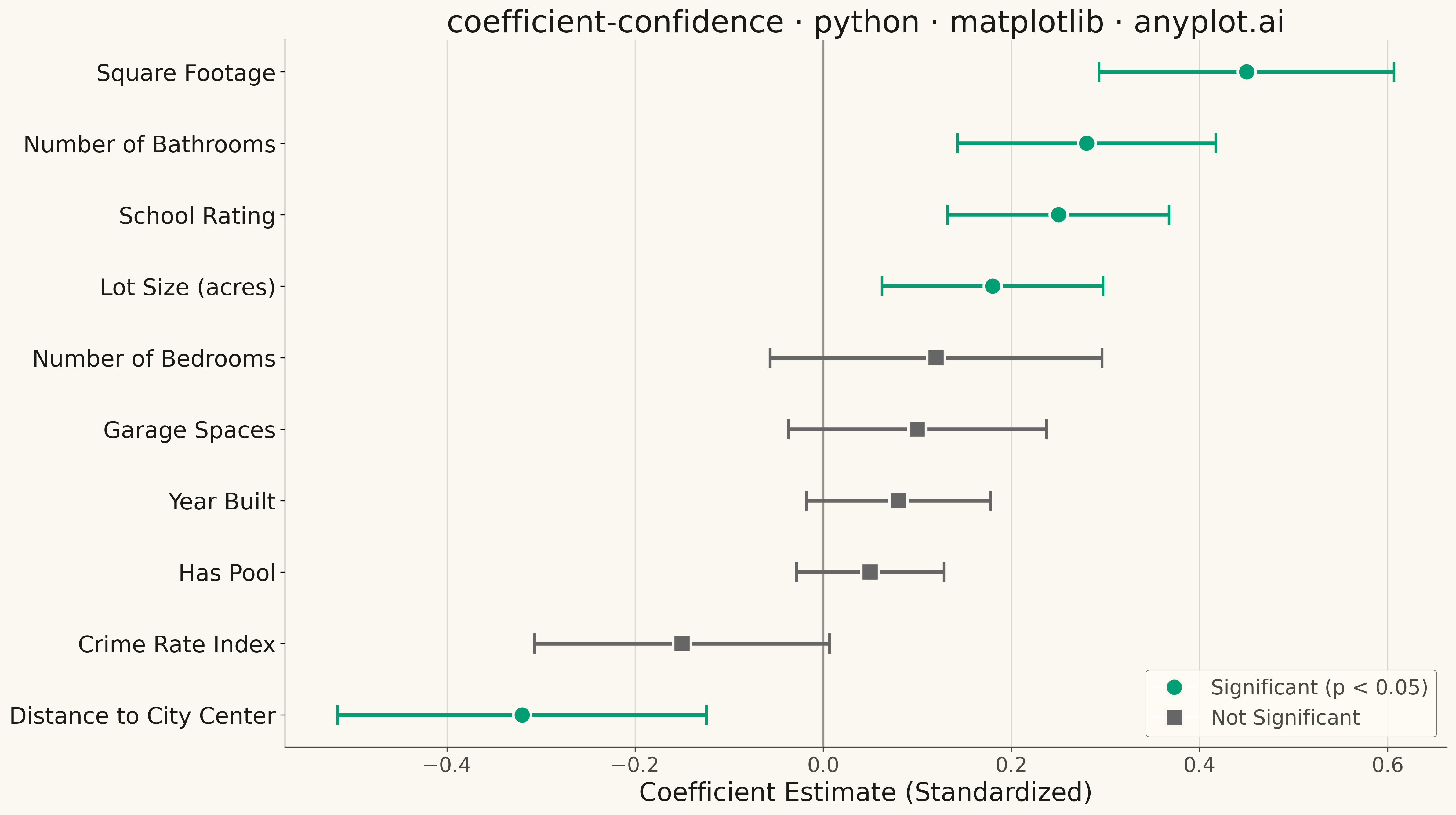
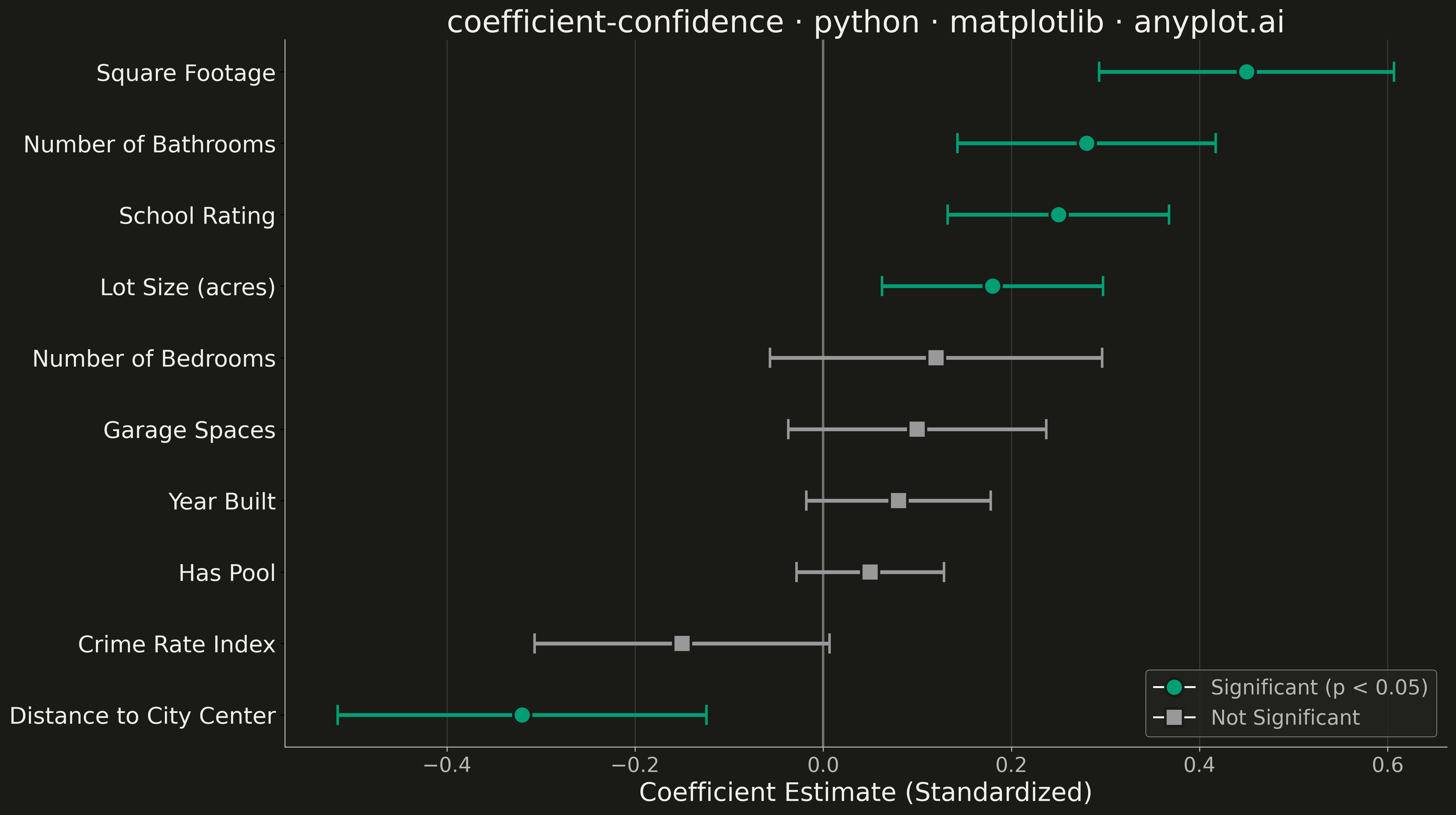
A coefficient plot displays regression coefficients as points positioned along a horizontal axis, with horizontal error bars showing confidence intervals. This visualization makes it easy to assess effect sizes and statistical significance - coefficients whose confidence intervals cross zero are not statistically significant. Typically used to summarize results from linear, logistic, or other regression models in a clear, publication-ready format.
""" anyplot.ai
coefficient-confidence: Coefficient Plot with Confidence Intervals
Library: matplotlib 3.10.9 | Python 3.13.13
Quality: 84/100 | Updated: 2026-05-18
"""

import matplotlib.pyplot as plt
import numpy as np
from matplotlib.lines import Line2D


# Data: Housing price regression coefficients (standardized)
np.random.seed(42)

variables = [
    "Square Footage",
    "Number of Bedrooms",
    "Number of Bathrooms",
    "Lot Size (acres)",
    "Year Built",
    "Distance to City Center",
    "School Rating",
    "Crime Rate Index",
    "Garage Spaces",
    "Has Pool",
]

# Coefficients with varying significance and direction
coefficients = np.array([0.45, 0.12, 0.28, 0.18, 0.08, -0.32, 0.25, -0.15, 0.10, 0.05])
# Standard errors for confidence intervals
std_errors = np.array([0.08, 0.09, 0.07, 0.06, 0.05, 0.10, 0.06, 0.08, 0.07, 0.04])

# 95% confidence intervals
ci_lower = coefficients - 1.96 * std_errors
ci_upper = coefficients + 1.96 * std_errors

# Determine significance (CI doesn't cross zero)
significant = (ci_lower > 0) | (ci_upper < 0)

# Sort by coefficient magnitude for better readability
sort_idx = np.argsort(coefficients)
variables = [variables[i] for i in sort_idx]
coefficients = coefficients[sort_idx]
ci_lower = ci_lower[sort_idx]
ci_upper = ci_upper[sort_idx]
significant = significant[sort_idx]

# Calculate error bar lengths
xerr_lower = coefficients - ci_lower
xerr_upper = ci_upper - coefficients
xerr = np.array([xerr_lower, xerr_upper])

# Create plot
fig, ax = plt.subplots(figsize=(16, 9))

# Y positions for variables
y_pos = np.arange(len(variables))

# Plot points and error bars with different colors for significant vs non-significant
colors = ["#306998" if sig else "#999999" for sig in significant]
markers = ["o" if sig else "s" for sig in significant]

# Plot error bars first
for i, (coef, y, color, marker) in enumerate(zip(coefficients, y_pos, colors, markers, strict=True)):
    ax.errorbar(
        coef,
        y,
        xerr=[[xerr_lower[i]], [xerr_upper[i]]],
        fmt=marker,
        color=color,
        markersize=14,
        markeredgewidth=2,
        markeredgecolor="white",
        capsize=8,
        capthick=3,
        elinewidth=3,
        zorder=3,
    )

# Vertical reference line at zero
ax.axvline(x=0, color="#FFD43B", linewidth=3, linestyle="-", zorder=2, alpha=0.8)

# Labels and styling
ax.set_yticks(y_pos)
ax.set_yticklabels(variables, fontsize=18)
ax.set_xlabel("Coefficient Estimate (Standardized)", fontsize=20)
ax.set_title("coefficient-confidence · matplotlib · pyplots.ai", fontsize=24)
ax.tick_params(axis="x", labelsize=16)

# Grid
ax.grid(True, alpha=0.3, linestyle="--", axis="x")
ax.set_axisbelow(True)

# Legend
legend_elements = [
    Line2D(
        [0],
        [0],
        marker="o",
        color="w",
        markerfacecolor="#306998",
        markersize=14,
        markeredgewidth=2,
        markeredgecolor="white",
        label="Significant (p < 0.05)",
    ),
    Line2D(
        [0],
        [0],
        marker="s",
        color="w",
        markerfacecolor="#999999",
        markersize=14,
        markeredgewidth=2,
        markeredgecolor="white",
        label="Not Significant",
    ),
]
ax.legend(handles=legend_elements, loc="lower right", fontsize=16, framealpha=0.9)

# Adjust layout
ax.spines["top"].set_visible(False)
ax.spines["right"].set_visible(False)

plt.tight_layout()
plt.savefig("plot.png", dpi=300, bbox_inches="tight")
Runnable source as JSON, for any HTTP client: https://api.anyplot.ai/specs/coefficient-confidence/matplotlib/code. Any spec id and library id listed in llms-full.txt fit the same URL shape; every URL below is complete and callable.
{
  "spec_id": "coefficient-confidence",
  "language": "python",
  "library": "matplotlib",
  "page": "https://anyplot.ai/coefficient-confidence/python/matplotlib",
  "hub": "https://anyplot.ai/coefficient-confidence",
  "code_json": "https://api.anyplot.ai/specs/coefficient-confidence/matplotlib/code",
  "spec_json": "https://api.anyplot.ai/specs/coefficient-confidence",
  "render_light_png": "https://storage.googleapis.com/anyplot-images/plots/coefficient-confidence/python/matplotlib/plot-light.png",
  "render_dark_png": "https://storage.googleapis.com/anyplot-images/plots/coefficient-confidence/python/matplotlib/plot-dark.png",
  "quality_score": 84.0,
  "license": "MIT",
  "guide": "https://anyplot.ai/llms.txt"
}
Part of Coefficient Plot with Confidence Intervals on anyplot.ai.