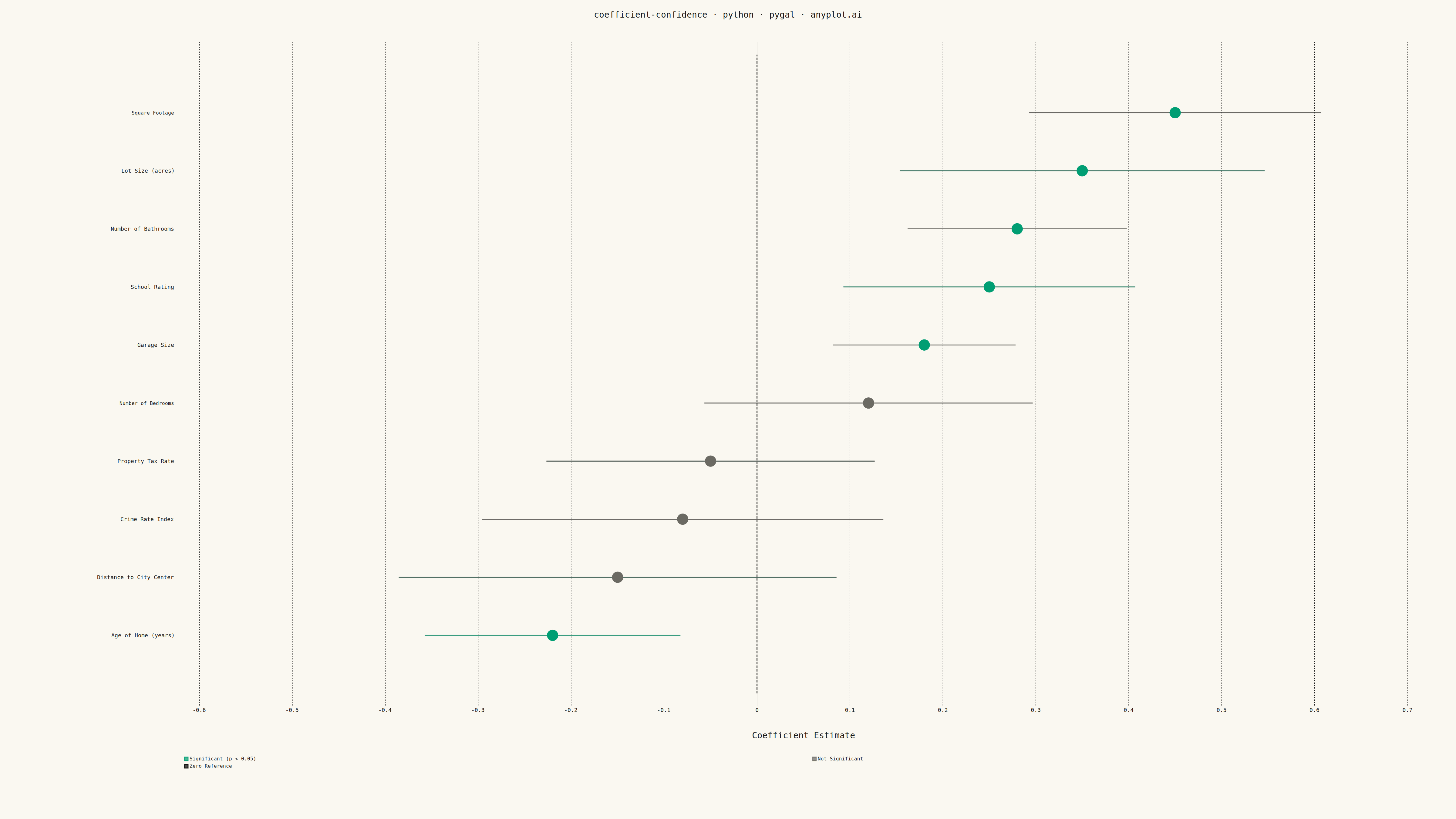
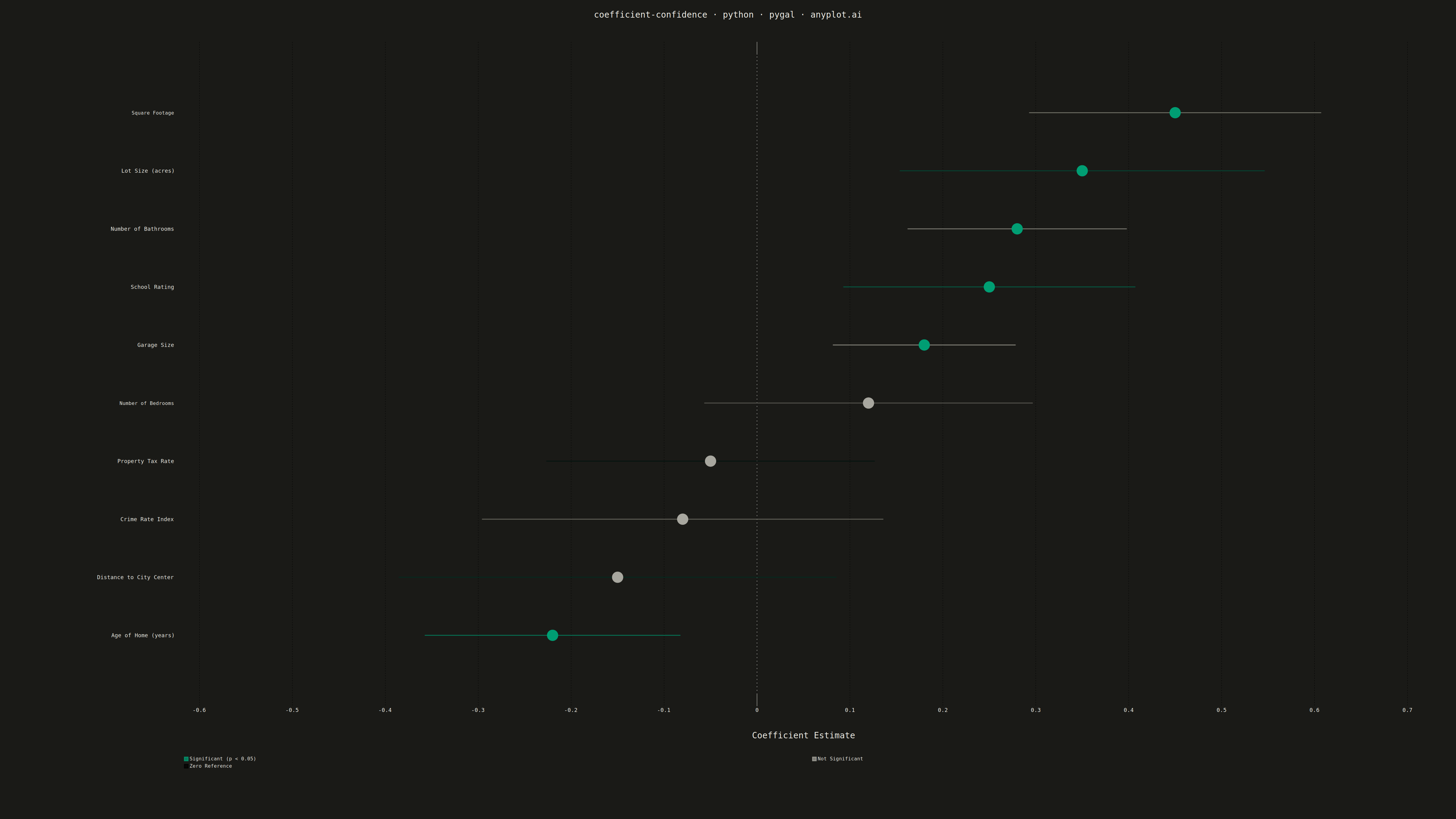
A coefficient plot displays regression coefficients as points positioned along a horizontal axis, with horizontal error bars showing confidence intervals. This visualization makes it easy to assess effect sizes and statistical significance - coefficients whose confidence intervals cross zero are not statistically significant. Typically used to summarize results from linear, logistic, or other regression models in a clear, publication-ready format.
""" anyplot.ai
coefficient-confidence: Coefficient Plot with Confidence Intervals
Library: pygal 3.1.0 | Python 3.13.13
Quality: 89/100 | Updated: 2026-05-18
"""

import os

import numpy as np
import pygal
from pygal.style import Style


# Theme tokens
THEME = os.getenv("ANYPLOT_THEME", "light")
PAGE_BG = "#FAF8F1" if THEME == "light" else "#1A1A17"
INK = "#1A1A17" if THEME == "light" else "#F0EFE8"
INK_SOFT = "#4A4A44" if THEME == "light" else "#B8B7B0"
INK_MUTED = "#6B6A63" if THEME == "light" else "#A8A79F"

# Okabe-Ito palette
BRAND = "#009E73"  # Significant coefficients (position 1 - brand green)
MUTED = INK_MUTED  # Non-significant coefficients (theme-adaptive muted)

# Data: Coefficients from a housing price regression model
np.random.seed(42)

variables = [
    "Square Footage",
    "Number of Bedrooms",
    "Number of Bathrooms",
    "Garage Size",
    "Lot Size (acres)",
    "Age of Home (years)",
    "Distance to City Center",
    "School Rating",
    "Crime Rate Index",
    "Property Tax Rate",
]

# Generate realistic coefficients
coefficients = np.array([0.45, 0.12, 0.28, 0.18, 0.35, -0.22, -0.15, 0.25, -0.08, -0.05])
std_errors = np.array([0.08, 0.09, 0.06, 0.05, 0.10, 0.07, 0.12, 0.08, 0.11, 0.09])

# Calculate 95% confidence intervals
ci_lower = coefficients - 1.96 * std_errors
ci_upper = coefficients + 1.96 * std_errors

# Determine significance (CI doesn't cross zero)
significant = (ci_lower > 0) | (ci_upper < 0)

# Sort by coefficient magnitude for easier comparison
sort_idx = np.argsort(coefficients)
variables = [variables[i] for i in sort_idx]
coefficients = coefficients[sort_idx]
ci_lower = ci_lower[sort_idx]
ci_upper = ci_upper[sort_idx]
significant = significant[sort_idx]

n_vars = len(variables)

# Custom style for theme-adaptive rendering
custom_style = Style(
    background=PAGE_BG,
    plot_background=PAGE_BG,
    foreground=INK,
    foreground_strong=INK,
    foreground_subtle=INK_MUTED,
    colors=(BRAND, MUTED),
    title_font_size=28,
    label_font_size=18,
    major_label_font_size=16,
    legend_font_size=16,
    value_font_size=14,
    stroke_width=3,
)

# Create XY chart for coefficient plot
chart = pygal.XY(
    width=4800,
    height=2700,
    style=custom_style,
    title="coefficient-confidence · python · pygal · anyplot.ai",
    x_title="Coefficient Estimate",
    show_legend=True,
    legend_at_bottom=True,
    legend_at_bottom_columns=2,
    show_y_guides=False,
    show_x_guides=True,
    dots_size=18,
    stroke=False,
    xrange=(-0.6, 0.7),
    range=(0, n_vars + 1),
    margin_top=80,
    margin_bottom=100,
    margin_left=300,
    margin_right=80,
    spacing=30,
    y_labels=[{"value": i + 1, "label": variables[i]} for i in range(n_vars)],
)

# Build data series
sig_points = []
nonsig_points = []
ci_sig = []
ci_nonsig = []

for i, (coef, lower, upper, sig) in enumerate(
    zip(coefficients, ci_lower, ci_upper, significant, strict=False)
):
    y_pos = i + 1
    if sig:
        sig_points.append((coef, y_pos))
        ci_sig.append(((lower, y_pos), (upper, y_pos)))
    else:
        nonsig_points.append((coef, y_pos))
        ci_nonsig.append(((lower, y_pos), (upper, y_pos)))

# Add point series (significant first for color order)
if sig_points:
    chart.add("Significant (p < 0.05)", sig_points, color=BRAND, dots_size=18)
if nonsig_points:
    chart.add("Not Significant", nonsig_points, color=MUTED, dots_size=18)

# Add confidence interval lines as horizontal lines
for (lower, y), (upper, y) in ci_sig:
    chart.add(
        None,
        [(lower, y), (upper, y)],
        stroke=True,
        show_dots=False,
        stroke_style={"width": 4, "linecap": "round"},
        color=BRAND,
    )

for (lower, y), (upper, y) in ci_nonsig:
    chart.add(
        None,
        [(lower, y), (upper, y)],
        stroke=True,
        show_dots=False,
        stroke_style={"width": 4, "linecap": "round"},
        color=MUTED,
    )

# Add vertical reference line at zero
zero_line = [(0, 0), (0, n_vars + 1)]
chart.add(
    "Zero Reference",
    zero_line,
    stroke=True,
    show_dots=False,
    stroke_style={"width": 3, "dasharray": "8,4"},
    color=INK_SOFT,
)

# Save outputs
chart.render_to_png(f"plot-{THEME}.png")
with open(f"plot-{THEME}.html", "wb") as f:
    f.write(chart.render())
Runnable source as JSON, for any HTTP client: https://api.anyplot.ai/specs/coefficient-confidence/pygal/code. Any spec id and library id listed in llms-full.txt fit the same URL shape; every URL below is complete and callable.
{
  "spec_id": "coefficient-confidence",
  "language": "python",
  "library": "pygal",
  "page": "https://anyplot.ai/coefficient-confidence/python/pygal",
  "hub": "https://anyplot.ai/coefficient-confidence",
  "code_json": "https://api.anyplot.ai/specs/coefficient-confidence/pygal/code",
  "spec_json": "https://api.anyplot.ai/specs/coefficient-confidence",
  "render_light_png": "https://storage.googleapis.com/anyplot-images/plots/coefficient-confidence/python/pygal/plot-light.png",
  "render_dark_png": "https://storage.googleapis.com/anyplot-images/plots/coefficient-confidence/python/pygal/plot-dark.png",
  "interactive_light_html": "https://storage.googleapis.com/anyplot-images/plots/coefficient-confidence/python/pygal/plot-light.html",
  "interactive_dark_html": "https://storage.googleapis.com/anyplot-images/plots/coefficient-confidence/python/pygal/plot-dark.html",
  "quality_score": 89.0,
  "license": "MIT",
  "guide": "https://anyplot.ai/llms.txt"
}
Part of Coefficient Plot with Confidence Intervals on anyplot.ai.