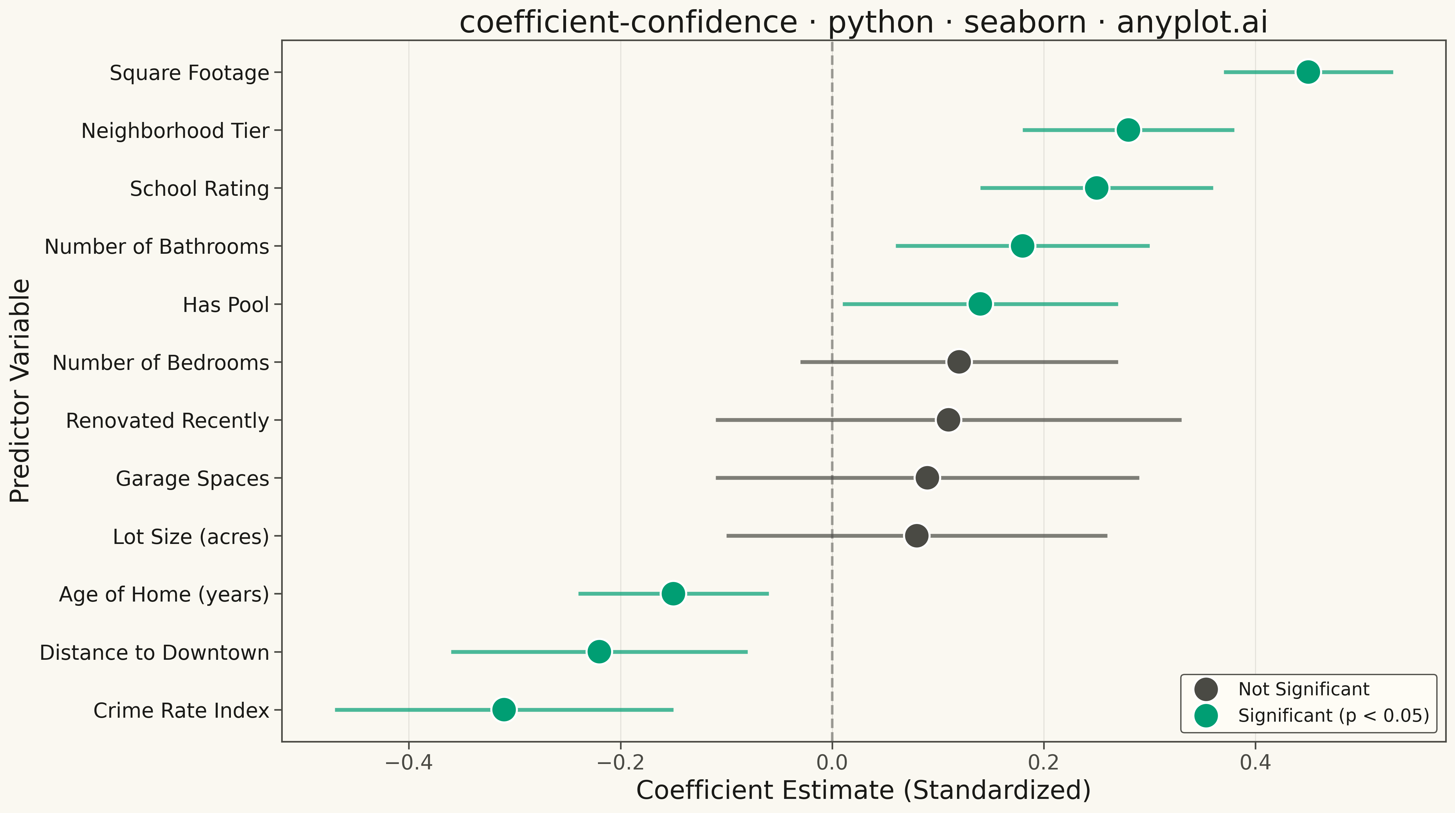
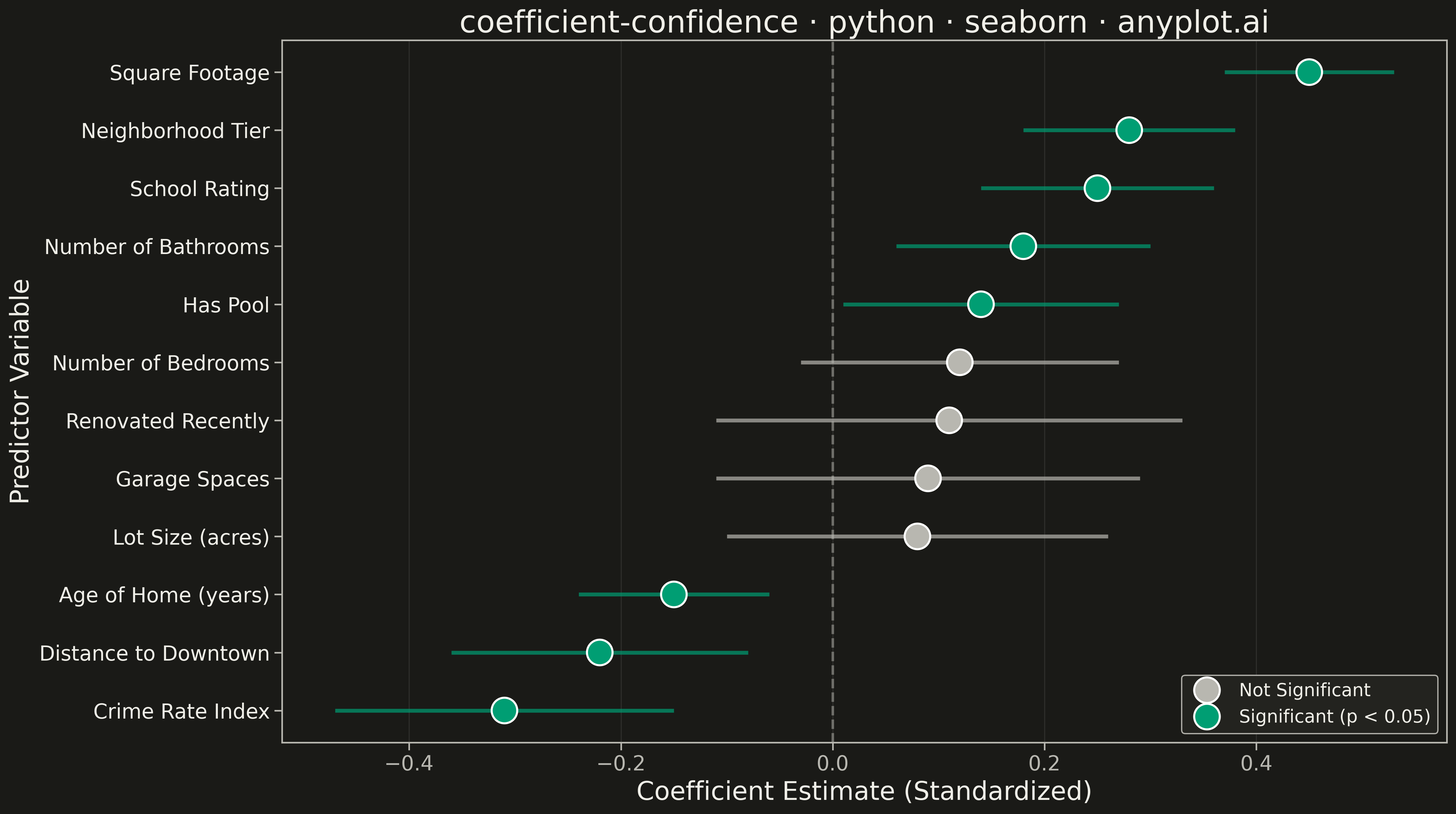
A coefficient plot displays regression coefficients as points positioned along a horizontal axis, with horizontal error bars showing confidence intervals. This visualization makes it easy to assess effect sizes and statistical significance - coefficients whose confidence intervals cross zero are not statistically significant. Typically used to summarize results from linear, logistic, or other regression models in a clear, publication-ready format.
""" anyplot.ai
coefficient-confidence: Coefficient Plot with Confidence Intervals
Library: seaborn 0.13.2 | Python 3.13.13
Quality: 87/100 | Updated: 2026-05-18
"""

import os

import matplotlib.pyplot as plt
import numpy as np
import pandas as pd
import seaborn as sns


# Theme tokens
THEME = os.getenv("ANYPLOT_THEME", "light")
PAGE_BG = "#FAF8F1" if THEME == "light" else "#1A1A17"
ELEVATED_BG = "#FFFDF6" if THEME == "light" else "#242420"
INK = "#1A1A17" if THEME == "light" else "#F0EFE8"
INK_SOFT = "#4A4A44" if THEME == "light" else "#B8B7B0"

SIGNIFICANT_COLOR = "#009E73"  # Okabe-Ito position 1 — brand green
NEUTRAL_COLOR = INK_SOFT  # Adaptive neutral for non-significant

# Data: Regression coefficients from a housing price prediction model
np.random.seed(42)

variables = [
    "Square Footage",
    "Number of Bedrooms",
    "Number of Bathrooms",
    "Lot Size (acres)",
    "Age of Home (years)",
    "Distance to Downtown",
    "School Rating",
    "Crime Rate Index",
    "Garage Spaces",
    "Has Pool",
    "Renovated Recently",
    "Neighborhood Tier",
]

# Generate realistic regression coefficients
coefficients = [0.45, 0.12, 0.18, 0.08, -0.15, -0.22, 0.25, -0.31, 0.09, 0.14, 0.11, 0.28]

# Generate confidence intervals (wider for less certain estimates)
ci_widths = [0.08, 0.15, 0.12, 0.18, 0.09, 0.14, 0.11, 0.16, 0.20, 0.13, 0.22, 0.10]
ci_lower = [c - w for c, w in zip(coefficients, ci_widths, strict=True)]
ci_upper = [c + w for c, w in zip(coefficients, ci_widths, strict=True)]

# Determine significance (CI does not cross zero)
significant = [not (low <= 0 <= high) for low, high in zip(ci_lower, ci_upper, strict=True)]

# Create DataFrame
df = pd.DataFrame(
    {
        "variable": variables,
        "coefficient": coefficients,
        "ci_lower": ci_lower,
        "ci_upper": ci_upper,
        "significant": significant,
    }
)

# Sort by coefficient magnitude for easier comparison
df = df.sort_values("coefficient", ascending=True).reset_index(drop=True)

# Configure seaborn theme
sns.set_theme(
    style="ticks",
    rc={
        "figure.facecolor": PAGE_BG,
        "axes.facecolor": PAGE_BG,
        "axes.edgecolor": INK_SOFT,
        "axes.labelcolor": INK,
        "text.color": INK,
        "xtick.color": INK_SOFT,
        "ytick.color": INK_SOFT,
        "grid.color": INK,
        "grid.alpha": 0.10,
        "legend.facecolor": ELEVATED_BG,
        "legend.edgecolor": INK_SOFT,
    },
)

# Create figure
fig, ax = plt.subplots(figsize=(16, 9), facecolor=PAGE_BG)
ax.set_facecolor(PAGE_BG)

# Assign colors based on significance
colors = [SIGNIFICANT_COLOR if sig else NEUTRAL_COLOR for sig in df["significant"]]

# Plot error bars (confidence intervals)
y_positions = np.arange(len(df))
for i, row in df.iterrows():
    color = SIGNIFICANT_COLOR if row["significant"] else NEUTRAL_COLOR
    ax.hlines(y=i, xmin=row["ci_lower"], xmax=row["ci_upper"], color=color, linewidth=3, alpha=0.7)

# Plot coefficient points
scatter_df = df.copy()
scatter_df["y_pos"] = y_positions

sns.scatterplot(
    data=scatter_df,
    x="coefficient",
    y="y_pos",
    hue="significant",
    palette={True: SIGNIFICANT_COLOR, False: NEUTRAL_COLOR},
    s=400,
    ax=ax,
    legend=True,
    zorder=5,
)

# Add vertical reference line at zero
ax.axvline(x=0, color=INK_SOFT, linewidth=2, linestyle="--", alpha=0.5, zorder=1)

# Set y-axis labels to variable names
ax.set_yticks(y_positions)
ax.set_yticklabels(df["variable"], fontsize=16, color=INK)

# Styling
ax.set_xlabel("Coefficient Estimate (Standardized)", fontsize=20, color=INK)
ax.set_ylabel("Predictor Variable", fontsize=20, color=INK)
ax.set_title("coefficient-confidence · python · seaborn · anyplot.ai", fontsize=24, fontweight="medium", color=INK)
ax.tick_params(axis="x", labelsize=16, colors=INK_SOFT)
ax.grid(True, axis="x", alpha=0.10, linewidth=0.8, color=INK)

# Update legend with correct label order
handles, labels = ax.get_legend_handles_labels()
ax.legend(handles, ["Not Significant", "Significant (p < 0.05)"], fontsize=14, loc="lower right", framealpha=0.95)

plt.tight_layout()
plt.savefig(f"plot-{THEME}.png", dpi=300, bbox_inches="tight", facecolor=PAGE_BG)
Runnable source as JSON, for any HTTP client: https://api.anyplot.ai/specs/coefficient-confidence/seaborn/code. Any spec id and library id listed in llms-full.txt fit the same URL shape; every URL below is complete and callable.
{
  "spec_id": "coefficient-confidence",
  "language": "python",
  "library": "seaborn",
  "page": "https://anyplot.ai/coefficient-confidence/python/seaborn",
  "hub": "https://anyplot.ai/coefficient-confidence",
  "code_json": "https://api.anyplot.ai/specs/coefficient-confidence/seaborn/code",
  "spec_json": "https://api.anyplot.ai/specs/coefficient-confidence",
  "render_light_png": "https://storage.googleapis.com/anyplot-images/plots/coefficient-confidence/python/seaborn/plot-light.png",
  "render_dark_png": "https://storage.googleapis.com/anyplot-images/plots/coefficient-confidence/python/seaborn/plot-dark.png",
  "quality_score": 87.0,
  "license": "MIT",
  "guide": "https://anyplot.ai/llms.txt"
}
Part of Coefficient Plot with Confidence Intervals on anyplot.ai.