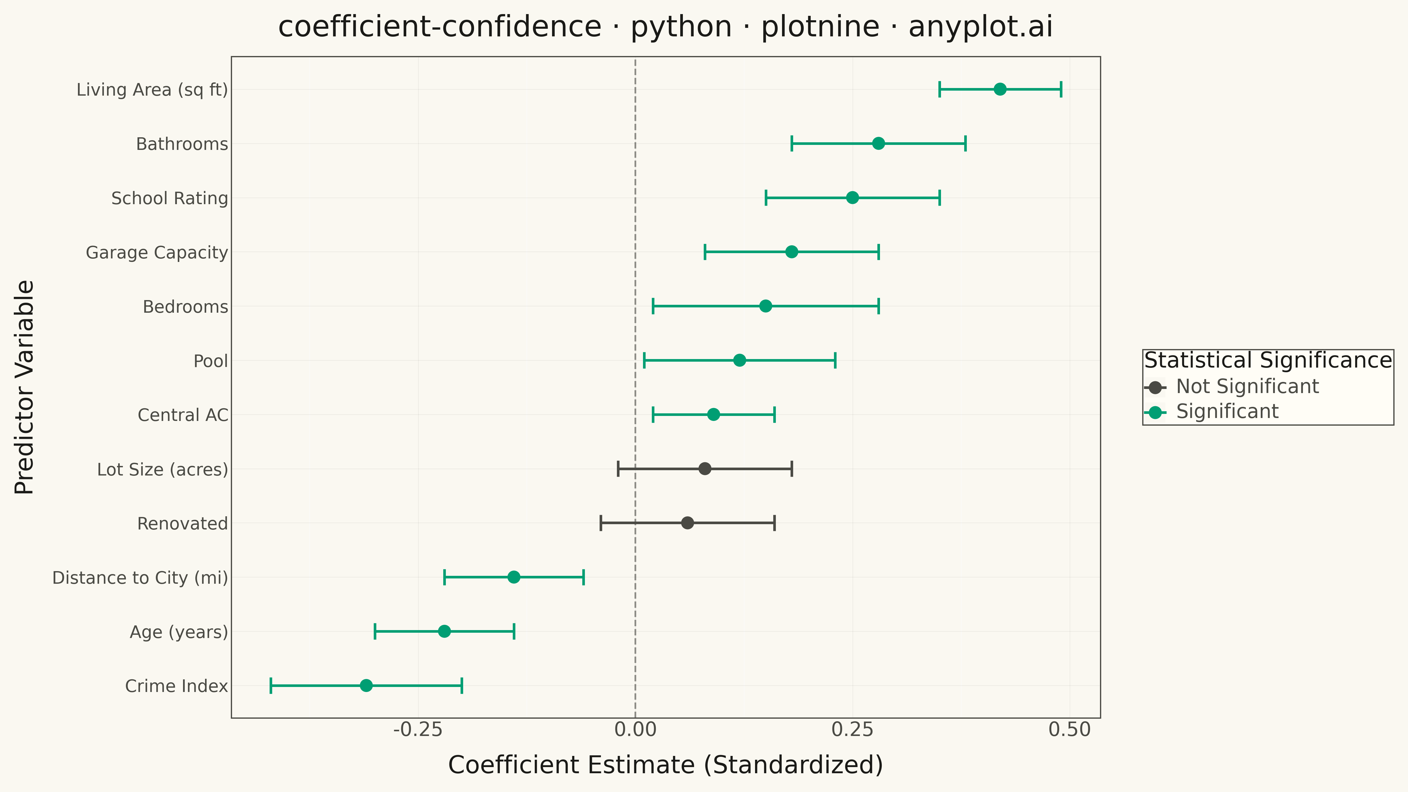
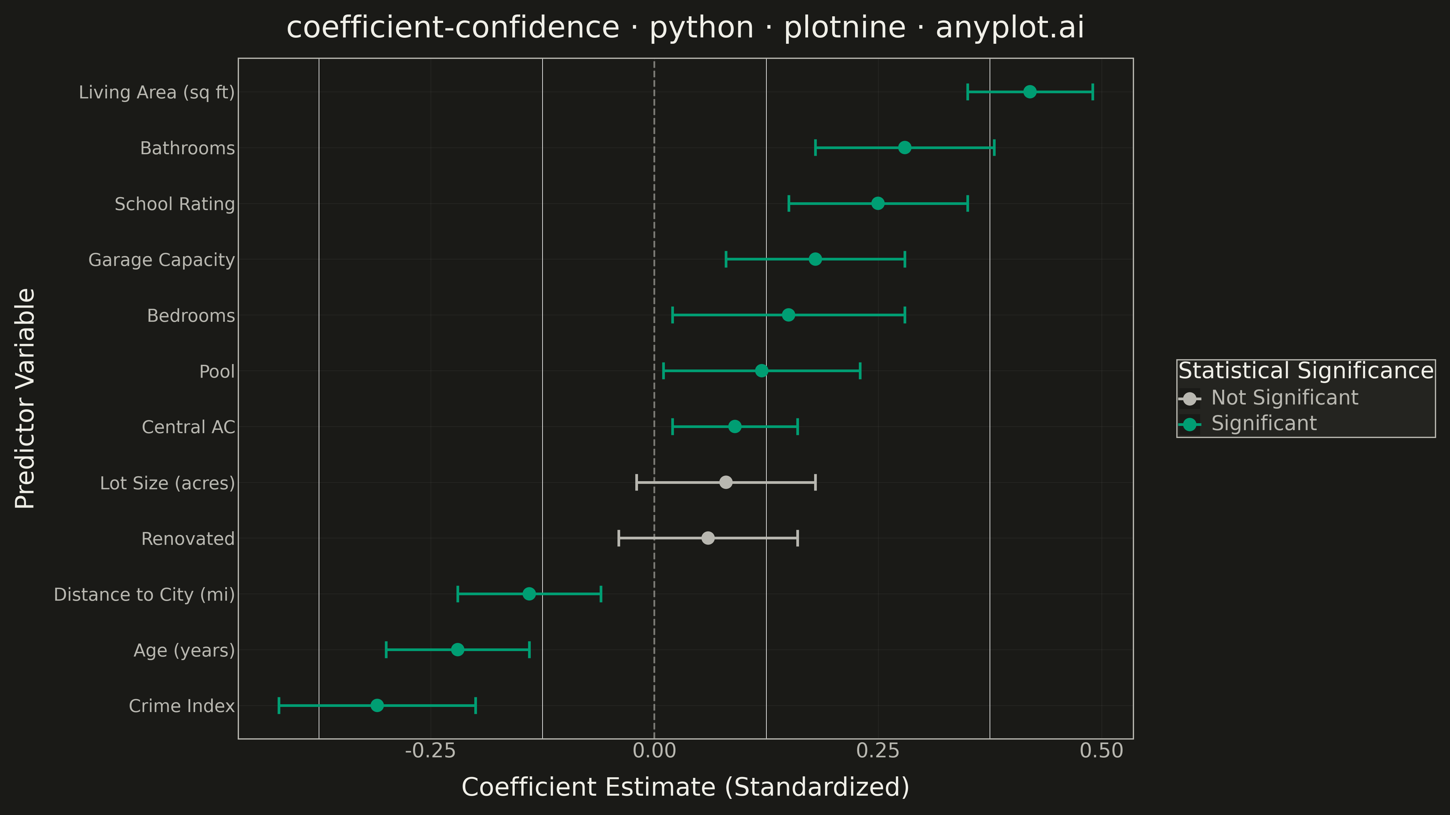
A coefficient plot displays regression coefficients as points positioned along a horizontal axis, with horizontal error bars showing confidence intervals. This visualization makes it easy to assess effect sizes and statistical significance - coefficients whose confidence intervals cross zero are not statistically significant. Typically used to summarize results from linear, logistic, or other regression models in a clear, publication-ready format.
""" anyplot.ai
coefficient-confidence: Coefficient Plot with Confidence Intervals
Library: plotnine 0.15.4 | Python 3.13.13
Quality: 84/100 | Updated: 2026-05-18
"""

import os

import numpy as np
import pandas as pd
from plotnine import (
    aes,
    element_line,
    element_rect,
    element_text,
    geom_errorbarh,
    geom_point,
    geom_vline,
    ggplot,
    labs,
    scale_color_manual,
    theme,
    theme_minimal,
)


# Theme tokens
THEME = os.getenv("ANYPLOT_THEME", "light")
PAGE_BG = "#FAF8F1" if THEME == "light" else "#1A1A17"
ELEVATED_BG = "#FFFDF6" if THEME == "light" else "#242420"
INK = "#1A1A17" if THEME == "light" else "#F0EFE8"
INK_SOFT = "#4A4A44" if THEME == "light" else "#B8B7B0"

# Okabe-Ito palette
IMPRINT = ["#009E73", "#C475FD", "#4467A3", "#BD8233", "#AE3030", "#2ABCCD", "#954477"]

# Data: Coefficients from a housing price regression model
np.random.seed(42)
data = {
    "variable": [
        "Living Area (sq ft)",
        "Bedrooms",
        "Bathrooms",
        "Garage Capacity",
        "Lot Size (acres)",
        "Age (years)",
        "Distance to City (mi)",
        "School Rating",
        "Crime Index",
        "Pool",
        "Central AC",
        "Renovated",
    ],
    "coefficient": [0.42, 0.15, 0.28, 0.18, 0.08, -0.22, -0.14, 0.25, -0.31, 0.12, 0.09, 0.06],
    "ci_lower": [0.35, 0.02, 0.18, 0.08, -0.02, -0.30, -0.22, 0.15, -0.42, 0.01, 0.02, -0.04],
    "ci_upper": [0.49, 0.28, 0.38, 0.28, 0.18, -0.14, -0.06, 0.35, -0.20, 0.23, 0.16, 0.16],
}

df = pd.DataFrame(data)

# Determine significance (CI does not cross zero)
df["significant"] = ~((df["ci_lower"] <= 0) & (df["ci_upper"] >= 0))
df["significance"] = df["significant"].map({True: "Significant", False: "Not Significant"})

# Order variables by coefficient magnitude for readability
df["variable"] = pd.Categorical(
    df["variable"], categories=df.sort_values("coefficient")["variable"].tolist(), ordered=True
)

# Theme-adaptive colors for significance
sig_colors = {
    "Significant": IMPRINT[0],  # Brand green
    "Not Significant": INK_SOFT,  # Theme-adaptive soft ink
}

# Create plot
plot = (
    ggplot(df, aes(x="coefficient", y="variable", color="significance"))
    + geom_vline(xintercept=0, linetype="dashed", color=INK_SOFT, size=0.8, alpha=0.6)
    + geom_errorbarh(aes(xmin="ci_lower", xmax="ci_upper"), height=0.3, size=1.2)
    + geom_point(size=5)
    + scale_color_manual(values=sig_colors)
    + labs(
        x="Coefficient Estimate (Standardized)",
        y="Predictor Variable",
        title="coefficient-confidence · python · plotnine · anyplot.ai",
        color="Statistical Significance",
    )
    + theme_minimal()
    + theme(
        figure_size=(16, 9),
        plot_background=element_rect(fill=PAGE_BG, color=PAGE_BG),
        panel_background=element_rect(fill=PAGE_BG),
        panel_grid_major_y=element_line(color=INK, size=0.3, alpha=0.10),
        panel_grid_major_x=element_line(color=INK, size=0.3, alpha=0.10),
        panel_border=element_rect(color=INK_SOFT, fill=None),
        axis_title=element_text(size=20, color=INK),
        axis_text=element_text(size=16, color=INK_SOFT),
        axis_text_y=element_text(size=14, color=INK_SOFT),
        axis_line=element_line(color=INK_SOFT, size=0.4),
        plot_title=element_text(size=24, color=INK),
        legend_background=element_rect(fill=ELEVATED_BG, color=INK_SOFT),
        legend_text=element_text(size=16, color=INK_SOFT),
        legend_title=element_text(size=18, color=INK),
        legend_position="right",
    )
)

# Save
plot.save(f"plot-{THEME}.png", dpi=300)
Runnable source as JSON, for any HTTP client: https://api.anyplot.ai/specs/coefficient-confidence/plotnine/code. Any spec id and library id listed in llms-full.txt fit the same URL shape; every URL below is complete and callable.
{
  "spec_id": "coefficient-confidence",
  "language": "python",
  "library": "plotnine",
  "page": "https://anyplot.ai/coefficient-confidence/python/plotnine",
  "hub": "https://anyplot.ai/coefficient-confidence",
  "code_json": "https://api.anyplot.ai/specs/coefficient-confidence/plotnine/code",
  "spec_json": "https://api.anyplot.ai/specs/coefficient-confidence",
  "render_light_png": "https://storage.googleapis.com/anyplot-images/plots/coefficient-confidence/python/plotnine/plot-light.png",
  "render_dark_png": "https://storage.googleapis.com/anyplot-images/plots/coefficient-confidence/python/plotnine/plot-dark.png",
  "quality_score": 84.0,
  "license": "MIT",
  "guide": "https://anyplot.ai/llms.txt"
}
Part of Coefficient Plot with Confidence Intervals on anyplot.ai.