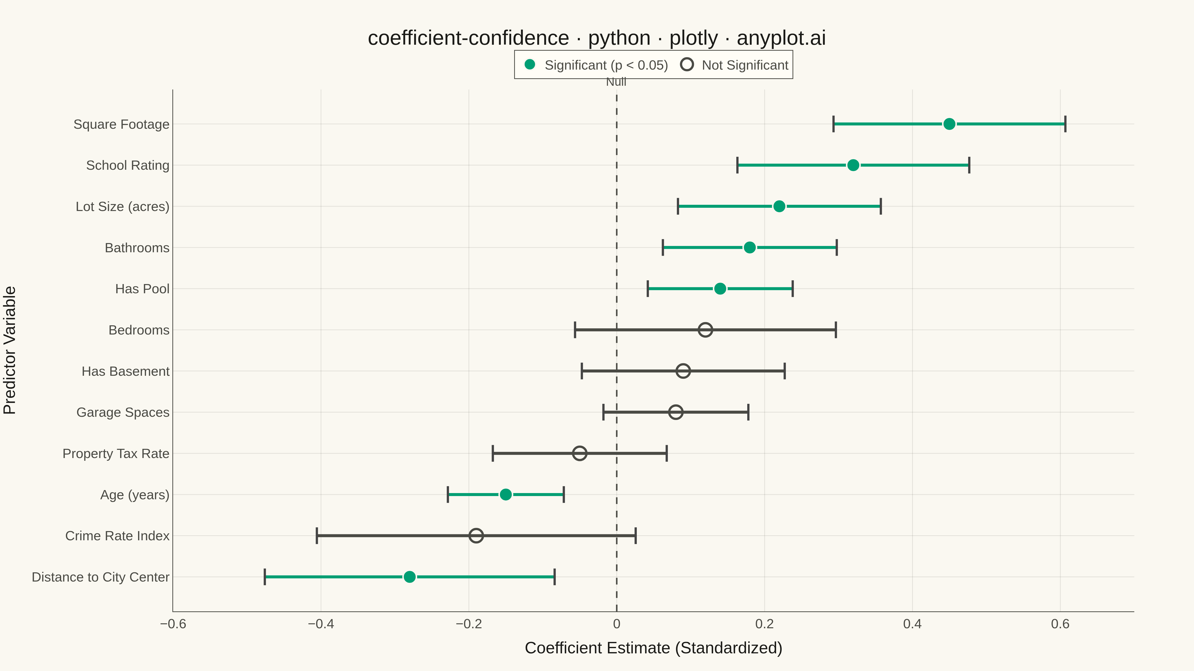
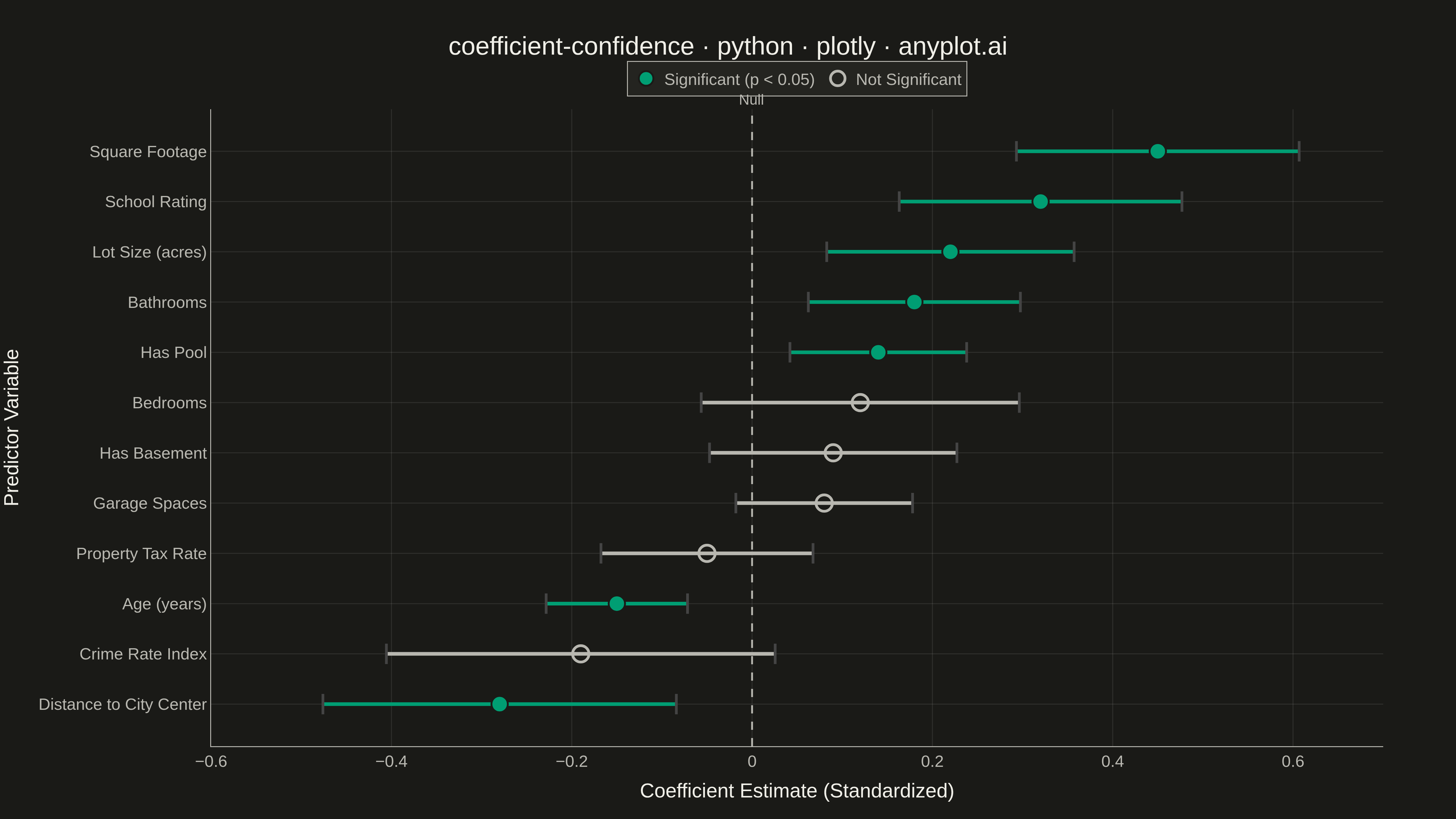
A coefficient plot displays regression coefficients as points positioned along a horizontal axis, with horizontal error bars showing confidence intervals. This visualization makes it easy to assess effect sizes and statistical significance - coefficients whose confidence intervals cross zero are not statistically significant. Typically used to summarize results from linear, logistic, or other regression models in a clear, publication-ready format.
""" anyplot.ai
coefficient-confidence: Coefficient Plot with Confidence Intervals
Library: plotly 6.7.0 | Python 3.13.13
Quality: 87/100 | Updated: 2026-05-18
"""

import os

import numpy as np
import plotly.graph_objects as go


# Theme-adaptive colors
THEME = os.getenv("ANYPLOT_THEME", "light")
PAGE_BG = "#FAF8F1" if THEME == "light" else "#1A1A17"
ELEVATED_BG = "#FFFDF6" if THEME == "light" else "#242420"
INK = "#1A1A17" if THEME == "light" else "#F0EFE8"
INK_SOFT = "#4A4A44" if THEME == "light" else "#B8B7B0"
GRID = "rgba(26,26,23,0.10)" if THEME == "light" else "rgba(240,239,232,0.10)"
BRAND = "#009E73"  # Okabe-Ito position 1

# Data: Housing price regression coefficients
np.random.seed(42)

variables = [
    "Square Footage",
    "Bedrooms",
    "Bathrooms",
    "Garage Spaces",
    "Lot Size (acres)",
    "Age (years)",
    "Distance to City Center",
    "School Rating",
    "Crime Rate Index",
    "Property Tax Rate",
    "Has Pool",
    "Has Basement",
]

# Generate realistic regression coefficients with varying significance
coefficients = np.array([0.45, 0.12, 0.18, 0.08, 0.22, -0.15, -0.28, 0.32, -0.19, -0.05, 0.14, 0.09])
standard_errors = np.array([0.08, 0.09, 0.06, 0.05, 0.07, 0.04, 0.10, 0.08, 0.11, 0.06, 0.05, 0.07])

# 95% confidence intervals
ci_lower = coefficients - 1.96 * standard_errors
ci_upper = coefficients + 1.96 * standard_errors

# Determine significance (CI does not cross zero)
significant = (ci_lower > 0) | (ci_upper < 0)

# Sort by coefficient magnitude for better visualization
sort_idx = np.argsort(coefficients)
variables = [variables[i] for i in sort_idx]
coefficients = coefficients[sort_idx]
ci_lower = ci_lower[sort_idx]
ci_upper = ci_upper[sort_idx]
significant = significant[sort_idx]

# Colors based on significance
colors = [BRAND if sig else INK_SOFT for sig in significant]
marker_symbols = ["circle" if sig else "circle-open" for sig in significant]

# Create figure
fig = go.Figure()

# Add error bars (confidence intervals)
for i in range(len(variables)):
    # Error bar line
    fig.add_trace(
        go.Scatter(
            x=[ci_lower[i], ci_upper[i]],
            y=[variables[i], variables[i]],
            mode="lines",
            line={"color": colors[i], "width": 4},
            showlegend=False,
            hoverinfo="skip",
        )
    )

    # End caps for error bars
    fig.add_trace(
        go.Scatter(
            x=[ci_lower[i], ci_upper[i]],
            y=[variables[i], variables[i]],
            mode="markers",
            marker={"symbol": "line-ns", "size": 16, "color": colors[i], "line": {"width": 3}},
            showlegend=False,
            hoverinfo="skip",
        )
    )

# Add coefficient points
fig.add_trace(
    go.Scatter(
        x=coefficients[significant],
        y=[variables[i] for i in range(len(variables)) if significant[i]],
        mode="markers",
        marker={"size": 18, "color": BRAND, "line": {"width": 2, "color": PAGE_BG}},
        name="Significant (p < 0.05)",
        hovertemplate="%{y}<br>Coefficient: %{x:.3f}<extra></extra>",
    )
)

fig.add_trace(
    go.Scatter(
        x=coefficients[~significant],
        y=[variables[i] for i in range(len(variables)) if not significant[i]],
        mode="markers",
        marker={"size": 18, "color": INK_SOFT, "symbol": "circle-open", "line": {"width": 3, "color": INK_SOFT}},
        name="Not Significant",
        hovertemplate="%{y}<br>Coefficient: %{x:.3f}<extra></extra>",
    )
)

# Add vertical reference line at zero
fig.add_vline(
    x=0,
    line={"color": INK_SOFT, "width": 2, "dash": "dash"},
    annotation_text="Null",
    annotation_position="top",
    annotation_font={"size": 16, "color": INK_SOFT},
)

# Layout
fig.update_layout(
    title={
        "text": "coefficient-confidence · python · plotly · anyplot.ai",
        "font": {"size": 28, "color": INK},
        "x": 0.5,
        "xanchor": "center",
    },
    xaxis={
        "title": {"text": "Coefficient Estimate (Standardized)", "font": {"size": 22, "color": INK}},
        "tickfont": {"size": 18, "color": INK_SOFT},
        "zeroline": False,
        "gridcolor": GRID,
        "range": [-0.6, 0.7],
        "linecolor": INK_SOFT,
        "zerolinecolor": INK_SOFT,
    },
    yaxis={
        "title": {"text": "Predictor Variable", "font": {"size": 22, "color": INK}},
        "tickfont": {"size": 18, "color": INK_SOFT},
        "gridcolor": GRID,
        "linecolor": INK_SOFT,
        "zerolinecolor": INK_SOFT,
    },
    paper_bgcolor=PAGE_BG,
    plot_bgcolor=PAGE_BG,
    font={"color": INK},
    legend={
        "orientation": "h",
        "yanchor": "bottom",
        "y": 1.02,
        "xanchor": "center",
        "x": 0.5,
        "font": {"size": 18, "color": INK_SOFT},
        "bgcolor": ELEVATED_BG,
        "bordercolor": INK_SOFT,
        "borderwidth": 1,
    },
    margin={"l": 200, "r": 80, "t": 120, "b": 80},
)

# Save as PNG (4800x2700)
fig.write_image(f"plot-{THEME}.png", width=1600, height=900, scale=3)

# Save as HTML for interactivity
fig.write_html(f"plot-{THEME}.html", include_plotlyjs="cdn")
Runnable source as JSON, for any HTTP client: https://api.anyplot.ai/specs/coefficient-confidence/plotly/code. Any spec id and library id listed in llms-full.txt fit the same URL shape; every URL below is complete and callable.
{
  "spec_id": "coefficient-confidence",
  "language": "python",
  "library": "plotly",
  "page": "https://anyplot.ai/coefficient-confidence/python/plotly",
  "hub": "https://anyplot.ai/coefficient-confidence",
  "code_json": "https://api.anyplot.ai/specs/coefficient-confidence/plotly/code",
  "spec_json": "https://api.anyplot.ai/specs/coefficient-confidence",
  "render_light_png": "https://storage.googleapis.com/anyplot-images/plots/coefficient-confidence/python/plotly/plot-light.png",
  "render_dark_png": "https://storage.googleapis.com/anyplot-images/plots/coefficient-confidence/python/plotly/plot-dark.png",
  "interactive_light_html": "https://storage.googleapis.com/anyplot-images/plots/coefficient-confidence/python/plotly/plot-light.html",
  "interactive_dark_html": "https://storage.googleapis.com/anyplot-images/plots/coefficient-confidence/python/plotly/plot-dark.html",
  "quality_score": 87.0,
  "license": "MIT",
  "guide": "https://anyplot.ai/llms.txt"
}
Part of Coefficient Plot with Confidence Intervals on anyplot.ai.