The same plot in 14 other libraries — Python: Altair, Bokeh, lets-plot, Matplotlib, Plotly, plotnine, Pygal, Seaborn; R: ggplot2; JavaScript: Chart.js, D3.js, Apache ECharts, Highcharts, MUI X Charts. Compare all 15 side by side: Filled Contour Plot in Python, R, Julia and JavaScript.
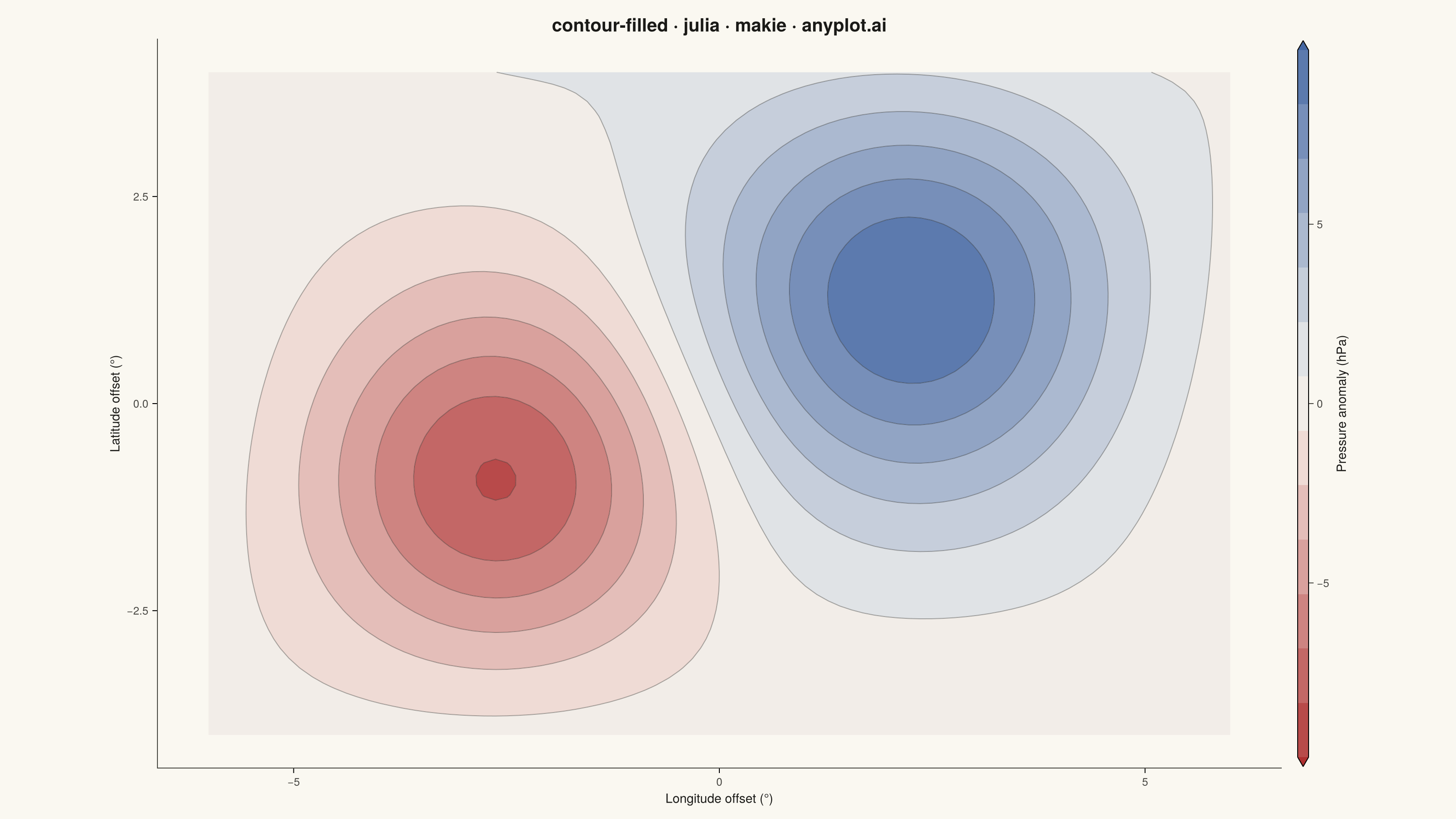
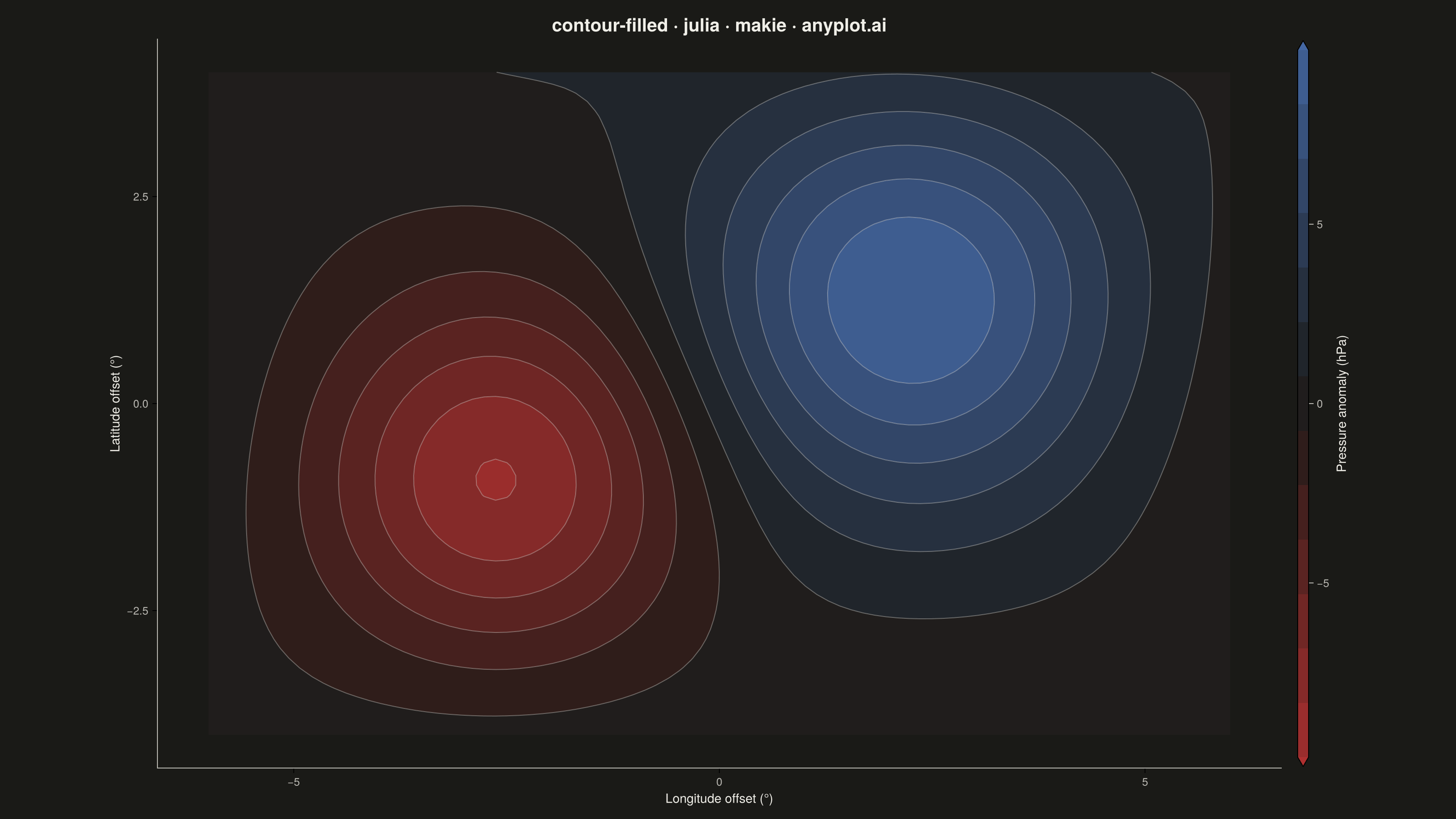
A filled contour plot displays colored regions between level curves of a 2D scalar field, creating a smooth gradient visualization of continuous data. Unlike basic contour plots that show only isolines, filled contours use color bands to represent value ranges, making it easier to perceive gradual changes and identify regions of similar magnitude. This visualization is particularly effective for showing how a quantity varies continuously across a 2D surface.
# anyplot.ai
# contour-filled: Filled Contour Plot
# Library: makie 0.21.9 | Julia 1.11.9
# Quality: 91/100 | Created: 2026-09-04

using CairoMakie
using Colors

# --- Theme tokens -----------------------------------------------------------
THEME     = get(ENV, "ANYPLOT_THEME", "light")
PAGE_BG   = THEME == "light" ? colorant"#FAF8F1" : colorant"#1A1A17"
INK       = THEME == "light" ? colorant"#1A1A17" : colorant"#F0EFE8"
INK_SOFT  = THEME == "light" ? colorant"#4A4A44" : colorant"#B8B7B0"
_midpoint = THEME == "light" ? colorant"#FAF8F1" : colorant"#1A1A17"
ANYPLOT_DIV = cgrad([colorant"#AE3030", _midpoint, colorant"#4467A3"])

# --- Data --------------------------------------------------------------------
# Sea-level pressure anomaly (hPa) over a synthetic regional grid: a high-pressure
# ridge and a low-pressure trough embedded in gentle background wave activity.
lon = range(-6.0, 6.0, length=90)
lat = range(-4.0, 4.0, length=70)
pressure_anomaly = [
    9.0 * exp(-((x - 2.2)^2 + (y - 1.4)^2) / 6.0) -
    7.5 * exp(-((x + 2.6)^2 + (y + 1.0)^2) / 4.5) +
    1.2 * sin(x / 1.6) * cos(y / 1.8)
    for x in lon, y in lat
]

n_levels = 14
z_max = maximum(abs, pressure_anomaly)
levels = range(-z_max, z_max, length=n_levels)

# --- Plot ---------------------------------------------------------------------
fig = Figure(
    resolution      = (1600, 900),
    fontsize        = 14,
    backgroundcolor = PAGE_BG,
)

ax = Axis(
    fig[1, 1];
    title             = "contour-filled · julia · makie · anyplot.ai",
    titlesize         = 20,
    titlecolor        = INK,
    xlabel            = "Longitude offset (°)",
    ylabel            = "Latitude offset (°)",
    xlabelsize        = 14,
    ylabelsize        = 14,
    xlabelcolor       = INK,
    ylabelcolor       = INK,
    xticklabelsize    = 12,
    yticklabelsize    = 12,
    xticklabelcolor   = INK_SOFT,
    yticklabelcolor   = INK_SOFT,
    backgroundcolor   = PAGE_BG,
    topspinevisible    = false,
    rightspinevisible  = false,
    leftspinecolor     = INK_SOFT,
    bottomspinecolor   = INK_SOFT,
    xgridvisible       = false,
    ygridvisible       = false,
)

cf = contourf!(
    ax, lon, lat, pressure_anomaly;
    levels = levels,
    colormap = ANYPLOT_DIV,
    extendlow = :auto,
    extendhigh = :auto,
)

contour!(
    ax, lon, lat, pressure_anomaly;
    levels = levels,
    color = (INK, 0.35),
    linewidth = 1.0,
)

Colorbar(
    fig[1, 2], cf;
    label            = "Pressure anomaly (hPa)",
    labelsize        = 14,
    labelcolor       = INK,
    ticklabelsize    = 12,
    ticklabelcolor   = INK_SOFT,
    tickcolor        = INK_SOFT,
)

colsize!(fig.layout, 1, Relative(0.85))

# --- Save ----------------------------------------------------------------------
save("plot-$(THEME).png", fig; px_per_unit = 2)
Runnable source as JSON, for any HTTP client: https://api.anyplot.ai/specs/contour-filled/makie/code. Any spec id and library id listed in llms-full.txt fit the same URL shape; every URL below is complete and callable.
{
  "spec_id": "contour-filled",
  "language": "julia",
  "library": "makie",
  "page": "https://anyplot.ai/contour-filled/julia/makie",
  "hub": "https://anyplot.ai/contour-filled",
  "code_json": "https://api.anyplot.ai/specs/contour-filled/makie/code",
  "spec_json": "https://api.anyplot.ai/specs/contour-filled",
  "render_light_png": "https://storage.googleapis.com/anyplot-images/plots/contour-filled/julia/makie/plot-light.png",
  "render_dark_png": "https://storage.googleapis.com/anyplot-images/plots/contour-filled/julia/makie/plot-dark.png",
  "quality_score": 91.0,
  "license": "MIT",
  "guide": "https://anyplot.ai/llms.txt"
}
Part of Filled Contour Plot on anyplot.ai.