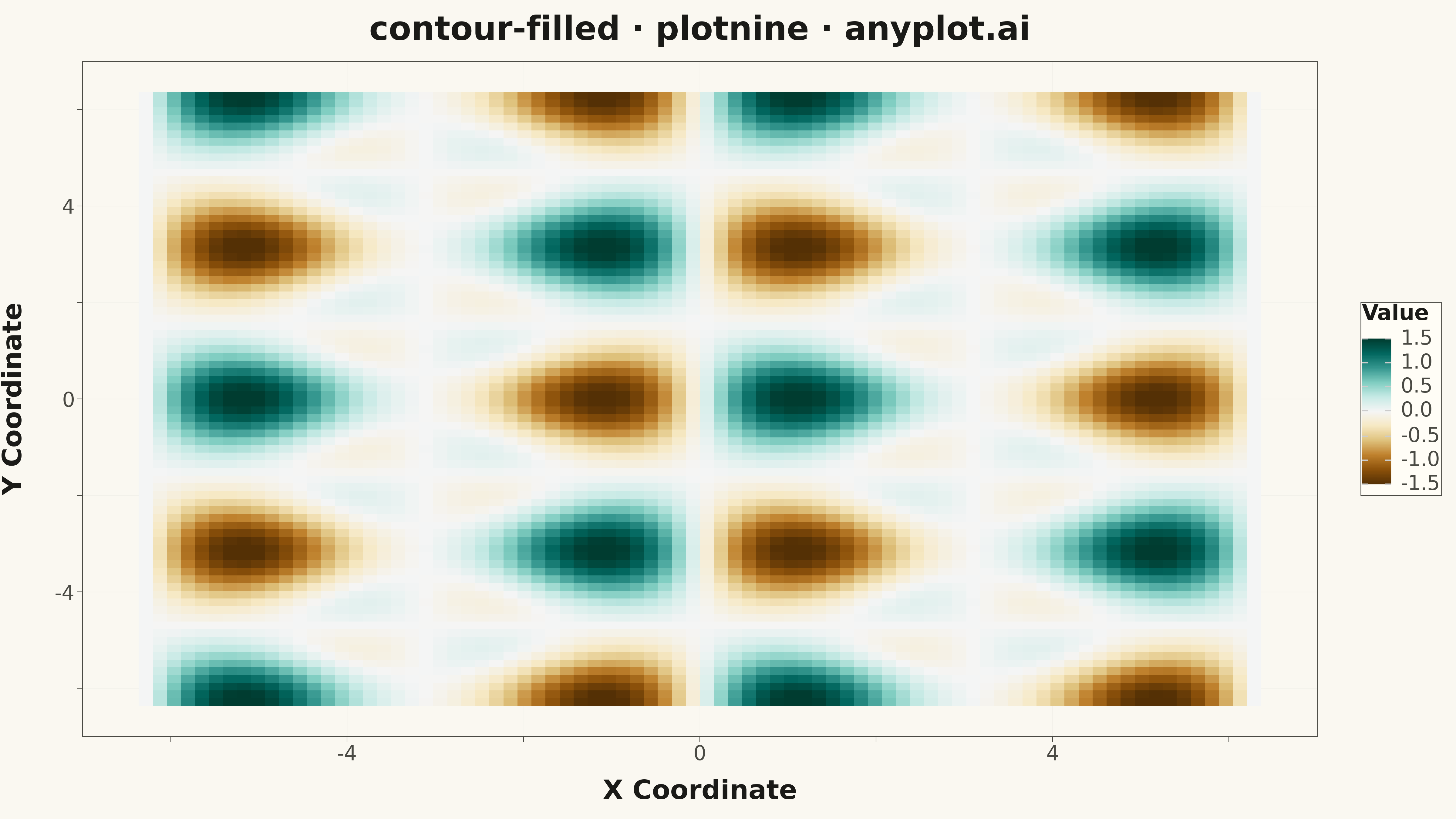
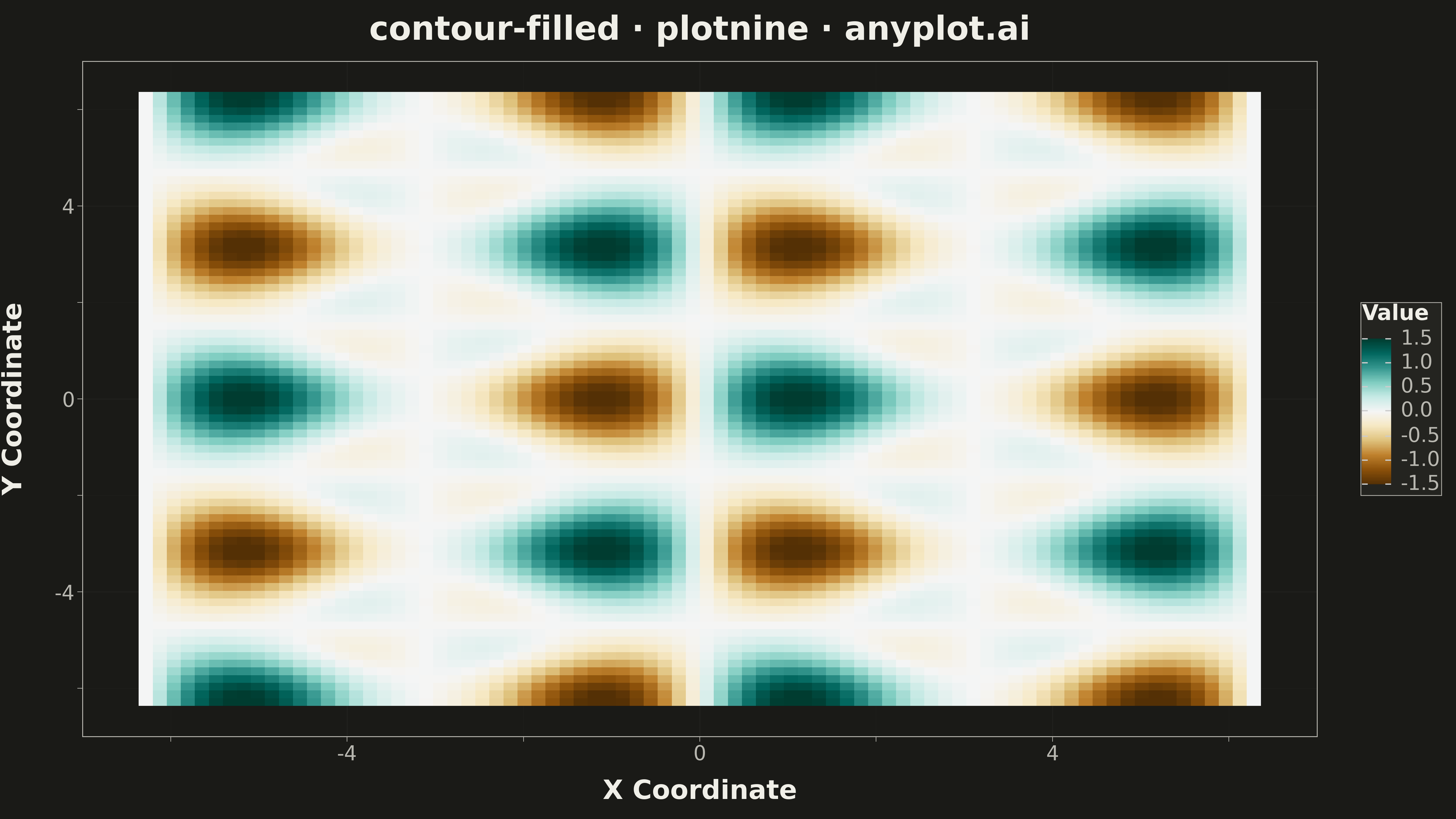
A filled contour plot displays colored regions between level curves of a 2D scalar field, creating a smooth gradient visualization of continuous data. Unlike basic contour plots that show only isolines, filled contours use color bands to represent value ranges, making it easier to perceive gradual changes and identify regions of similar magnitude. This visualization is particularly effective for showing how a quantity varies continuously across a 2D surface.
""" anyplot.ai
contour-filled: Filled Contour Plot
Library: plotnine 0.15.4 | Python 3.13.13
Quality: 88/100 | Updated: 2026-05-11
"""

import os

import numpy as np
import pandas as pd
from plotnine import aes, element_line, element_rect, element_text, geom_tile, ggplot, labs, scale_fill_cmap, theme


# Theme tokens
THEME = os.getenv("ANYPLOT_THEME", "light")
PAGE_BG = "#FAF8F1" if THEME == "light" else "#1A1A17"
ELEVATED_BG = "#FFFDF6" if THEME == "light" else "#242420"
INK = "#1A1A17" if THEME == "light" else "#F0EFE8"
INK_SOFT = "#4A4A44" if THEME == "light" else "#B8B7B0"

# Data - Sinusoidal waves: a distinct pattern different from Gaussian peaks
x = np.linspace(-2 * np.pi, 2 * np.pi, 80)
y = np.linspace(-2 * np.pi, 2 * np.pi, 80)
X, Y = np.meshgrid(x, y)

# Create a wavy surface combining sine and cosine with interference patterns
Z = (
    np.sin(X) * np.cos(Y)  # Primary oscillatory pattern
    + 0.5 * np.sin(2 * X) * np.cos(Y)  # Secondary harmonic
    + 0.3 * np.cos(3 * Y) * np.sin(X)  # Tertiary component
)

# Convert to long-format DataFrame for plotnine
df = pd.DataFrame({"x": X.ravel(), "y": Y.ravel(), "z": Z.ravel()})

# Custom theme with theme-adaptive chrome
anyplot_theme = theme(
    plot_background=element_rect(fill=PAGE_BG, color=PAGE_BG),
    panel_background=element_rect(fill=PAGE_BG),
    panel_grid_major=element_line(color=INK, size=0.3, alpha=0.10),
    panel_grid_minor=element_line(color=INK, size=0.2, alpha=0.05),
    panel_border=element_rect(color=INK_SOFT, fill=None),
    axis_title=element_text(color=INK, size=20),
    axis_text=element_text(color=INK_SOFT, size=16),
    axis_line=element_line(color=INK_SOFT, size=0.5),
    plot_title=element_text(color=INK, size=24),
    legend_background=element_rect(fill=ELEVATED_BG, color=INK_SOFT),
    legend_text=element_text(color=INK_SOFT, size=16),
    legend_title=element_text(color=INK, size=16),
    figure_size=(16, 9),
)

# Create filled contour visualization using geom_tile
plot = (
    ggplot(df, aes(x="x", y="y", fill="z"))
    + geom_tile()
    + scale_fill_cmap(cmap_name="BrBG", name="Value")
    + labs(x="X Coordinate", y="Y Coordinate", title="contour-filled · plotnine · anyplot.ai")
    + anyplot_theme
)

# Save
plot.save(f"plot-{THEME}.png", dpi=300, width=16, height=9)
Runnable source as JSON, for any HTTP client: https://api.anyplot.ai/specs/contour-filled/plotnine/code. Any spec id and library id listed in llms-full.txt fit the same URL shape; every URL below is complete and callable.
{
  "spec_id": "contour-filled",
  "language": "python",
  "library": "plotnine",
  "page": "https://anyplot.ai/contour-filled/python/plotnine",
  "hub": "https://anyplot.ai/contour-filled",
  "code_json": "https://api.anyplot.ai/specs/contour-filled/plotnine/code",
  "spec_json": "https://api.anyplot.ai/specs/contour-filled",
  "render_light_png": "https://storage.googleapis.com/anyplot-images/plots/contour-filled/python/plotnine/plot-light.png",
  "render_dark_png": "https://storage.googleapis.com/anyplot-images/plots/contour-filled/python/plotnine/plot-dark.png",
  "quality_score": 88.0,
  "license": "MIT",
  "guide": "https://anyplot.ai/llms.txt"
}
Part of Filled Contour Plot on anyplot.ai.