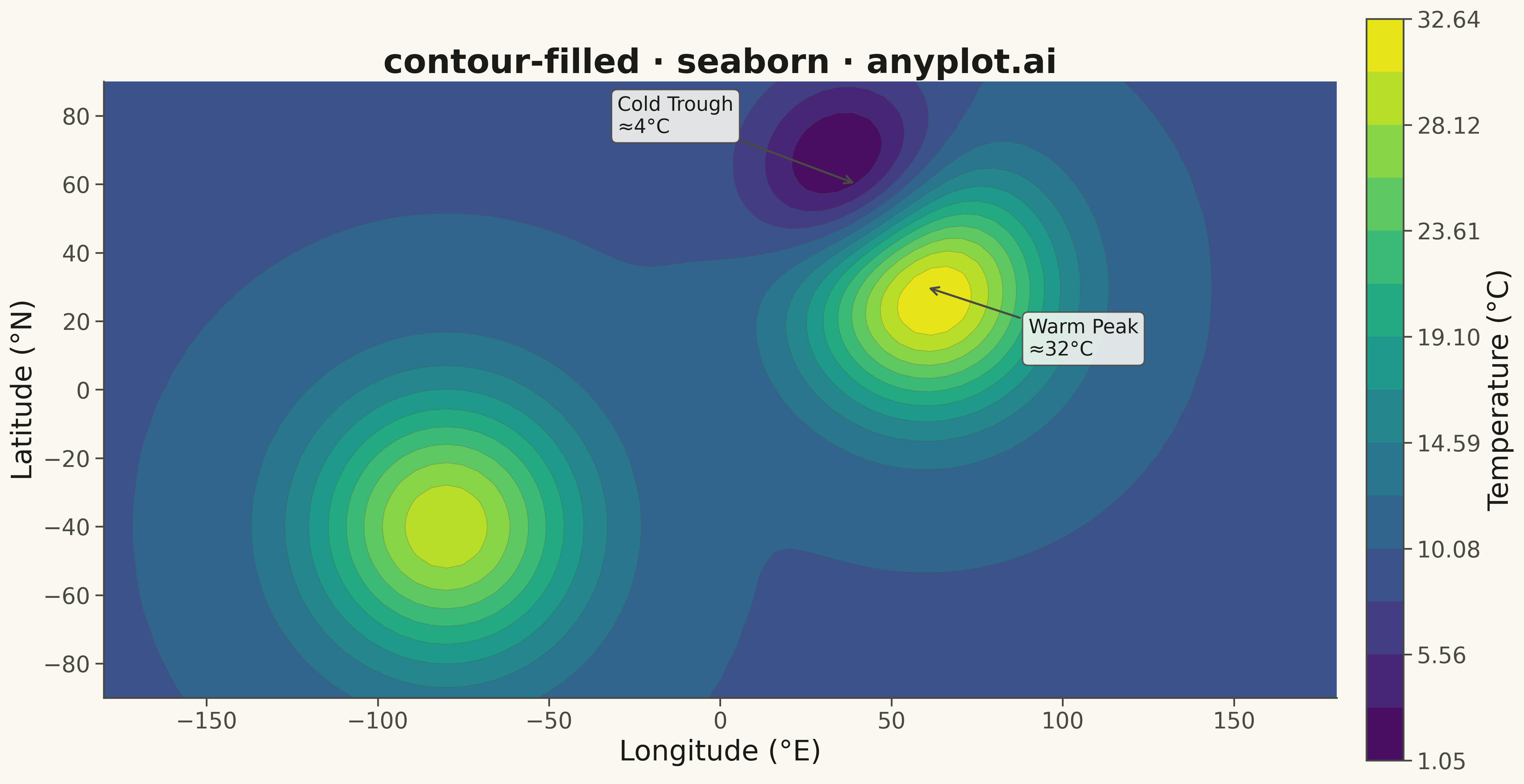
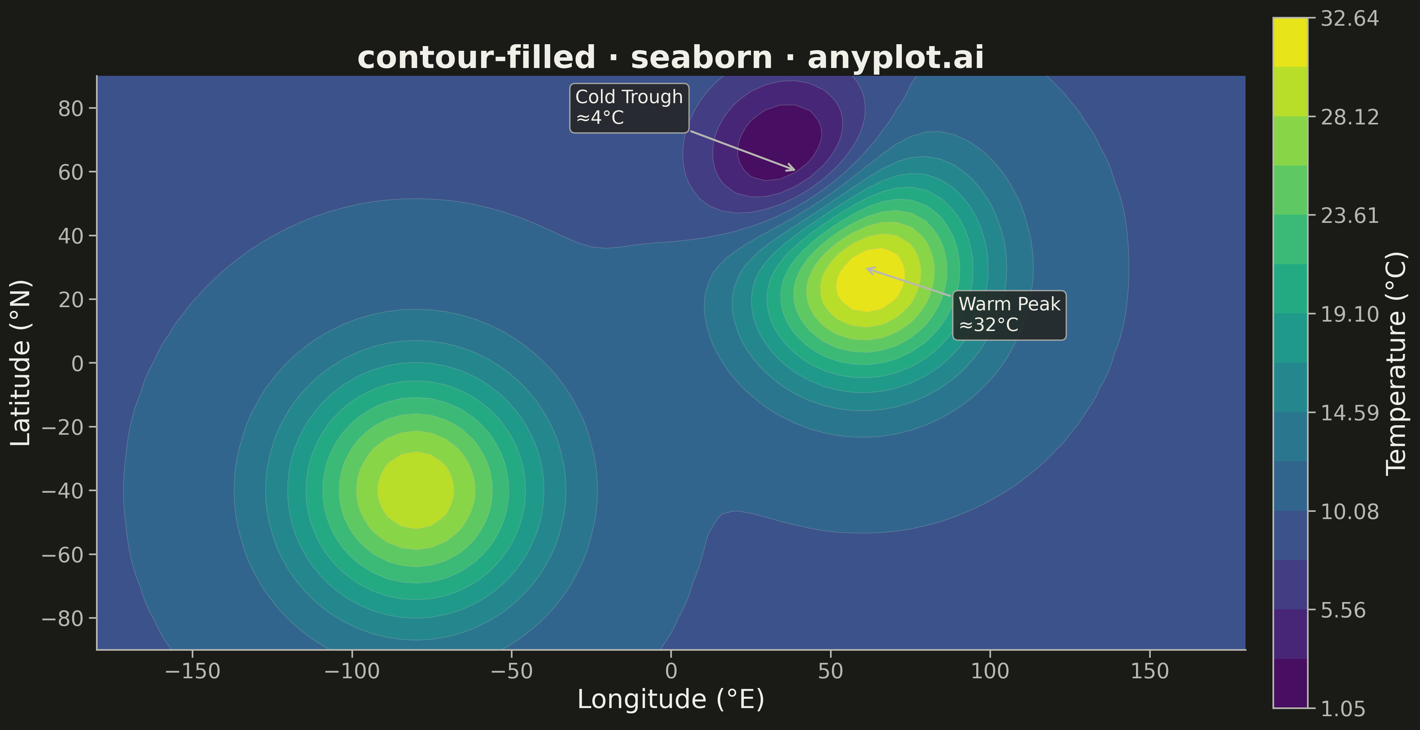
A filled contour plot displays colored regions between level curves of a 2D scalar field, creating a smooth gradient visualization of continuous data. Unlike basic contour plots that show only isolines, filled contours use color bands to represent value ranges, making it easier to perceive gradual changes and identify regions of similar magnitude. This visualization is particularly effective for showing how a quantity varies continuously across a 2D surface.
""" anyplot.ai
contour-filled: Filled Contour Plot
Library: seaborn 0.13.2 | Python 3.13.13
Quality: 88/100 | Updated: 2026-05-15
"""

import os

import matplotlib.pyplot as plt
import numpy as np
import seaborn as sns


# Theme tokens
THEME = os.getenv("ANYPLOT_THEME", "light")
PAGE_BG = "#FAF8F1" if THEME == "light" else "#1A1A17"
ELEVATED_BG = "#FFFDF6" if THEME == "light" else "#242420"
INK = "#1A1A17" if THEME == "light" else "#F0EFE8"
INK_SOFT = "#4A4A44" if THEME == "light" else "#B8B7B0"

# Configure seaborn theme
sns.set_theme(
    style="ticks",
    rc={
        "figure.facecolor": PAGE_BG,
        "axes.facecolor": PAGE_BG,
        "axes.edgecolor": INK_SOFT,
        "axes.labelcolor": INK,
        "text.color": INK,
        "xtick.color": INK_SOFT,
        "ytick.color": INK_SOFT,
        "grid.color": INK,
        "grid.alpha": 0.10,
        "legend.facecolor": ELEVATED_BG,
        "legend.edgecolor": INK_SOFT,
    },
)

# Data: Temperature field across geographic region (application context)
np.random.seed(42)
longitude = np.linspace(-180, 180, 80)
latitude = np.linspace(-90, 90, 80)
Lon, Lat = np.meshgrid(longitude, latitude)

# Create realistic temperature field with peaks (hot regions) and valleys (cold regions)
temp1 = 25 * np.exp(-((Lon - 60) ** 2 + (Lat - 30) ** 2) / 1200)
temp2 = 20 * np.exp(-((Lon + 80) ** 2 + (Lat + 40) ** 2) / 1500)
temp3 = -15 * np.exp(-((Lon - 40) ** 2 + (Lat - 60) ** 2) / 800)
Temperature = temp1 + temp2 + temp3 + 10

# Create figure and plot
fig, ax = plt.subplots(figsize=(16, 9), facecolor=PAGE_BG)

# Create filled contour with viridis colormap
palette = sns.color_palette("viridis", as_cmap=True)
levels = np.linspace(Temperature.min(), Temperature.max(), 15)
contourf = ax.contourf(Lon, Lat, Temperature, levels=levels, cmap=palette)

# Overlay contour lines for level identification
contour_lines = ax.contour(Lon, Lat, Temperature, levels=levels, colors=INK_SOFT, linewidths=0.5, alpha=0.3)

# Add colorbar
cbar = fig.colorbar(contourf, ax=ax, shrink=0.85, pad=0.02)
cbar.set_label("Temperature (°C)", fontsize=20, color=INK)
cbar.ax.tick_params(labelsize=16, colors=INK_SOFT)

# Styling
ax.set_xlabel("Longitude (°E)", fontsize=20, color=INK)
ax.set_ylabel("Latitude (°N)", fontsize=20, color=INK)
ax.set_title("contour-filled · seaborn · anyplot.ai", fontsize=24, color=INK)
ax.tick_params(axis="both", labelsize=16, colors=INK_SOFT)
ax.set_aspect("equal")

# Remove grid
ax.grid(False)

# Style colorbar ticks
for label in cbar.ax.get_yticklabels():
    label.set_color(INK_SOFT)

plt.tight_layout()
plt.savefig(f"plot-{THEME}.png", dpi=300, bbox_inches="tight", facecolor=PAGE_BG)
Runnable source as JSON, for any HTTP client: https://api.anyplot.ai/specs/contour-filled/seaborn/code. Any spec id and library id listed in llms-full.txt fit the same URL shape; every URL below is complete and callable.
{
  "spec_id": "contour-filled",
  "language": "python",
  "library": "seaborn",
  "page": "https://anyplot.ai/contour-filled/python/seaborn",
  "hub": "https://anyplot.ai/contour-filled",
  "code_json": "https://api.anyplot.ai/specs/contour-filled/seaborn/code",
  "spec_json": "https://api.anyplot.ai/specs/contour-filled",
  "render_light_png": "https://storage.googleapis.com/anyplot-images/plots/contour-filled/python/seaborn/plot-light.png",
  "render_dark_png": "https://storage.googleapis.com/anyplot-images/plots/contour-filled/python/seaborn/plot-dark.png",
  "quality_score": 88.0,
  "license": "MIT",
  "guide": "https://anyplot.ai/llms.txt"
}
Part of Filled Contour Plot on anyplot.ai.