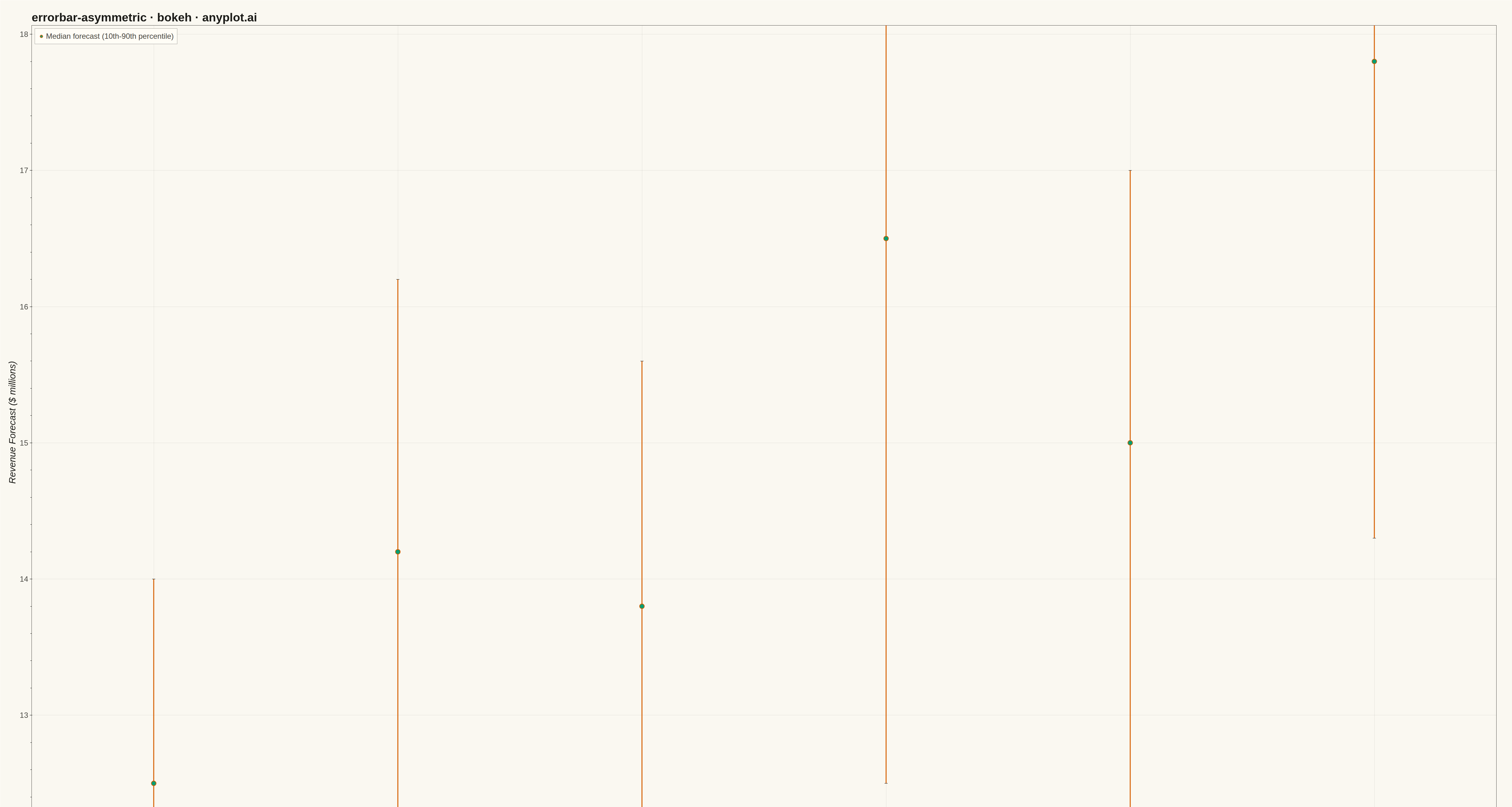
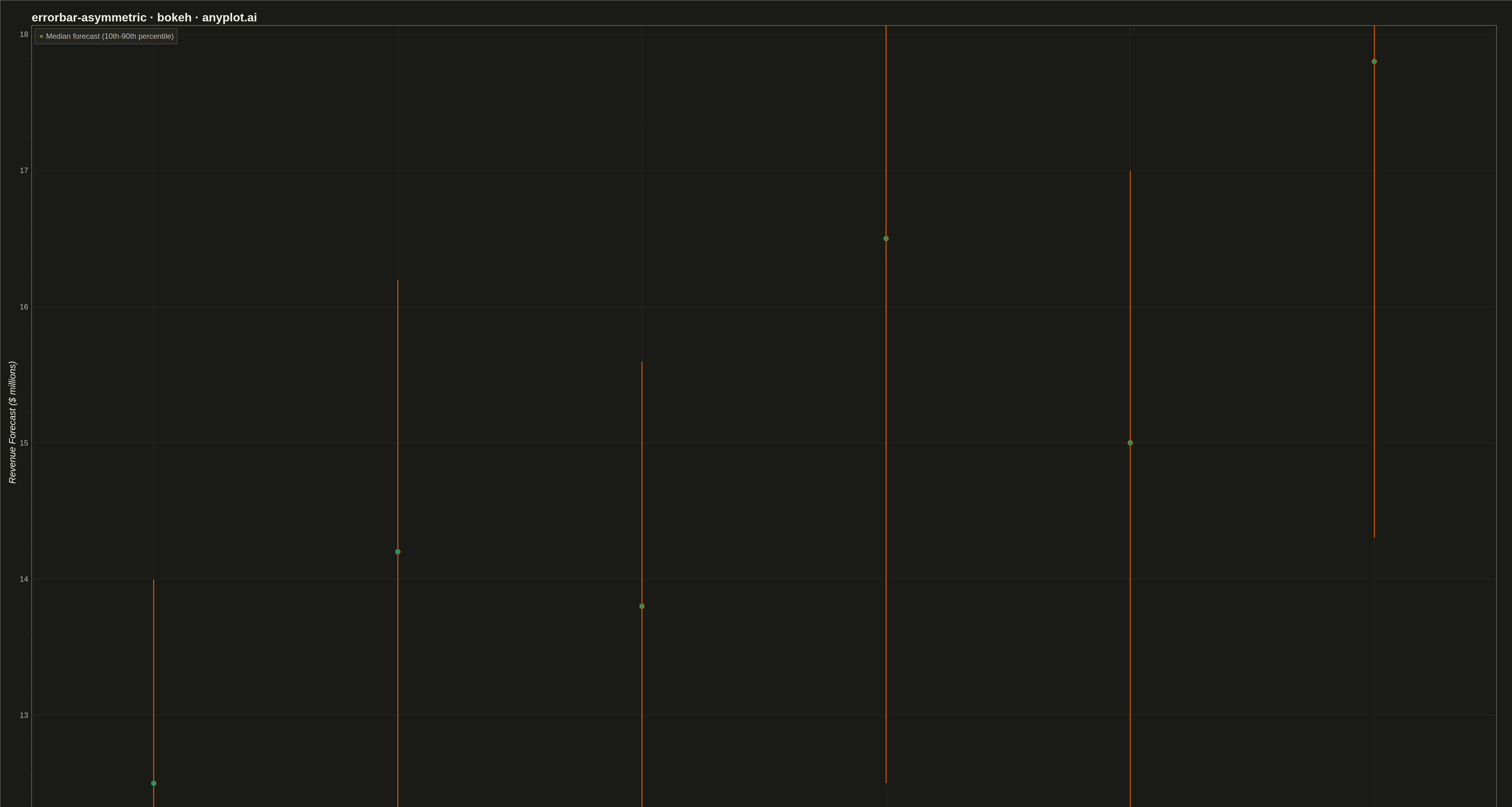
An asymmetric error bar plot displays data points with separate upper and lower error magnitudes, allowing different-sized bars extending above and below each point. This visualization is essential for representing skewed distributions, non-symmetric confidence intervals, or data where uncertainty differs in positive and negative directions. Common applications include percentile-based intervals, log-transformed data, and Bayesian credible intervals.
""" anyplot.ai
errorbar-asymmetric: Asymmetric Error Bars Plot
Library: bokeh 3.9.0 | Python 3.13.13
Quality: 71/100 | Updated: 2026-05-13
"""

import numpy as np
from bokeh.io import export_png
from bokeh.models import ColumnDataSource, Whisker
from bokeh.plotting import figure


# Data - Quarterly revenue forecasts with asymmetric uncertainty (10th-90th percentile)
np.random.seed(42)
quarters = ["Q1 2024", "Q2 2024", "Q3 2024", "Q4 2024", "Q1 2025", "Q2 2025"]

# Central estimates (median forecast in millions)
y = np.array([12.5, 14.2, 13.8, 16.5, 15.0, 17.8])

# Asymmetric errors - downside risk typically larger than upside potential
error_lower = np.array([2.5, 3.0, 2.2, 4.0, 2.8, 3.5])  # Larger downside
error_upper = np.array([1.5, 2.0, 1.8, 2.5, 2.0, 2.8])  # Smaller upside

# Calculate upper and lower bounds
upper = y + error_upper
lower = y - error_lower

# Create ColumnDataSource
source = ColumnDataSource(data={"y": y, "upper": upper, "lower": lower, "quarters": quarters})

# Create figure with categorical x-axis (no toolbar for static export)
p = figure(
    width=4800,
    height=2700,
    x_range=quarters,
    title="errorbar-asymmetric · bokeh · pyplots.ai",
    x_axis_label="Quarter",
    y_axis_label="Revenue Forecast ($ millions)",
    toolbar_location=None,
)

# Add whiskers for error bars (asymmetric)
whisker = Whisker(
    source=source,
    base="quarters",
    upper="upper",
    lower="lower",
    line_color="#306998",
    line_width=6,
    upper_head=None,
    lower_head=None,
)
p.add_layout(whisker)

# Add horizontal caps manually
cap_width = 0.2
for i, _q in enumerate(quarters):
    # Upper cap
    p.line(x=[i - cap_width, i + cap_width], y=[upper[i], upper[i]], line_color="#306998", line_width=6)
    # Lower cap
    p.line(x=[i - cap_width, i + cap_width], y=[lower[i], lower[i]], line_color="#306998", line_width=6)

# Plot central points
p.scatter(
    x="quarters",
    y="y",
    source=source,
    size=35,
    color="#FFD43B",
    line_color="#306998",
    line_width=4,
    legend_label="Median forecast (10th-90th percentile)",
)

# Title styling
p.title.text_font_size = "42pt"
p.title.text_font_style = "bold"

# Axis label styling
p.xaxis.axis_label_text_font_size = "32pt"
p.yaxis.axis_label_text_font_size = "32pt"
p.xaxis.major_label_text_font_size = "26pt"
p.yaxis.major_label_text_font_size = "26pt"
p.xaxis.major_label_orientation = 0

# Axis line styling
p.xaxis.axis_line_width = 2
p.yaxis.axis_line_width = 2
p.xaxis.major_tick_line_width = 2
p.yaxis.major_tick_line_width = 2

# Grid styling
p.grid.grid_line_alpha = 0.3
p.grid.grid_line_dash = "dashed"

# Legend styling
p.legend.label_text_font_size = "26pt"
p.legend.location = "top_left"
p.legend.background_fill_alpha = 0.8
p.legend.border_line_width = 2
p.legend.padding = 15
p.legend.margin = 20

# Background
p.background_fill_color = "white"
p.border_fill_color = "white"

# Add some padding
p.min_border_left = 100
p.min_border_right = 50
p.min_border_top = 80
p.min_border_bottom = 100

# Save output
export_png(p, filename="plot.png")
Runnable source as JSON, for any HTTP client: https://api.anyplot.ai/specs/errorbar-asymmetric/bokeh/code. Any spec id and library id listed in llms-full.txt fit the same URL shape; every URL below is complete and callable.
{
  "spec_id": "errorbar-asymmetric",
  "language": "python",
  "library": "bokeh",
  "page": "https://anyplot.ai/errorbar-asymmetric/python/bokeh",
  "hub": "https://anyplot.ai/errorbar-asymmetric",
  "code_json": "https://api.anyplot.ai/specs/errorbar-asymmetric/bokeh/code",
  "spec_json": "https://api.anyplot.ai/specs/errorbar-asymmetric",
  "render_light_png": "https://storage.googleapis.com/anyplot-images/plots/errorbar-asymmetric/python/bokeh/plot-light.png",
  "render_dark_png": "https://storage.googleapis.com/anyplot-images/plots/errorbar-asymmetric/python/bokeh/plot-dark.png",
  "interactive_light_html": "https://storage.googleapis.com/anyplot-images/plots/errorbar-asymmetric/python/bokeh/plot-light.html",
  "interactive_dark_html": "https://storage.googleapis.com/anyplot-images/plots/errorbar-asymmetric/python/bokeh/plot-dark.html",
  "quality_score": 71.0,
  "license": "MIT",
  "guide": "https://anyplot.ai/llms.txt"
}
Part of Asymmetric Error Bars Plot on anyplot.ai.