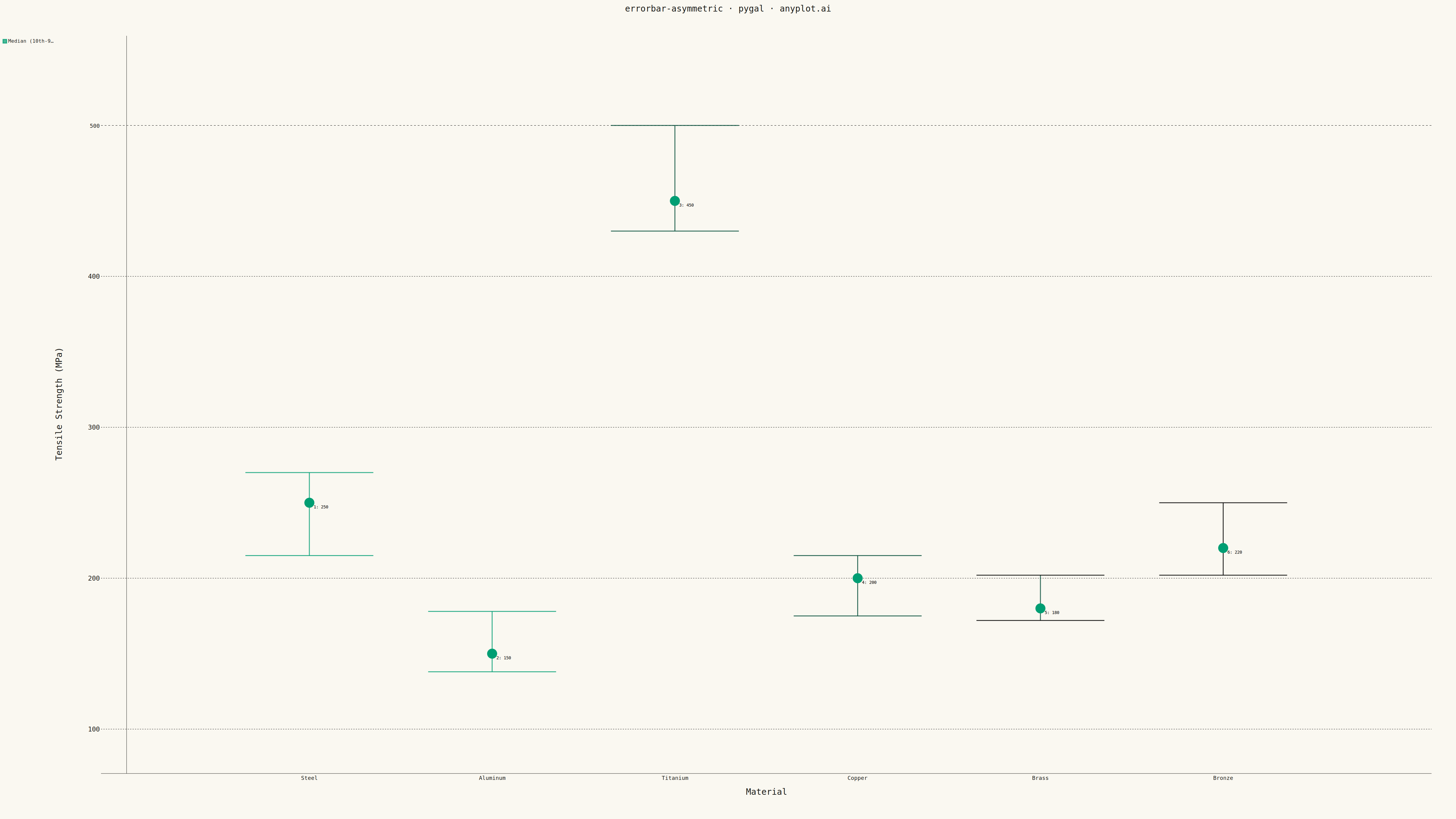
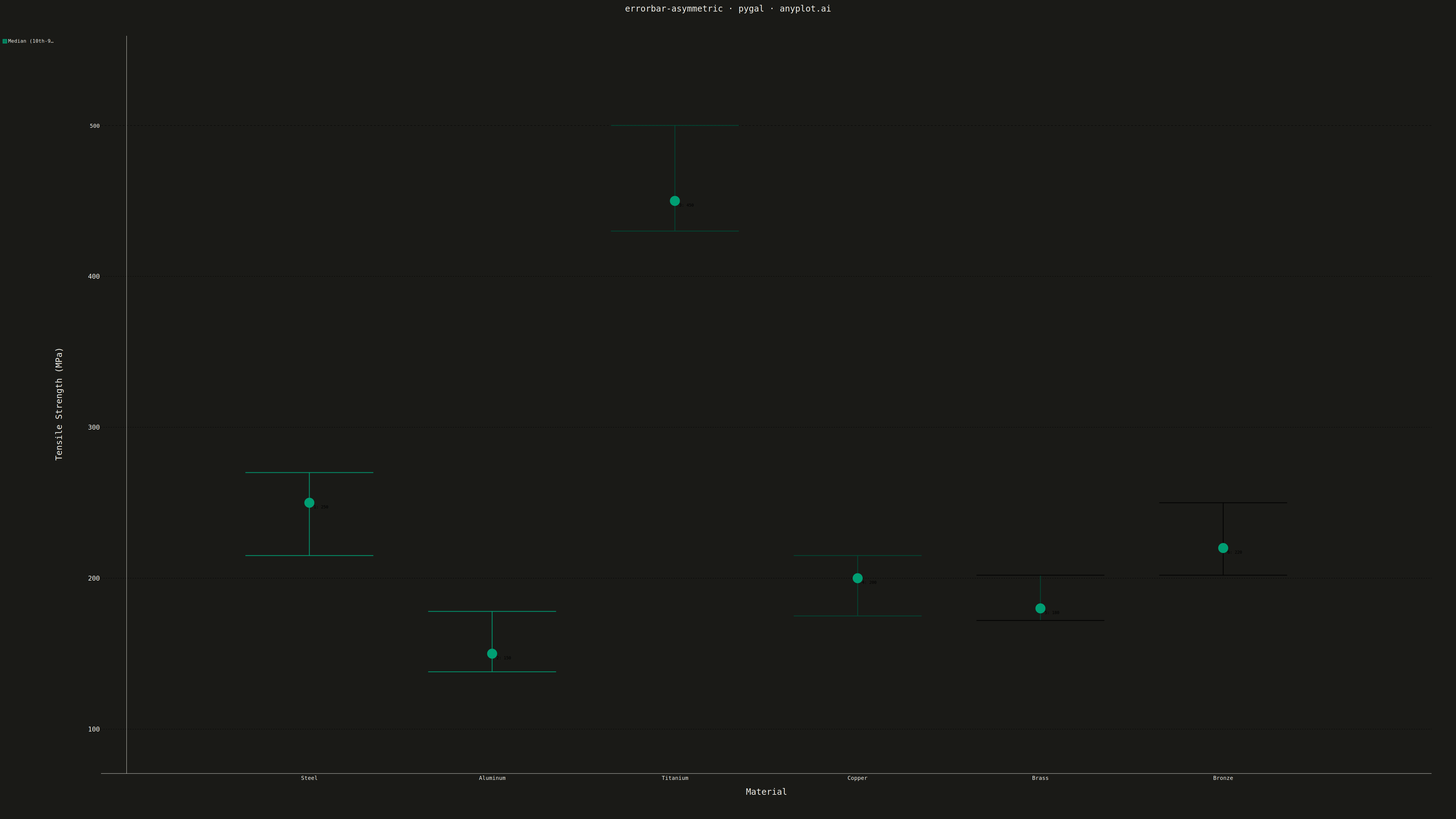
An asymmetric error bar plot displays data points with separate upper and lower error magnitudes, allowing different-sized bars extending above and below each point. This visualization is essential for representing skewed distributions, non-symmetric confidence intervals, or data where uncertainty differs in positive and negative directions. Common applications include percentile-based intervals, log-transformed data, and Bayesian credible intervals.
""" anyplot.ai
errorbar-asymmetric: Asymmetric Error Bars Plot
Library: pygal 3.1.0 | Python 3.13.13
Quality: 87/100 | Updated: 2026-05-13
"""

import os

import pygal
from pygal.style import Style


# Theme tokens
THEME = os.getenv("ANYPLOT_THEME", "light")
PAGE_BG = "#FAF8F1" if THEME == "light" else "#1A1A17"
INK = "#1A1A17" if THEME == "light" else "#F0EFE8"
INK_SOFT = "#4A4A44" if THEME == "light" else "#B8B7B0"
INK_MUTED = "#6B6A63" if THEME == "light" else "#A8A79F"

BRAND = "#009E73"  # Okabe-Ito position 1

# Data - Material strength testing (MPa) with asymmetric confidence intervals
materials = ["Steel", "Aluminum", "Titanium", "Copper", "Brass", "Bronze"]
y_values = [250, 150, 450, 200, 180, 220]
error_lower = [35, 12, 20, 25, 8, 18]
error_upper = [20, 28, 50, 15, 22, 30]

# Cap width for error bar ends
cap_width = 0.35

# Custom style with theme-adaptive colors and appropriate font sizes
custom_style = Style(
    background=PAGE_BG,
    plot_background=PAGE_BG,
    foreground=INK,
    foreground_strong=INK,
    foreground_subtle=INK_MUTED,
    colors=(BRAND, BRAND, BRAND, BRAND, BRAND, BRAND, BRAND),
    title_font_size=28,
    label_font_size=22,
    major_label_font_size=18,
    legend_font_size=16,
    value_font_size=14,
    stroke_width=3,
)

# Create XY chart for error bar visualization
chart = pygal.XY(
    width=4800,
    height=2700,
    style=custom_style,
    title="errorbar-asymmetric · pygal · anyplot.ai",
    x_title="Material",
    y_title="Tensile Strength (MPa)",
    show_legend=True,
    legend_at_bottom=False,
    show_y_guides=True,
    show_x_guides=False,
    print_values=False,
    margin=80,
    stroke=True,
    dots_size=12,
    range=(80, 550),
    xrange=(0, 7),
    x_labels=["", "Steel", "Aluminum", "Titanium", "Copper", "Brass", "Bronze"],
    x_labels_major_every=1,
    show_minor_x_labels=False,
)

# Add central points as main series with legend
central_data = [(i + 1, y_values[i]) for i in range(len(materials))]
chart.add("Median (10th-90th percentile)", central_data, stroke=False, dots_size=16)

# Add error bars and caps for each material
for i in range(len(materials)):
    x_pos = i + 1
    y_center = y_values[i]
    y_low = y_center - error_lower[i]
    y_high = y_center + error_upper[i]

    # Vertical error bar segment
    bar_data = [(x_pos, y_low), (x_pos, y_high)]

    # Bottom cap (horizontal line)
    bottom_cap = [(x_pos - cap_width, y_low), (x_pos + cap_width, y_low)]

    # Top cap (horizontal line)
    top_cap = [(x_pos - cap_width, y_high), (x_pos + cap_width, y_high)]

    # Add error bar (no legend entry)
    chart.add(None, bar_data, stroke=True, show_dots=False, stroke_style={"width": 3})

    # Add caps with thicker stroke for prominence
    chart.add(None, bottom_cap, stroke=True, show_dots=False, stroke_style={"width": 5})
    chart.add(None, top_cap, stroke=True, show_dots=False, stroke_style={"width": 5})

# Render to files
chart.render_to_file(f"plot-{THEME}.html")
chart.render_to_png(f"plot-{THEME}.png")
Runnable source as JSON, for any HTTP client: https://api.anyplot.ai/specs/errorbar-asymmetric/pygal/code. Any spec id and library id listed in llms-full.txt fit the same URL shape; every URL below is complete and callable.
{
  "spec_id": "errorbar-asymmetric",
  "language": "python",
  "library": "pygal",
  "page": "https://anyplot.ai/errorbar-asymmetric/python/pygal",
  "hub": "https://anyplot.ai/errorbar-asymmetric",
  "code_json": "https://api.anyplot.ai/specs/errorbar-asymmetric/pygal/code",
  "spec_json": "https://api.anyplot.ai/specs/errorbar-asymmetric",
  "render_light_png": "https://storage.googleapis.com/anyplot-images/plots/errorbar-asymmetric/python/pygal/plot-light.png",
  "render_dark_png": "https://storage.googleapis.com/anyplot-images/plots/errorbar-asymmetric/python/pygal/plot-dark.png",
  "interactive_light_html": "https://storage.googleapis.com/anyplot-images/plots/errorbar-asymmetric/python/pygal/plot-light.html",
  "interactive_dark_html": "https://storage.googleapis.com/anyplot-images/plots/errorbar-asymmetric/python/pygal/plot-dark.html",
  "quality_score": 87.0,
  "license": "MIT",
  "guide": "https://anyplot.ai/llms.txt"
}
Part of Asymmetric Error Bars Plot on anyplot.ai.