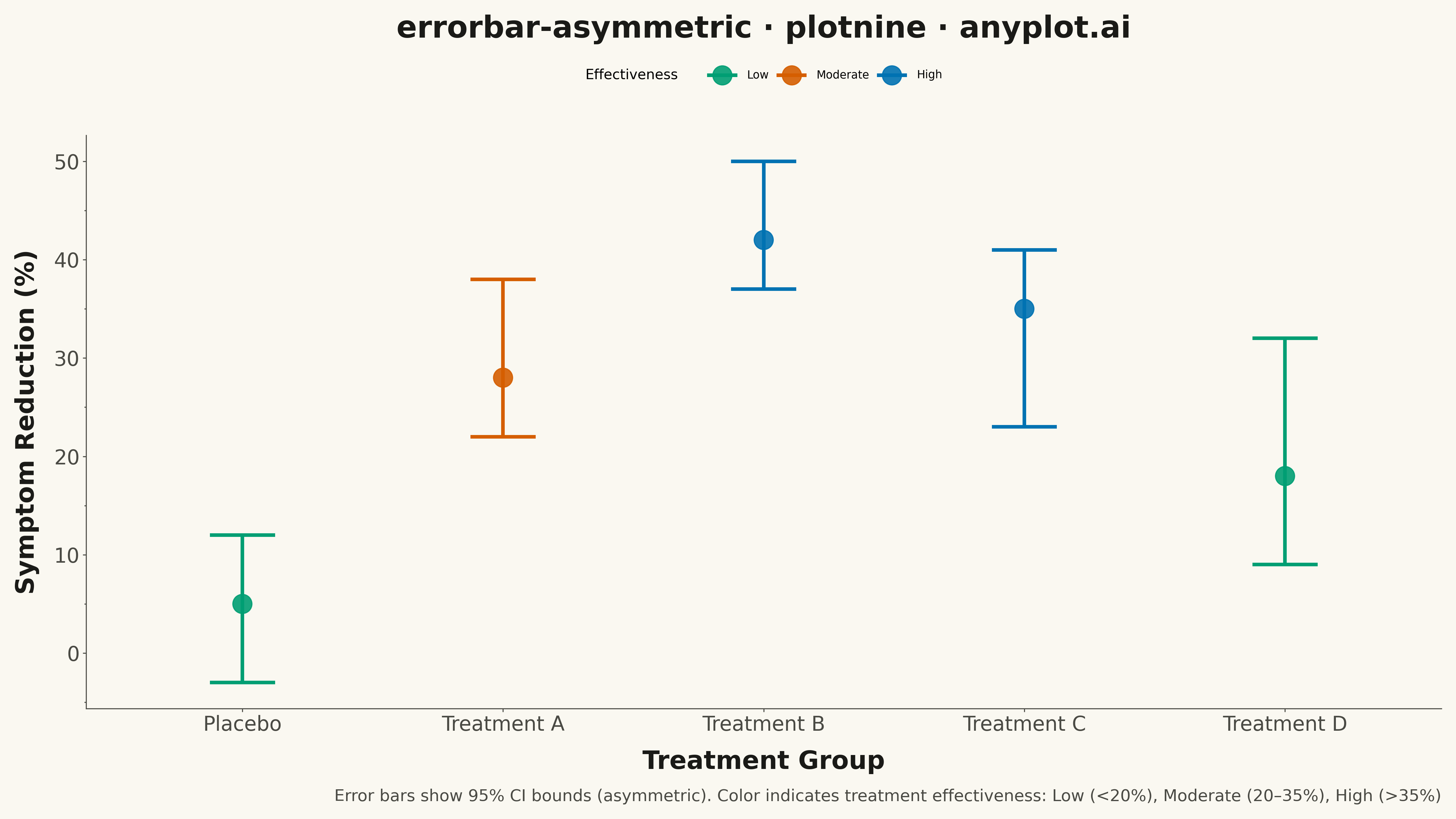
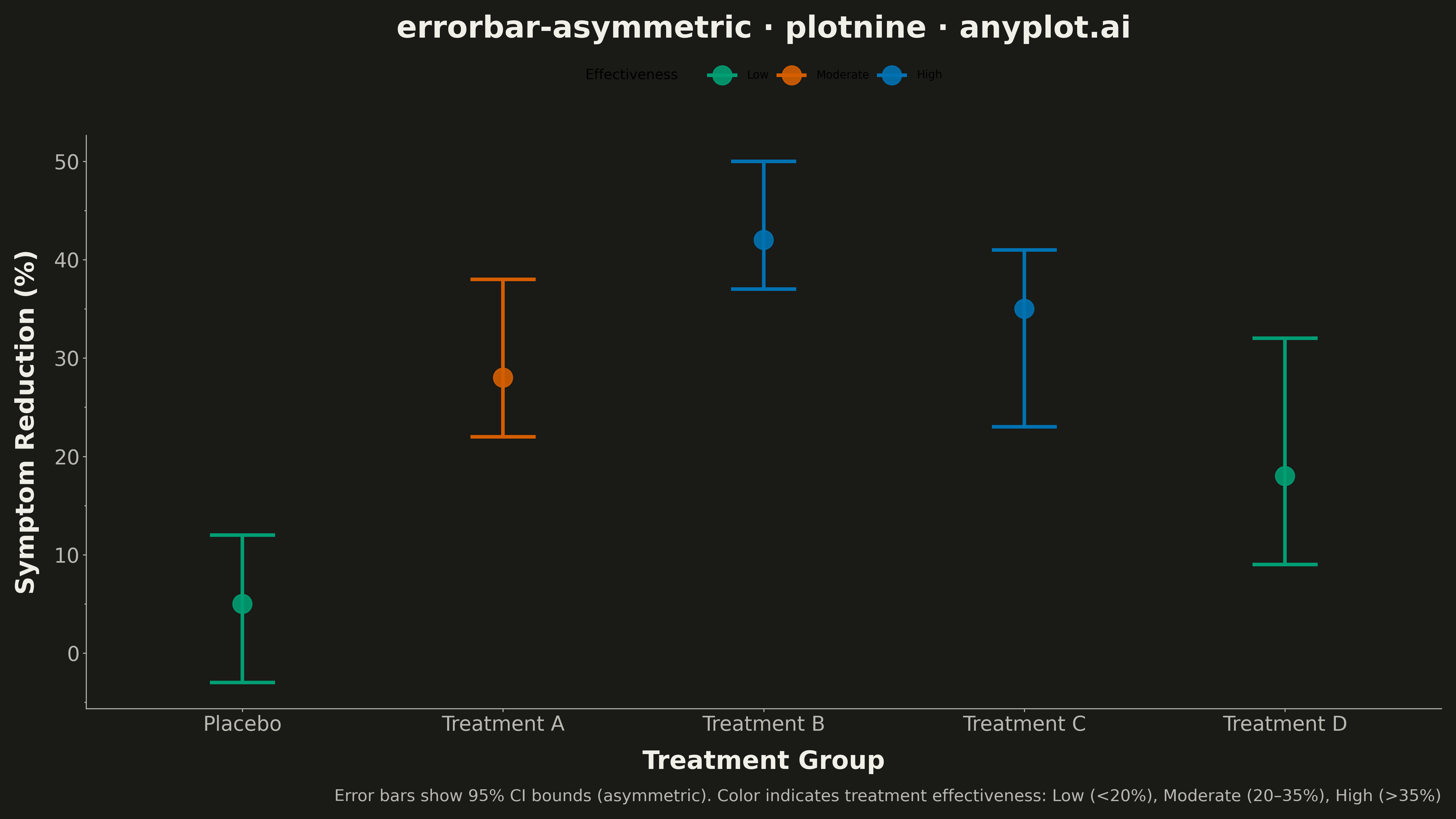
An asymmetric error bar plot displays data points with separate upper and lower error magnitudes, allowing different-sized bars extending above and below each point. This visualization is essential for representing skewed distributions, non-symmetric confidence intervals, or data where uncertainty differs in positive and negative directions. Common applications include percentile-based intervals, log-transformed data, and Bayesian credible intervals.
""" anyplot.ai
errorbar-asymmetric: Asymmetric Error Bars Plot
Library: plotnine 0.15.4 | Python 3.13.13
Quality: 82/100 | Updated: 2026-05-13
"""

import os
import sys
from pathlib import Path


_script_dir = str(Path(__file__).parent)
sys.path = [p for p in sys.path if p != _script_dir and p != ""]

import numpy as np
import pandas as pd
from plotnine import (
    aes,
    element_line,
    element_rect,
    element_text,
    geom_errorbar,
    geom_point,
    ggplot,
    labs,
    theme,
    theme_minimal,
)


# Theme tokens
THEME = os.getenv("ANYPLOT_THEME", "light")
PAGE_BG = "#FAF8F1" if THEME == "light" else "#1A1A17"
INK = "#1A1A17" if THEME == "light" else "#F0EFE8"
INK_SOFT = "#4A4A44" if THEME == "light" else "#B8B7B0"
BRAND = "#009E73"

# Data - Clinical trial outcomes with asymmetric confidence intervals
np.random.seed(42)
treatments = ["Placebo", "Treatment A", "Treatment B", "Treatment C", "Treatment D"]
# Measured reduction in symptoms (%)
effect_sizes = [5, 28, 42, 35, 18]
# Different asymmetry patterns: some treatments show larger upside, some larger downside
error_lower = [8, 6, 5, 12, 9]  # Asymmetric confidence bounds
error_upper = [7, 10, 8, 6, 14]

df = pd.DataFrame(
    {
        "treatment": pd.Categorical(treatments, categories=treatments, ordered=True),
        "effect": effect_sizes,
        "ymin": [e - lo for e, lo in zip(effect_sizes, error_lower, strict=True)],
        "ymax": [e + up for e, up in zip(effect_sizes, error_upper, strict=True)],
    }
)

# Create plot with asymmetric error bars
anyplot_theme = theme(
    plot_background=element_rect(fill=PAGE_BG, color=PAGE_BG),
    panel_background=element_rect(fill=PAGE_BG),
    panel_grid_major=element_line(color=INK, size=0.3, alpha=0.10),
    panel_grid_minor=element_line(alpha=0.0),
    panel_border=element_rect(color=INK_SOFT, fill=None, size=0.5),
    axis_title=element_text(size=20, color=INK),
    axis_text=element_text(size=16, color=INK_SOFT),
    axis_line=element_line(color=INK_SOFT, size=0.5),
    plot_title=element_text(size=24, color=INK, ha="center"),
    plot_caption=element_text(size=14, color=INK_SOFT, ha="right"),
    figure_size=(16, 9),
)

plot = (
    ggplot(df, aes(x="treatment", y="effect"))
    + geom_errorbar(aes(ymin="ymin", ymax="ymax"), width=0.25, size=1.5, color=BRAND)
    + geom_point(size=6, color=BRAND)
    + labs(
        x="Treatment Group",
        y="Symptom Reduction (%)",
        title="errorbar-asymmetric · plotnine · anyplot.ai",
        caption="Error bars show 95% confidence interval bounds (asymmetric)",
    )
    + theme_minimal()
    + anyplot_theme
)

# Save
plot.save(f"plot-{THEME}.png", dpi=300)
Runnable source as JSON, for any HTTP client: https://api.anyplot.ai/specs/errorbar-asymmetric/plotnine/code. Any spec id and library id listed in llms-full.txt fit the same URL shape; every URL below is complete and callable.
{
  "spec_id": "errorbar-asymmetric",
  "language": "python",
  "library": "plotnine",
  "page": "https://anyplot.ai/errorbar-asymmetric/python/plotnine",
  "hub": "https://anyplot.ai/errorbar-asymmetric",
  "code_json": "https://api.anyplot.ai/specs/errorbar-asymmetric/plotnine/code",
  "spec_json": "https://api.anyplot.ai/specs/errorbar-asymmetric",
  "render_light_png": "https://storage.googleapis.com/anyplot-images/plots/errorbar-asymmetric/python/plotnine/plot-light.png",
  "render_dark_png": "https://storage.googleapis.com/anyplot-images/plots/errorbar-asymmetric/python/plotnine/plot-dark.png",
  "quality_score": 82.0,
  "license": "MIT",
  "guide": "https://anyplot.ai/llms.txt"
}
Part of Asymmetric Error Bars Plot on anyplot.ai.