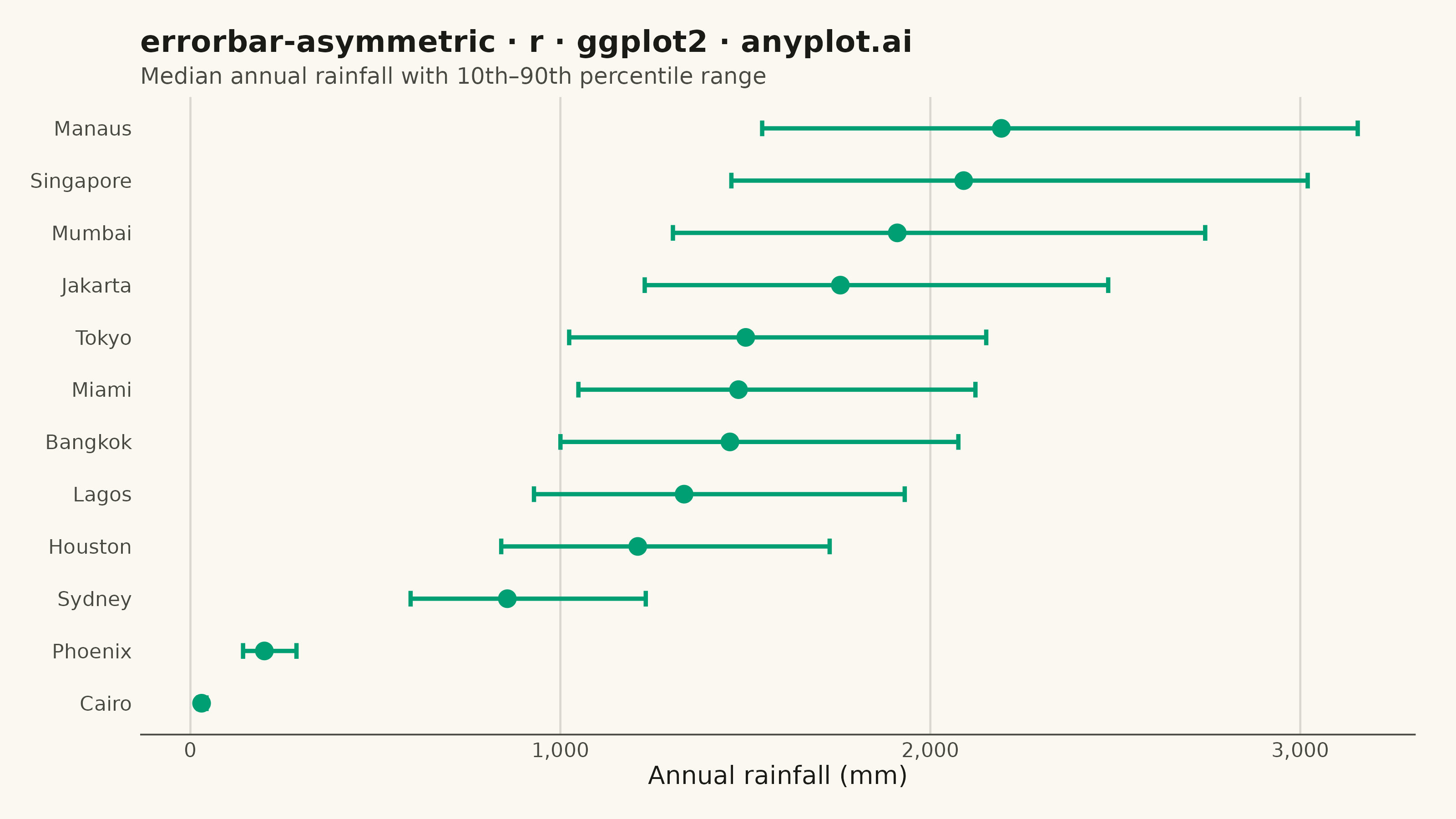
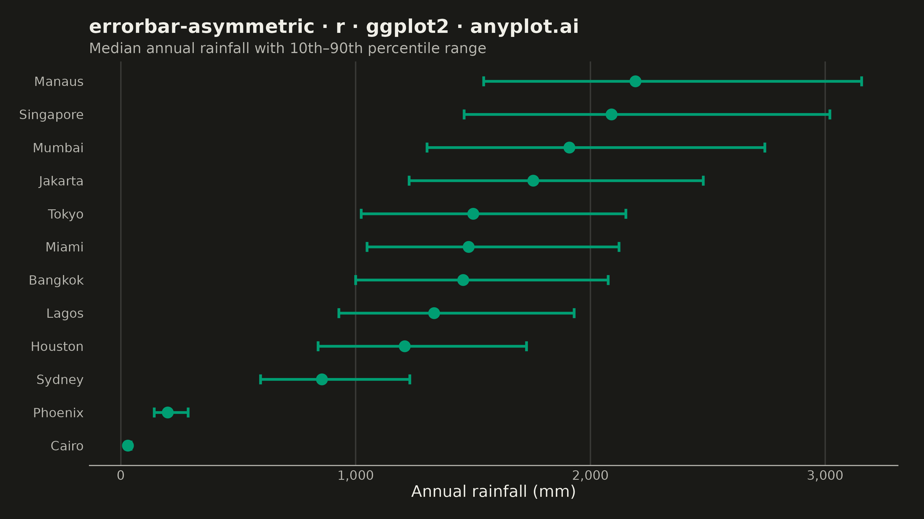
The same plot in 14 other libraries — Python: Altair, Bokeh, lets-plot, Matplotlib, Plotly, plotnine, Pygal, Seaborn; Julia: Makie.jl; JavaScript: Chart.js, D3.js, Apache ECharts, Highcharts, MUI X Charts. Compare all 15 side by side: Asymmetric Error Bars Plot in Python, R, Julia and JavaScript.
An asymmetric error bar plot displays data points with separate upper and lower error magnitudes, allowing different-sized bars extending above and below each point. This visualization is essential for representing skewed distributions, non-symmetric confidence intervals, or data where uncertainty differs in positive and negative directions. Common applications include percentile-based intervals, log-transformed data, and Bayesian credible intervals.
#' anyplot.ai
#' errorbar-asymmetric: Asymmetric Error Bars Plot
#' Library: ggplot2 3.5.1 | R 4.4.1
#' Quality: 86/100 | Created: 2026-09-05

library(ggplot2)
library(dplyr)
library(scales)
library(ragg)

set.seed(42)

# --- Theme tokens -----------------------------------------------------------
THEME       <- Sys.getenv("ANYPLOT_THEME", "light")
PAGE_BG     <- if (THEME == "light") "#FAF8F1" else "#1A1A17"
INK         <- if (THEME == "light") "#1A1A17" else "#F0EFE8"
INK_SOFT    <- if (THEME == "light") "#4A4A44" else "#B8B7B0"
IMPRINT_PALETTE <- c("#009E73", "#C475FD", "#4467A3", "#BD8233",
                     "#AE3030", "#2ABCCD", "#954477", "#99B314")
BRAND <- IMPRINT_PALETTE[1]

# --- Data ---------------------------------------------------------------
# Annual rainfall is right-skewed (occasional very wet years pull the upper
# tail out further than the lower tail), so the 10th-90th percentile range
# around the median is naturally asymmetric.
stations <- c("Manaus", "Singapore", "Mumbai", "Miami", "Bangkok", "Lagos",
              "Jakarta", "Houston", "Tokyo", "Sydney", "Cairo", "Phoenix")
typical_mm <- c(2200, 2100, 1900, 1500, 1450, 1350,
                1750, 1200, 1500, 850, 30, 200)

station_quantiles <- lapply(seq_along(stations), function(i) {
  samples <- rlnorm(2000, meanlog = log(typical_mm[i]), sdlog = 0.28)
  quantile(samples, probs = c(0.10, 0.50, 0.90))
})

df <- tibble::tibble(
  station   = stations,
  p10       = vapply(station_quantiles, `[[`, numeric(1), 1),
  median_mm = vapply(station_quantiles, `[[`, numeric(1), 2),
  p90       = vapply(station_quantiles, `[[`, numeric(1), 3)
) %>%
  mutate(
    error_lower = median_mm - p10,
    error_upper = p90 - median_mm,
    station     = factor(station, levels = stations[order(median_mm)])
  )

overall_median <- median(df$median_mm)

# --- Plot -----------------------------------------------------------------
# A dashed reference line at the cross-station median gives readers an
# anchor to judge each station's rainfall against, beyond the sorted order.
p <- ggplot(df, aes(x = station, y = median_mm)) +
  geom_hline(
    yintercept = overall_median, linetype = "dashed",
    color = INK_SOFT, linewidth = 0.5, alpha = 0.7
  ) +
  geom_errorbar(
    aes(ymin = median_mm - error_lower, ymax = median_mm + error_upper),
    color = BRAND, width = 0.3, linewidth = 0.8
  ) +
  geom_point(color = BRAND, size = 2.8) +
  annotate(
    "text", x = 12.5, y = overall_median,
    label = sprintf("All-station median: %s mm", label_comma()(round(overall_median))),
    hjust = 0.5, vjust = 0, size = 2.6, color = INK_SOFT, fontface = "italic"
  ) +
  coord_flip(clip = "off") +
  scale_y_continuous(labels = label_comma()) +
  labs(
    title    = "errorbar-asymmetric · r · ggplot2 · anyplot.ai",
    subtitle = "Median annual rainfall with 10th–90th percentile range",
    x        = NULL,
    y        = "Annual rainfall (mm)"
  ) +
  theme_minimal(base_size = 7) +
  theme(
    plot.background   = element_rect(fill = PAGE_BG, color = PAGE_BG),
    panel.background  = element_rect(fill = PAGE_BG, color = NA),
    panel.grid.major  = element_line(color = alpha(INK, 0.15), linewidth = 0.4),
    panel.grid.minor  = element_blank(),
    panel.grid.major.y = element_blank(),
    axis.line.x       = element_line(color = INK_SOFT),
    axis.ticks        = element_blank(),
    axis.title        = element_text(color = INK, size = 10),
    axis.text         = element_text(color = INK_SOFT, size = 8),
    plot.title        = element_text(color = INK, size = 12, face = "bold"),
    plot.subtitle     = element_text(color = INK_SOFT, size = 9),
    plot.margin       = margin(22, 16, 12, 12)
  )

# --- Save -------------------------------------------------------------------
ggsave(
  filename = sprintf("plot-%s.png", THEME),
  plot     = p,
  device   = ragg::agg_png,
  width    = 8,
  height   = 4.5,
  units    = "in",
  dpi      = 400
)
Runnable source as JSON, for any HTTP client: https://api.anyplot.ai/specs/errorbar-asymmetric/ggplot2/code. Any spec id and library id listed in llms-full.txt fit the same URL shape; every URL below is complete and callable.
{
  "spec_id": "errorbar-asymmetric",
  "language": "r",
  "library": "ggplot2",
  "page": "https://anyplot.ai/errorbar-asymmetric/r/ggplot2",
  "hub": "https://anyplot.ai/errorbar-asymmetric",
  "code_json": "https://api.anyplot.ai/specs/errorbar-asymmetric/ggplot2/code",
  "spec_json": "https://api.anyplot.ai/specs/errorbar-asymmetric",
  "render_light_png": "https://storage.googleapis.com/anyplot-images/plots/errorbar-asymmetric/r/ggplot2/plot-light.png",
  "render_dark_png": "https://storage.googleapis.com/anyplot-images/plots/errorbar-asymmetric/r/ggplot2/plot-dark.png",
  "quality_score": 86.0,
  "license": "MIT",
  "guide": "https://anyplot.ai/llms.txt"
}
Part of Asymmetric Error Bars Plot on anyplot.ai.