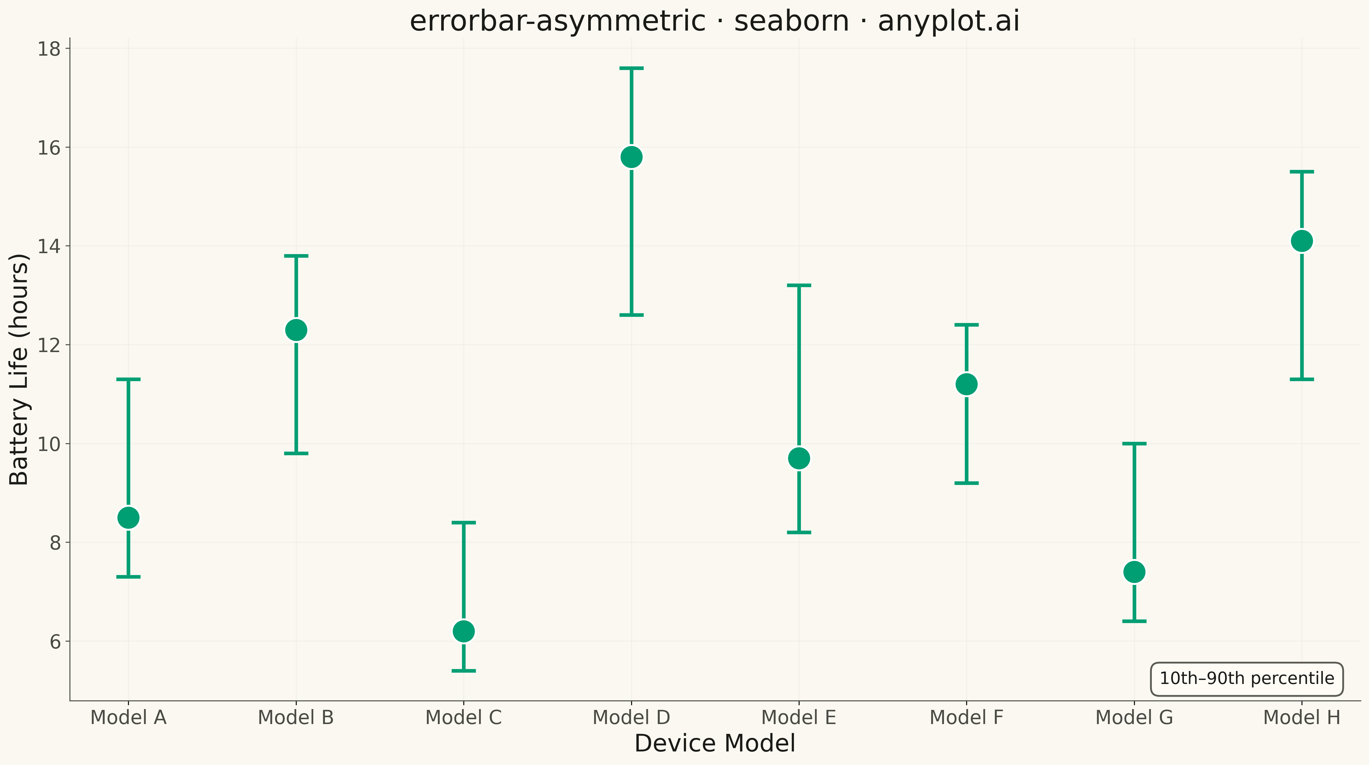
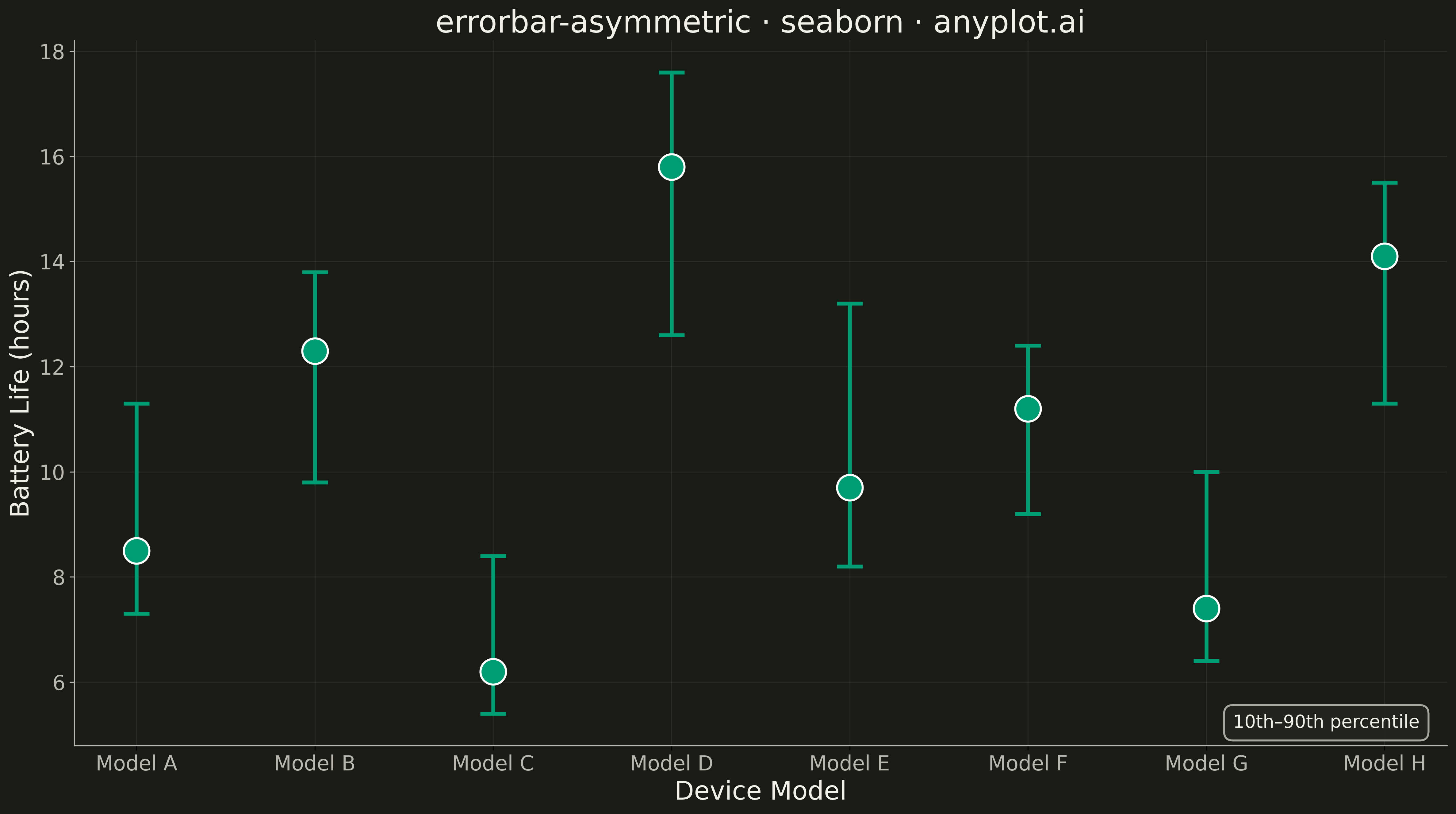
An asymmetric error bar plot displays data points with separate upper and lower error magnitudes, allowing different-sized bars extending above and below each point. This visualization is essential for representing skewed distributions, non-symmetric confidence intervals, or data where uncertainty differs in positive and negative directions. Common applications include percentile-based intervals, log-transformed data, and Bayesian credible intervals.
""" anyplot.ai
errorbar-asymmetric: Asymmetric Error Bars Plot
Library: seaborn 0.13.2 | Python 3.13.13
Quality: 96/100 | Updated: 2026-05-13
"""

import os

import matplotlib.pyplot as plt
import numpy as np
import seaborn as sns


# Theme tokens
THEME = os.getenv("ANYPLOT_THEME", "light")
PAGE_BG = "#FAF8F1" if THEME == "light" else "#1A1A17"
ELEVATED_BG = "#FFFDF6" if THEME == "light" else "#242420"
INK = "#1A1A17" if THEME == "light" else "#F0EFE8"
INK_SOFT = "#4A4A44" if THEME == "light" else "#B8B7B0"

BRAND = "#009E73"  # Okabe-Ito position 1

# Data: Battery life measurements across device models (10th-90th percentile)
np.random.seed(42)

devices = ["Model A", "Model B", "Model C", "Model D", "Model E", "Model F", "Model G", "Model H"]
x = np.arange(len(devices))

# Central values (median battery life in hours)
y = np.array([8.5, 12.3, 6.2, 15.8, 9.7, 11.2, 7.4, 14.1])

# Asymmetric errors (10th-90th percentile bounds)
# Lower errors: distance from median to 10th percentile
error_lower = np.array([1.2, 2.5, 0.8, 3.2, 1.5, 2.0, 1.0, 2.8])
# Upper errors: distance from median to 90th percentile
error_upper = np.array([2.8, 1.5, 2.2, 1.8, 3.5, 1.2, 2.6, 1.4])

# Create figure with theme-aware background
fig, ax = plt.subplots(figsize=(16, 9), facecolor=PAGE_BG)
ax.set_facecolor(PAGE_BG)

# Configure seaborn theme
sns.set_theme(
    style="ticks",
    rc={
        "figure.facecolor": PAGE_BG,
        "axes.facecolor": PAGE_BG,
        "axes.edgecolor": INK_SOFT,
        "axes.labelcolor": INK,
        "text.color": INK,
        "xtick.color": INK_SOFT,
        "ytick.color": INK_SOFT,
        "grid.color": INK,
        "grid.alpha": 0.10,
    },
)

# Plot points using seaborn scatterplot
sns.scatterplot(x=x, y=y, s=400, color=BRAND, zorder=5, ax=ax)

# Add asymmetric error bars using matplotlib errorbar
ax.errorbar(
    x=x, y=y, yerr=[error_lower, error_upper], fmt="none", ecolor=BRAND, elinewidth=3, capsize=10, capthick=3, zorder=4
)

# Style with theme-aware colors
ax.set_xticks(x)
ax.set_xticklabels(devices, fontsize=16, color=INK_SOFT)
ax.set_xlabel("Device Model", fontsize=20, color=INK)
ax.set_ylabel("Battery Life (hours)", fontsize=20, color=INK)
ax.set_title("errorbar-asymmetric · seaborn · anyplot.ai", fontsize=24, fontweight="medium", color=INK)
ax.tick_params(axis="y", labelsize=16, colors=INK_SOFT)
ax.grid(True, alpha=0.10, linestyle="-", linewidth=0.8)

# Remove top and right spines
ax.spines["top"].set_visible(False)
ax.spines["right"].set_visible(False)
ax.spines["left"].set_color(INK_SOFT)
ax.spines["bottom"].set_color(INK_SOFT)

# Add theme-aware annotation explaining the error bars
ax.annotate(
    "10th–90th percentile",
    xy=(0.98, 0.02),
    xycoords="axes fraction",
    fontsize=14,
    ha="right",
    va="bottom",
    color=INK,
    bbox={"boxstyle": "round,pad=0.5", "facecolor": ELEVATED_BG, "edgecolor": INK_SOFT, "linewidth": 1.5, "alpha": 0.9},
)

plt.tight_layout()
plt.savefig(f"plot-{THEME}.png", dpi=300, bbox_inches="tight", facecolor=PAGE_BG)
Runnable source as JSON, for any HTTP client: https://api.anyplot.ai/specs/errorbar-asymmetric/seaborn/code. Any spec id and library id listed in llms-full.txt fit the same URL shape; every URL below is complete and callable.
{
  "spec_id": "errorbar-asymmetric",
  "language": "python",
  "library": "seaborn",
  "page": "https://anyplot.ai/errorbar-asymmetric/python/seaborn",
  "hub": "https://anyplot.ai/errorbar-asymmetric",
  "code_json": "https://api.anyplot.ai/specs/errorbar-asymmetric/seaborn/code",
  "spec_json": "https://api.anyplot.ai/specs/errorbar-asymmetric",
  "render_light_png": "https://storage.googleapis.com/anyplot-images/plots/errorbar-asymmetric/python/seaborn/plot-light.png",
  "render_dark_png": "https://storage.googleapis.com/anyplot-images/plots/errorbar-asymmetric/python/seaborn/plot-dark.png",
  "quality_score": 96.0,
  "license": "MIT",
  "guide": "https://anyplot.ai/llms.txt"
}
Part of Asymmetric Error Bars Plot on anyplot.ai.