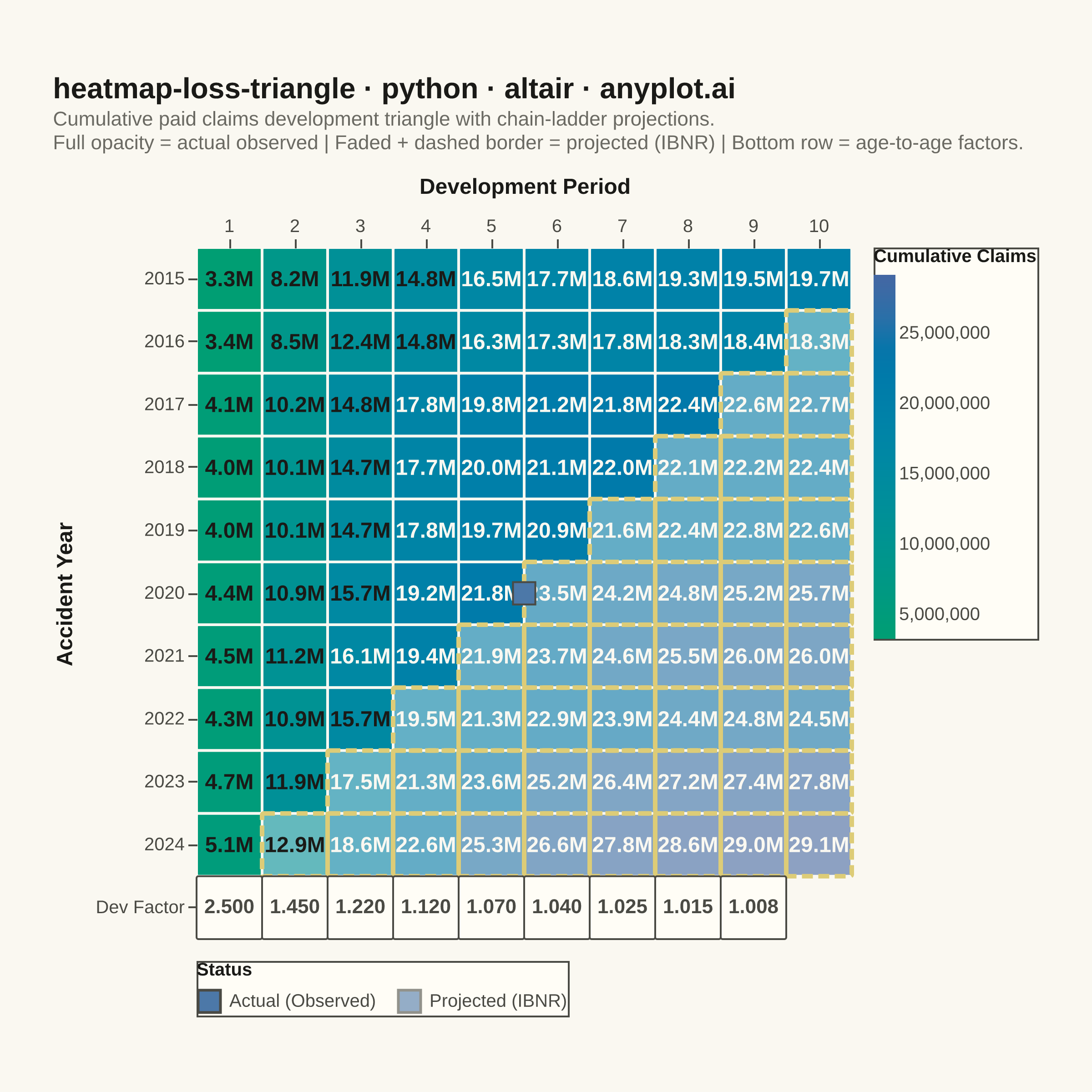
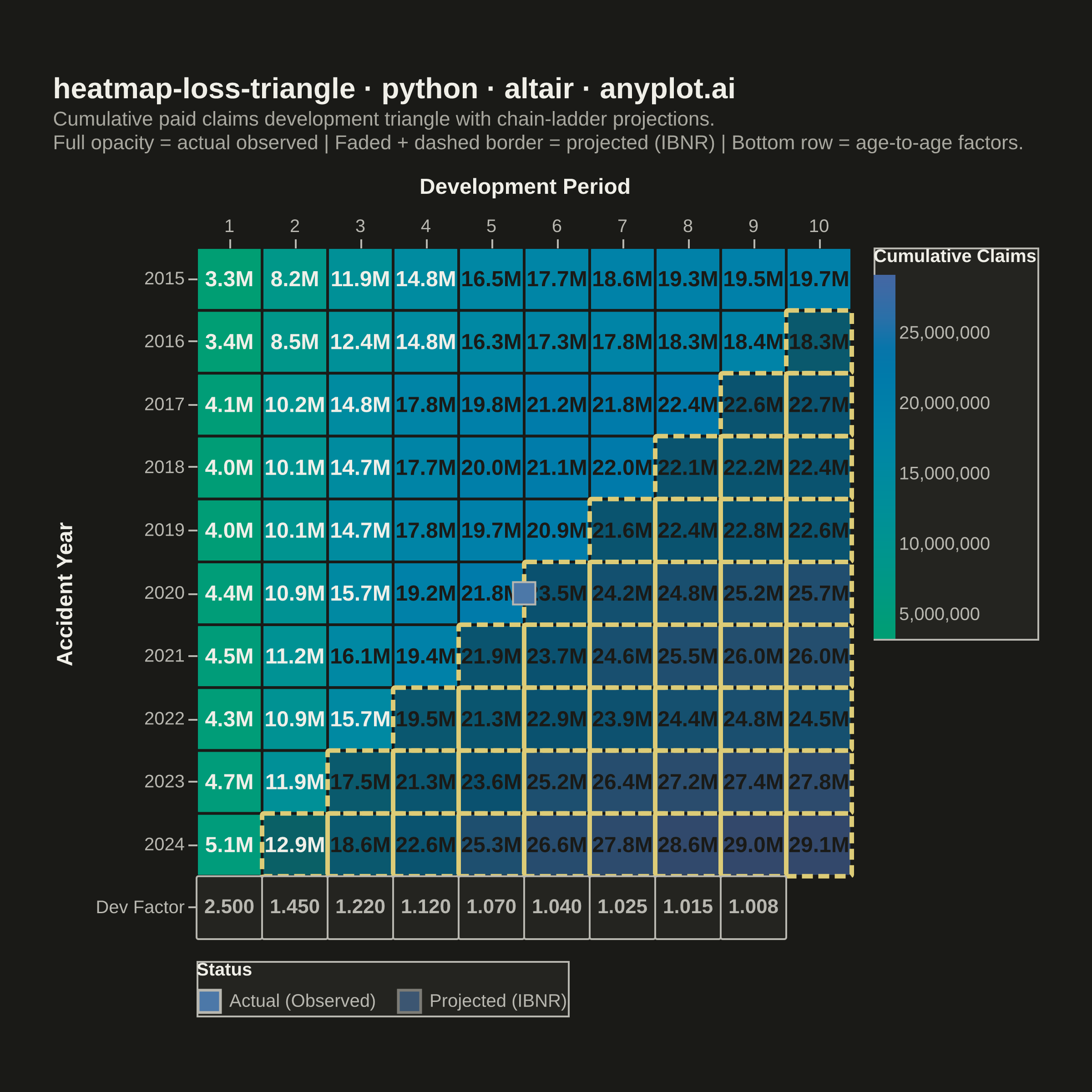
A triangular matrix visualization showing cumulative insurance claim payments developing over time. Rows represent accident/origin years, columns represent development periods (e.g., 1-10 years), with the upper-left triangle displaying actual observed cumulative claims and the lower-right triangle showing projected/estimated values (IBNR). This plot is essential for actuarial reserving, enabling analysts to visualize the chain-ladder method and identify development patterns in loss data.
""" anyplot.ai
heatmap-loss-triangle: Actuarial Loss Development Triangle
Library: altair 6.1.0 | Python 3.13.13
Quality: 89/100 | Updated: 2026-06-03
"""

import os
import sys as _sys


# Prevent this file from shadowing the installed altair package.
# Python inserts the script's directory as sys.path[0] when running `python altair.py`.
_self_dir = os.path.dirname(os.path.abspath(__file__))
if _self_dir in _sys.path:
    _sys.path.remove(_self_dir)
del _sys, _self_dir

import altair as alt
import numpy as np
import pandas as pd
from PIL import Image


# Theme-adaptive chrome (Imprint palette)
THEME = os.getenv("ANYPLOT_THEME", "light")
PAGE_BG = "#FAF8F1" if THEME == "light" else "#1A1A17"
ELEVATED_BG = "#FFFDF6" if THEME == "light" else "#242420"
INK = "#1A1A17" if THEME == "light" else "#F0EFE8"
INK_SOFT = "#4A4A44" if THEME == "light" else "#B8B7B0"
INK_MUTED = "#6B6A63" if THEME == "light" else "#A8A79F"

# Canvas — square 2400×2400 for symmetric heatmap grid
TW, TH = 2400, 2400

# Imprint sequential colormap: brand green → blue (single-polarity, claim magnitude)
IMPRINT_SEQ_START = "#009E73"  # Imprint palette position 1
IMPRINT_SEQ_END = "#4467A3"  # Imprint palette position 3
AMBER = "#DDCC77"  # Imprint amber — IBNR boundary marker

# Data — cumulative paid claims triangle (10 accident years × 10 development periods)
np.random.seed(42)
accident_years = list(range(2015, 2025))
dev_periods = list(range(1, 11))
n_years = len(accident_years)

base_claims = np.array([3200, 3500, 3800, 4100, 3900, 4300, 4600, 4200, 4800, 5100]) * 1000
dev_factors = [2.50, 1.45, 1.22, 1.12, 1.07, 1.04, 1.025, 1.015, 1.008]

cumulative = np.zeros((n_years, len(dev_periods)))
for i in range(n_years):
    cumulative[i, 0] = base_claims[i] + np.random.normal(0, base_claims[i] * 0.05)
    for j in range(1, len(dev_periods)):
        noise = 1 + np.random.normal(0, 0.01)
        cumulative[i, j] = cumulative[i, j - 1] * dev_factors[j - 1] * noise

rows = []
for i, year in enumerate(accident_years):
    for j, period in enumerate(dev_periods):
        is_projected = (i + j) >= n_years
        amount = round(cumulative[i, j])
        label = f"{amount / 1e6:.1f}M" if amount >= 1e6 else f"{amount / 1e3:.0f}K"
        rows.append(
            {
                "Accident Year": str(year),
                "Development Period": period,
                "Cumulative Amount": amount,
                "Status": "Projected (IBNR)" if is_projected else "Actual",
                "Label": label,
            }
        )

df = pd.DataFrame(rows)

legend_data = pd.DataFrame(
    [{"legend_label": "Actual (Observed)", "legend_order": 0}, {"legend_label": "Projected (IBNR)", "legend_order": 1}]
)

factor_rows = []
for j, factor in enumerate(dev_factors):
    factor_rows.append({"Accident Year": "Dev Factor", "Development Period": j + 1, "Factor": f"{factor:.3f}"})
df_factors = pd.DataFrame(factor_rows)

year_order = [str(y) for y in accident_years] + ["Dev Factor"]
min_val = df["Cumulative Amount"].min()
max_val = df["Cumulative Amount"].max()

x_enc = alt.X(
    "Development Period:O",
    axis=alt.Axis(labelFontSize=10, titleFontSize=12, labelAngle=0, orient="top", titlePadding=10),
)
y_enc = alt.Y(
    "Accident Year:N",
    sort=[str(y) for y in accident_years],
    axis=alt.Axis(labelFontSize=10, titleFontSize=12, titlePadding=10),
)

# Heatmap cells with Imprint sequential colormap encoding cumulative claim magnitude
heatmap = (
    alt.Chart(df)
    .mark_rect(stroke=PAGE_BG, strokeWidth=1.5, cornerRadius=1)
    .encode(
        x=x_enc,
        y=y_enc,
        color=alt.Color(
            "Cumulative Amount:Q",
            scale=alt.Scale(range=[IMPRINT_SEQ_START, IMPRINT_SEQ_END], domain=[min_val, max_val]),
            legend=alt.Legend(
                title="Cumulative Claims",
                titleFontSize=10,
                labelFontSize=10,
                gradientLength=200,
                gradientThickness=12,
                orient="right",
                offset=12,
            ),
        ),
        opacity=alt.when(alt.datum.Status == "Actual").then(alt.value(1.0)).otherwise(alt.value(0.6)),
        tooltip=[
            alt.Tooltip("Accident Year:N"),
            alt.Tooltip("Development Period:O"),
            alt.Tooltip("Cumulative Amount:Q", format=",.0f", title="Cumulative ($)"),
            alt.Tooltip("Status:N"),
        ],
    )
)

# Dashed amber border on projected cells — marks the IBNR evaluation boundary
projected_df = df[df["Status"] == "Projected (IBNR)"].copy()
projected_border = (
    alt.Chart(projected_df)
    .mark_rect(stroke=AMBER, strokeWidth=2.5, strokeDash=[6, 3], filled=False, cornerRadius=1)
    .encode(x=x_enc, y=y_enc)
)

# Cell text annotations — ink color adapts for contrast over light/dark cells
text = (
    alt.Chart(df)
    .mark_text(fontSize=12, fontWeight="bold")
    .encode(
        x=x_enc,
        y=y_enc,
        text="Label:N",
        color=alt.when(alt.datum["Cumulative Amount"] > (max_val * 0.55))
        .then(alt.value(PAGE_BG))
        .otherwise(alt.value(INK)),
    )
)

# Dev factors background row (age-to-age chain-ladder factors)
factor_bg = (
    alt.Chart(df_factors)
    .mark_rect(fill=ELEVATED_BG, stroke=INK_SOFT, strokeWidth=1, cornerRadius=1)
    .encode(x=alt.X("Development Period:O"), y=alt.Y("Accident Year:N", sort=year_order))
)
factor_text = (
    alt.Chart(df_factors)
    .mark_text(fontSize=11, fontWeight="bold", color=INK_SOFT)
    .encode(x=alt.X("Development Period:O"), y=alt.Y("Accident Year:N", sort=year_order), text="Factor:N")
)

# Status legend placed at bottom to avoid crowding the right-side color legend
status_legend = (
    alt.Chart(legend_data)
    .mark_square(size=150, stroke=INK_SOFT, strokeWidth=1)
    .encode(
        opacity=alt.Opacity(
            "legend_label:N",
            scale=alt.Scale(domain=["Actual (Observed)", "Projected (IBNR)"], range=[1.0, 0.6]),
            legend=alt.Legend(
                title="Status",
                titleFontSize=10,
                labelFontSize=10,
                orient="bottom",
                offset=12,
                symbolType="square",
                symbolSize=150,
                symbolStrokeWidth=1.5,
                symbolFillColor=IMPRINT_SEQ_START,
            ),
        )
    )
)

chart = (
    (heatmap + projected_border + text + factor_bg + factor_text + status_legend)
    .properties(
        width=360,
        height=380,
        background=PAGE_BG,
        title=alt.Title(
            "heatmap-loss-triangle · python · altair · anyplot.ai",
            subtitle=[
                "Cumulative paid claims development triangle with chain-ladder projections.",
                "Full opacity = actual observed  |  Faded + dashed border = projected (IBNR)  |  Bottom row = age-to-age factors.",
            ],
            fontSize=16,
            subtitleFontSize=11,
            subtitleColor=INK_MUTED,
            color=INK,
            anchor="start",
            offset=12,
        ),
        padding={"left": 20, "right": 20, "top": 20, "bottom": 20},
    )
    .configure_axis(grid=False, domainWidth=0, labelColor=INK_SOFT, titleColor=INK, tickColor=INK_SOFT)
    .configure_view(strokeWidth=0, fill=PAGE_BG)
    .configure_legend(fillColor=ELEVATED_BG, strokeColor=INK_SOFT, labelColor=INK_SOFT, titleColor=INK)
    .configure_title(color=INK)
)

# Save PNG then pad to exact 2400×2400 target (square format for symmetric heatmap)
chart.save(f"plot-{THEME}.png", scale_factor=4.0)
chart.save(f"plot-{THEME}.html")

_img = Image.open(f"plot-{THEME}.png").convert("RGB")
_w, _h = _img.size
if _w > TW or _h > TH:
    raise SystemExit(
        f"altair vl-convert produced {_w}×{_h}, exceeds target {TW}×{TH}. "
        f"Shrink chart .properties(width=, height=) values and re-render."
    )
if _w < TW or _h < TH:
    _canvas = Image.new("RGB", (TW, TH), PAGE_BG)
    _canvas.paste(_img, ((TW - _w) // 2, (TH - _h) // 2))
    _canvas.save(f"plot-{THEME}.png")
Runnable source as JSON, for any HTTP client: https://api.anyplot.ai/specs/heatmap-loss-triangle/altair/code. Any spec id and library id listed in llms-full.txt fit the same URL shape; every URL below is complete and callable.
{
  "spec_id": "heatmap-loss-triangle",
  "language": "python",
  "library": "altair",
  "page": "https://anyplot.ai/heatmap-loss-triangle/python/altair",
  "hub": "https://anyplot.ai/heatmap-loss-triangle",
  "code_json": "https://api.anyplot.ai/specs/heatmap-loss-triangle/altair/code",
  "spec_json": "https://api.anyplot.ai/specs/heatmap-loss-triangle",
  "render_light_png": "https://storage.googleapis.com/anyplot-images/plots/heatmap-loss-triangle/python/altair/plot-light.png",
  "render_dark_png": "https://storage.googleapis.com/anyplot-images/plots/heatmap-loss-triangle/python/altair/plot-dark.png",
  "interactive_light_html": "https://storage.googleapis.com/anyplot-images/plots/heatmap-loss-triangle/python/altair/plot-light.html",
  "interactive_dark_html": "https://storage.googleapis.com/anyplot-images/plots/heatmap-loss-triangle/python/altair/plot-dark.html",
  "quality_score": 89.0,
  "license": "MIT",
  "guide": "https://anyplot.ai/llms.txt"
}
Part of Actuarial Loss Development Triangle on anyplot.ai.