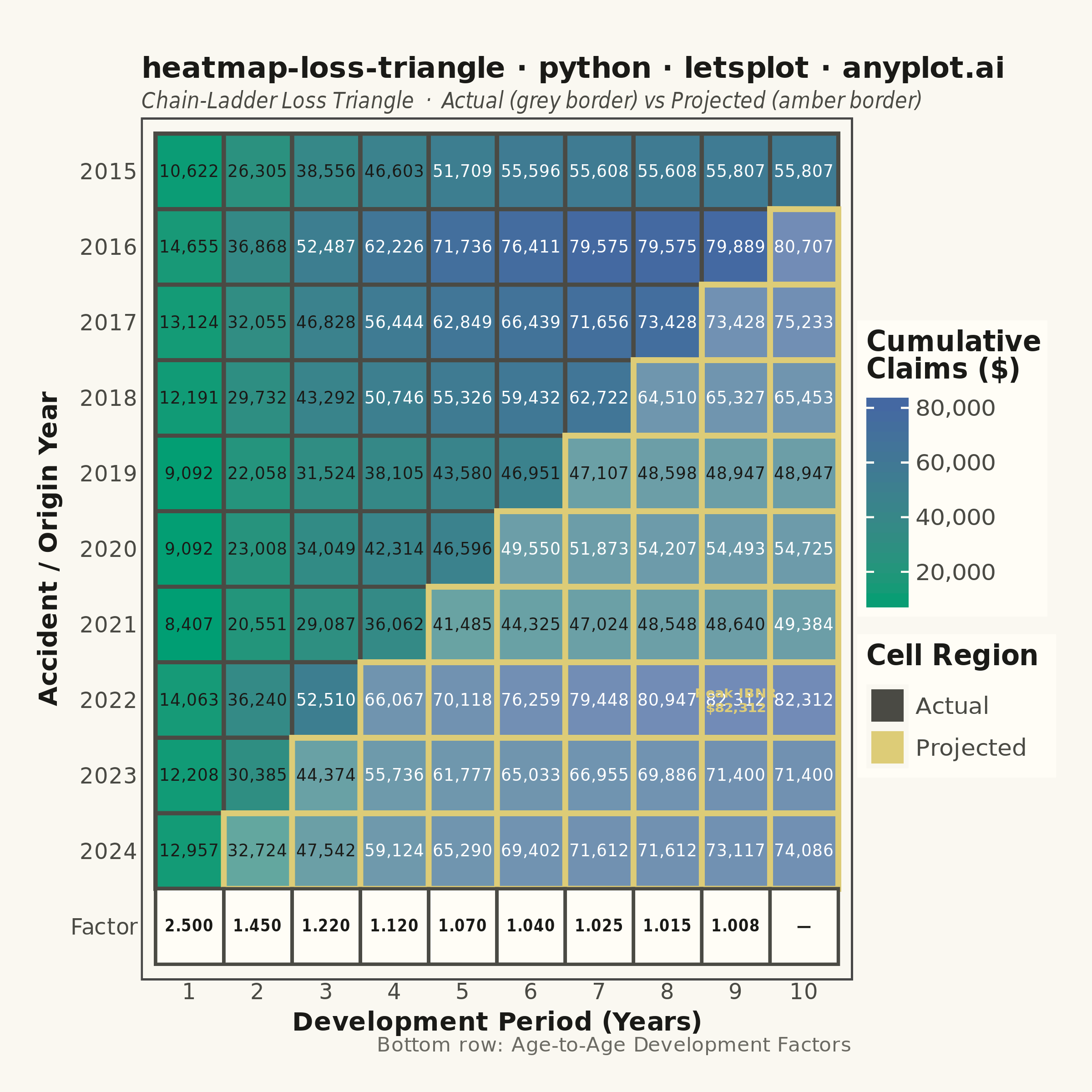
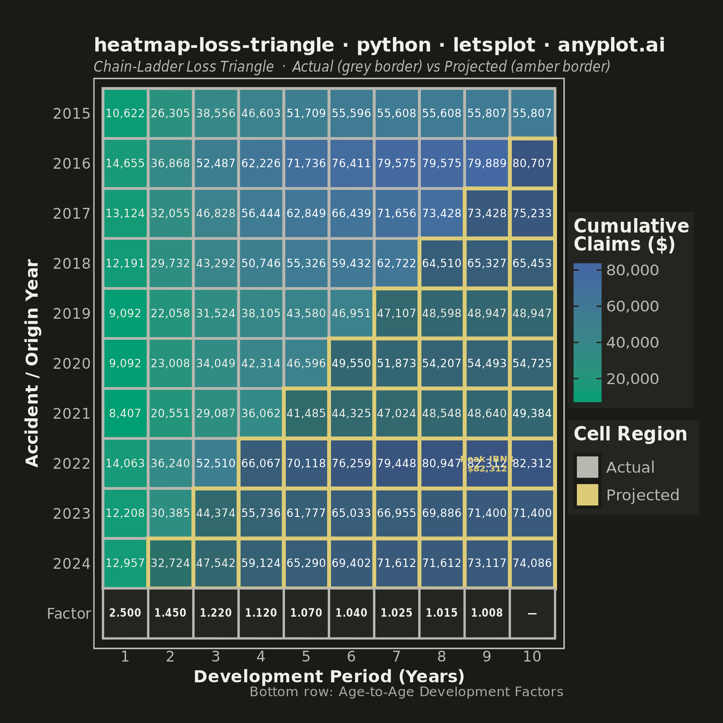
A triangular matrix visualization showing cumulative insurance claim payments developing over time. Rows represent accident/origin years, columns represent development periods (e.g., 1-10 years), with the upper-left triangle displaying actual observed cumulative claims and the lower-right triangle showing projected/estimated values (IBNR). This plot is essential for actuarial reserving, enabling analysts to visualize the chain-ladder method and identify development patterns in loss data.
""" anyplot.ai
heatmap-loss-triangle: Actuarial Loss Development Triangle
Library: letsplot 4.10.1 | Python 3.13.13
Quality: 86/100 | Updated: 2026-06-03
"""

import os

import numpy as np
import pandas as pd
from lets_plot import *


LetsPlot.setup_html()

# Theme tokens (Imprint palette — theme-adaptive chrome)
THEME = os.getenv("ANYPLOT_THEME", "light")
PAGE_BG = "#FAF8F1" if THEME == "light" else "#1A1A17"
ELEVATED_BG = "#FFFDF6" if THEME == "light" else "#242420"
INK = "#1A1A17" if THEME == "light" else "#F0EFE8"
INK_SOFT = "#4A4A44" if THEME == "light" else "#B8B7B0"
INK_MUTED = "#6B6A63" if THEME == "light" else "#A8A79F"
ANYPLOT_AMBER = "#DDCC77"  # warning / caution anchor — outside the categorical pool

# Data — cumulative paid claims triangle (10 accident years × 10 development periods)
np.random.seed(42)
accident_years = list(range(2015, 2025))
dev_periods = list(range(1, 11))
n_years = len(accident_years)
n_periods = len(dev_periods)

# Age-to-age development factors (realistic chain-ladder factors)
age_to_age_factors = [2.50, 1.45, 1.22, 1.12, 1.07, 1.04, 1.025, 1.015, 1.008]

# Generate realistic initial claims and build cumulative triangle
initial_claims = np.random.uniform(8000, 15000, n_years)
triangle = np.full((n_years, n_periods), np.nan)
for i in range(n_years):
    triangle[i, 0] = initial_claims[i]
    for j in range(1, n_periods):
        noise = max(np.random.normal(1.0, 0.02), 1.0 / age_to_age_factors[j - 1])
        triangle[i, j] = triangle[i, j - 1] * age_to_age_factors[j - 1] * noise

# Build main heatmap dataframe
rows = []
for i in range(n_years):
    for j in range(n_periods):
        is_projected = (i + j) >= n_years
        rows.append(
            {
                "accident_year": str(accident_years[i]),
                "dev_period": str(dev_periods[j]),
                "cumulative": triangle[i, j],
                "region": "Projected" if is_projected else "Actual",
            }
        )

df = pd.DataFrame(rows)
df["label"] = df["cumulative"].apply(lambda v: f"{v:,.0f}")

# Text color: white on dark cells, INK on lighter cells (contrast against fill gradient)
max_val = df["cumulative"].max()
min_val = df["cumulative"].min()
df["text_color"] = df["cumulative"].apply(lambda v: "white" if (v - min_val) / (max_val - min_val) > 0.55 else INK)

# Build development factors row (9 factors + terminal "—")
factor_rows = []
for j in range(len(age_to_age_factors)):
    factor_rows.append(
        {"accident_year": "Factor", "dev_period": str(dev_periods[j]), "label": f"{age_to_age_factors[j]:.3f}"}
    )
factor_rows.append({"accident_year": "Factor", "dev_period": str(dev_periods[-1]), "label": "—"})
df_factors = pd.DataFrame(factor_rows)

# Y-axis ordering: Factor at bottom, 2024 above, 2015 at top
y_order = ["Factor"] + [str(y) for y in reversed(accident_years)]

# Separate actual and projected
df_actual = df[df["region"] == "Actual"].copy()
df_projected = df[df["region"] == "Projected"].copy()

# Invisible points for Actual/Projected legend (lets-plot guide trick)
df_legend = pd.DataFrame(
    {
        "x": [str(dev_periods[0]), str(dev_periods[0])],
        "y": [str(accident_years[0]), str(accident_years[0])],
        "region": ["Actual", "Projected"],
    }
)

# Split cell annotations by text color for contrast against fill gradient
df_light_text = df[df["text_color"] == "white"].copy()
df_dark_text = df[df["text_color"] != "white"].copy()

# Focal point: identify peak projected (IBNR) cell for storytelling annotation
max_proj_idx = df_projected["cumulative"].idxmax()
max_proj_row = df_projected.loc[max_proj_idx]
df_peak = pd.DataFrame(
    {
        "accident_year": [max_proj_row["accident_year"]],
        "dev_period": [max_proj_row["dev_period"]],
        "text": [f"Peak IBNR\n${max_proj_row['cumulative']:,.0f}"],
    }
)

title = "heatmap-loss-triangle · python · letsplot · anyplot.ai"

# Theme-adaptive chrome
anyplot_theme = theme(
    plot_background=element_rect(fill=PAGE_BG, color=PAGE_BG),
    panel_background=element_rect(fill=PAGE_BG),
    panel_grid=element_blank(),
    panel_border=element_blank(),
    axis_line=element_blank(),
    axis_ticks=element_blank(),
    axis_title=element_text(color=INK, size=14, face="bold"),
    axis_text=element_text(color=INK_SOFT, size=12),
    plot_title=element_text(color=INK, size=16, face="bold"),
    plot_subtitle=element_text(color=INK_SOFT, size=12, face="italic"),
    plot_caption=element_text(color=INK_MUTED, size=11),
    legend_background=element_rect(fill=ELEVATED_BG, color=INK_SOFT),
    legend_text=element_text(color=INK_SOFT, size=13),
    legend_title=element_text(color=INK, size=15, face="bold"),
    legend_position="right",
    plot_margin=[30, 20, 20, 20],
)

# Base flavor: lets-plot exclusive dark theme for dark renders
base_flavor = flavor_darcula() if THEME == "dark" else theme_minimal()

# Plot
plot = (
    ggplot()
    # Actual cells: border in INK_SOFT (theme-adaptive grey)
    + geom_tile(aes(x="dev_period", y="accident_year", fill="cumulative"), data=df_actual, color=INK_SOFT, size=1.0)
    # Projected cells: amber border + slightly reduced alpha marks the IBNR region
    + geom_tile(
        aes(x="dev_period", y="accident_year", fill="cumulative"),
        data=df_projected,
        color=ANYPLOT_AMBER,
        size=1.4,
        alpha=0.75,
    )
    # Cell annotations — split by text color for readability across gradient
    + geom_text(aes(x="dev_period", y="accident_year", label="label"), data=df_light_text, color="white", size=4.5)
    + geom_text(aes(x="dev_period", y="accident_year", label="label"), data=df_dark_text, color=INK, size=4.5)
    # Invisible points for Actual / Projected legend via guide_legend override_aes
    + geom_point(aes(x="x", y="y", color="region"), data=df_legend, size=0, alpha=0)
    + scale_color_manual(
        values={"Actual": INK_SOFT, "Projected": ANYPLOT_AMBER},
        name="Cell Region",
        guide=guide_legend(override_aes={"size": 8, "alpha": 1, "shape": 15}),
    )
    # Factor row tiles with elevated background
    + geom_tile(aes(x="dev_period", y="accident_year"), data=df_factors, fill=ELEVATED_BG, color=INK_SOFT, size=0.8)
    # Factor labels in bold
    + geom_text(
        aes(x="dev_period", y="accident_year", label="label"), data=df_factors, color=INK, size=4.0, fontface="bold"
    )
    # Focal point: callout on peak projected (IBNR) cell for data storytelling
    + geom_text(
        aes(x="dev_period", y="accident_year", label="text"),
        data=df_peak,
        color=ANYPLOT_AMBER,
        size=3.8,
        fontface="bold",
    )
    # Imprint sequential colormap: brand green → blue (single-polarity magnitude)
    + scale_fill_gradient(low="#009E73", high="#4467A3", name="Cumulative\nClaims ($)")
    + scale_x_discrete(limits=[str(p) for p in dev_periods])
    + scale_y_discrete(limits=y_order)
    + labs(
        x="Development Period (Years)",
        y="Accident / Origin Year",
        title=title,
        subtitle="Chain-Ladder Loss Triangle  ·  Actual (grey border) vs Projected (amber border)",
        caption="Bottom row: Age-to-Age Development Factors",
    )
    + ggsize(600, 600)
    + base_flavor
    + anyplot_theme
)

# Save
ggsave(plot, f"plot-{THEME}.png", path=".", scale=4)
ggsave(plot, f"plot-{THEME}.html", path=".")
Runnable source as JSON, for any HTTP client: https://api.anyplot.ai/specs/heatmap-loss-triangle/letsplot/code. Any spec id and library id listed in llms-full.txt fit the same URL shape; every URL below is complete and callable.
{
  "spec_id": "heatmap-loss-triangle",
  "language": "python",
  "library": "letsplot",
  "page": "https://anyplot.ai/heatmap-loss-triangle/python/letsplot",
  "hub": "https://anyplot.ai/heatmap-loss-triangle",
  "code_json": "https://api.anyplot.ai/specs/heatmap-loss-triangle/letsplot/code",
  "spec_json": "https://api.anyplot.ai/specs/heatmap-loss-triangle",
  "render_light_png": "https://storage.googleapis.com/anyplot-images/plots/heatmap-loss-triangle/python/letsplot/plot-light.png",
  "render_dark_png": "https://storage.googleapis.com/anyplot-images/plots/heatmap-loss-triangle/python/letsplot/plot-dark.png",
  "interactive_light_html": "https://storage.googleapis.com/anyplot-images/plots/heatmap-loss-triangle/python/letsplot/plot-light.html",
  "interactive_dark_html": "https://storage.googleapis.com/anyplot-images/plots/heatmap-loss-triangle/python/letsplot/plot-dark.html",
  "quality_score": 86.0,
  "license": "MIT",
  "guide": "https://anyplot.ai/llms.txt"
}
Part of Actuarial Loss Development Triangle on anyplot.ai.