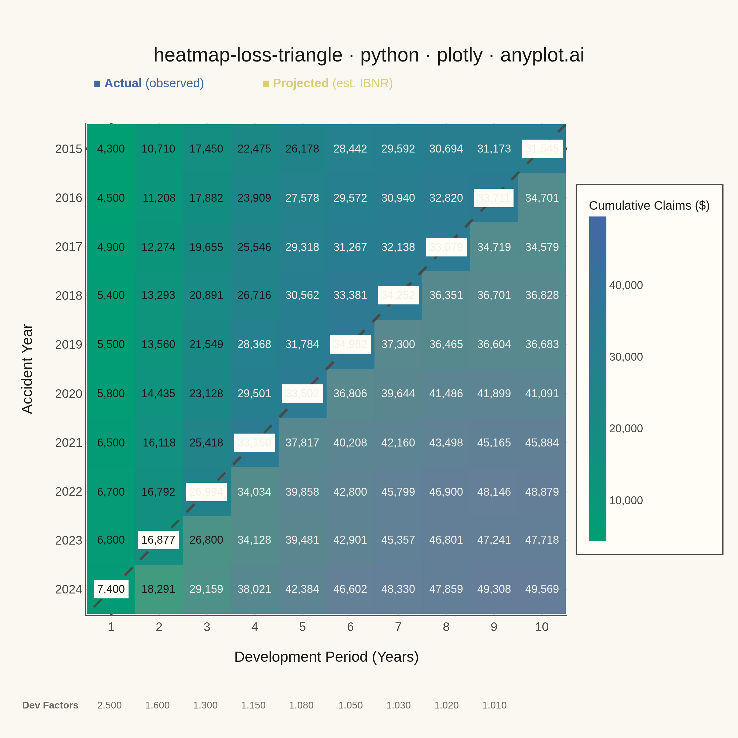
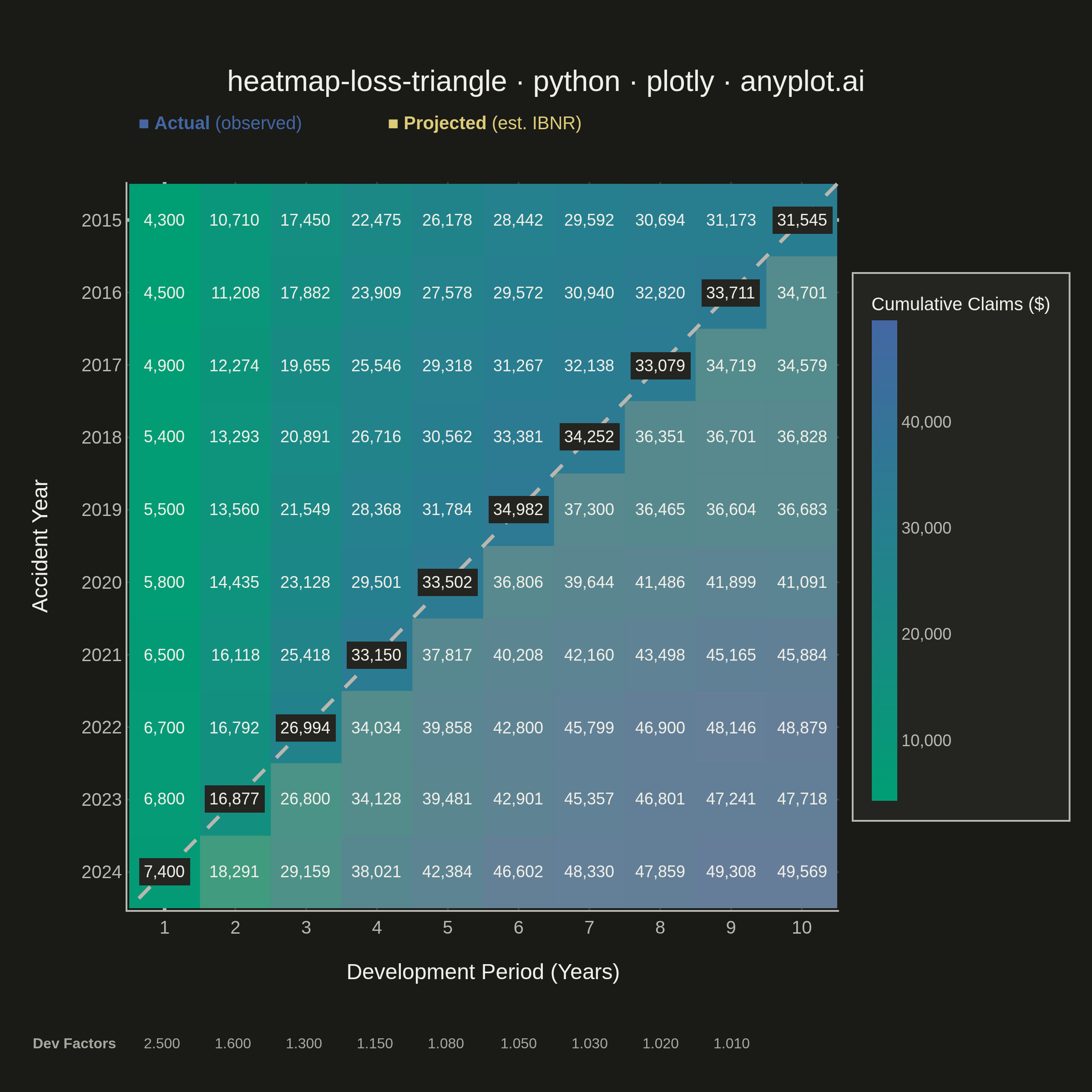
A triangular matrix visualization showing cumulative insurance claim payments developing over time. Rows represent accident/origin years, columns represent development periods (e.g., 1-10 years), with the upper-left triangle displaying actual observed cumulative claims and the lower-right triangle showing projected/estimated values (IBNR). This plot is essential for actuarial reserving, enabling analysts to visualize the chain-ladder method and identify development patterns in loss data.
""" anyplot.ai
heatmap-loss-triangle: Actuarial Loss Development Triangle
Library: plotly 6.7.0 | Python 3.13.13
Quality: 87/100 | Updated: 2026-06-03
"""

import os
import sys


# Prevent this file (plotly.py) from shadowing the installed plotly package
_here = os.path.dirname(os.path.abspath(__file__))
sys.path = [p for p in sys.path if p and os.path.abspath(p) != _here]

import numpy as np
import plotly.graph_objects as go


# Theme
THEME = os.getenv("ANYPLOT_THEME", "light")

# Imprint palette — theme-adaptive chrome tokens
PAGE_BG = "#FAF8F1" if THEME == "light" else "#1A1A17"
ELEVATED_BG = "#FFFDF6" if THEME == "light" else "#242420"
INK = "#1A1A17" if THEME == "light" else "#F0EFE8"
INK_SOFT = "#4A4A44" if THEME == "light" else "#B8B7B0"
INK_MUTED = "#6B6A63" if THEME == "light" else "#A8A79F"
GRID = "rgba(26,26,23,0.15)" if THEME == "light" else "rgba(240,239,232,0.15)"

# Imprint sequential colormap for continuous loss data (green → blue)
imprint_seq = [[0.0, "#009E73"], [1.0, "#4467A3"]]
# Amber anchor for projected / IBNR region
ANYPLOT_AMBER = "#DDCC77"

# Data generation
np.random.seed(42)
accident_years = list(range(2015, 2025))
development_periods = list(range(1, 11))
n_years = len(accident_years)
n_periods = len(development_periods)

dev_factors = [2.50, 1.60, 1.30, 1.15, 1.08, 1.05, 1.03, 1.02, 1.01]

base_claims = np.array([4200, 4500, 4800, 5100, 5500, 5800, 6200, 6500, 6900, 7300], dtype=float)
base_claims += np.random.normal(0, 200, n_years)
base_claims = np.round(base_claims / 100) * 100

cumulative = np.full((n_years, n_periods), np.nan)
cumulative[:, 0] = base_claims
for col in range(1, n_periods):
    factor = dev_factors[col - 1] + np.random.normal(0, 0.02, n_years)
    cumulative[:, col] = cumulative[:, col - 1] * factor
cumulative = np.round(cumulative, 0)

is_actual = np.full((n_years, n_periods), False)
for i in range(n_years):
    is_actual[i, : n_years - i] = True

z_min = np.nanmin(cumulative)
z_max = np.nanmax(cumulative)

# Figure
fig = go.Figure()

fig.add_trace(
    go.Heatmap(
        z=cumulative,
        x=list(range(n_periods)),
        y=list(range(n_years)),
        colorscale=imprint_seq,
        zmin=z_min,
        zmax=z_max,
        colorbar={
            "title": {"text": "Cumulative Claims ($)", "font": {"size": 10, "color": INK}},
            "tickfont": {"size": 9, "color": INK_SOFT},
            "thickness": 14,
            "len": 0.75,
            "tickformat": ",.0f",
            "bgcolor": ELEVATED_BG,
            "bordercolor": INK_SOFT,
            "borderwidth": 1,
        },
        hovertemplate=(
            "Accident Year: %{customdata[0]}<br>Dev Period: %{customdata[1]}<br>Claims: $%{z:,.0f}<extra></extra>"
        ),
        customdata=[[(accident_years[i], development_periods[j]) for j in range(n_periods)] for i in range(n_years)],
        showscale=True,
    )
)

# Cell value annotations — bolder font for actual cells, lighter for projected
annotations = []
for i in range(n_years):
    for j in range(n_periods):
        val = cumulative[i, j]
        relative = (val - z_min) / (z_max - z_min)
        font_color = "#F0EFE8" if relative > 0.50 else INK
        boundary = j == n_years - 1 - i
        projected = not is_actual[i, j]
        # Typographic distinction: actual cells use Arial Black, projected use regular Arial
        font_family = "Arial, sans-serif" if projected else "Arial Black, Arial, sans-serif"
        annotations.append(
            {
                "x": j,
                "y": i,
                "text": f"{val:,.0f}",
                "showarrow": False,
                "font": {"size": 9, "color": font_color, "family": font_family},
                "bgcolor": ELEVATED_BG if boundary else None,
                "borderpad": 2 if boundary else 0,
            }
        )

# Projected cell overlays (Imprint amber tint to distinguish from actual)
shapes = []
for i in range(n_years):
    for j in range(n_periods):
        if not is_actual[i, j]:
            shapes.append(
                {
                    "type": "rect",
                    "x0": j - 0.5,
                    "x1": j + 0.5,
                    "y0": i - 0.5,
                    "y1": i + 0.5,
                    "line": {"color": "rgba(0,0,0,0)"},
                    "fillcolor": "rgba(221,204,119,0.22)",
                    "layer": "above",
                }
            )

# Diagonal separator (actual vs projected boundary)
shapes.append(
    {
        "type": "line",
        "x0": n_periods - 1 + 0.5,
        "y0": 0 - 0.5,
        "x1": 0 - 0.5,
        "y1": n_years - 1 + 0.5,
        "line": {"color": INK_SOFT, "width": 2, "dash": "dash"},
        "layer": "above",
    }
)

# Development factors row below the x-axis
for k, factor in enumerate(dev_factors):
    annotations.append(
        {
            "x": (k + 0.5) / n_periods,
            "y": -0.20,
            "xref": "paper",
            "yref": "paper",
            "text": f"{factor:.3f}",
            "showarrow": False,
            "font": {"size": 8, "color": INK_MUTED, "family": "Arial, sans-serif"},
            "xanchor": "center",
        }
    )
annotations.append(
    {
        "x": -0.01,
        "y": -0.20,
        "xref": "paper",
        "yref": "paper",
        "text": "<b>Dev Factors</b>",
        "showarrow": False,
        "font": {"size": 8, "color": INK_MUTED, "family": "Arial, sans-serif"},
        "xanchor": "right",
    }
)

# Legend: actual vs projected
annotations.append(
    {
        "x": 0.01,
        "y": 1.10,
        "xref": "paper",
        "yref": "paper",
        "text": "■ <b>Actual</b> (observed)",
        "showarrow": False,
        "font": {"size": 10, "color": "#4467A3", "family": "Arial, sans-serif"},
        "xanchor": "left",
    }
)
annotations.append(
    {
        "x": 0.36,
        "y": 1.10,
        "xref": "paper",
        "yref": "paper",
        "text": "■ <b>Projected</b> (est. IBNR)",
        "showarrow": False,
        "font": {"size": 10, "color": ANYPLOT_AMBER, "family": "Arial, sans-serif"},
        "xanchor": "left",
    }
)

fig.update_layout(
    autosize=False,
    title={
        "text": "heatmap-loss-triangle · python · plotly · anyplot.ai",
        "font": {"size": 16, "family": "Arial, sans-serif", "color": INK},
        "x": 0.5,
        "xanchor": "center",
    },
    xaxis={
        "title": {"text": "Development Period (Years)", "font": {"size": 12, "color": INK}},
        "tickfont": {"size": 10, "color": INK_SOFT},
        "tickvals": list(range(n_periods)),
        "ticktext": [str(p) for p in development_periods],
        "side": "bottom",
        "gridcolor": GRID,
        "linecolor": INK_SOFT,
        "zerolinecolor": INK_SOFT,
    },
    yaxis={
        "title": {"text": "Accident Year", "font": {"size": 12, "color": INK}},
        "tickfont": {"size": 10, "color": INK_SOFT},
        "tickvals": list(range(n_years)),
        "ticktext": [str(y) for y in accident_years],
        "autorange": "reversed",
        "gridcolor": GRID,
        "linecolor": INK_SOFT,
        "zerolinecolor": INK_SOFT,
    },
    paper_bgcolor=PAGE_BG,
    plot_bgcolor=PAGE_BG,
    font={"color": INK},
    shapes=shapes,
    annotations=annotations,
    margin={"l": 70, "r": 95, "t": 100, "b": 100},
)

fig.write_image(f"plot-{THEME}.png", width=600, height=600, scale=4)
fig.write_html(f"plot-{THEME}.html", include_plotlyjs="cdn")
Runnable source as JSON, for any HTTP client: https://api.anyplot.ai/specs/heatmap-loss-triangle/plotly/code. Any spec id and library id listed in llms-full.txt fit the same URL shape; every URL below is complete and callable.
{
  "spec_id": "heatmap-loss-triangle",
  "language": "python",
  "library": "plotly",
  "page": "https://anyplot.ai/heatmap-loss-triangle/python/plotly",
  "hub": "https://anyplot.ai/heatmap-loss-triangle",
  "code_json": "https://api.anyplot.ai/specs/heatmap-loss-triangle/plotly/code",
  "spec_json": "https://api.anyplot.ai/specs/heatmap-loss-triangle",
  "render_light_png": "https://storage.googleapis.com/anyplot-images/plots/heatmap-loss-triangle/python/plotly/plot-light.png",
  "render_dark_png": "https://storage.googleapis.com/anyplot-images/plots/heatmap-loss-triangle/python/plotly/plot-dark.png",
  "interactive_light_html": "https://storage.googleapis.com/anyplot-images/plots/heatmap-loss-triangle/python/plotly/plot-light.html",
  "interactive_dark_html": "https://storage.googleapis.com/anyplot-images/plots/heatmap-loss-triangle/python/plotly/plot-dark.html",
  "quality_score": 87.0,
  "license": "MIT",
  "guide": "https://anyplot.ai/llms.txt"
}
Part of Actuarial Loss Development Triangle on anyplot.ai.