The same plot in 14 other libraries — JavaScript: Chart.js, D3.js, Apache ECharts, MUI X Charts; Python: Altair, Bokeh, lets-plot, Matplotlib, Plotly, plotnine, Pygal, Seaborn; R: ggplot2; Julia: Makie.jl. Compare all 15 side by side: Mandelbrot Set Fractal Visualization in Python, R, Julia and JavaScript.
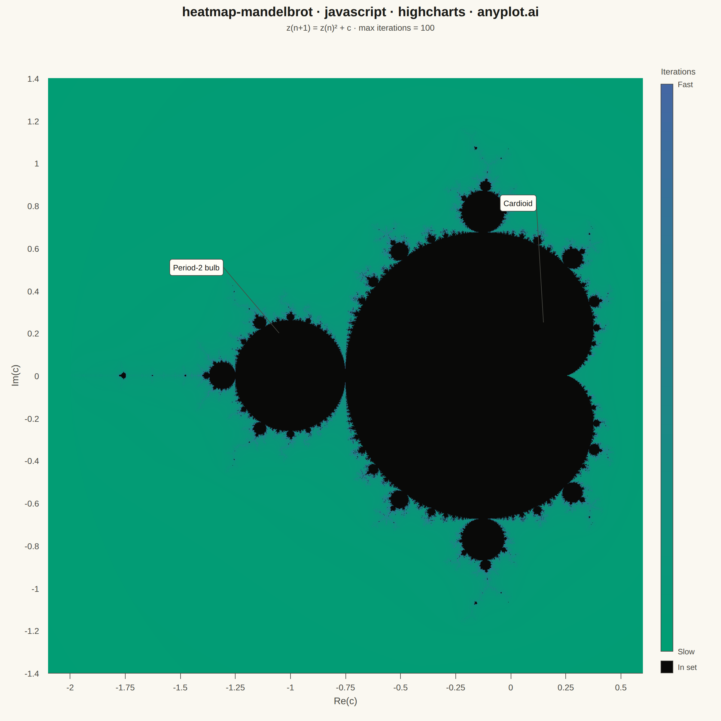
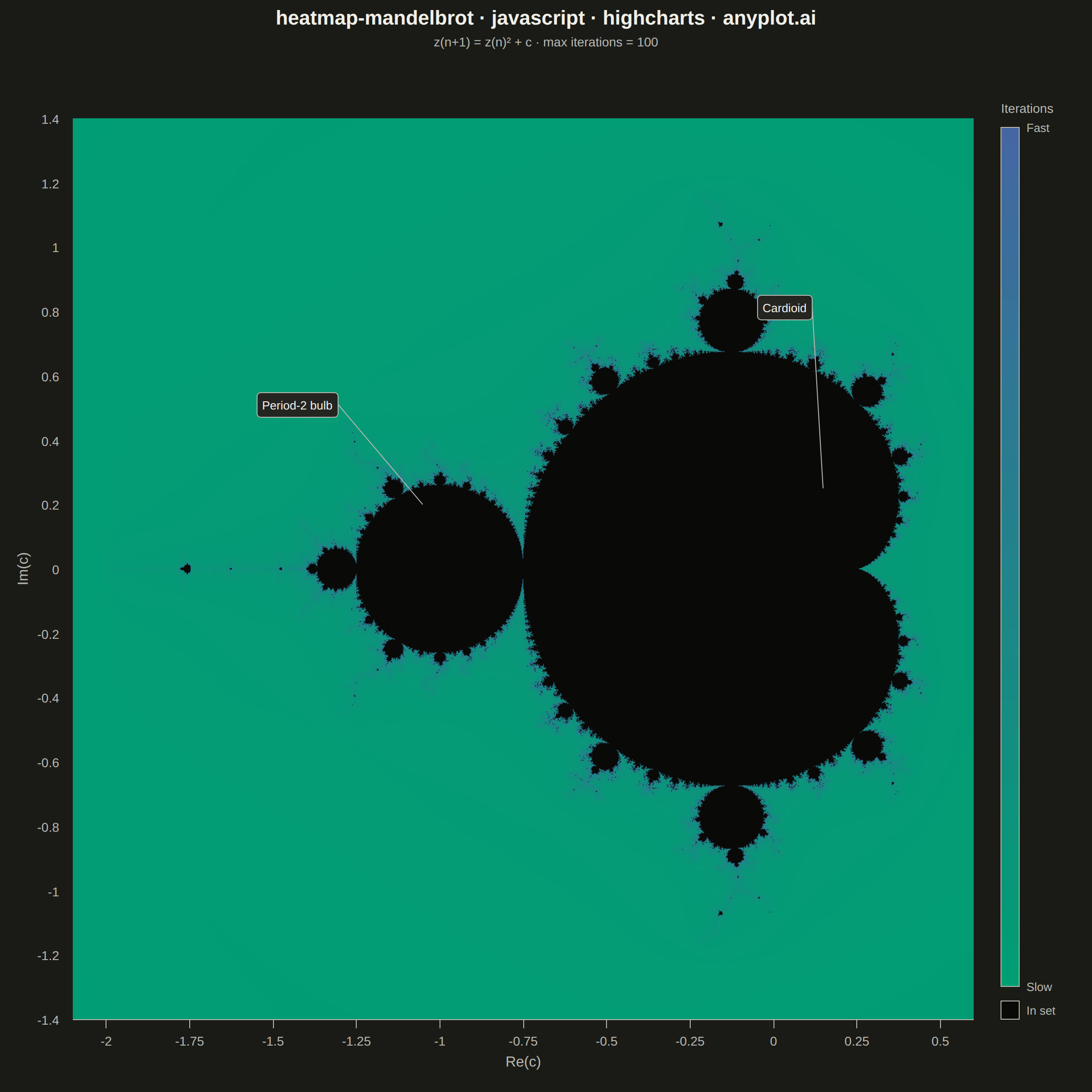
A visualization of the Mandelbrot set, the most iconic fractal in mathematics. Each pixel represents a complex number c on the complex plane, colored by how quickly the iteration z(n+1) = z(n)^2 + c diverges. The boundary between convergent and divergent regions reveals infinitely complex, self-similar structure including the characteristic cardioid and period-2 bulb.
// anyplot.ai
// heatmap-mandelbrot: Mandelbrot Set Fractal Visualization
// Library: highcharts 12.6.0 | JavaScript 22.23.2
// Quality: 92/100 | Created: 2026-08-25
//# anyplot-orientation: square

const t = window.ANYPLOT_TOKENS;

// --- Mandelbrot parameters ---------------------------------------------------
// A square viewport (equal real/imaginary extent) so the square canvas can host
// it with uniform x/y scale — no stretching of the complex plane. This framing
// still shows the full classic view: the cardioid, the period-2 bulb on its
// left, and the negative-real spike tapering out past Re(c) = -2.
const X_MIN = -2.1;
const X_MAX = 0.6;
const Y_MIN = -1.35;
const Y_MAX = 1.35;
const MAX_ITER = 100;

// Raster resolution: comfortably above the spec's 800x600 floor, and close to
// the plot area's own device-pixel size (square mount, deviceScaleFactor 2) so
// the embedded image is neither blurrily upscaled nor wastefully oversampled.
const RES = 1400;

// In-set points (orbit stays bounded) get a fixed, theme-independent solid
// color — this is data, not chrome, so it does not follow ANYPLOT_THEME.
const IN_SET_RGB = [9, 9, 8];

function hexToRgb(hex) {
  return [parseInt(hex.slice(1, 3), 16), parseInt(hex.slice(3, 5), 16), parseInt(hex.slice(5, 7), 16)];
}
const SEQ_LO = hexToRgb(t.seq[0]); // #009E73 — escapes fast (low iteration count)
const SEQ_HI = hexToRgb(t.seq[1]); // #4467A3 — escapes slowly (near the boundary)

// --- Escape-time raster (smooth/continuous iteration count) -----------------
// Computed straight into an off-screen canvas's ImageData, not RES*RES SVG
// rects — the core Highcharts bundle has no heatmap/colorAxis module, and that
// many SVG nodes would be both a DOM-size problem and far slower to paint than
// a raster. The finished raster is embedded as a single <image> in the chart's
// SVG via the renderer, so the chart otherwise stays plain core Highcharts.
const canvas = document.createElement('canvas');
canvas.width = RES;
canvas.height = RES;
const ctx = canvas.getContext('2d');
const imageData = ctx.createImageData(RES, RES);
const pixels = imageData.data;

const LOG2 = Math.log(2);

for (let py = 0; py < RES; py++) {
  const ci = Y_MAX - (py / (RES - 1)) * (Y_MAX - Y_MIN); // row 0 = top = Y_MAX
  for (let px = 0; px < RES; px++) {
    const cr = X_MIN + (px / (RES - 1)) * (X_MAX - X_MIN);
    let zr = 0;
    let zi = 0;
    let zr2 = 0;
    let zi2 = 0;
    let n = 0;
    while (n < MAX_ITER && zr2 + zi2 <= 4) {
      zi = 2 * zr * zi + ci;
      zr = zr2 - zi2 + cr;
      zr2 = zr * zr;
      zi2 = zi * zi;
      n++;
    }

    const idx = (py * RES + px) * 4;
    if (n >= MAX_ITER) {
      pixels[idx] = IN_SET_RGB[0];
      pixels[idx + 1] = IN_SET_RGB[1];
      pixels[idx + 2] = IN_SET_RGB[2];
    } else {
      // Smooth normalized iteration count (renormalized escape-time) avoids
      // the discrete color banding a raw integer count produces at this
      // max_iterations, per the spec's "smooth coloring" requirement.
      const modulus = Math.sqrt(zr2 + zi2);
      const nu = n + 1 - Math.log(Math.log(modulus)) / LOG2;
      const f = Math.max(0, Math.min(1, nu / MAX_ITER));
      pixels[idx] = Math.round(SEQ_LO[0] + (SEQ_HI[0] - SEQ_LO[0]) * f);
      pixels[idx + 1] = Math.round(SEQ_LO[1] + (SEQ_HI[1] - SEQ_LO[1]) * f);
      pixels[idx + 2] = Math.round(SEQ_LO[2] + (SEQ_HI[2] - SEQ_LO[2]) * f);
    }
    pixels[idx + 3] = 255;
  }
}
ctx.putImageData(imageData, 0, 0);
const RASTER_URL = canvas.toDataURL('image/png');

// --- Title (fontsize scaled off the 67-char baseline) -----------------------
const TITLE_TEXT = 'heatmap-mandelbrot · javascript · highcharts · anyplot.ai';
const TITLE_FS = Math.max(Math.round(22 * Math.min(1, 67 / TITLE_TEXT.length)), 14);

// --- Fixed chart geometry -----------------------------------------------------
// Margins chosen so left+right sums to top+bottom: on a square mount that
// forces plotWidth === plotHeight, so the square raster maps onto the plot
// area with no distortion (and the axis extents above are square too).
const CHART_MARGIN = [130, 130, 80, 80]; // [top, right, bottom, left]

const drawn = [];
function clearDrawn() {
  drawn.forEach((el) => {
    try {
      el.destroy();
    } catch (_err) {
      // already removed
    }
  });
  drawn.length = 0;
}

function drawAll() {
  const chart = this;
  clearDrawn();
  const r = chart.renderer;

  const rasterImage = r
    .image(RASTER_URL, chart.plotLeft, chart.plotTop, chart.plotWidth, chart.plotHeight)
    .attr({ zIndex: 2 })
    .add();
  drawn.push(rasterImage);
  if (rasterImage.element) {
    rasterImage.element.addEventListener('load', () => {
      window.__anyplotReady = true;
    });
    if (rasterImage.element.complete) window.__anyplotReady = true;
  }

  // Escape-iteration colorbar in the freed right margin.
  const barLeft = chart.plotLeft + chart.plotWidth + 30;
  const barTop = chart.plotTop + 10;
  const barWidth = 20;
  const barHeight = chart.plotHeight - 46;
  const segments = 60;
  const segH = barHeight / segments;

  for (let i = 0; i < segments; i++) {
    const f = 1 - i / (segments - 1);
    const red = Math.round(SEQ_LO[0] + (SEQ_HI[0] - SEQ_LO[0]) * f);
    const green = Math.round(SEQ_LO[1] + (SEQ_HI[1] - SEQ_LO[1]) * f);
    const blue = Math.round(SEQ_LO[2] + (SEQ_HI[2] - SEQ_LO[2]) * f);
    drawn.push(
      r
        .rect(barLeft, barTop + i * segH, barWidth, segH + 0.5)
        .attr({ fill: `rgb(${red},${green},${blue})`, zIndex: 2 })
        .add()
    );
  }
  drawn.push(
    r
      .rect(barLeft, barTop, barWidth, barHeight)
      .attr({ fill: 'none', stroke: t.inkSoft, 'stroke-width': 1, zIndex: 2 })
      .add()
  );
  drawn.push(
    r
      .rect(barLeft, barTop + barHeight + 16, barWidth, barWidth)
      .attr({
        fill: `rgb(${IN_SET_RGB[0]},${IN_SET_RGB[1]},${IN_SET_RGB[2]})`,
        stroke: t.inkSoft,
        'stroke-width': 1,
        zIndex: 2,
      })
      .add()
  );
  [
    ['Fast', 0],
    ['Slow', 1],
  ].forEach(([label, frac]) => {
    drawn.push(
      r
        .text(label, barLeft + barWidth + 8, barTop + frac * barHeight + 5)
        .attr({ align: 'left', zIndex: 2 })
        .css({ color: t.inkSoft, fontSize: '13px' })
        .add()
    );
  });
  drawn.push(
    r
      .text('In set', barLeft + barWidth + 8, barTop + barHeight + 16 + barWidth / 2 + 5)
      .attr({ align: 'left', zIndex: 2 })
      .css({ color: t.inkSoft, fontSize: '13px' })
      .add()
  );
  drawn.push(
    r
      .text('Iterations', barLeft, barTop - 16)
      .attr({ align: 'left', zIndex: 2 })
      .css({ color: t.inkSoft, fontSize: '14px', fontWeight: '500' })
      .add()
  );

  // Feature callouts: the cardioid and period-2 bulb are visible in the raster
  // but unlabeled — a light callout naming each one strengthens the data
  // storytelling on top of the spec-required visual (cardioid cusp is the
  // real point c=0.25; the period-2 bulb is the circle centered at c=-1).
  const toPx = (x, y) => [chart.xAxis[0].toPixels(x, false), chart.yAxis[0].toPixels(y, false)];
  const addCallout = (text, boxX, boxY, anchorX, anchorY) => {
    const [bx, by] = toPx(boxX, boxY);
    const [ax, ay] = toPx(anchorX, anchorY);
    drawn.push(
      r
        .label(text, bx, by, 'callout', ax, ay)
        .attr({ fill: t.elevatedBg, stroke: t.inkSoft, 'stroke-width': 1, r: 4, padding: 6, zIndex: 3 })
        .css({ color: t.ink, fontSize: '13px' })
        .add()
    );
  };
  addCallout('Cardioid', -0.05, 0.85, 0.15, 0.25);
  addCallout('Period-2 bulb', -1.55, 0.55, -1.05, 0.2);
}

Highcharts.chart('container', {
  chart: {
    backgroundColor: 'transparent',
    animation: false,
    style: { fontFamily: 'inherit' },
    margin: CHART_MARGIN,
    events: { load: drawAll, redraw: drawAll },
  },
  credits: { enabled: false },
  title: {
    text: TITLE_TEXT,
    style: { color: t.ink, fontSize: TITLE_FS + 'px', fontWeight: '600' },
  },
  subtitle: {
    text: `z(n+1) = z(n)² + c · max iterations = ${MAX_ITER}`,
    style: { color: t.inkSoft, fontSize: '14px' },
  },
  xAxis: {
    title: { text: 'Re(c)', style: { color: t.inkSoft, fontSize: '16px' } },
    min: X_MIN,
    max: X_MAX,
    lineColor: t.inkSoft,
    tickColor: t.inkSoft,
    gridLineWidth: 0,
    labels: { style: { color: t.inkSoft, fontSize: '14px' } },
  },
  yAxis: {
    title: { text: 'Im(c)', style: { color: t.inkSoft, fontSize: '16px' } },
    min: Y_MIN,
    max: Y_MAX,
    lineColor: t.inkSoft,
    tickColor: t.inkSoft,
    gridLineWidth: 0,
    labels: { style: { color: t.inkSoft, fontSize: '14px' } },
  },
  legend: { enabled: false },
  tooltip: { enabled: false },
  plotOptions: { series: { animation: false } },
  // A chart with zero series bound to the x/y axes never renders those axes at
  // all (Highcharts skips Cartesian axis rendering when hasCartesianSeries is
  // false) — this invisible corner-anchored series is what makes the Re(c) /
  // Im(c) axes (and their tick labels) actually draw.
  series: [
    {
      type: 'scatter',
      data: [
        { x: X_MIN, y: Y_MIN },
        { x: X_MAX, y: Y_MAX },
      ],
      marker: { enabled: false },
      enableMouseTracking: false,
      showInLegend: false,
    },
  ],
});
Runnable source as JSON, for any HTTP client: https://api.anyplot.ai/specs/heatmap-mandelbrot/highcharts/code. Any spec id and library id listed in llms-full.txt fit the same URL shape; every URL below is complete and callable.
{
  "spec_id": "heatmap-mandelbrot",
  "language": "javascript",
  "library": "highcharts",
  "page": "https://anyplot.ai/heatmap-mandelbrot/javascript/highcharts",
  "hub": "https://anyplot.ai/heatmap-mandelbrot",
  "code_json": "https://api.anyplot.ai/specs/heatmap-mandelbrot/highcharts/code",
  "spec_json": "https://api.anyplot.ai/specs/heatmap-mandelbrot",
  "render_light_png": "https://storage.googleapis.com/anyplot-images/plots/heatmap-mandelbrot/javascript/highcharts/plot-light.png",
  "render_dark_png": "https://storage.googleapis.com/anyplot-images/plots/heatmap-mandelbrot/javascript/highcharts/plot-dark.png",
  "interactive_light_html": "https://storage.googleapis.com/anyplot-images/plots/heatmap-mandelbrot/javascript/highcharts/plot-light.html",
  "interactive_dark_html": "https://storage.googleapis.com/anyplot-images/plots/heatmap-mandelbrot/javascript/highcharts/plot-dark.html",
  "quality_score": 92.0,
  "license": "MIT",
  "guide": "https://anyplot.ai/llms.txt"
}
Part of Mandelbrot Set Fractal Visualization on anyplot.ai.