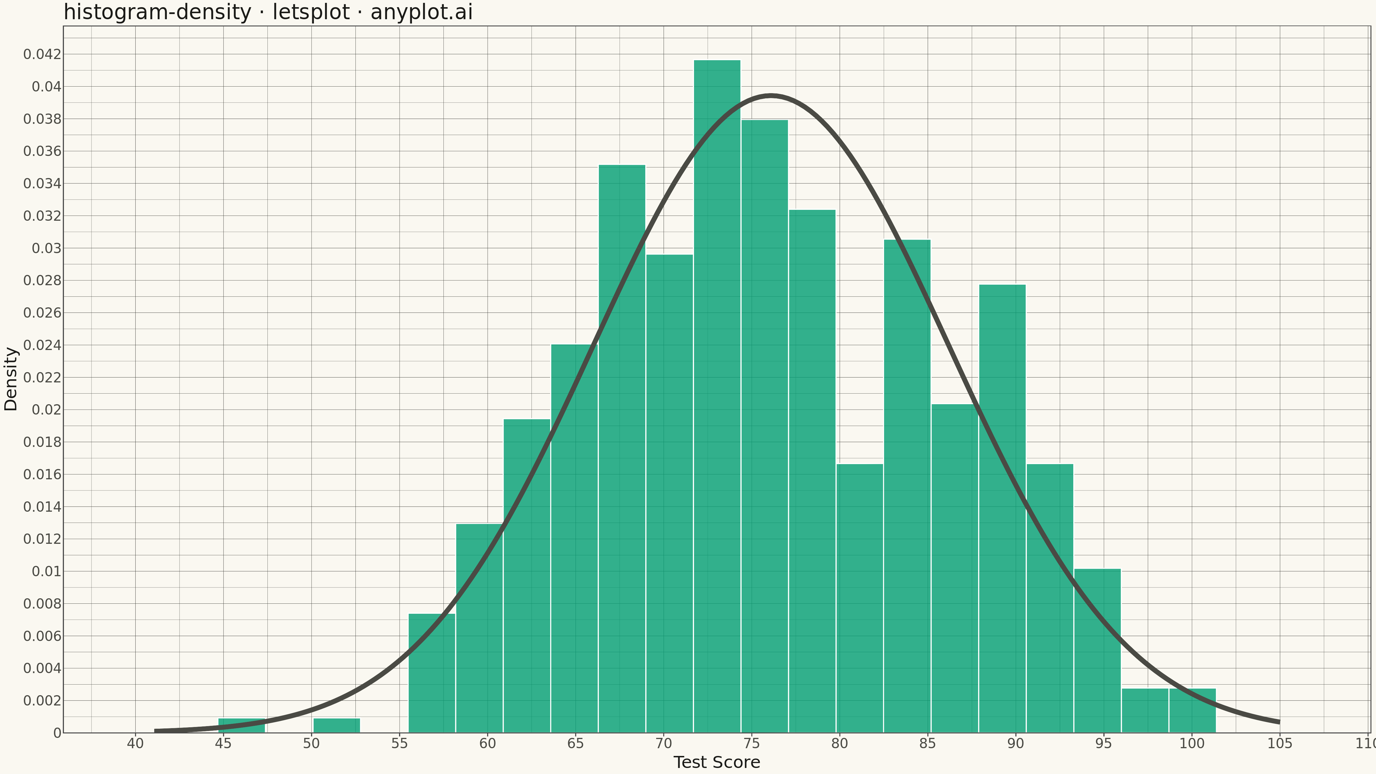
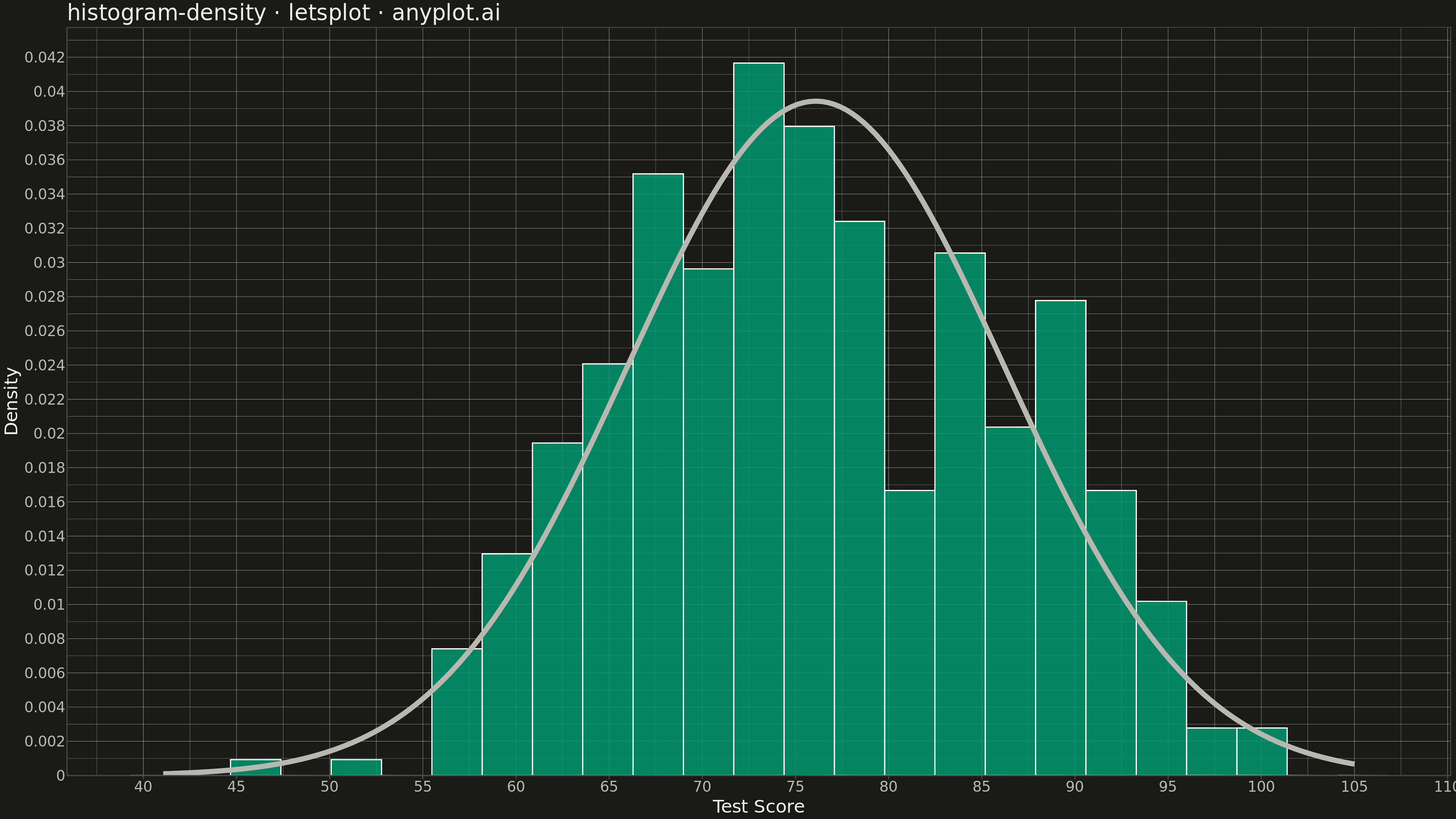
A density histogram displays the distribution of a continuous variable normalized so that the total area under the histogram equals 1, representing probability density instead of raw counts. This normalization allows direct comparison between distributions with different sample sizes and enables overlaying theoretical probability density functions (PDFs) for statistical analysis.
""" anyplot.ai
histogram-density: Density Histogram
Library: letsplot 4.9.0 | Python 3.13.13
Quality: 78/100 | Updated: 2026-05-11
"""

import numpy as np
import pandas as pd
from lets_plot import *
from scipy import stats


LetsPlot.setup_html()

# Data - Test scores with normal-like distribution
np.random.seed(42)
scores = np.concatenate(
    [
        np.random.normal(72, 8, 300),  # Main group
        np.random.normal(88, 5, 100),  # High performers
    ]
)
# Clip to realistic test score range
scores = np.clip(scores, 0, 100)

# Create DataFrame
df = pd.DataFrame({"score": scores})

# Create theoretical normal distribution for overlay
x_range = np.linspace(scores.min() - 5, scores.max() + 5, 200)
# Fit normal distribution to data
mu, sigma = stats.norm.fit(scores)
y_pdf = stats.norm.pdf(x_range, mu, sigma)
df_pdf = pd.DataFrame({"x": x_range, "y": y_pdf})

# Create density histogram with KDE overlay
plot = (
    ggplot()
    + geom_histogram(
        aes(x="score", y="..density.."), data=df, bins=25, fill="#306998", color="white", alpha=0.7, size=0.5
    )
    + geom_line(aes(x="x", y="y"), data=df_pdf, color="#FFD43B", size=2.5)
    + labs(x="Test Score", y="Density", title="histogram-density · letsplot · pyplots.ai")
    + theme_minimal()
    + theme(
        plot_title=element_text(size=24),
        axis_title=element_text(size=20),
        axis_text=element_text(size=16),
        panel_grid_major=element_line(color="#CCCCCC", size=0.3),
    )
    + ggsize(1600, 900)
)

# Save as PNG (scale 3x = 4800 x 2700 px)
ggsave(plot, "plot.png", path=".", scale=3)

# Save as HTML for interactivity
ggsave(plot, "plot.html", path=".")
Runnable source as JSON, for any HTTP client: https://api.anyplot.ai/specs/histogram-density/letsplot/code. Any spec id and library id listed in llms-full.txt fit the same URL shape; every URL below is complete and callable.
{
  "spec_id": "histogram-density",
  "language": "python",
  "library": "letsplot",
  "page": "https://anyplot.ai/histogram-density/python/letsplot",
  "hub": "https://anyplot.ai/histogram-density",
  "code_json": "https://api.anyplot.ai/specs/histogram-density/letsplot/code",
  "spec_json": "https://api.anyplot.ai/specs/histogram-density",
  "render_light_png": "https://storage.googleapis.com/anyplot-images/plots/histogram-density/python/letsplot/plot-light.png",
  "render_dark_png": "https://storage.googleapis.com/anyplot-images/plots/histogram-density/python/letsplot/plot-dark.png",
  "interactive_light_html": "https://storage.googleapis.com/anyplot-images/plots/histogram-density/python/letsplot/plot-light.html",
  "interactive_dark_html": "https://storage.googleapis.com/anyplot-images/plots/histogram-density/python/letsplot/plot-dark.html",
  "quality_score": 78.0,
  "license": "MIT",
  "guide": "https://anyplot.ai/llms.txt"
}
Part of Density Histogram on anyplot.ai.