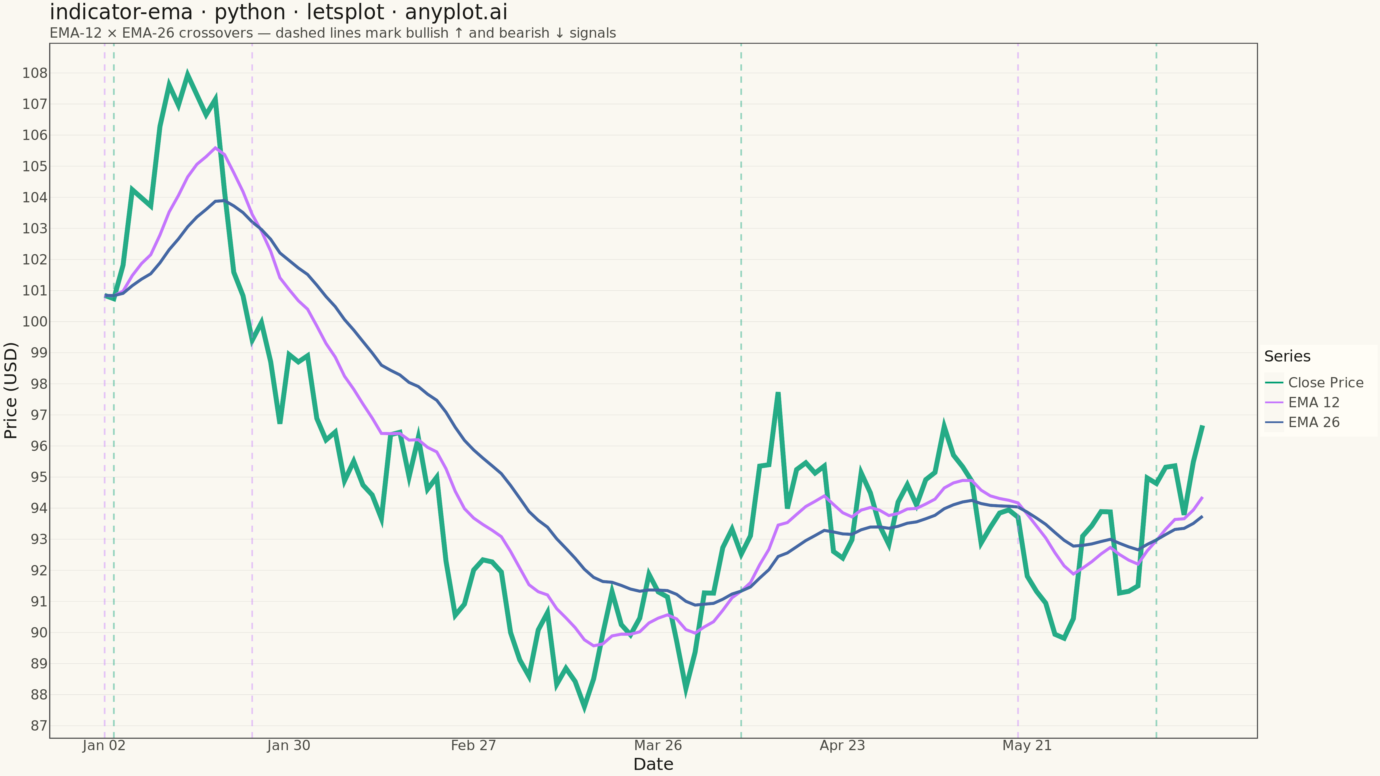
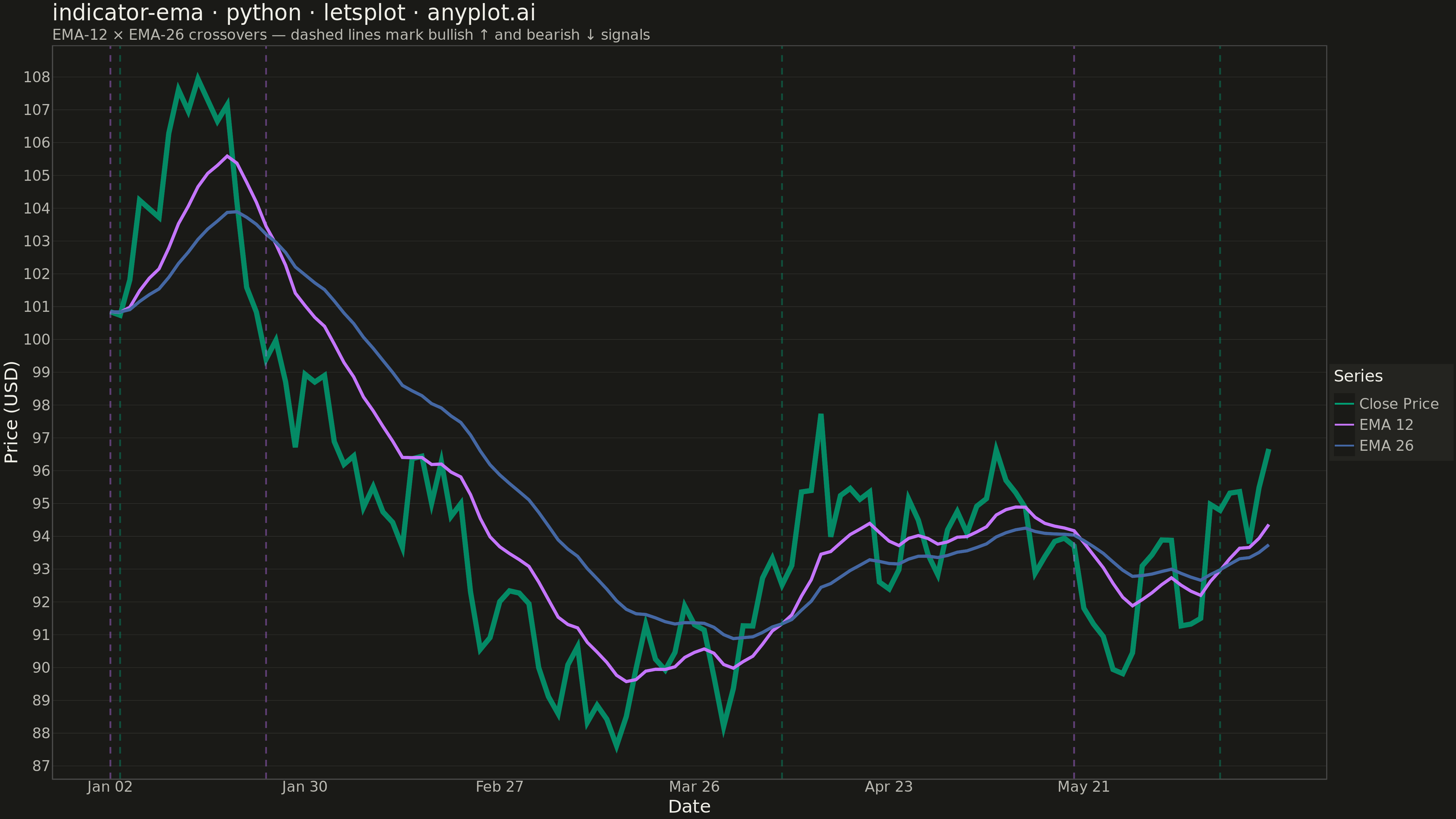
An Exponential Moving Average (EMA) overlay chart displays price data with one or more EMA lines that give greater weight to recent prices, making them more responsive to new information than simple moving averages. The EMA calculation applies an exponential weighting factor that decreases with each older data point, allowing traders to identify trends faster. This technical indicator is fundamental in trading for spotting trend direction, dynamic support/resistance levels, and crossover signals.
""" anyplot.ai
indicator-ema: Exponential Moving Average (EMA) Indicator Chart
Library: letsplot 4.9.0 | Python 3.13.13
Quality: 92/100 | Updated: 2026-05-19
"""

import os

import numpy as np
import pandas as pd
from lets_plot import *
from lets_plot.export import ggsave as export_ggsave


LetsPlot.setup_html()

# Theme tokens
THEME = os.getenv("ANYPLOT_THEME", "light")
PAGE_BG = "#FAF8F1" if THEME == "light" else "#1A1A17"
ELEVATED_BG = "#FFFDF6" if THEME == "light" else "#242420"
INK = "#1A1A17" if THEME == "light" else "#F0EFE8"
INK_SOFT = "#4A4A44" if THEME == "light" else "#B8B7B0"
RULE = "rgba(26,26,23,0.10)" if THEME == "light" else "rgba(240,239,232,0.10)"

# Okabe-Ito colors for Close Price, EMA 12, EMA 26
COLORS = {"Close Price": "#009E73", "EMA 12": "#C475FD", "EMA 26": "#4467A3"}

# Data
np.random.seed(42)
dates = pd.date_range("2024-01-02", periods=120, freq="B")
returns = np.random.normal(0.001, 0.015, 120)
price = 100 * np.cumprod(1 + returns)

price_series = pd.Series(price)
ema_12 = price_series.ewm(span=12, adjust=False).mean().values
ema_26 = price_series.ewm(span=26, adjust=False).mean().values

df = pd.DataFrame({"date_num": range(120), "close": price, "ema_12": ema_12, "ema_26": ema_26})

# Detect EMA-12/EMA-26 crossovers for signal annotations
diff = ema_12 - ema_26
sign_changes = np.where(np.diff(np.sign(diff)) != 0)[0]
bullish_crosses = [int(i) for i in sign_changes if diff[i + 1] > 0]
bearish_crosses = [int(i) for i in sign_changes if diff[i + 1] < 0]

df_price = df[["date_num", "close"]].rename(columns={"close": "value"}).copy()
df_price["series"] = "Close Price"

df_ema12 = df[["date_num", "ema_12"]].rename(columns={"ema_12": "value"}).copy()
df_ema12["series"] = "EMA 12"

df_ema26 = df[["date_num", "ema_26"]].rename(columns={"ema_26": "value"}).copy()
df_ema26["series"] = "EMA 26"

df_ema_only = pd.concat([df_ema12, df_ema26], ignore_index=True)

date_labels = {i: dates[i].strftime("%b %d") for i in range(0, 120, 20)}

# Theme — Y-axis-only major grid (style guide: line charts use Y grid only)
anyplot_theme = theme(
    plot_background=element_rect(fill=PAGE_BG, color=PAGE_BG),
    panel_background=element_rect(fill=PAGE_BG),
    panel_grid_major_y=element_line(color=RULE, size=0.5),
    panel_grid_major_x=element_blank(),
    panel_grid_minor=element_blank(),
    axis_title=element_text(size=20, color=INK),
    axis_text=element_text(size=16, color=INK_SOFT),
    axis_line=element_line(color=INK_SOFT),
    plot_title=element_text(size=24, color=INK),
    plot_subtitle=element_text(size=16, color=INK_SOFT),
    legend_background=element_rect(fill=ELEVATED_BG, color=INK_SOFT),
    legend_text=element_text(size=16, color=INK_SOFT),
    legend_title=element_text(size=18, color=INK),
    legend_position="right",
)

# Plot — crossover vlines first so lines render on top; interactive tooltips (letsplot-exclusive)
plot = (
    ggplot(mapping=aes(x="date_num", y="value", color="series"))
    + geom_line(
        data=df_price,
        size=2.5,
        alpha=0.85,
        tooltips=layer_tooltips().title("Close Price").line("$@value"),
    )
    + geom_line(
        data=df_ema_only,
        size=1.5,
        tooltips=layer_tooltips().title("@series").line("$@value"),
    )
    + scale_color_manual(values=COLORS, name="Series")
    + scale_x_continuous(
        breaks=list(date_labels.keys()), labels=list(date_labels.values())
    )
    + labs(
        x="Date",
        y="Price (USD)",
        title="indicator-ema · python · letsplot · anyplot.ai",
        subtitle="EMA-12 × EMA-26 crossovers — dashed lines mark bullish ↑ and bearish ↓ signals",
    )
    + theme_minimal()
    + anyplot_theme
    + ggsize(1600, 900)
)

# Annotate crossover signals after base plot is built
for x in bullish_crosses:
    plot = plot + geom_vline(xintercept=x, color="#009E73", linetype="dashed", size=0.8, alpha=0.4)
for x in bearish_crosses:
    plot = plot + geom_vline(xintercept=x, color="#C475FD", linetype="dashed", size=0.8, alpha=0.4)

# Save
export_ggsave(plot, f"plot-{THEME}.png", path=".", scale=3)
export_ggsave(plot, f"plot-{THEME}.html", path=".")
Runnable source as JSON, for any HTTP client: https://api.anyplot.ai/specs/indicator-ema/letsplot/code. Any spec id and library id listed in llms-full.txt fit the same URL shape; every URL below is complete and callable.
{
  "spec_id": "indicator-ema",
  "language": "python",
  "library": "letsplot",
  "page": "https://anyplot.ai/indicator-ema/python/letsplot",
  "hub": "https://anyplot.ai/indicator-ema",
  "code_json": "https://api.anyplot.ai/specs/indicator-ema/letsplot/code",
  "spec_json": "https://api.anyplot.ai/specs/indicator-ema",
  "render_light_png": "https://storage.googleapis.com/anyplot-images/plots/indicator-ema/python/letsplot/plot-light.png",
  "render_dark_png": "https://storage.googleapis.com/anyplot-images/plots/indicator-ema/python/letsplot/plot-dark.png",
  "interactive_light_html": "https://storage.googleapis.com/anyplot-images/plots/indicator-ema/python/letsplot/plot-light.html",
  "interactive_dark_html": "https://storage.googleapis.com/anyplot-images/plots/indicator-ema/python/letsplot/plot-dark.html",
  "quality_score": 92.0,
  "license": "MIT",
  "guide": "https://anyplot.ai/llms.txt"
}
Part of Exponential Moving Average (EMA) Indicator Chart on anyplot.ai.