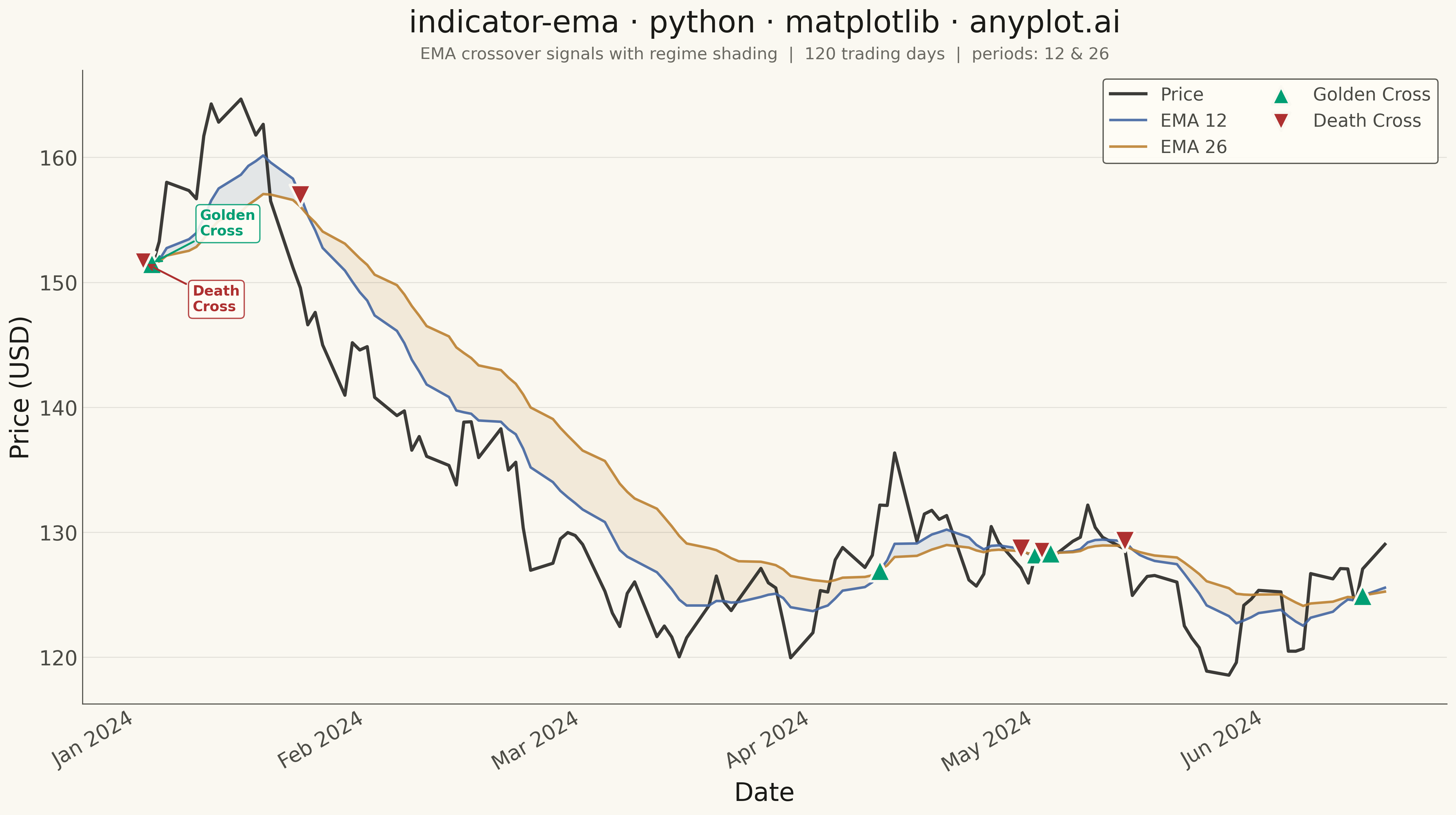
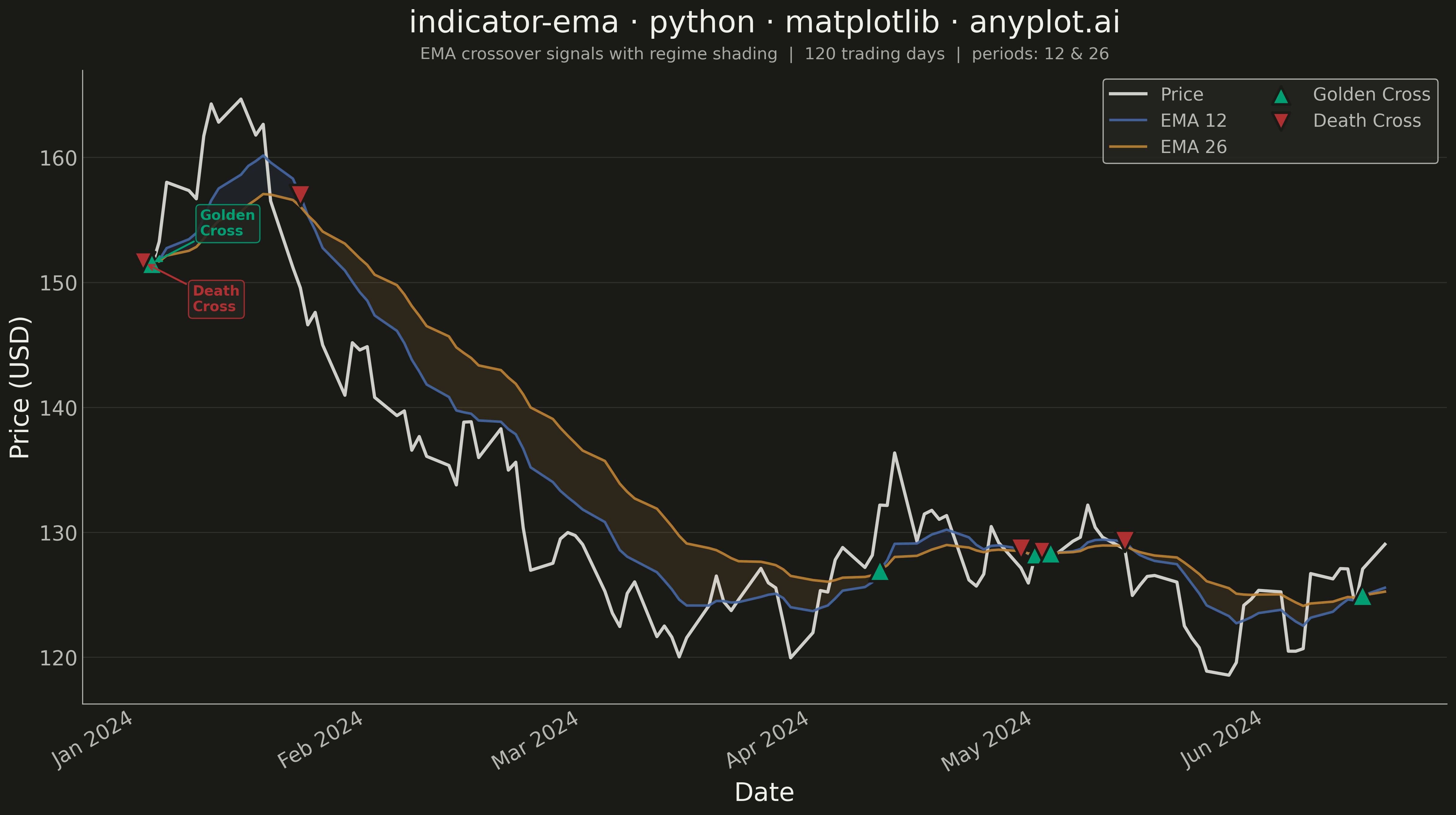
An Exponential Moving Average (EMA) overlay chart displays price data with one or more EMA lines that give greater weight to recent prices, making them more responsive to new information than simple moving averages. The EMA calculation applies an exponential weighting factor that decreases with each older data point, allowing traders to identify trends faster. This technical indicator is fundamental in trading for spotting trend direction, dynamic support/resistance levels, and crossover signals.
""" anyplot.ai
indicator-ema: Exponential Moving Average (EMA) Indicator Chart
Library: matplotlib 3.10.9 | Python 3.13.13
Quality: 92/100 | Updated: 2026-05-19
"""

import os

import matplotlib.pyplot as plt
import numpy as np
import pandas as pd
from matplotlib.dates import DateFormatter, MonthLocator


# Theme tokens
THEME = os.getenv("ANYPLOT_THEME", "light")
PAGE_BG = "#FAF8F1" if THEME == "light" else "#1A1A17"
ELEVATED_BG = "#FFFDF6" if THEME == "light" else "#242420"
INK = "#1A1A17" if THEME == "light" else "#F0EFE8"
INK_SOFT = "#4A4A44" if THEME == "light" else "#B8B7B0"
INK_MUTED = "#6B6A63" if THEME == "light" else "#A8A79F"

# imprint palette — categorical EMAs + semantic crossover markers
EMA_SHORT_COLOR = "#4467A3"  # imprint blue — 12-day EMA
EMA_LONG_COLOR = "#BD8233"  # imprint ochre — 26-day EMA
GOLDEN_COLOR = "#009E73"  # green — bullish crossover (semantic)
DEATH_COLOR = "#AE3030"  # red — bearish crossover (semantic)

# Data
np.random.seed(42)
n_days = 120

dates = pd.date_range("2024-01-02", periods=n_days, freq="B")
returns = np.random.normal(0.0005, 0.02, n_days)
price = 150 * np.cumprod(1 + returns)

df = pd.DataFrame({"date": dates, "close": price})
df["ema_12"] = df["close"].ewm(span=12, adjust=False).mean()
df["ema_26"] = df["close"].ewm(span=26, adjust=False).mean()

# Identify crossover signals
signal = np.sign(df["ema_12"].values - df["ema_26"].values)
crossover_idx = np.where(np.diff(signal))[0]

# Plot
fig, ax = plt.subplots(figsize=(16, 9), facecolor=PAGE_BG)
ax.set_facecolor(PAGE_BG)

# Shaded regime regions between EMA lines
ax.fill_between(
    df["date"],
    df["ema_12"],
    df["ema_26"],
    where=df["ema_12"] >= df["ema_26"],
    alpha=0.12,
    color=EMA_SHORT_COLOR,
    interpolate=True,
)
ax.fill_between(
    df["date"],
    df["ema_12"],
    df["ema_26"],
    where=df["ema_12"] < df["ema_26"],
    alpha=0.12,
    color=EMA_LONG_COLOR,
    interpolate=True,
)

# Price line (most prominent)
ax.plot(df["date"], df["close"], linewidth=2.5, color=INK, label="Price", alpha=0.85, zorder=3)

# EMA lines (slightly thinner per spec)
ax.plot(df["date"], df["ema_12"], linewidth=2, color=EMA_SHORT_COLOR, label="EMA 12", alpha=0.9, zorder=4)
ax.plot(df["date"], df["ema_26"], linewidth=2, color=EMA_LONG_COLOR, label="EMA 26", alpha=0.9, zorder=4)

# Crossover markers — golden cross (^) vs death cross (v)
for idx in crossover_idx:
    x_date = df["date"].iloc[idx]
    y_val = df["ema_12"].iloc[idx]
    is_golden = signal[idx] < 0  # EMA12 was below, now crossing above
    ax.scatter(
        x_date,
        y_val,
        s=280,
        color=GOLDEN_COLOR if is_golden else DEATH_COLOR,
        marker="^" if is_golden else "v",
        zorder=6,
        edgecolors=PAGE_BG,
        linewidths=2,
    )

# Proxy artists for crossover legend entries
ax.scatter([], [], s=200, color=GOLDEN_COLOR, marker="^", edgecolors=PAGE_BG, linewidths=2, label="Golden Cross")
ax.scatter([], [], s=200, color=DEATH_COLOR, marker="v", edgecolors=PAGE_BG, linewidths=2, label="Death Cross")

# Annotate first golden cross and first death cross with arrows
first_golden = True
first_death = True
for idx in crossover_idx:
    x_date = df["date"].iloc[idx]
    y_val = df["ema_12"].iloc[idx]
    is_golden = signal[idx] < 0
    if is_golden and first_golden:
        ax.annotate(
            "Golden\nCross",
            xy=(x_date, y_val),
            xytext=(38, 22),
            textcoords="offset points",
            fontsize=11,
            color=GOLDEN_COLOR,
            fontweight="semibold",
            arrowprops={"arrowstyle": "->", "color": GOLDEN_COLOR, "lw": 1.5},
            bbox={"facecolor": ELEVATED_BG, "edgecolor": GOLDEN_COLOR, "alpha": 0.88, "boxstyle": "round,pad=0.3"},
            zorder=8,
        )
        first_golden = False
    elif not is_golden and first_death:
        ax.annotate(
            "Death\nCross",
            xy=(x_date, y_val),
            xytext=(38, -38),
            textcoords="offset points",
            fontsize=11,
            color=DEATH_COLOR,
            fontweight="semibold",
            arrowprops={"arrowstyle": "->", "color": DEATH_COLOR, "lw": 1.5},
            bbox={"facecolor": ELEVATED_BG, "edgecolor": DEATH_COLOR, "alpha": 0.88, "boxstyle": "round,pad=0.3"},
            zorder=8,
        )
        first_death = False

# Style
ax.set_xlabel("Date", fontsize=20, color=INK)
ax.set_ylabel("Price (USD)", fontsize=20, color=INK)
ax.set_title("indicator-ema · python · matplotlib · anyplot.ai", fontsize=24, fontweight="medium", color=INK, pad=30)
# Subtitle for typographic hierarchy
ax.text(
    0.5,
    1.012,
    "EMA crossover signals with regime shading  |  120 trading days  |  periods: 12 & 26",
    transform=ax.transAxes,
    fontsize=13,
    color=INK_MUTED,
    ha="center",
    va="bottom",
)
ax.tick_params(axis="both", labelsize=16, colors=INK_SOFT, labelcolor=INK_SOFT, length=0)

ax.spines["top"].set_visible(False)
ax.spines["right"].set_visible(False)
for s in ("left", "bottom"):
    ax.spines[s].set_color(INK_SOFT)

ax.yaxis.grid(True, alpha=0.10, linewidth=0.8, color=INK)

# Date locator/formatter for clean month labels
ax.xaxis.set_major_locator(MonthLocator())
ax.xaxis.set_major_formatter(DateFormatter("%b %Y"))
plt.setp(ax.get_xticklabels(), rotation=30, ha="right", fontsize=16, color=INK_SOFT)

leg = ax.legend(fontsize=14, loc="upper right", framealpha=0.9, ncol=2)
leg.get_frame().set_facecolor(ELEVATED_BG)
leg.get_frame().set_edgecolor(INK_SOFT)
plt.setp(leg.get_texts(), color=INK_SOFT)

plt.tight_layout()
plt.savefig(f"plot-{THEME}.png", dpi=300, bbox_inches="tight", facecolor=PAGE_BG)
Runnable source as JSON, for any HTTP client: https://api.anyplot.ai/specs/indicator-ema/matplotlib/code. Any spec id and library id listed in llms-full.txt fit the same URL shape; every URL below is complete and callable.
{
  "spec_id": "indicator-ema",
  "language": "python",
  "library": "matplotlib",
  "page": "https://anyplot.ai/indicator-ema/python/matplotlib",
  "hub": "https://anyplot.ai/indicator-ema",
  "code_json": "https://api.anyplot.ai/specs/indicator-ema/matplotlib/code",
  "spec_json": "https://api.anyplot.ai/specs/indicator-ema",
  "render_light_png": "https://storage.googleapis.com/anyplot-images/plots/indicator-ema/python/matplotlib/plot-light.png",
  "render_dark_png": "https://storage.googleapis.com/anyplot-images/plots/indicator-ema/python/matplotlib/plot-dark.png",
  "quality_score": 92.0,
  "license": "MIT",
  "guide": "https://anyplot.ai/llms.txt"
}
Part of Exponential Moving Average (EMA) Indicator Chart on anyplot.ai.