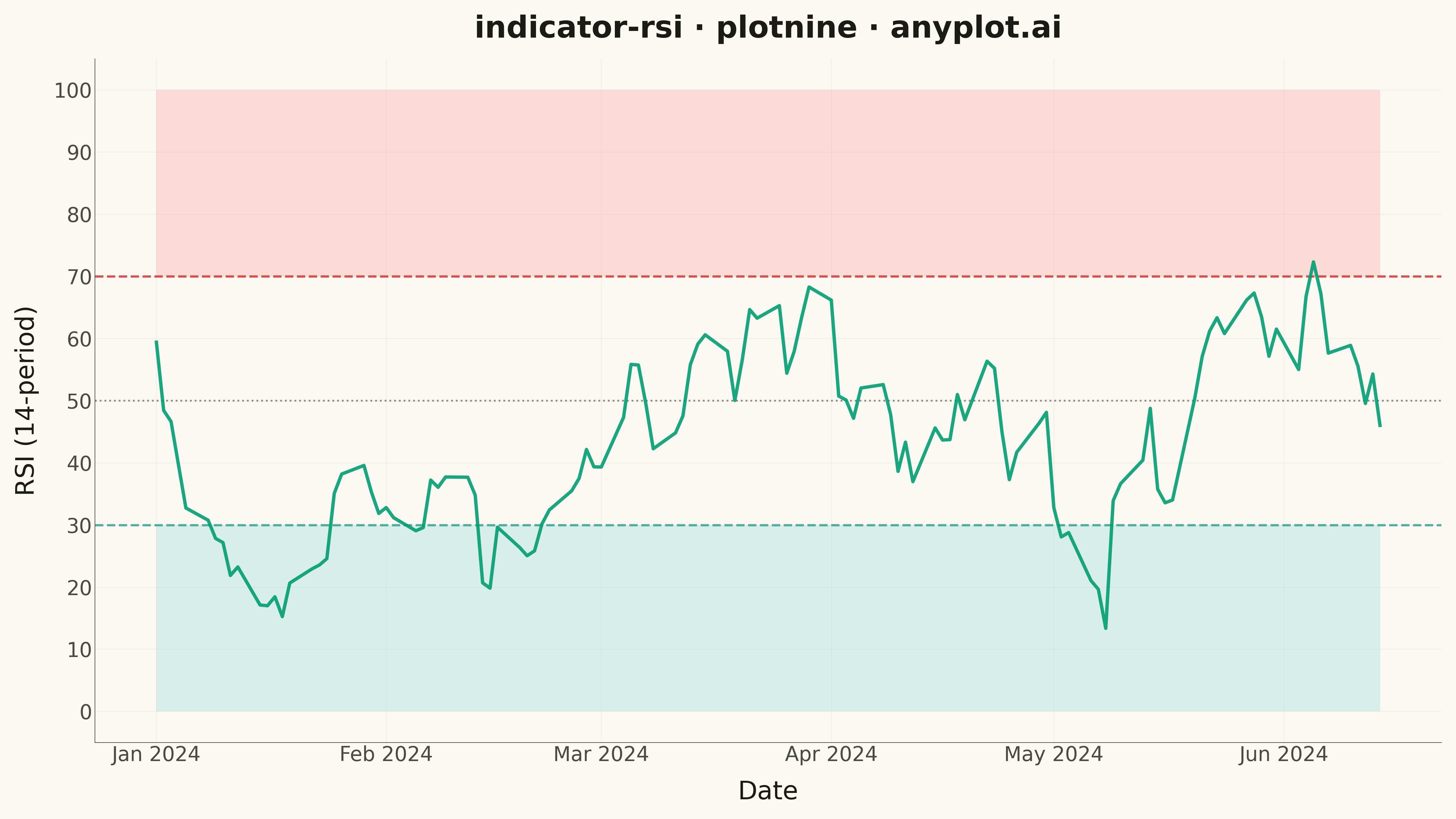
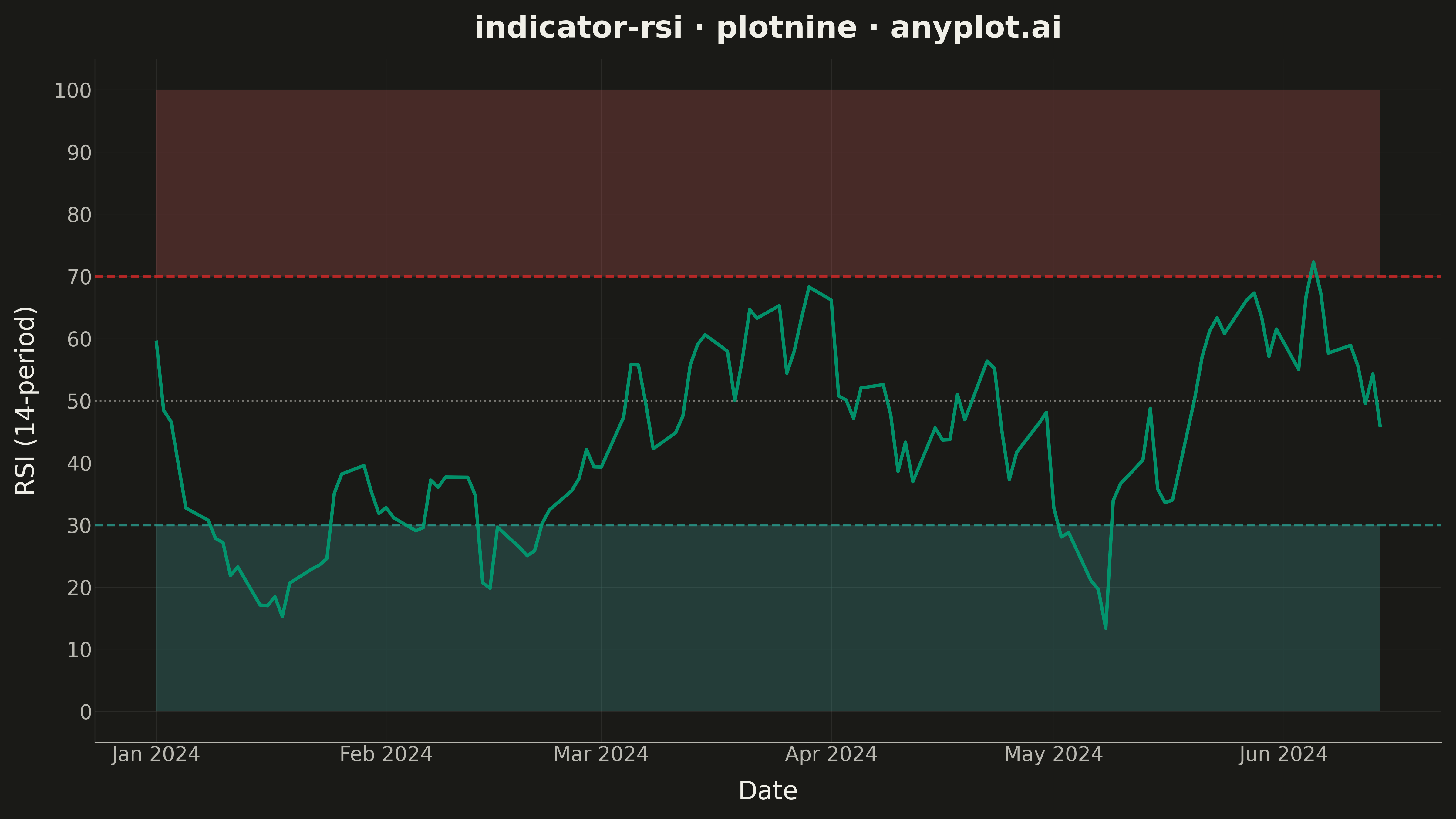
A Relative Strength Index (RSI) chart displaying the momentum oscillator on a 0-100 scale with horizontal threshold lines at 70 (overbought) and 30 (oversold). The RSI measures the speed and magnitude of recent price changes to evaluate overbought or oversold conditions. This is a fundamental momentum indicator in technical analysis, helping traders identify potential reversal points when the market reaches extreme conditions.
""" anyplot.ai
indicator-rsi: RSI Technical Indicator Chart
Library: plotnine 0.15.4 | Python 3.13.13
Quality: 92/100 | Updated: 2026-05-16
"""

import os

import numpy as np
import pandas as pd
from plotnine import (
    aes,
    annotate,
    element_blank,
    element_line,
    element_rect,
    element_text,
    geom_hline,
    geom_line,
    ggplot,
    labs,
    scale_x_datetime,
    scale_y_continuous,
    theme,
    theme_minimal,
)


# Theme tokens
THEME = os.getenv("ANYPLOT_THEME", "light")
PAGE_BG = "#FAF8F1" if THEME == "light" else "#1A1A17"
ELEVATED_BG = "#FFFDF6" if THEME == "light" else "#242420"
INK = "#1A1A17" if THEME == "light" else "#F0EFE8"
INK_SOFT = "#4A4A44" if THEME == "light" else "#B8B7B0"
BRAND = "#009E73"

# Data - Generate RSI values for 120 trading days
np.random.seed(42)
n_days = 120
period = 14

# Generate synthetic price changes to calculate RSI
price_changes = np.random.normal(0, 1.5, n_days + period)

# Calculate RSI using 14-period lookback
rsi_values = []
for i in range(period, len(price_changes)):
    window = price_changes[i - period : i]
    gains = np.maximum(window, 0)
    losses = np.abs(np.minimum(window, 0))
    avg_gain = np.mean(gains)
    avg_loss = np.mean(losses)
    if avg_loss == 0:
        rsi = 100
    else:
        rs = avg_gain / avg_loss
        rsi = 100 - (100 / (1 + rs))
    rsi_values.append(rsi)
rsi_values = np.array(rsi_values)

# Create date range (business days)
dates = pd.date_range(start="2024-01-01", periods=n_days, freq="B")

df = pd.DataFrame({"date": dates, "rsi": rsi_values})

# Plot
plot = (
    ggplot(df, aes(x="date", y="rsi"))
    # Overbought zone (70-100) - light red shading
    + annotate("rect", xmin=dates.min(), xmax=dates.max(), ymin=70, ymax=100, fill="#FF6B6B", alpha=0.2)
    # Oversold zone (0-30) - light green shading
    + annotate("rect", xmin=dates.min(), xmax=dates.max(), ymin=0, ymax=30, fill="#4ECDC4", alpha=0.2)
    # Threshold lines
    + geom_hline(yintercept=70, color="#D62828", size=1, linetype="dashed", alpha=0.8)
    + geom_hline(yintercept=30, color="#2A9D8F", size=1, linetype="dashed", alpha=0.8)
    + geom_hline(yintercept=50, color=INK_SOFT, size=0.8, linetype="dotted", alpha=0.6)
    # RSI line in brand color
    + geom_line(color=BRAND, size=1.5, alpha=0.9)
    # Axis settings
    + scale_y_continuous(limits=(0, 100), breaks=range(0, 101, 10))
    + scale_x_datetime(date_breaks="1 month", date_labels="%b %Y")
    # Labels
    + labs(title="indicator-rsi · plotnine · anyplot.ai", x="Date", y="RSI (14-period)")
    # Base theme
    + theme_minimal()
    # Theme-adaptive styling
    + theme(
        figure_size=(16, 9),
        plot_background=element_rect(fill=PAGE_BG, color=PAGE_BG),
        panel_background=element_rect(fill=PAGE_BG),
        panel_grid_major=element_line(color=INK, size=0.3, alpha=0.08),
        panel_grid_minor=element_blank(),
        panel_border=element_blank(),
        axis_title=element_text(size=20, color=INK),
        axis_text=element_text(size=16, color=INK_SOFT),
        axis_line=element_line(color=INK_SOFT, size=0.5),
        plot_title=element_text(size=24, weight="bold", color=INK),
    )
)

# Save
plot.save(f"plot-{THEME}.png", dpi=300, width=16, height=9)
Runnable source as JSON, for any HTTP client: https://api.anyplot.ai/specs/indicator-rsi/plotnine/code. Any spec id and library id listed in llms-full.txt fit the same URL shape; every URL below is complete and callable.
{
  "spec_id": "indicator-rsi",
  "language": "python",
  "library": "plotnine",
  "page": "https://anyplot.ai/indicator-rsi/python/plotnine",
  "hub": "https://anyplot.ai/indicator-rsi",
  "code_json": "https://api.anyplot.ai/specs/indicator-rsi/plotnine/code",
  "spec_json": "https://api.anyplot.ai/specs/indicator-rsi",
  "render_light_png": "https://storage.googleapis.com/anyplot-images/plots/indicator-rsi/python/plotnine/plot-light.png",
  "render_dark_png": "https://storage.googleapis.com/anyplot-images/plots/indicator-rsi/python/plotnine/plot-dark.png",
  "quality_score": 92.0,
  "license": "MIT",
  "guide": "https://anyplot.ai/llms.txt"
}
Part of RSI Technical Indicator Chart on anyplot.ai.