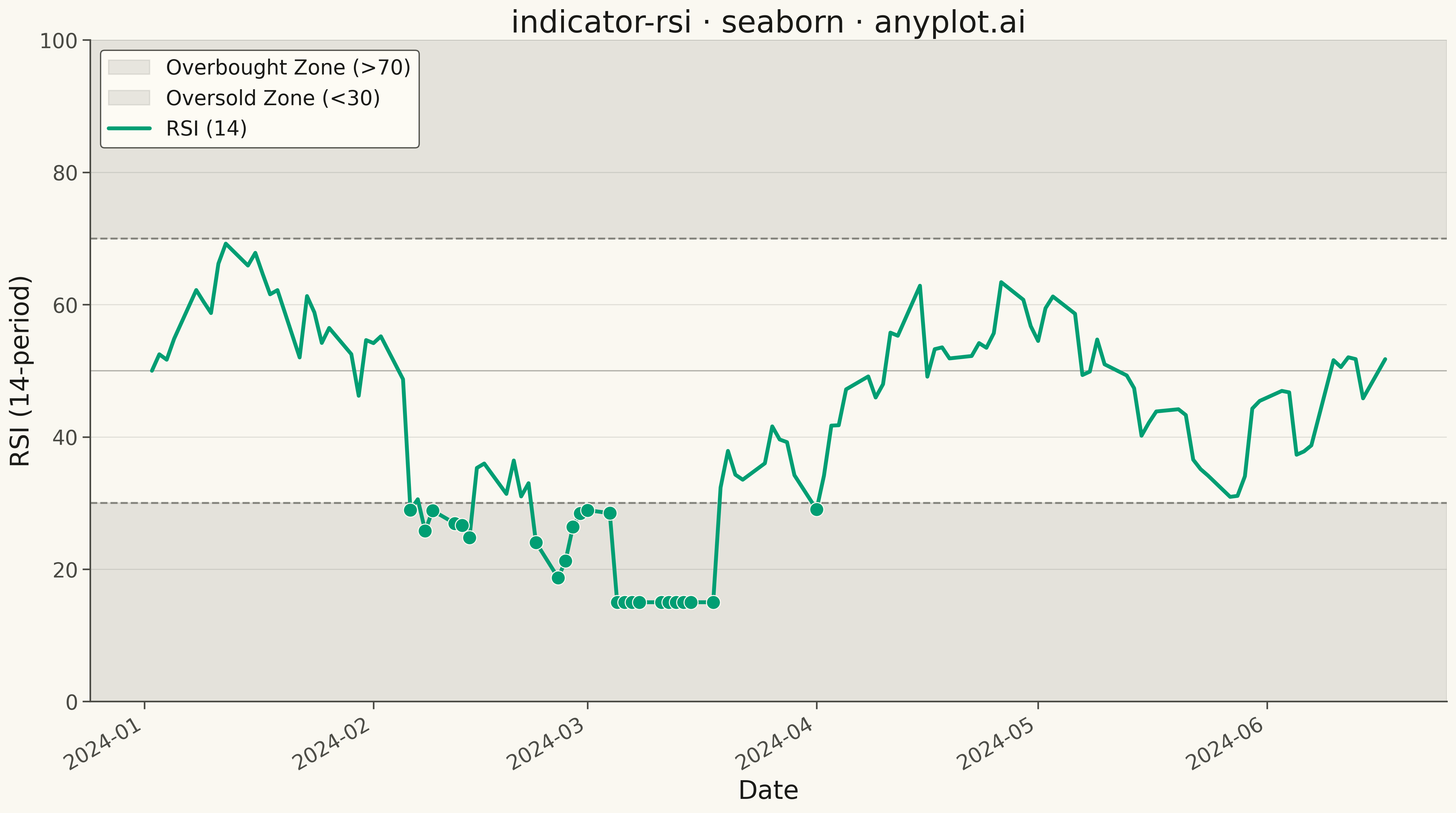
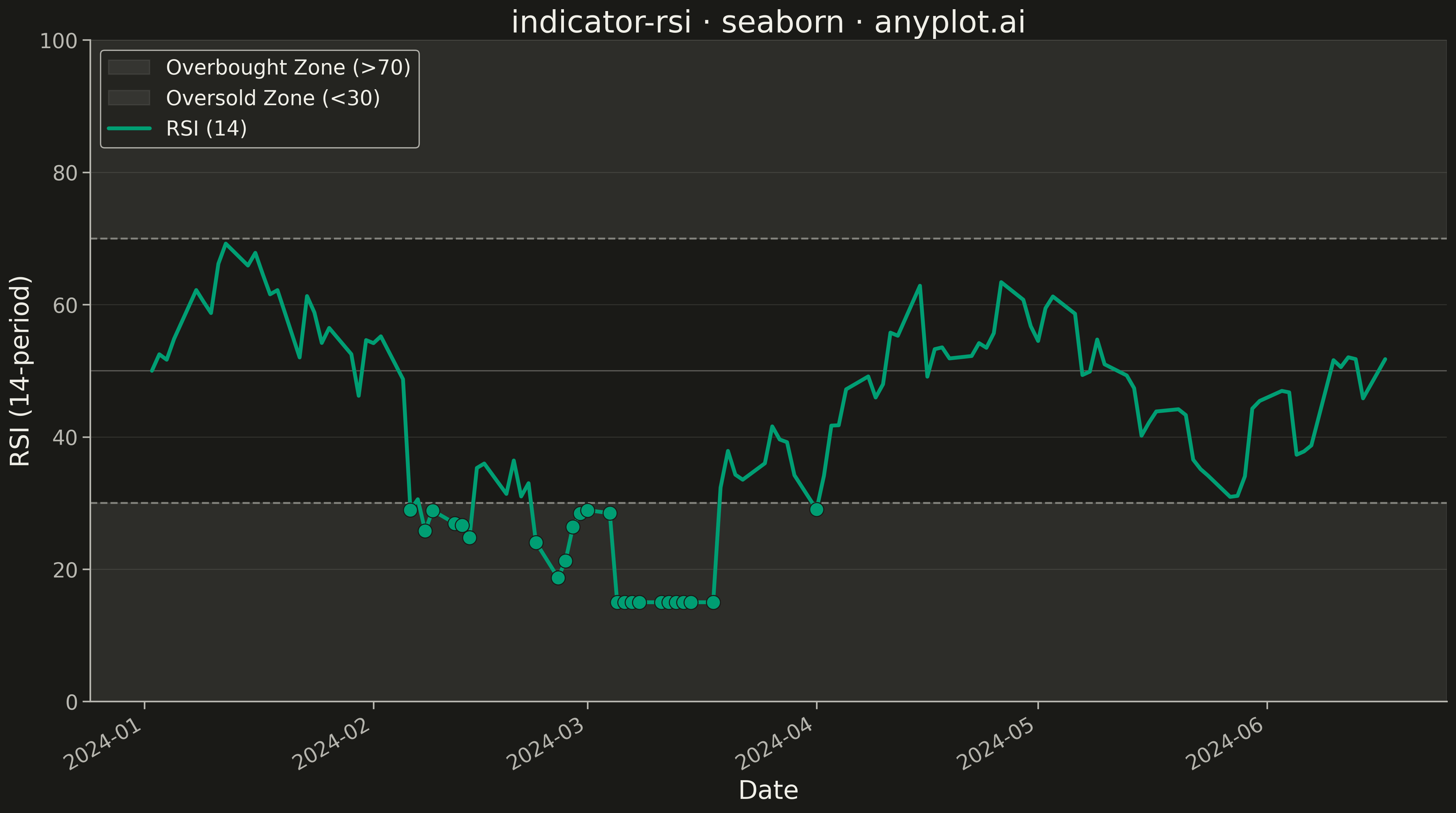
A Relative Strength Index (RSI) chart displaying the momentum oscillator on a 0-100 scale with horizontal threshold lines at 70 (overbought) and 30 (oversold). The RSI measures the speed and magnitude of recent price changes to evaluate overbought or oversold conditions. This is a fundamental momentum indicator in technical analysis, helping traders identify potential reversal points when the market reaches extreme conditions.
""" anyplot.ai
indicator-rsi: RSI Technical Indicator Chart
Library: seaborn 0.13.2 | Python 3.13.13
Quality: 81/100 | Updated: 2026-05-16
"""

import matplotlib.pyplot as plt
import numpy as np
import pandas as pd
import seaborn as sns


# Data - Generate realistic RSI values with market-like behavior
np.random.seed(42)
n_periods = 120

# Create date range for trading days
dates = pd.date_range(start="2024-01-02", periods=n_periods, freq="B")

# Generate RSI values with realistic market dynamics
# RSI tends to mean-revert and oscillate between zones
rsi_values = np.zeros(n_periods)
rsi_values[0] = 50  # Start at neutral

for i in range(1, n_periods):
    # Mean-reverting random walk with momentum
    mean_reversion = 0.05 * (50 - rsi_values[i - 1])
    momentum = np.random.randn() * 5
    rsi_values[i] = rsi_values[i - 1] + mean_reversion + momentum
    # Clamp to valid RSI range
    rsi_values[i] = np.clip(rsi_values[i], 5, 95)

# Create some realistic market events - push into overbought/oversold zones
rsi_values[15:25] = rsi_values[15:25] + 18  # Bull run into overbought
rsi_values[45:55] = rsi_values[45:55] - 15  # Bear drop into oversold
rsi_values[80:90] = rsi_values[80:90] + 12  # Another overbought push
rsi_values = np.clip(rsi_values, 15, 85)  # Keep within typical RSI bounds

df = pd.DataFrame({"date": dates, "rsi": rsi_values})

# Plot
fig, ax = plt.subplots(figsize=(16, 9))

# Shade overbought zone (70-100)
ax.axhspan(70, 100, alpha=0.15, color="#D32F2F", label="Overbought Zone")

# Shade oversold zone (0-30)
ax.axhspan(0, 30, alpha=0.15, color="#388E3C", label="Oversold Zone")

# Add threshold lines
ax.axhline(y=70, color="#D32F2F", linestyle="--", linewidth=2, alpha=0.8)
ax.axhline(y=30, color="#388E3C", linestyle="--", linewidth=2, alpha=0.8)
ax.axhline(y=50, color="#757575", linestyle="-", linewidth=1.5, alpha=0.6)

# Plot RSI line using seaborn
sns.lineplot(data=df, x="date", y="rsi", ax=ax, color="#306998", linewidth=3)

# Mark overbought and oversold points
overbought_mask = df["rsi"] >= 70
oversold_mask = df["rsi"] <= 30

if overbought_mask.any():
    sns.scatterplot(data=df[overbought_mask], x="date", y="rsi", ax=ax, color="#D32F2F", s=100, zorder=5, legend=False)

if oversold_mask.any():
    sns.scatterplot(data=df[oversold_mask], x="date", y="rsi", ax=ax, color="#388E3C", s=100, zorder=5, legend=False)

# Style
ax.set_ylim(0, 100)
ax.set_xlabel("Date", fontsize=20)
ax.set_ylabel("RSI (14-period)", fontsize=20)
ax.set_title("indicator-rsi · seaborn · pyplots.ai", fontsize=24)
ax.tick_params(axis="both", labelsize=16)
ax.grid(True, alpha=0.3, linestyle="--")

# Add text annotations for zones
ax.text(
    df["date"].iloc[-1],
    85,
    "Overbought (>70)",
    fontsize=14,
    ha="right",
    va="center",
    color="#D32F2F",
    fontweight="bold",
)
ax.text(
    df["date"].iloc[-1], 15, "Oversold (<30)", fontsize=14, ha="right", va="center", color="#388E3C", fontweight="bold"
)
ax.text(df["date"].iloc[-1], 52, "Neutral (50)", fontsize=14, ha="right", va="center", color="#757575")

# Format x-axis dates
fig.autofmt_xdate(rotation=30)

plt.tight_layout()
plt.savefig("plot.png", dpi=300, bbox_inches="tight")
Runnable source as JSON, for any HTTP client: https://api.anyplot.ai/specs/indicator-rsi/seaborn/code. Any spec id and library id listed in llms-full.txt fit the same URL shape; every URL below is complete and callable.
{
  "spec_id": "indicator-rsi",
  "language": "python",
  "library": "seaborn",
  "page": "https://anyplot.ai/indicator-rsi/python/seaborn",
  "hub": "https://anyplot.ai/indicator-rsi",
  "code_json": "https://api.anyplot.ai/specs/indicator-rsi/seaborn/code",
  "spec_json": "https://api.anyplot.ai/specs/indicator-rsi",
  "render_light_png": "https://storage.googleapis.com/anyplot-images/plots/indicator-rsi/python/seaborn/plot-light.png",
  "render_dark_png": "https://storage.googleapis.com/anyplot-images/plots/indicator-rsi/python/seaborn/plot-dark.png",
  "quality_score": 81.0,
  "license": "MIT",
  "guide": "https://anyplot.ai/llms.txt"
}
Part of RSI Technical Indicator Chart on anyplot.ai.