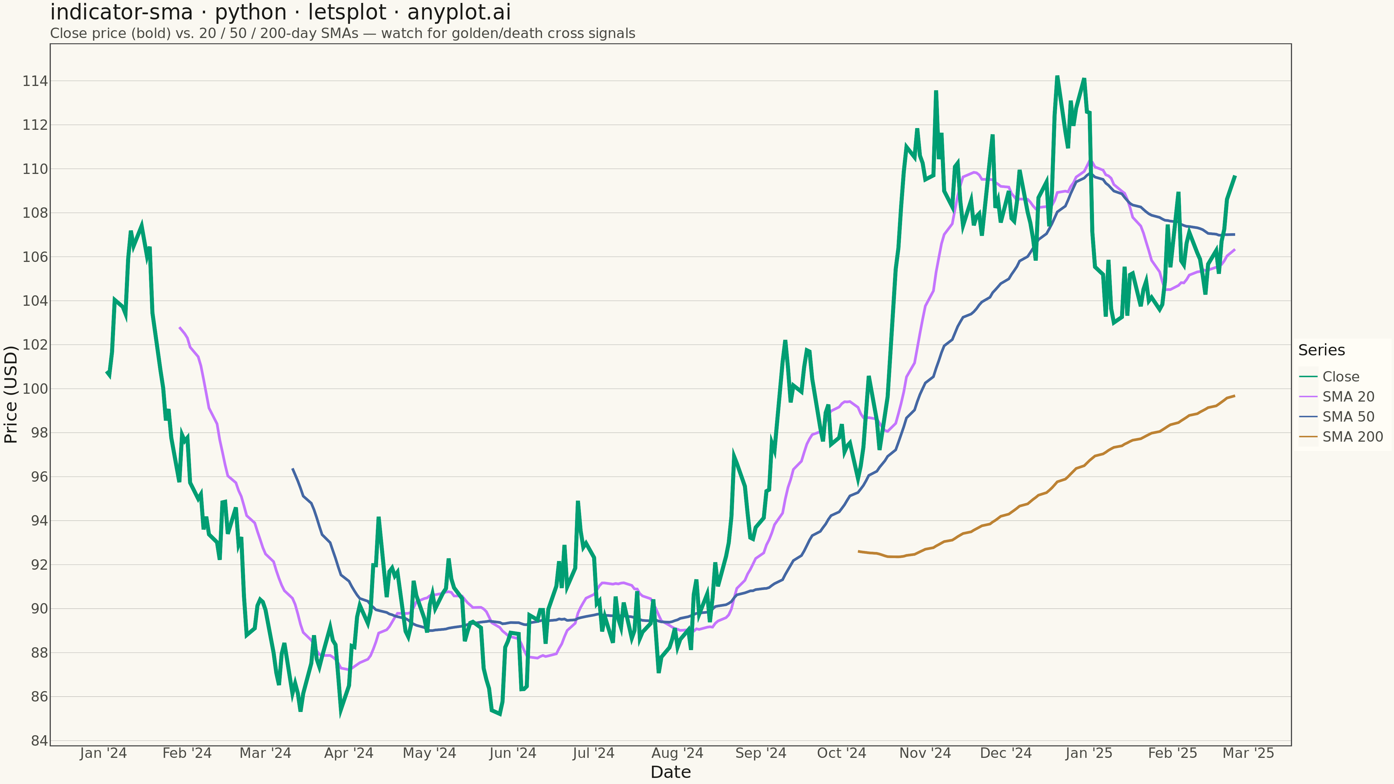
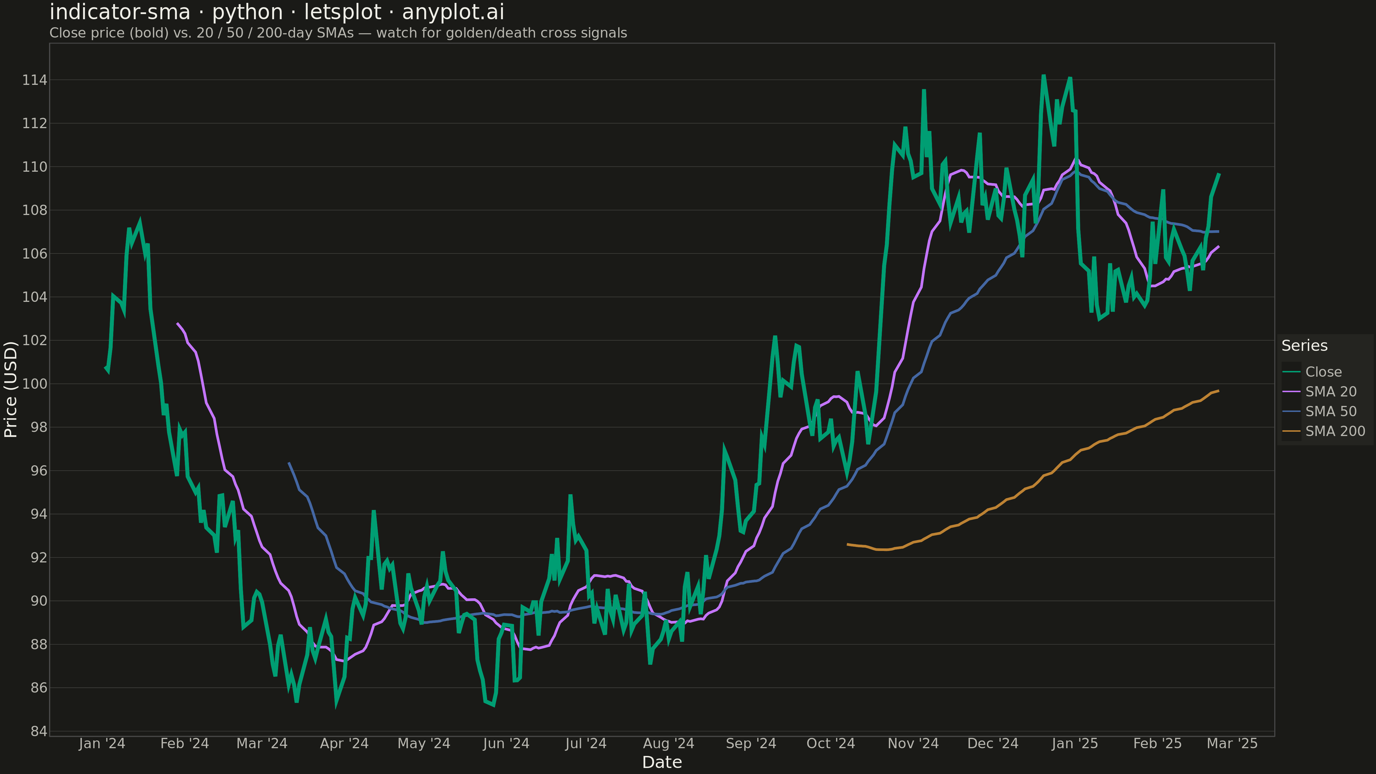
A Simple Moving Average (SMA) chart displays price or value data with one or more SMA overlays, typically showing short, medium, and long-term periods (e.g., 20, 50, 200-day). Each SMA line smooths out price fluctuations by averaging the last N data points, revealing underlying trends at different time scales. This multi-period overlay is fundamental to technical analysis, helping traders identify trend direction, support/resistance levels, and potential crossover signals.
""" anyplot.ai
indicator-sma: Simple Moving Average (SMA) Indicator Chart
Library: letsplot 4.9.0 | Python 3.13.13
Quality: 86/100 | Updated: 2026-05-19
"""

import os

import numpy as np
import pandas as pd
from lets_plot import (
    LetsPlot,
    aes,
    element_blank,
    element_line,
    element_rect,
    element_text,
    geom_line,
    ggplot,
    ggsave,
    ggsize,
    labs,
    scale_color_manual,
    scale_x_datetime,
    theme,
    theme_minimal,
)


LetsPlot.setup_html()

# Theme tokens
THEME = os.getenv("ANYPLOT_THEME", "light")
PAGE_BG = "#FAF8F1" if THEME == "light" else "#1A1A17"
ELEVATED_BG = "#FFFDF6" if THEME == "light" else "#242420"
INK = "#1A1A17" if THEME == "light" else "#F0EFE8"
INK_SOFT = "#4A4A44" if THEME == "light" else "#B8B7B0"
GRID_COLOR = "#C0BFBA" if THEME == "light" else "#484844"

# Okabe-Ito palette — first series always #009E73
COLORS = {"Close": "#009E73", "SMA 20": "#C475FD", "SMA 50": "#4467A3", "SMA 200": "#BD8233"}

# Data
np.random.seed(42)
n_periods = 300
dates = pd.date_range(start="2024-01-02", periods=n_periods, freq="B")
returns = np.random.normal(0.0005, 0.015, n_periods)
price_series = 100 * np.cumprod(1 + returns)

sma_20 = pd.Series(price_series).rolling(window=20).mean()
sma_50 = pd.Series(price_series).rolling(window=50).mean()
sma_200 = pd.Series(price_series).rolling(window=200).mean()

df = pd.DataFrame({"date": dates, "Close": price_series, "SMA 20": sma_20, "SMA 50": sma_50, "SMA 200": sma_200})

df_long = df.melt(
    id_vars=["date"], value_vars=["Close", "SMA 20", "SMA 50", "SMA 200"], var_name="series", value_name="price"
)

# Separate data for line-weight hierarchy: Close thicker, SMAs thinner
df_sma = df_long[df_long["series"] != "Close"]
df_close = df_long[df_long["series"] == "Close"]

# Plot
anyplot_theme = theme(
    plot_background=element_rect(fill=PAGE_BG, color=PAGE_BG),
    panel_background=element_rect(fill=PAGE_BG),
    panel_grid_major_y=element_line(color=GRID_COLOR, size=0.5),
    panel_grid_major_x=element_blank(),
    panel_grid_minor=element_blank(),
    axis_title=element_text(color=INK, size=20),
    axis_text=element_text(color=INK_SOFT, size=16),
    axis_line=element_line(color=INK_SOFT),
    plot_title=element_text(color=INK, size=24),
    plot_subtitle=element_text(color=INK_SOFT, size=16),
    legend_background=element_rect(fill=ELEVATED_BG, color=INK_SOFT),
    legend_text=element_text(color=INK_SOFT, size=16),
    legend_title=element_text(color=INK, size=18),
)

plot = (
    ggplot(df_long, aes(x="date", y="price", color="series"))
    + geom_line(data=df_sma, size=1.3)
    + geom_line(data=df_close, size=2.0)
    + scale_color_manual(values=COLORS)
    + scale_x_datetime(format="%b '%y")
    + labs(
        title="indicator-sma · python · letsplot · anyplot.ai",
        subtitle="Close price (bold) vs. 20 / 50 / 200-day SMAs — watch for golden/death cross signals",
        x="Date",
        y="Price (USD)",
        color="Series",
    )
    + theme_minimal()
    + anyplot_theme
    + ggsize(1600, 900)
)

# Save
ggsave(plot, f"plot-{THEME}.png", path=".", scale=3)
ggsave(plot, f"plot-{THEME}.html", path=".")
Runnable source as JSON, for any HTTP client: https://api.anyplot.ai/specs/indicator-sma/letsplot/code. Any spec id and library id listed in llms-full.txt fit the same URL shape; every URL below is complete and callable.
{
  "spec_id": "indicator-sma",
  "language": "python",
  "library": "letsplot",
  "page": "https://anyplot.ai/indicator-sma/python/letsplot",
  "hub": "https://anyplot.ai/indicator-sma",
  "code_json": "https://api.anyplot.ai/specs/indicator-sma/letsplot/code",
  "spec_json": "https://api.anyplot.ai/specs/indicator-sma",
  "render_light_png": "https://storage.googleapis.com/anyplot-images/plots/indicator-sma/python/letsplot/plot-light.png",
  "render_dark_png": "https://storage.googleapis.com/anyplot-images/plots/indicator-sma/python/letsplot/plot-dark.png",
  "interactive_light_html": "https://storage.googleapis.com/anyplot-images/plots/indicator-sma/python/letsplot/plot-light.html",
  "interactive_dark_html": "https://storage.googleapis.com/anyplot-images/plots/indicator-sma/python/letsplot/plot-dark.html",
  "quality_score": 86.0,
  "license": "MIT",
  "guide": "https://anyplot.ai/llms.txt"
}
Part of Simple Moving Average (SMA) Indicator Chart on anyplot.ai.