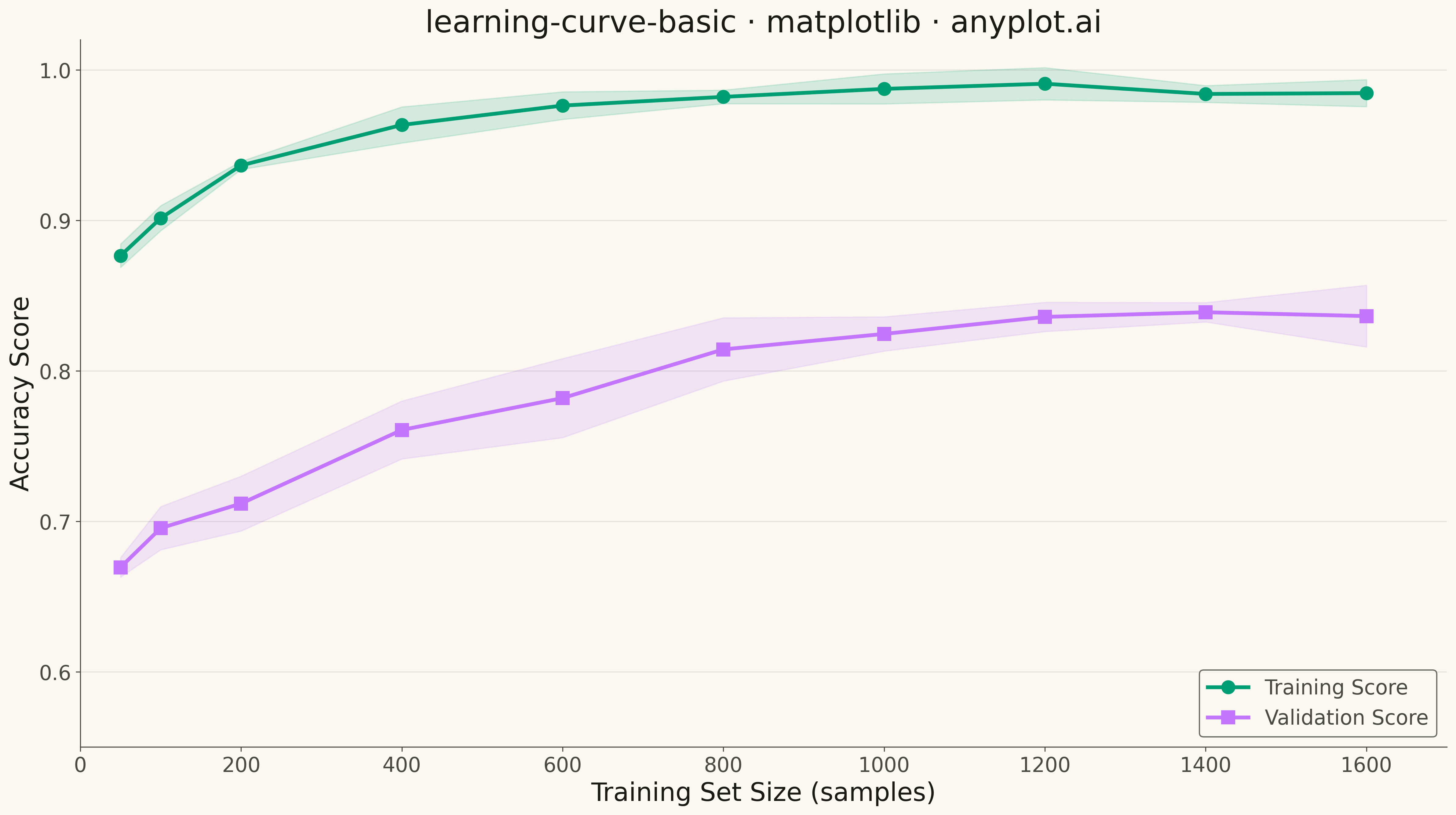
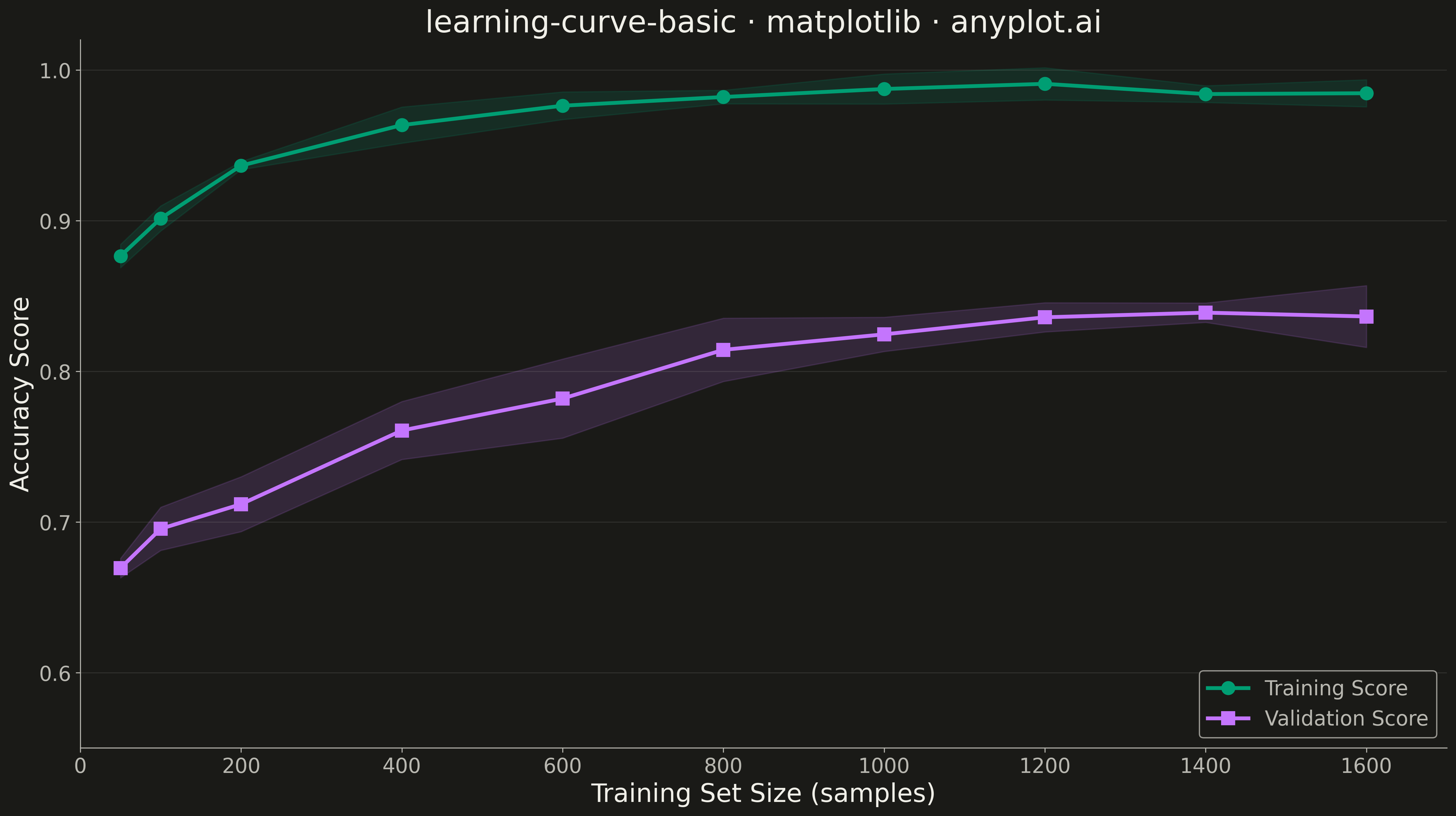
A learning curve visualizes model performance (training and validation scores) as a function of training set size. It is essential for diagnosing bias vs variance tradeoffs, determining whether collecting more data would improve model performance, and guiding model selection decisions. The plot typically shows two lines with shaded confidence bands representing variability across cross-validation folds.
""" anyplot.ai
learning-curve-basic: Model Learning Curve
Library: matplotlib 3.10.9 | Python 3.13.13
Quality: 90/100 | Updated: 2026-05-10
"""

import os

import matplotlib.pyplot as plt
import numpy as np


# Theme tokens
THEME = os.getenv("ANYPLOT_THEME", "light")
PAGE_BG = "#FAF8F1" if THEME == "light" else "#1A1A17"
INK = "#1A1A17" if THEME == "light" else "#F0EFE8"
INK_SOFT = "#4A4A44" if THEME == "light" else "#B8B7B0"
BRAND = "#009E73"
ACCENT = "#C475FD"

# Data - Simulate learning curve for a model
np.random.seed(42)

# Training set sizes (10 different sizes)
train_sizes = np.array([50, 100, 200, 400, 600, 800, 1000, 1200, 1400, 1600])

# Simulate 5 cross-validation folds
n_folds = 5
n_sizes = len(train_sizes)

# Training scores: Start high, stay high (model fits training data well)
train_scores_mean = 0.99 - 0.15 * np.exp(-train_sizes / 200)
train_scores = np.zeros((n_folds, n_sizes))
for i in range(n_folds):
    noise = np.random.randn(n_sizes) * 0.01
    train_scores[i] = train_scores_mean + noise

# Validation scores: Start lower, improve with more data (learning effect)
validation_scores_mean = 0.65 + 0.20 * (1 - np.exp(-train_sizes / 500))
validation_scores = np.zeros((n_folds, n_sizes))
for i in range(n_folds):
    noise = np.random.randn(n_sizes) * 0.02
    validation_scores[i] = validation_scores_mean + noise

# Calculate means and standard deviations
train_mean = np.mean(train_scores, axis=0)
train_std = np.std(train_scores, axis=0)
val_mean = np.mean(validation_scores, axis=0)
val_std = np.std(validation_scores, axis=0)

# Plot
fig, ax = plt.subplots(figsize=(16, 9), facecolor=PAGE_BG)
ax.set_facecolor(PAGE_BG)

# Training curve with confidence band
ax.fill_between(train_sizes, train_mean - train_std, train_mean + train_std, alpha=0.15, color=BRAND)
ax.plot(train_sizes, train_mean, "o-", color=BRAND, linewidth=3, markersize=10, label="Training Score")

# Validation curve with confidence band
ax.fill_between(train_sizes, val_mean - val_std, val_mean + val_std, alpha=0.15, color=ACCENT)
ax.plot(train_sizes, val_mean, "s-", color=ACCENT, linewidth=3, markersize=10, label="Validation Score")

# Labels and styling
ax.set_xlabel("Training Set Size (samples)", fontsize=20, color=INK)
ax.set_ylabel("Accuracy Score", fontsize=20, color=INK)
ax.set_title("learning-curve-basic · matplotlib · anyplot.ai", fontsize=24, color=INK)
ax.tick_params(axis="both", labelsize=16, colors=INK_SOFT)

# Spines
ax.spines["top"].set_visible(False)
ax.spines["right"].set_visible(False)
for s in ("left", "bottom"):
    ax.spines[s].set_color(INK_SOFT)

# Grid
ax.yaxis.grid(True, alpha=0.10, linewidth=0.8, color=INK)

# Legend
leg = ax.legend(fontsize=16, loc="lower right")
if leg:
    leg.get_frame().set_facecolor(PAGE_BG)
    leg.get_frame().set_edgecolor(INK_SOFT)
    plt.setp(leg.get_texts(), color=INK_SOFT)

# Set y-axis limits to show full range with some padding
ax.set_ylim(0.55, 1.02)
ax.set_xlim(0, 1700)

plt.tight_layout()
plt.savefig(f"plot-{THEME}.png", dpi=300, bbox_inches="tight", facecolor=PAGE_BG)
Runnable source as JSON, for any HTTP client: https://api.anyplot.ai/specs/learning-curve-basic/matplotlib/code. Any spec id and library id listed in llms-full.txt fit the same URL shape; every URL below is complete and callable.
{
  "spec_id": "learning-curve-basic",
  "language": "python",
  "library": "matplotlib",
  "page": "https://anyplot.ai/learning-curve-basic/python/matplotlib",
  "hub": "https://anyplot.ai/learning-curve-basic",
  "code_json": "https://api.anyplot.ai/specs/learning-curve-basic/matplotlib/code",
  "spec_json": "https://api.anyplot.ai/specs/learning-curve-basic",
  "render_light_png": "https://storage.googleapis.com/anyplot-images/plots/learning-curve-basic/python/matplotlib/plot-light.png",
  "render_dark_png": "https://storage.googleapis.com/anyplot-images/plots/learning-curve-basic/python/matplotlib/plot-dark.png",
  "quality_score": 90.0,
  "license": "MIT",
  "guide": "https://anyplot.ai/llms.txt"
}
Part of Model Learning Curve on anyplot.ai.