The same plot in 14 other libraries — Python: Altair, Bokeh, lets-plot, Matplotlib, Plotly, plotnine, Pygal, Seaborn; Julia: Makie.jl; JavaScript: Chart.js, D3.js, Apache ECharts, Highcharts, MUI X Charts. Compare all 15 side by side: Model Learning Curve in Python, R, Julia and JavaScript.
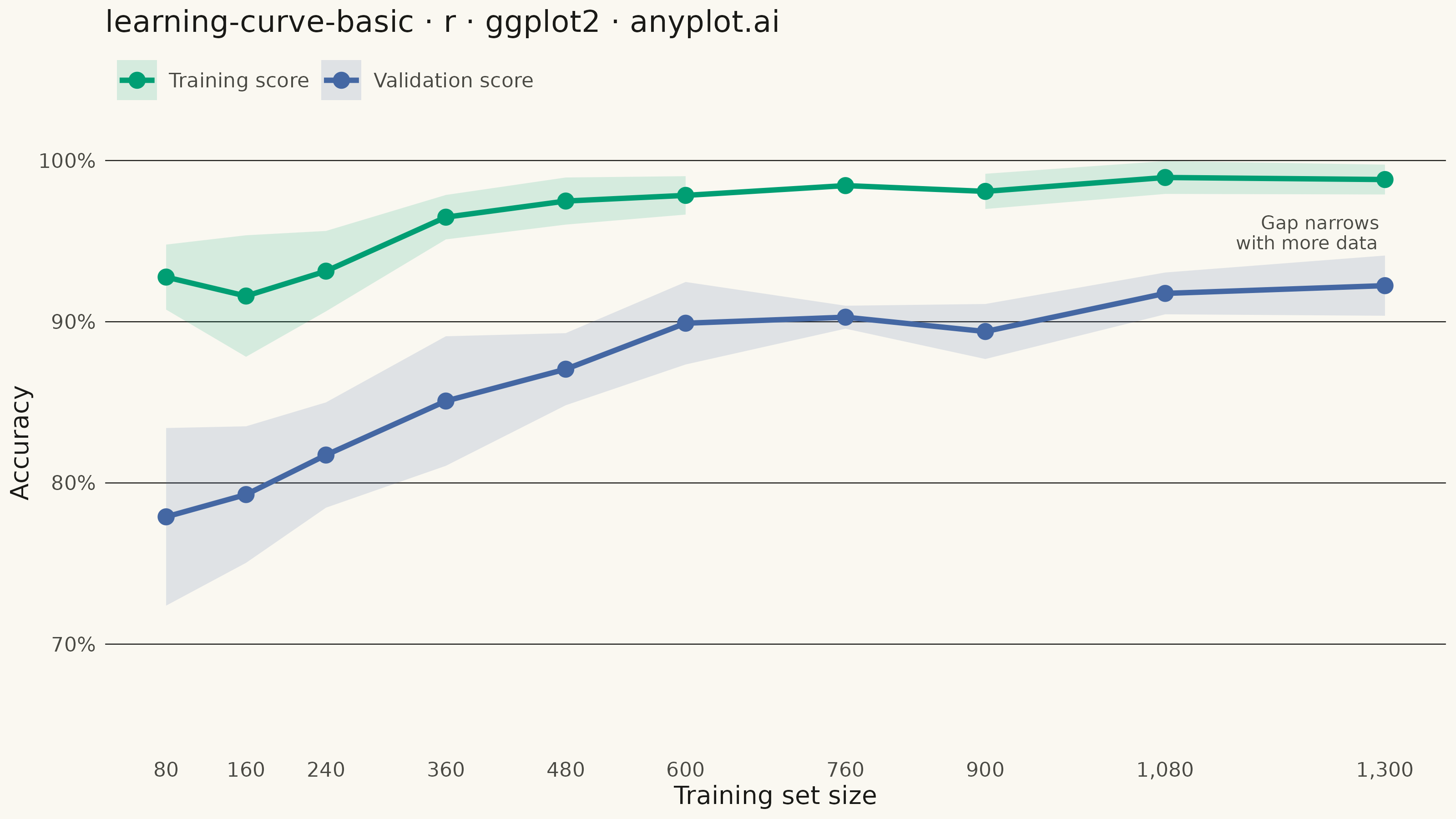
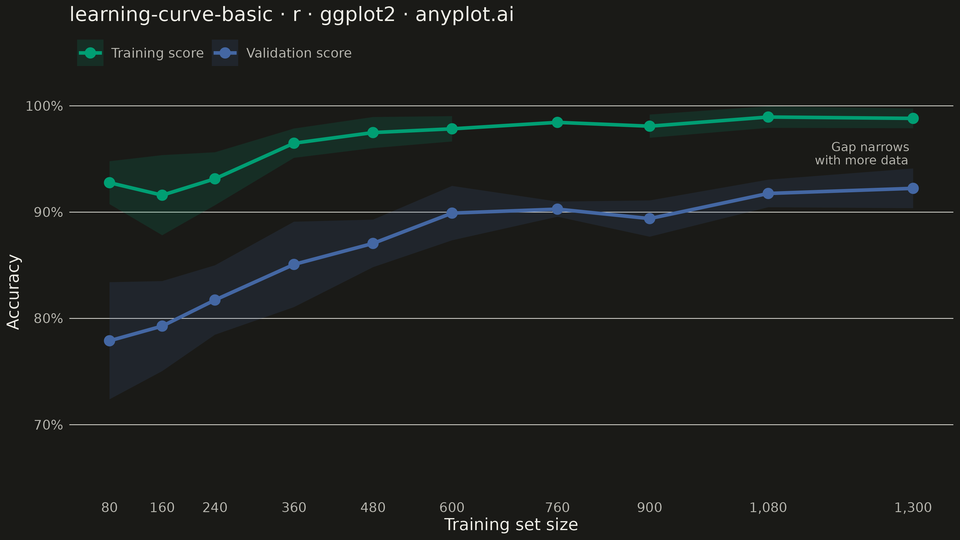
A learning curve visualizes model performance (training and validation scores) as a function of training set size. It is essential for diagnosing bias vs variance tradeoffs, determining whether collecting more data would improve model performance, and guiding model selection decisions. The plot typically shows two lines with shaded confidence bands representing variability across cross-validation folds.
#' anyplot.ai
#' learning-curve-basic: Model Learning Curve
#' Library: ggplot2 3.5.1 | R 4.4.1
#' Quality: 90/100 | Created: 2026-09-05

library(ggplot2)
library(dplyr)
library(tidyr)
library(ragg)

set.seed(42)

# --- Theme tokens -----------------------------------------------------------
THEME    <- Sys.getenv("ANYPLOT_THEME", "light")
PAGE_BG  <- if (THEME == "light") "#FAF8F1" else "#1A1A17"
INK      <- if (THEME == "light") "#1A1A17" else "#F0EFE8"
INK_SOFT <- if (THEME == "light") "#4A4A44" else "#B8B7B0"

IMPRINT_PALETTE <- c(
  "#009E73", # 1 — brand green, training score
  "#4467A3"  # 3 — blue, validation score
)

# --- Data --------------------------------------------------------------------
# Simulated sklearn-style learning_curve() output for a random-forest digit
# classifier: 10 training-set sizes, 8 cross-validation folds each.
train_sizes <- c(80, 160, 240, 360, 480, 600, 760, 900, 1080, 1300)
n_folds <- 8

train_asymptote <- 0.995
val_asymptote <- 0.93

learning_df <- lapply(seq_along(train_sizes), function(i) {
  size <- train_sizes[i]
  decay <- exp(-size / 350)

  train_mean <- train_asymptote - 0.10 * decay
  val_mean <- val_asymptote - 0.22 * decay

  tibble::tibble(
    fold = seq_len(n_folds),
    train_size = size,
    train_score = pmin(1, train_mean + rnorm(n_folds, 0, 0.012 + 0.02 * decay)),
    validation_score = pmin(1, val_mean + rnorm(n_folds, 0, 0.02 + 0.03 * decay))
  )
}) |>
  bind_rows()

curve_df <- learning_df |>
  group_by(train_size) |>
  summarise(
    train_mean = mean(train_score),
    train_sd = sd(train_score),
    validation_mean = mean(validation_score),
    validation_sd = sd(validation_score),
    .groups = "drop"
  ) |>
  pivot_longer(
    cols = -train_size,
    names_to = c("series", ".value"),
    names_pattern = "(train|validation)_(mean|sd)"
  ) |>
  mutate(series = factor(series,
    levels = c("train", "validation"),
    labels = c("Training score", "Validation score")
  ))

# Tighten the y-axis to the actual data range (mean ± sd) instead of a fixed
# 50%-100% span, so the bias-variance gap uses the available vertical space.
y_lower <- max(0, floor(20 * min(curve_df$mean - curve_df$sd)) / 20 - 0.05)

# Annotate the converging train/validation gap at the largest sample size to
# give the chart a storytelling focal point beyond the raw curves.
gap_row <- curve_df |>
  filter(train_size == max(train_size)) |>
  summarise(x = max(train_size), gap_mid = mean(mean), .groups = "drop")

# --- Plot ---------------------------------------------------------------------
p <- ggplot(curve_df, aes(x = train_size, y = mean, color = series, fill = series)) +
  geom_ribbon(aes(ymin = mean - sd, ymax = mean + sd), alpha = 0.15, color = NA) +
  geom_line(linewidth = 1.0) +
  geom_point(size = 2.5) +
  annotate(
    "text",
    x = gap_row$x, y = gap_row$gap_mid,
    label = "Gap narrows\nwith more data",
    hjust = 1.05, vjust = 0.5, size = 2.6, color = INK_SOFT, lineheight = 0.9
  ) +
  scale_color_manual(values = IMPRINT_PALETTE) +
  scale_fill_manual(values = IMPRINT_PALETTE) +
  scale_x_continuous(breaks = train_sizes, labels = scales::comma) +
  scale_y_continuous(labels = scales::percent, limits = c(y_lower, 1.0)) +
  labs(
    title = "learning-curve-basic · r · ggplot2 · anyplot.ai",
    x = "Training set size",
    y = "Accuracy",
    color = NULL,
    fill = NULL
  ) +
  theme_minimal(base_size = 8) +
  theme(
    plot.background = element_rect(fill = PAGE_BG, color = PAGE_BG),
    panel.background = element_rect(fill = PAGE_BG, color = NA),
    panel.grid.major.x = element_blank(),
    panel.grid.minor = element_blank(),
    panel.grid.major.y = element_line(color = INK, linewidth = 0.2),
    axis.title = element_text(color = INK, size = 10),
    axis.text = element_text(color = INK_SOFT, size = 8),
    axis.ticks = element_blank(),
    plot.title = element_text(color = INK, size = 12),
    legend.position = "top",
    legend.justification = "left",
    legend.text = element_text(color = INK_SOFT, size = 8),
    legend.key = element_blank()
  )

# --- Save ----------------------------------------------------------------------
ggsave(
  filename = sprintf("plot-%s.png", THEME),
  plot = p,
  device = ragg::agg_png,
  width = 8,
  height = 4.5,
  units = "in",
  dpi = 400
)
Runnable source as JSON, for any HTTP client: https://api.anyplot.ai/specs/learning-curve-basic/ggplot2/code. Any spec id and library id listed in llms-full.txt fit the same URL shape; every URL below is complete and callable.
{
  "spec_id": "learning-curve-basic",
  "language": "r",
  "library": "ggplot2",
  "page": "https://anyplot.ai/learning-curve-basic/r/ggplot2",
  "hub": "https://anyplot.ai/learning-curve-basic",
  "code_json": "https://api.anyplot.ai/specs/learning-curve-basic/ggplot2/code",
  "spec_json": "https://api.anyplot.ai/specs/learning-curve-basic",
  "render_light_png": "https://storage.googleapis.com/anyplot-images/plots/learning-curve-basic/r/ggplot2/plot-light.png",
  "render_dark_png": "https://storage.googleapis.com/anyplot-images/plots/learning-curve-basic/r/ggplot2/plot-dark.png",
  "quality_score": 90.0,
  "license": "MIT",
  "guide": "https://anyplot.ai/llms.txt"
}
Part of Model Learning Curve on anyplot.ai.