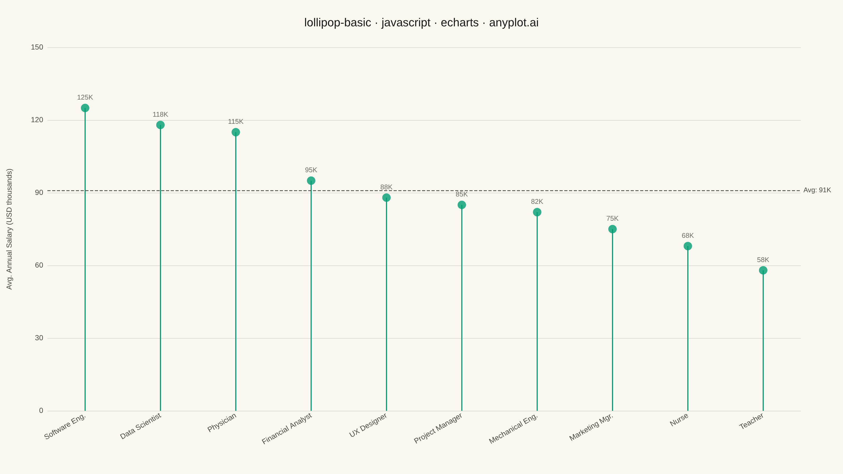
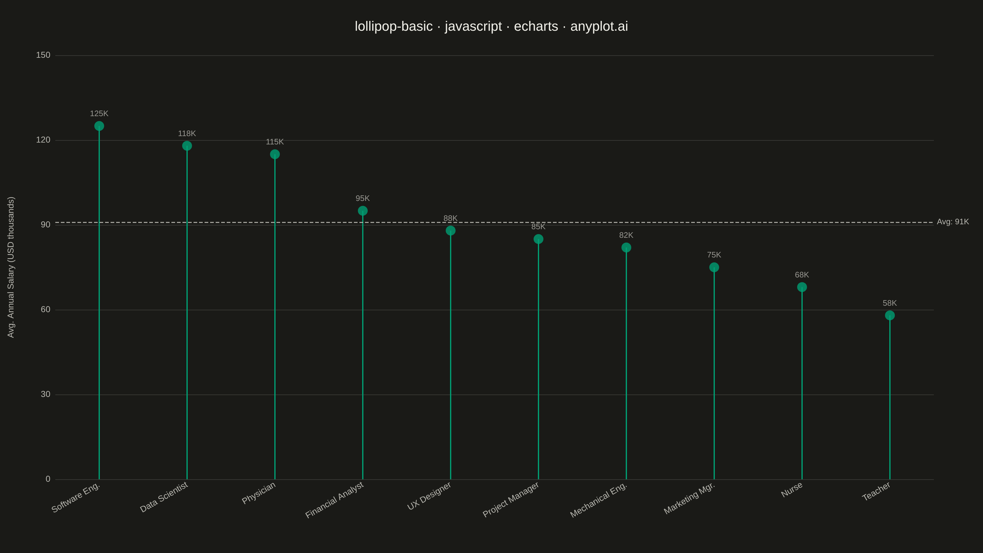
The same plot in 14 other libraries — JavaScript: Chart.js, D3.js, Highcharts, MUI X Charts; Python: Altair, Bokeh, lets-plot, Matplotlib, Plotly, plotnine, Pygal, Seaborn; R: ggplot2; Julia: Makie.jl. Compare all 15 side by side: Basic Lollipop Chart in Python, R, Julia and JavaScript.
A lollipop chart displays categorical data with thin lines (stems) extending from a baseline to circular markers (dots) at each data point. It presents the same information as a bar chart but with a cleaner, more minimalist aesthetic that reduces visual clutter while maintaining clear value comparisons.
// anyplot.ai
// lollipop-basic: Basic Lollipop Chart
// Library: echarts 5.5.1 | JavaScript 22.23.0
// Quality: 88/100 | Created: 2026-07-01

const t = window.ANYPLOT_TOKENS;

// --- Data (average annual salary by profession, USD thousands) --------------
const professions = [
  "Software Eng.", "Data Scientist", "Physician",
  "Financial Analyst", "UX Designer", "Project Manager",
  "Mechanical Eng.", "Marketing Mgr.", "Nurse", "Teacher"
];
const salaries = [125, 118, 115, 95, 88, 85, 82, 75, 68, 58];
const avg = Math.round(salaries.reduce((a, b) => a + b, 0) / salaries.length);

// --- Init -------------------------------------------------------------------
const chart = echarts.init(document.getElementById("container"));

// --- Option -----------------------------------------------------------------
chart.setOption({
  animation: false,
  color: t.palette,
  backgroundColor: "transparent",
  title: {
    text: "lollipop-basic · javascript · echarts · anyplot.ai",
    left: "center",
    top: 28,
    textStyle: { color: t.ink, fontSize: 22, fontWeight: "normal" }
  },
  grid: { left: 90, right: 80, top: 90, bottom: 120 },
  xAxis: {
    type: "category",
    data: professions,
    axisLabel: {
      color: t.inkSoft,
      fontSize: 14,
      rotate: 30,
      interval: 0
    },
    axisLine: { show: false },
    axisTick: { show: false },
    splitLine: { show: false }
  },
  yAxis: {
    type: "value",
    name: "Avg. Annual Salary (USD thousands)",
    nameLocation: "middle",
    nameGap: 65,
    nameTextStyle: { color: t.inkSoft, fontSize: 14 },
    min: 0,
    max: 150,
    axisLabel: { color: t.inkSoft, fontSize: 14 },
    axisLine: { show: false },
    axisTick: { show: false },
    splitLine: { lineStyle: { color: t.grid } }
  },
  series: [
    {
      type: "bar",
      data: salaries,
      barWidth: 2,
      itemStyle: { color: t.palette[0] },
      markLine: {
        symbol: "none",
        silent: true,
        lineStyle: { color: t.inkSoft, type: "dashed", width: 1.5 },
        label: {
          position: "end",
          formatter: "Avg: " + avg + "K",
          color: t.inkSoft,
          fontSize: 13
        },
        data: [{ yAxis: avg, name: "Average" }]
      },
      z: 1
    },
    {
      type: "scatter",
      data: salaries,
      symbolSize: 16,
      itemStyle: { color: t.palette[0] },
      label: {
        show: true,
        position: "top",
        formatter: "{c}K",
        color: t.inkSoft,
        fontSize: 13
      },
      z: 2
    }
  ]
});
Runnable source as JSON, for any HTTP client: https://api.anyplot.ai/specs/lollipop-basic/echarts/code. Any spec id and library id listed in llms-full.txt fit the same URL shape; every URL below is complete and callable.
{
  "spec_id": "lollipop-basic",
  "language": "javascript",
  "library": "echarts",
  "page": "https://anyplot.ai/lollipop-basic/javascript/echarts",
  "hub": "https://anyplot.ai/lollipop-basic",
  "code_json": "https://api.anyplot.ai/specs/lollipop-basic/echarts/code",
  "spec_json": "https://api.anyplot.ai/specs/lollipop-basic",
  "render_light_png": "https://storage.googleapis.com/anyplot-images/plots/lollipop-basic/javascript/echarts/plot-light.png",
  "render_dark_png": "https://storage.googleapis.com/anyplot-images/plots/lollipop-basic/javascript/echarts/plot-dark.png",
  "interactive_light_html": "https://storage.googleapis.com/anyplot-images/plots/lollipop-basic/javascript/echarts/plot-light.html",
  "interactive_dark_html": "https://storage.googleapis.com/anyplot-images/plots/lollipop-basic/javascript/echarts/plot-dark.html",
  "quality_score": 88.0,
  "license": "MIT",
  "guide": "https://anyplot.ai/llms.txt"
}
Part of Basic Lollipop Chart on anyplot.ai.