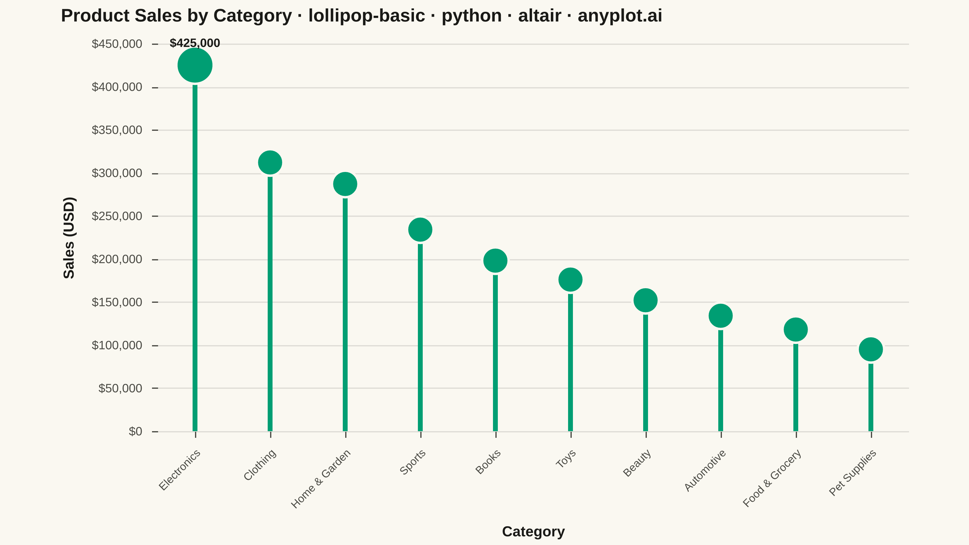
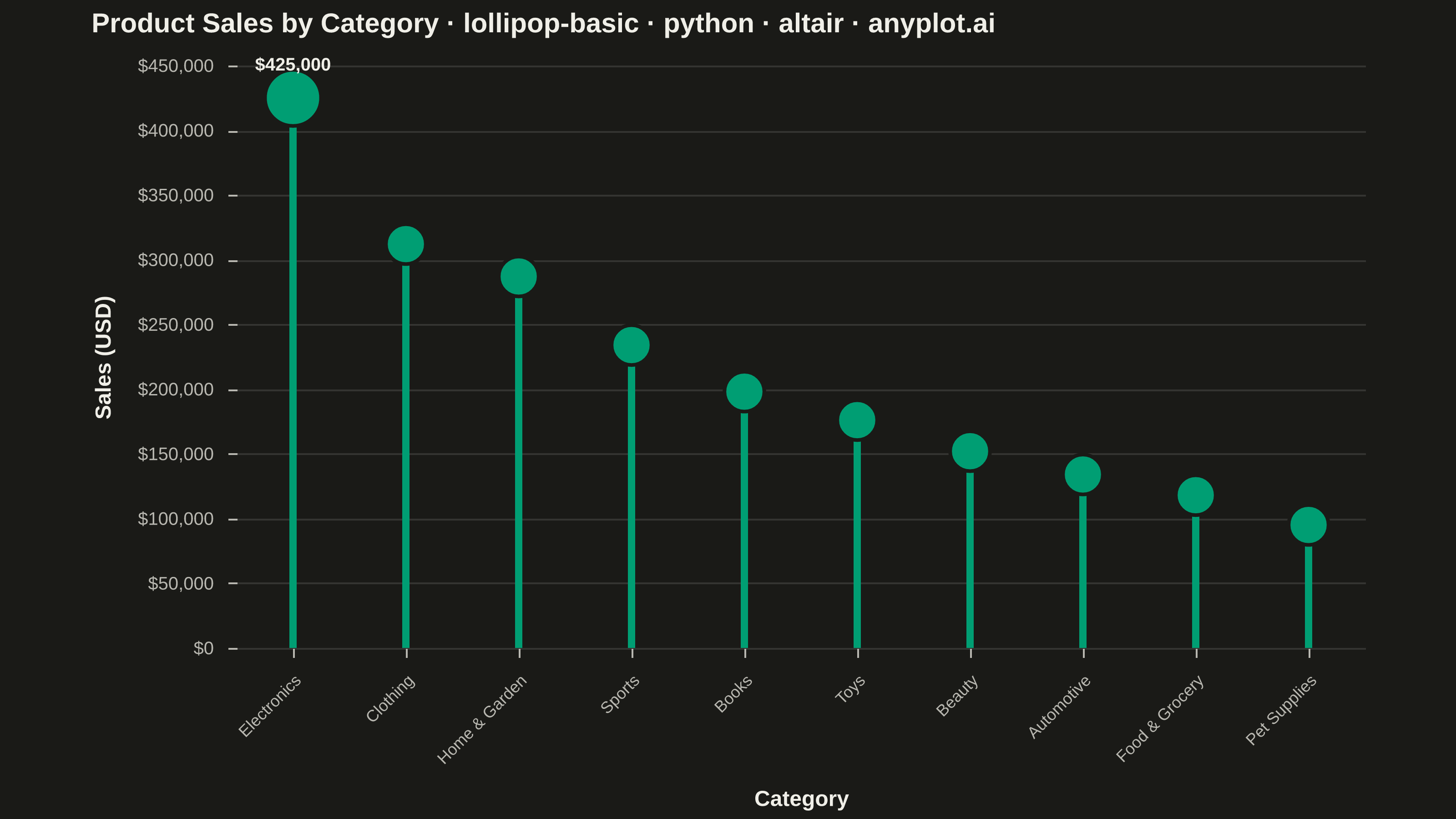
A lollipop chart displays categorical data with thin lines (stems) extending from a baseline to circular markers (dots) at each data point. It presents the same information as a bar chart but with a cleaner, more minimalist aesthetic that reduces visual clutter while maintaining clear value comparisons.
""" anyplot.ai
lollipop-basic: Basic Lollipop Chart
Library: altair 6.2.2 | Python 3.13.14
Quality: 91/100 | Updated: 2026-07-01
"""

import sys as _sys


# Remove script directory from sys.path so `import altair` finds the installed
# package and not this file (which shares the library name).
if _sys.path:
    _sys.path.pop(0)
del _sys

import os

import altair as alt
import pandas as pd
from PIL import Image


# Theme tokens (see prompts/default-style-guide.md "Theme-adaptive Chrome")
THEME = os.getenv("ANYPLOT_THEME", "light")
PAGE_BG = "#FAF8F1" if THEME == "light" else "#1A1A17"
ELEVATED_BG = "#FFFDF6" if THEME == "light" else "#242420"
INK = "#1A1A17" if THEME == "light" else "#F0EFE8"
INK_SOFT = "#4A4A44" if THEME == "light" else "#B8B7B0"

BRAND = "#009E73"  # Imprint palette position 1 — ALWAYS first series

# Data — product sales by category
categories = [
    "Electronics",
    "Clothing",
    "Home & Garden",
    "Sports",
    "Books",
    "Toys",
    "Beauty",
    "Automotive",
    "Food & Grocery",
    "Pet Supplies",
]
values = [425000, 312000, 287000, 234000, 198000, 176000, 152000, 134000, 118000, 95000]

df = pd.DataFrame({"category": categories, "value": values})
df = df.sort_values("value", ascending=False).reset_index(drop=True)

# Interactive hover selection — highlight/dim on pointerover (LM-02)
selection = alt.selection_point(fields=["category"], on="pointerover", empty=True)

# Stems: vertical rules from baseline to value
stems = (
    alt.Chart(df)
    .mark_rule(strokeWidth=4)
    .encode(
        x=alt.X("category:N", sort="-y", title="Category", axis=alt.Axis(labelAngle=-45, labelFontSize=9)),
        y=alt.Y("value:Q", title="Sales (USD)", axis=alt.Axis(format="$,.0f")),
        color=alt.value(BRAND),
        opacity=alt.condition(selection, alt.value(1.0), alt.value(0.3)),
    )
    .add_params(selection)
)

# Dots: top performer (Electronics) gets focal emphasis via larger marker (DE-01)
dots = (
    alt.Chart(df)
    .mark_circle(stroke=PAGE_BG, strokeWidth=2)
    .encode(
        x=alt.X("category:N", sort="-y"),
        y=alt.Y("value:Q"),
        color=alt.value(BRAND),
        size=alt.condition(alt.datum.category == "Electronics", alt.value(950), alt.value(480)),
        opacity=alt.condition(selection, alt.value(1.0), alt.value(0.3)),
        tooltip=[alt.Tooltip("category:N", title="Category"), alt.Tooltip("value:Q", title="Sales", format="$,.0f")],
    )
)

# Value annotation on top performer to anchor the narrative (DE-03)
annotation_df = df[df["category"] == "Electronics"].copy()
annotation = (
    alt.Chart(annotation_df)
    .mark_text(dy=-18, fontSize=10, fontWeight="bold")
    .encode(
        x=alt.X("category:N", sort="-y"),
        y=alt.Y("value:Q"),
        text=alt.Text("value:Q", format="$,.0f"),
        color=alt.value(INK),
    )
)

# Title: n=73 chars → fontsize = round(16 × 67/73) = 15
TITLE = "Product Sales by Category · lollipop-basic · python · altair · anyplot.ai"

chart = (
    (stems + dots + annotation)
    .properties(
        width=620,
        height=320,
        background=PAGE_BG,
        title=alt.Title(TITLE, fontSize=15, anchor="start", color=INK, offset=10),
    )
    .configure_view(fill=PAGE_BG, stroke=None)
    .configure_axis(
        domainColor=INK_SOFT,
        domainOpacity=0,
        domainWidth=1,
        tickColor=INK_SOFT,
        gridColor=INK,
        gridOpacity=0.12,
        gridWidth=1,
        labelColor=INK_SOFT,
        labelFontSize=10,
        titleColor=INK,
        titleFontSize=12,
        titlePadding=12,
    )
    .configure_axisX(grid=False, labelPadding=8)
    .configure_axisY(grid=True, labelPadding=8)
    .configure_title(color=INK, fontWeight="bold")
    .configure_legend(fillColor=ELEVATED_BG, strokeColor=INK_SOFT, labelColor=INK_SOFT, titleColor=INK)
)

chart.save(f"plot-{THEME}.png", scale_factor=4.0)

# Pad to exact 3200×1800 — altair/vl-convert canvas rule (see prompts/library/altair.md)
TW, TH = 3200, 1800
_img = Image.open(f"plot-{THEME}.png").convert("RGB")
_w, _h = _img.size
if _w > TW or _h > TH:
    raise SystemExit(
        f"altair vl-convert produced {_w}×{_h}, exceeds target {TW}×{TH}. "
        "Shrink chart .properties(width=, height=) and re-render."
    )
if _w < TW or _h < TH:
    _canvas = Image.new("RGB", (TW, TH), PAGE_BG)
    _canvas.paste(_img, ((TW - _w) // 2, (TH - _h) // 2))
    _canvas.save(f"plot-{THEME}.png")

chart.save(f"plot-{THEME}.html")
Runnable source as JSON, for any HTTP client: https://api.anyplot.ai/specs/lollipop-basic/altair/code. Any spec id and library id listed in llms-full.txt fit the same URL shape; every URL below is complete and callable.
{
  "spec_id": "lollipop-basic",
  "language": "python",
  "library": "altair",
  "page": "https://anyplot.ai/lollipop-basic/python/altair",
  "hub": "https://anyplot.ai/lollipop-basic",
  "code_json": "https://api.anyplot.ai/specs/lollipop-basic/altair/code",
  "spec_json": "https://api.anyplot.ai/specs/lollipop-basic",
  "render_light_png": "https://storage.googleapis.com/anyplot-images/plots/lollipop-basic/python/altair/plot-light.png",
  "render_dark_png": "https://storage.googleapis.com/anyplot-images/plots/lollipop-basic/python/altair/plot-dark.png",
  "interactive_light_html": "https://storage.googleapis.com/anyplot-images/plots/lollipop-basic/python/altair/plot-light.html",
  "interactive_dark_html": "https://storage.googleapis.com/anyplot-images/plots/lollipop-basic/python/altair/plot-dark.html",
  "quality_score": 91.0,
  "license": "MIT",
  "guide": "https://anyplot.ai/llms.txt"
}
Part of Basic Lollipop Chart on anyplot.ai.