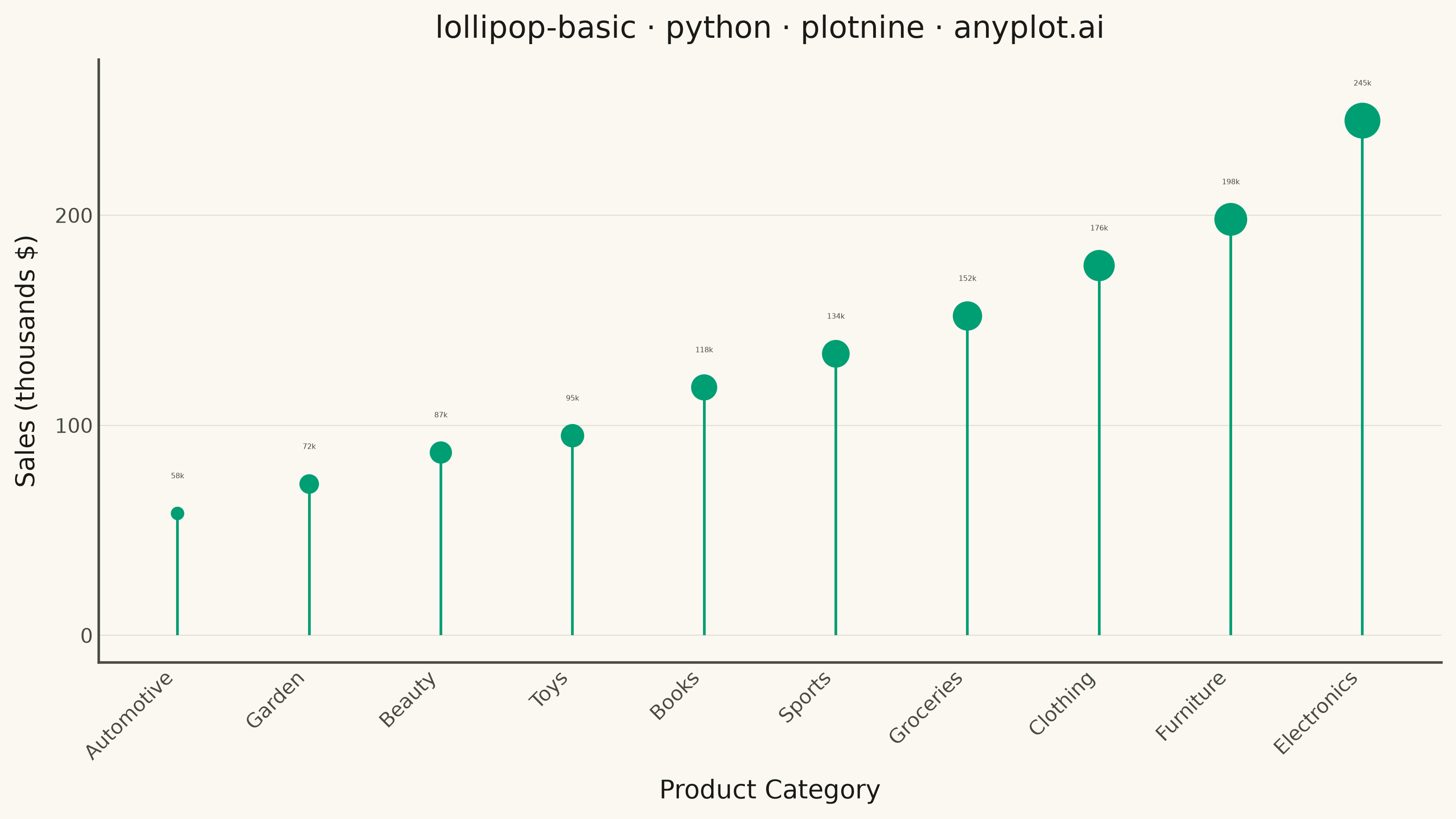
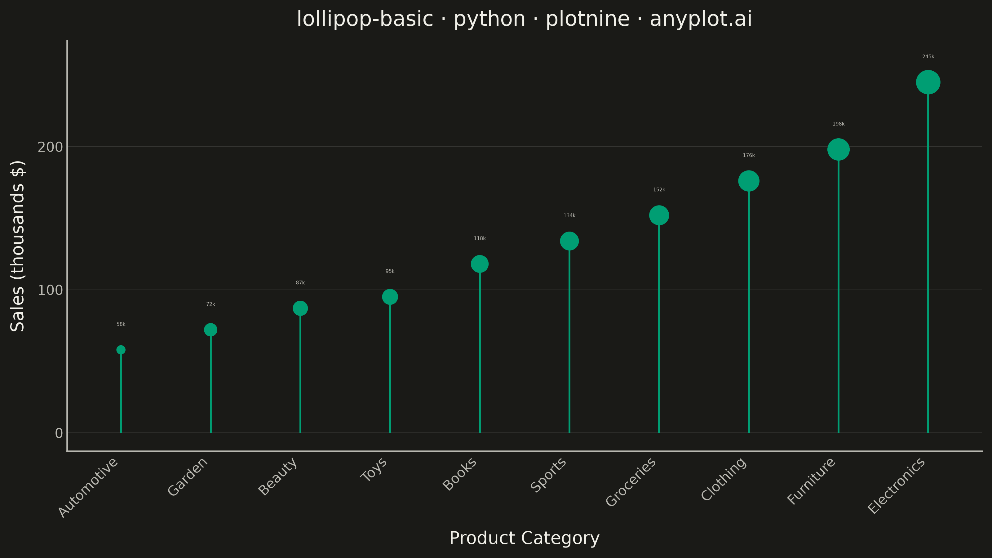
A lollipop chart displays categorical data with thin lines (stems) extending from a baseline to circular markers (dots) at each data point. It presents the same information as a bar chart but with a cleaner, more minimalist aesthetic that reduces visual clutter while maintaining clear value comparisons.
""" anyplot.ai
lollipop-basic: Basic Lollipop Chart
Library: plotnine 0.15.7 | Python 3.13.14
Quality: 84/100 | Updated: 2026-07-01
"""

import os
import sys


# Prevent circular import: remove this script's directory from sys.path so
# "from plotnine import ..." resolves to the installed library, not this file.
_here = os.path.dirname(os.path.abspath(__file__))
sys.path = [p for p in sys.path if os.path.abspath(p) != _here]

import pandas as pd
from plotnine import (
    aes,
    element_blank,
    element_line,
    element_rect,
    element_text,
    geom_point,
    geom_segment,
    geom_text,
    ggplot,
    ggsave,
    labs,
    scale_size_continuous,
    theme,
    theme_minimal,
)


THEME = os.getenv("ANYPLOT_THEME", "light")
PAGE_BG = "#FAF8F1" if THEME == "light" else "#1A1A17"
INK = "#1A1A17" if THEME == "light" else "#F0EFE8"
INK_SOFT = "#4A4A44" if THEME == "light" else "#B8B7B0"
BRAND = "#009E73"

# Product sales by category, sorted ascending for ranking narrative
data = {
    "category": [
        "Electronics",
        "Furniture",
        "Clothing",
        "Groceries",
        "Sports",
        "Books",
        "Toys",
        "Beauty",
        "Garden",
        "Automotive",
    ],
    "value": [245, 198, 176, 152, 134, 118, 95, 87, 72, 58],
}

df = pd.DataFrame(data)
df = df.sort_values("value", ascending=True).reset_index(drop=True)
df["category"] = pd.Categorical(df["category"], categories=df["category"], ordered=True)
df["label"] = df["value"].astype(str) + "k"

plot = (
    ggplot(df, aes(x="category", y="value"))
    + geom_segment(aes(x="category", xend="category", y=0, yend="value"), color=BRAND, size=0.6)
    + geom_point(aes(size="value"), color=BRAND, fill=BRAND, show_legend=False)
    + geom_text(
        aes(label="label"),
        color=INK_SOFT,
        size=2.8,  # geom_text size is in mm (~2.8mm ≈ 8pt at dpi=400)
        nudge_y=16,
        va="bottom",
    )
    + scale_size_continuous(range=[2, 7])
    + labs(x="Product Category", y="Sales (thousands $)", title="lollipop-basic · python · plotnine · anyplot.ai")
    + theme_minimal()
    + theme(
        figure_size=(8, 4.5),
        plot_background=element_rect(fill=PAGE_BG, color=PAGE_BG),
        panel_background=element_rect(fill=PAGE_BG, color=PAGE_BG),
        panel_border=element_blank(),
        text=element_text(size=7, color=INK),
        axis_title=element_text(size=10, color=INK),
        axis_text=element_text(size=8, color=INK_SOFT),
        axis_text_x=element_text(angle=45, ha="right", color=INK_SOFT),
        axis_line=element_line(color=INK_SOFT),
        plot_title=element_text(size=12, color=INK),
        panel_grid_minor=element_blank(),
        panel_grid_major_x=element_blank(),
        panel_grid_major_y=element_line(color=INK, alpha=0.15, size=0.3),
    )
)

ggsave(plot, filename=f"plot-{THEME}.png", dpi=400, width=8, height=4.5, units="in")
Runnable source as JSON, for any HTTP client: https://api.anyplot.ai/specs/lollipop-basic/plotnine/code. Any spec id and library id listed in llms-full.txt fit the same URL shape; every URL below is complete and callable.
{
  "spec_id": "lollipop-basic",
  "language": "python",
  "library": "plotnine",
  "page": "https://anyplot.ai/lollipop-basic/python/plotnine",
  "hub": "https://anyplot.ai/lollipop-basic",
  "code_json": "https://api.anyplot.ai/specs/lollipop-basic/plotnine/code",
  "spec_json": "https://api.anyplot.ai/specs/lollipop-basic",
  "render_light_png": "https://storage.googleapis.com/anyplot-images/plots/lollipop-basic/python/plotnine/plot-light.png",
  "render_dark_png": "https://storage.googleapis.com/anyplot-images/plots/lollipop-basic/python/plotnine/plot-dark.png",
  "quality_score": 84.0,
  "license": "MIT",
  "guide": "https://anyplot.ai/llms.txt"
}
Part of Basic Lollipop Chart on anyplot.ai.