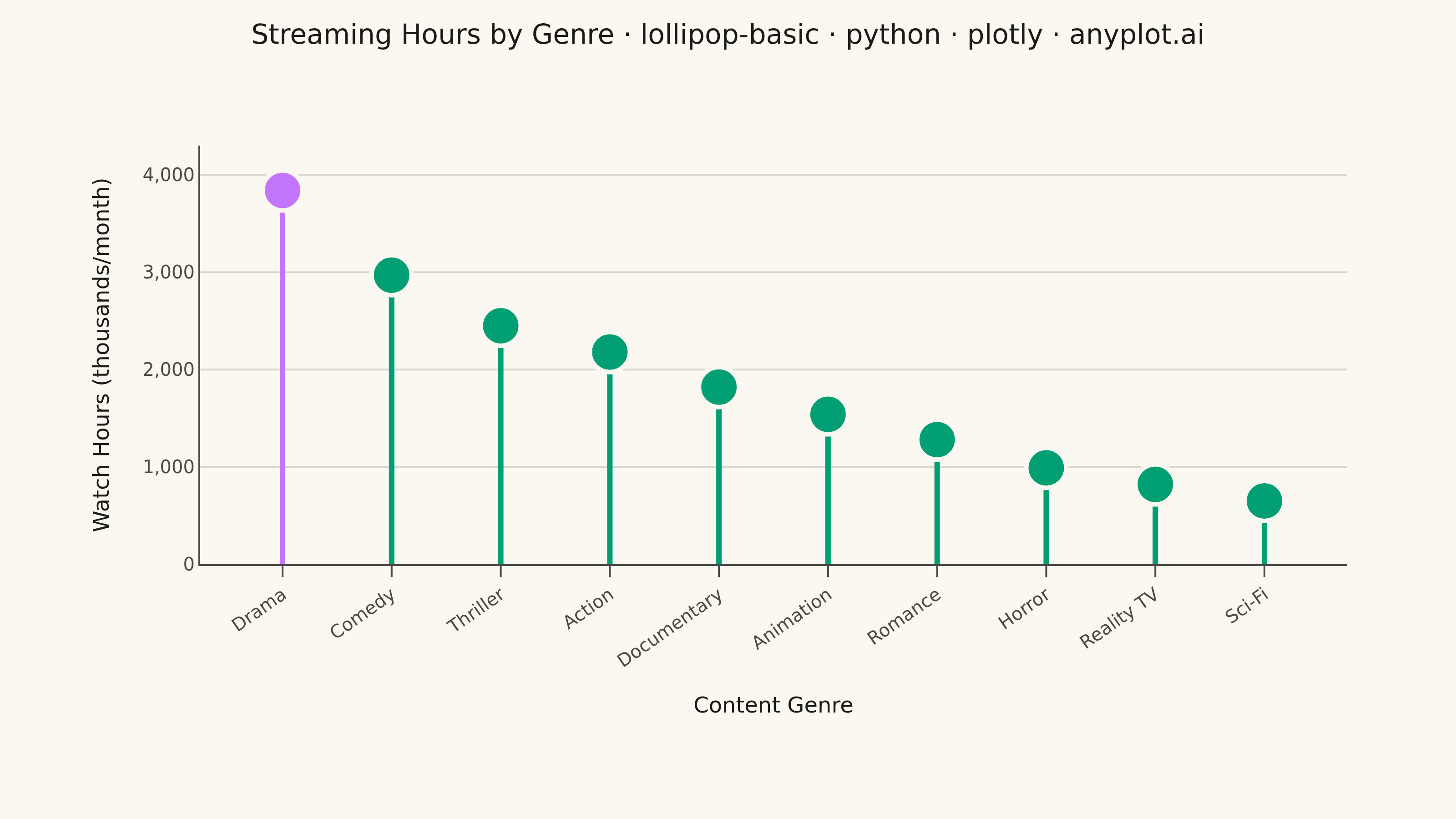
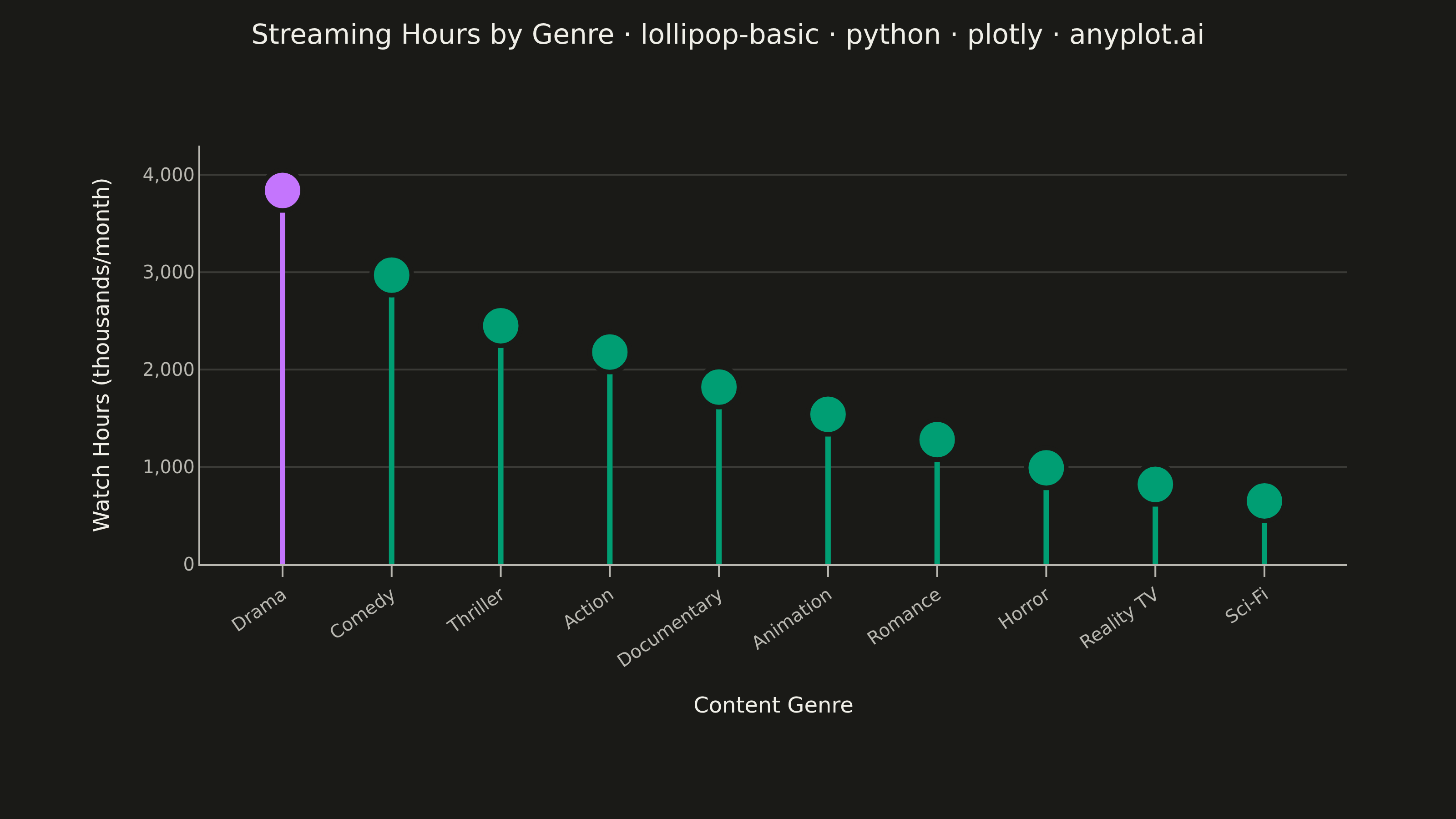
A lollipop chart displays categorical data with thin lines (stems) extending from a baseline to circular markers (dots) at each data point. It presents the same information as a bar chart but with a cleaner, more minimalist aesthetic that reduces visual clutter while maintaining clear value comparisons.
""" anyplot.ai
lollipop-basic: Basic Lollipop Chart
Library: plotly 6.8.0 | Python 3.13.14
Quality: 92/100 | Updated: 2026-07-01
"""

import os

import plotly.graph_objects as go


# Theme tokens (see prompts/default-style-guide.md "Theme-adaptive Chrome")
THEME = os.getenv("ANYPLOT_THEME", "light")
PAGE_BG = "#FAF8F1" if THEME == "light" else "#1A1A17"
ELEVATED_BG = "#FFFDF6" if THEME == "light" else "#242420"
INK = "#1A1A17" if THEME == "light" else "#F0EFE8"
INK_SOFT = "#4A4A44" if THEME == "light" else "#B8B7B0"
GRID = "rgba(26,26,23,0.15)" if THEME == "light" else "rgba(240,239,232,0.15)"
BRAND = "#009E73"  # Imprint palette position 1 — ALWAYS first series
ACCENT = "#C475FD"  # Imprint palette position 2 — focal point for top performer

# Data — streaming platform monthly watch hours by genre (thousands of hours, sorted descending)
genres = [
    "Drama",
    "Comedy",
    "Thriller",
    "Action",
    "Documentary",
    "Animation",
    "Romance",
    "Horror",
    "Reality TV",
    "Sci-Fi",
]
watch_hours = [3840, 2970, 2450, 2180, 1820, 1540, 1280, 990, 820, 650]

# Plot
fig = go.Figure()

# Accent stem first — anchors Drama as the leftmost category on the x-axis
fig.add_trace(
    go.Scatter(
        x=[genres[0], genres[0], None],
        y=[0, watch_hours[0], None],
        mode="lines",
        line={"color": ACCENT, "width": 3},
        showlegend=False,
        hoverinfo="skip",
    )
)

# Standard stems — brand color for positions 1–9 via None-separator trick
stem_x, stem_y = [], []
for genre, hours in zip(genres[1:], watch_hours[1:], strict=True):
    stem_x.extend([genre, genre, None])
    stem_y.extend([0, hours, None])

fig.add_trace(
    go.Scatter(x=stem_x, y=stem_y, mode="lines", line={"color": BRAND, "width": 3}, showlegend=False, hoverinfo="skip")
)

# Markers — top performer in accent, rest in brand green
marker_colors = [ACCENT] + [BRAND] * (len(genres) - 1)
fig.add_trace(
    go.Scatter(
        x=genres,
        y=watch_hours,
        mode="markers",
        marker={"color": marker_colors, "size": 22, "line": {"color": PAGE_BG, "width": 2.5}, "symbol": "circle"},
        showlegend=False,
        hovertemplate="<b>%{x}</b><br>%{y:,.0f}k hours/month<extra></extra>",
        cliponaxis=False,
    )
)

# Title fontsize scaled for length (plotly default 16px, floor 11px)
title_text = "Streaming Hours by Genre · lollipop-basic · python · plotly · anyplot.ai"
title_fontsize = max(11, round(16 * 67 / len(title_text)))

# Style
fig.update_layout(
    autosize=False,
    title={
        "text": title_text,
        "font": {"size": title_fontsize, "color": INK},
        "x": 0.5,
        "xanchor": "center",
        "y": 0.97,
    },
    xaxis={
        "title": {"text": "Content Genre", "font": {"size": 12, "color": INK}},
        "tickfont": {"size": 10, "color": INK_SOFT},
        "tickangle": -35,
        "showgrid": False,
        "showline": True,
        "mirror": False,
        "linecolor": INK_SOFT,
        "ticks": "outside",
        "tickcolor": INK_SOFT,
        "ticklen": 6,
    },
    yaxis={
        "title": {"text": "Watch Hours (thousands/month)", "font": {"size": 12, "color": INK}},
        "tickfont": {"size": 10, "color": INK_SOFT},
        "tickformat": ",.0f",
        "gridcolor": GRID,
        "gridwidth": 1,
        "zeroline": True,
        "zerolinecolor": INK_SOFT,
        "zerolinewidth": 1.5,
        "showline": True,
        "mirror": False,
        "linecolor": INK_SOFT,
        "range": [0, max(watch_hours) * 1.12],
    },
    paper_bgcolor=PAGE_BG,
    plot_bgcolor=PAGE_BG,
    font={"color": INK, "family": "Inter, system-ui, sans-serif"},
    margin={"l": 110, "r": 60, "t": 80, "b": 140},
    showlegend=False,
    hoverlabel={"bgcolor": ELEVATED_BG, "bordercolor": INK_SOFT, "font": {"color": INK, "size": 14}},
)

# Save — canonical 3200×1800 landscape canvas
fig.write_image(f"plot-{THEME}.png", width=800, height=450, scale=4)
fig.write_html(f"plot-{THEME}.html", include_plotlyjs="cdn")
Runnable source as JSON, for any HTTP client: https://api.anyplot.ai/specs/lollipop-basic/plotly/code. Any spec id and library id listed in llms-full.txt fit the same URL shape; every URL below is complete and callable.
{
  "spec_id": "lollipop-basic",
  "language": "python",
  "library": "plotly",
  "page": "https://anyplot.ai/lollipop-basic/python/plotly",
  "hub": "https://anyplot.ai/lollipop-basic",
  "code_json": "https://api.anyplot.ai/specs/lollipop-basic/plotly/code",
  "spec_json": "https://api.anyplot.ai/specs/lollipop-basic",
  "render_light_png": "https://storage.googleapis.com/anyplot-images/plots/lollipop-basic/python/plotly/plot-light.png",
  "render_dark_png": "https://storage.googleapis.com/anyplot-images/plots/lollipop-basic/python/plotly/plot-dark.png",
  "interactive_light_html": "https://storage.googleapis.com/anyplot-images/plots/lollipop-basic/python/plotly/plot-light.html",
  "interactive_dark_html": "https://storage.googleapis.com/anyplot-images/plots/lollipop-basic/python/plotly/plot-dark.html",
  "quality_score": 92.0,
  "license": "MIT",
  "guide": "https://anyplot.ai/llms.txt"
}
Part of Basic Lollipop Chart on anyplot.ai.