The same plot in 14 other libraries — JavaScript: Chart.js, D3.js, Apache ECharts, MUI X Charts; Python: Altair, Bokeh, lets-plot, Matplotlib, Plotly, plotnine, Pygal, Seaborn; R: ggplot2; Julia: Makie.jl. Compare all 15 side by side: Basic Lollipop Chart in Python, R, Julia and JavaScript.
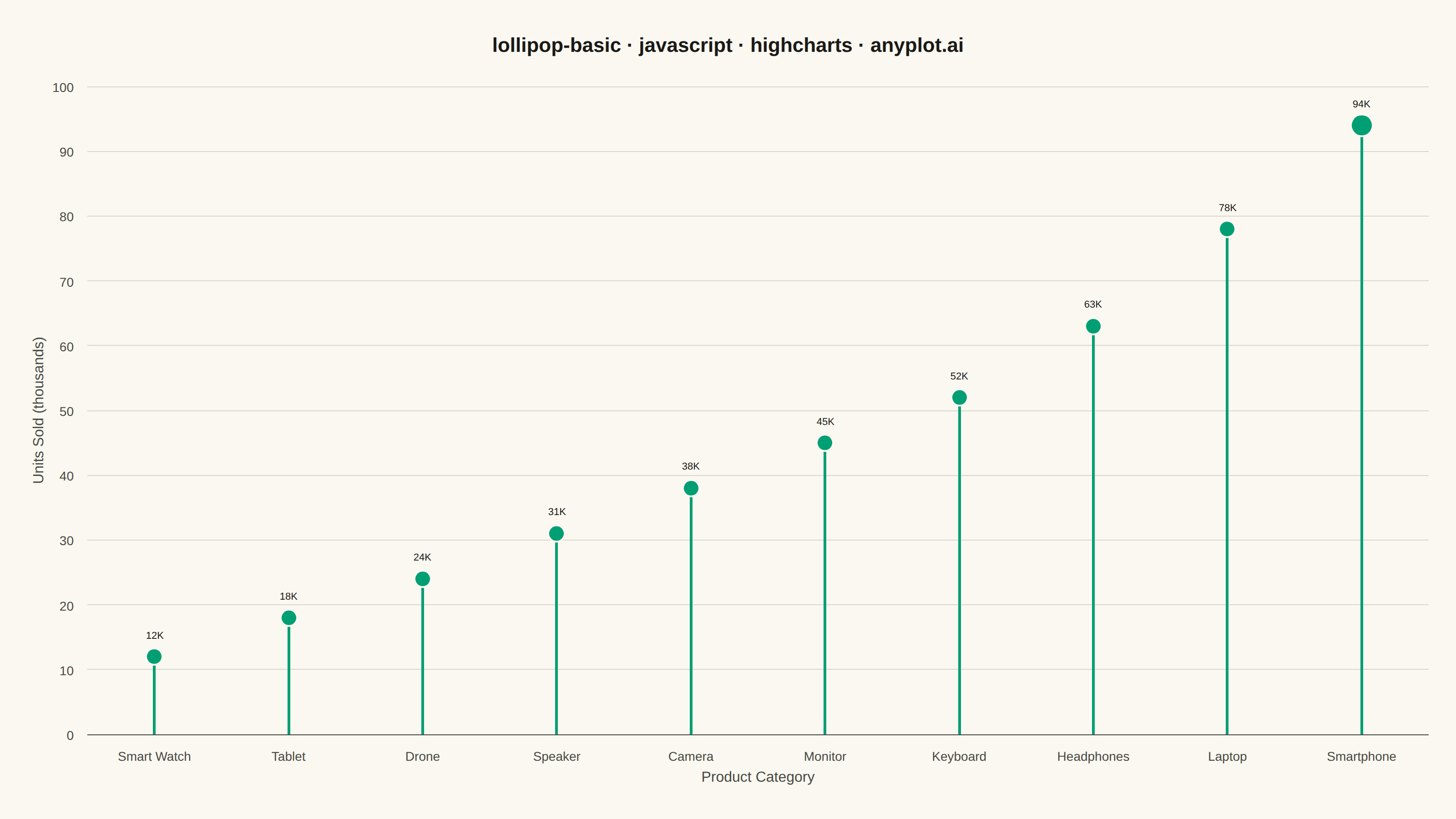
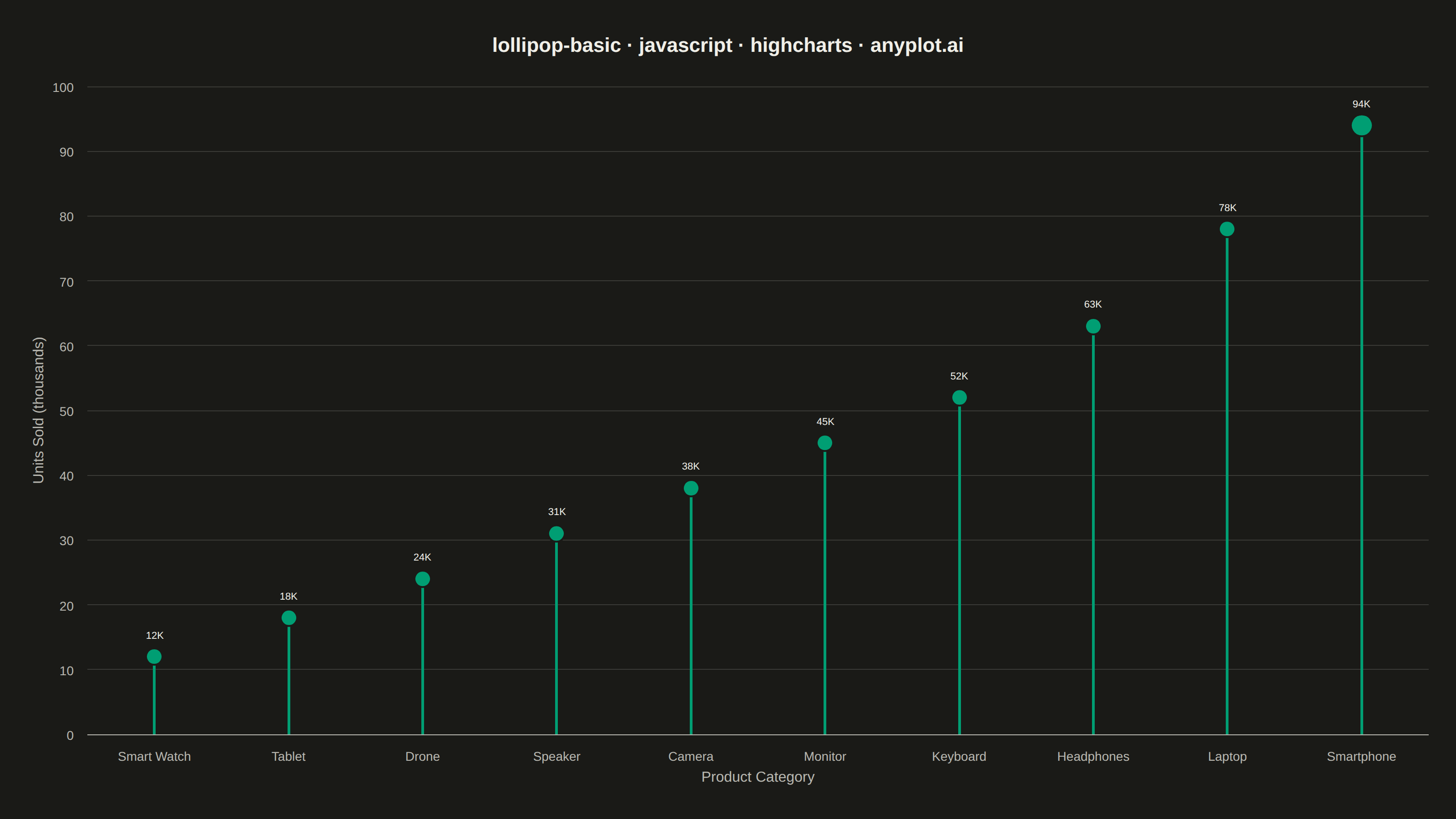
A lollipop chart displays categorical data with thin lines (stems) extending from a baseline to circular markers (dots) at each data point. It presents the same information as a bar chart but with a cleaner, more minimalist aesthetic that reduces visual clutter while maintaining clear value comparisons.
// anyplot.ai
// lollipop-basic: Basic Lollipop Chart
// Library: highcharts 12.6.0 | JavaScript 22.23.0
// Quality: 87/100 | Created: 2026-07-01

//# anyplot-orientation: landscape

const t = window.ANYPLOT_TOKENS;

// Data — Q1 units sold by tech product category (thousands), sorted ascending
const data = [
    { category: "Smart Watch", value: 12 },
    { category: "Tablet",      value: 18 },
    { category: "Drone",       value: 24 },
    { category: "Speaker",     value: 31 },
    { category: "Camera",      value: 38 },
    { category: "Monitor",     value: 45 },
    { category: "Keyboard",    value: 52 },
    { category: "Headphones",  value: 63 },
    { category: "Laptop",      value: 78 },
    { category: "Smartphone",  value: 94 },
];

const categories = data.map(d => d.category);
const stemValues = data.map(d => d.value);

// Scatter points — top performer gets a larger dot for emphasis
const dotValues = data.map((d, i) => ({
    y: d.value,
    marker: i === data.length - 1 ? { radius: 12 } : undefined,
}));

Highcharts.chart("container", {
    chart: {
        backgroundColor: "transparent",
        animation: false,
        style: { fontFamily: "inherit" },
        spacing: [40, 30, 40, 30],
    },
    credits: { enabled: false },
    colors: t.palette,
    title: {
        text: "lollipop-basic · javascript · highcharts · anyplot.ai",
        style: { color: t.ink, fontSize: "22px", fontWeight: "600" },
        margin: 30,
    },
    xAxis: {
        categories: categories,
        title: {
            text: "Product Category",
            style: { color: t.inkSoft, fontSize: "16px" },
        },
        lineColor: t.inkSoft,
        tickColor: "transparent",
        gridLineWidth: 0,
        labels: { style: { color: t.inkSoft, fontSize: "14px" } },
    },
    yAxis: {
        title: {
            text: "Units Sold (thousands)",
            style: { color: t.inkSoft, fontSize: "16px" },
        },
        gridLineColor: t.grid,
        lineColor: "transparent",
        tickColor: "transparent",
        labels: { style: { color: t.inkSoft, fontSize: "14px" } },
        min: 0,
    },
    legend: { enabled: false },
    plotOptions: {
        series: { animation: false },
        column: {
            borderWidth: 0,
            pointWidth: 3,
            groupPadding: 0,
            pointPadding: 0,
            enableMouseTracking: false,
        },
        scatter: {
            marker: {
                radius: 9,
                symbol: "circle",
                lineWidth: 2,
                lineColor: t.pageBg,
            },
            dataLabels: {
                enabled: true,
                formatter: function () { return this.y + "K"; },
                style: {
                    color: t.ink,
                    fontSize: "11px",
                    fontWeight: "400",
                    textOutline: "none",
                },
                verticalAlign: "bottom",
                y: -14,
            },
        },
    },
    tooltip: {
        formatter: function () {
            return "<b>" + categories[this.x] + "</b><br/>Units Sold: <b>" + this.y + "K</b>";
        },
    },
    series: [
        {
            type: "column",
            name: "Stem",
            data: stemValues,
            color: t.palette[0],
        },
        {
            type: "scatter",
            name: "Units Sold",
            data: dotValues,
            color: t.palette[0],
        },
    ],
});
Runnable source as JSON, for any HTTP client: https://api.anyplot.ai/specs/lollipop-basic/highcharts/code. Any spec id and library id listed in llms-full.txt fit the same URL shape; every URL below is complete and callable.
{
  "spec_id": "lollipop-basic",
  "language": "javascript",
  "library": "highcharts",
  "page": "https://anyplot.ai/lollipop-basic/javascript/highcharts",
  "hub": "https://anyplot.ai/lollipop-basic",
  "code_json": "https://api.anyplot.ai/specs/lollipop-basic/highcharts/code",
  "spec_json": "https://api.anyplot.ai/specs/lollipop-basic",
  "render_light_png": "https://storage.googleapis.com/anyplot-images/plots/lollipop-basic/javascript/highcharts/plot-light.png",
  "render_dark_png": "https://storage.googleapis.com/anyplot-images/plots/lollipop-basic/javascript/highcharts/plot-dark.png",
  "interactive_light_html": "https://storage.googleapis.com/anyplot-images/plots/lollipop-basic/javascript/highcharts/plot-light.html",
  "interactive_dark_html": "https://storage.googleapis.com/anyplot-images/plots/lollipop-basic/javascript/highcharts/plot-dark.html",
  "quality_score": 87.0,
  "license": "MIT",
  "guide": "https://anyplot.ai/llms.txt"
}
Part of Basic Lollipop Chart on anyplot.ai.