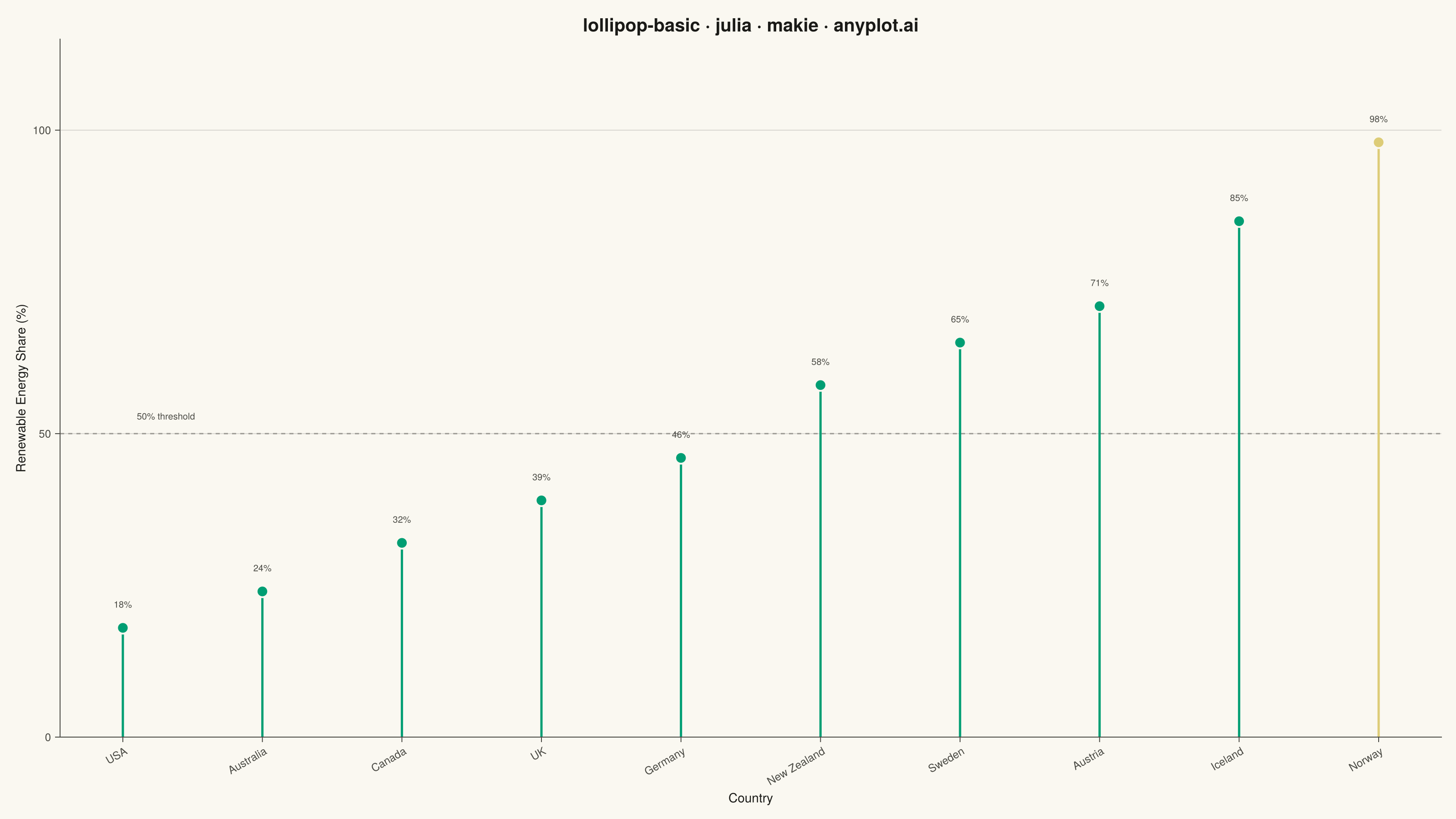
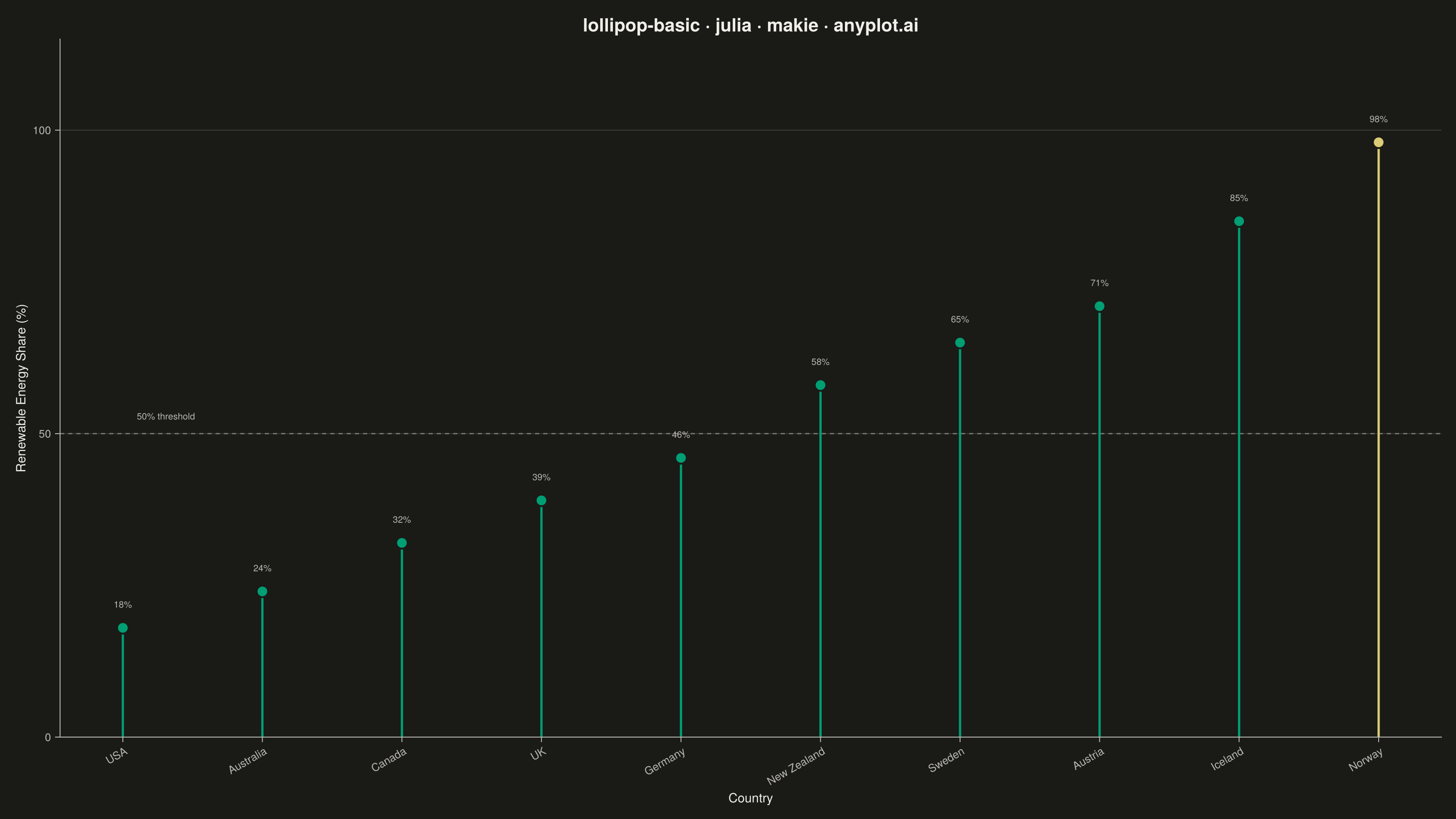
The same plot in 14 other libraries — Python: Altair, Bokeh, lets-plot, Matplotlib, Plotly, plotnine, Pygal, Seaborn; R: ggplot2; JavaScript: Chart.js, D3.js, Apache ECharts, Highcharts, MUI X Charts. Compare all 15 side by side: Basic Lollipop Chart in Python, R, Julia and JavaScript.
A lollipop chart displays categorical data with thin lines (stems) extending from a baseline to circular markers (dots) at each data point. It presents the same information as a bar chart but with a cleaner, more minimalist aesthetic that reduces visual clutter while maintaining clear value comparisons.
# anyplot.ai
# lollipop-basic: Basic Lollipop Chart
# Library: makie 0.21.9 | Julia 1.11.9
# Quality: 90/100 | Created: 2026-07-01

using CairoMakie
using Colors
using Random

Random.seed!(42)

# Theme tokens
const THEME        = get(ENV, "ANYPLOT_THEME", "light")
const PAGE_BG      = THEME == "light" ? colorant"#FAF8F1" : colorant"#1A1A17"
const INK          = THEME == "light" ? colorant"#1A1A17" : colorant"#F0EFE8"
const INK_SOFT     = THEME == "light" ? colorant"#4A4A44" : colorant"#B8B7B0"
const IMPRINT_PALETTE = [
    colorant"#009E73",  # 1 — brand green (always first categorical series)
    colorant"#C475FD",  # 2 — lavender
    colorant"#4467A3",  # 3 — blue
    colorant"#BD8233",  # 4 — ochre
    colorant"#AE3030",  # 5 — matte red
    colorant"#2ABCCD",  # 6 — cyan
    colorant"#954477",  # 7 — rose
    colorant"#99B314",  # 8 — lime
]
const ANYPLOT_AMBER = colorant"#DDCC77"

# Data — renewable energy share (%) by country
countries = ["Norway", "Iceland", "Austria", "Sweden", "New Zealand",
             "Germany", "UK", "Canada", "Australia", "USA"]
pct_renew = [98.0, 85.0, 71.0, 65.0, 58.0, 46.0, 39.0, 32.0, 24.0, 18.0]

# Sort ascending so values rise left-to-right
order            = sortperm(pct_renew)
sorted_countries = countries[order]
sorted_pct       = pct_renew[order]
n                = length(sorted_pct)

# Amber accent on the clear leader (Norway 98%, rightmost after ascending sort)
base_color  = IMPRINT_PALETTE[1]
dot_colors  = [i == n ? ANYPLOT_AMBER : base_color for i in 1:n]
stem_colors = [c for dc in dot_colors for c in (dc, dc)]  # 2 points per stem

# Build stem point pairs for linesegments!
stem_pts = Point2f[]
for (i, val) in enumerate(sorted_pct)
    push!(stem_pts, Point2f(i, 0.0))
    push!(stem_pts, Point2f(i, val))
end

# Figure
fig = Figure(
    size            = (1600, 900),
    fontsize        = 14,
    backgroundcolor = PAGE_BG,
)

ax = Axis(
    fig[1, 1];
    title              = "lollipop-basic · julia · makie · anyplot.ai",
    titlesize          = 20,
    titlecolor         = INK,
    xlabel             = "Country",
    ylabel             = "Renewable Energy Share (%)",
    xlabelcolor        = INK,
    ylabelcolor        = INK,
    xlabelsize         = 14,
    ylabelsize         = 14,
    xticklabelcolor    = INK_SOFT,
    yticklabelcolor    = INK_SOFT,
    xticklabelsize     = 12,
    yticklabelsize     = 12,
    backgroundcolor    = PAGE_BG,
    topspinevisible    = false,
    rightspinevisible  = false,
    leftspinecolor     = INK_SOFT,
    bottomspinecolor   = INK_SOFT,
    xtickcolor         = INK_SOFT,
    ytickcolor         = INK_SOFT,
    xgridvisible       = false,
    ygridcolor         = RGBAf(INK.r, INK.g, INK.b, 0.15),
    yminorgridvisible  = false,
    xminorgridvisible  = false,
)

ax.xticks = (1:n, sorted_countries)
ax.xticklabelrotation = π / 6

# 50% reference line — "majority renewable" threshold
hlines!(ax, [50.0]; color = RGBAf(INK.r, INK.g, INK.b, 0.35), linestyle = :dash, linewidth = 1.5)
text!(ax, 1.1, 52.0; text = "50% threshold", color = INK_SOFT, fontsize = 10, align = (:left, :bottom))

# Stems
linesegments!(ax, stem_pts; color = stem_colors, linewidth = 2.5)

# Dots
scatter!(ax, collect(1:n), sorted_pct;
    color       = dot_colors,
    markersize  = 18,
    strokewidth = 2.0,
    strokecolor = PAGE_BG,
)

# Value annotations via Makie's native text! — lightweight data labels
for (i, val) in enumerate(sorted_pct)
    text!(ax, i, val + 3.0;
        text     = "$(Int(val))%",
        color    = INK_SOFT,
        fontsize = 10,
        align    = (:center, :bottom),
    )
end

ylims!(ax, 0, 115)

# Save
save("plot-$(THEME).png", fig; px_per_unit = 2)
Runnable source as JSON, for any HTTP client: https://api.anyplot.ai/specs/lollipop-basic/makie/code. Any spec id and library id listed in llms-full.txt fit the same URL shape; every URL below is complete and callable.
{
  "spec_id": "lollipop-basic",
  "language": "julia",
  "library": "makie",
  "page": "https://anyplot.ai/lollipop-basic/julia/makie",
  "hub": "https://anyplot.ai/lollipop-basic",
  "code_json": "https://api.anyplot.ai/specs/lollipop-basic/makie/code",
  "spec_json": "https://api.anyplot.ai/specs/lollipop-basic",
  "render_light_png": "https://storage.googleapis.com/anyplot-images/plots/lollipop-basic/julia/makie/plot-light.png",
  "render_dark_png": "https://storage.googleapis.com/anyplot-images/plots/lollipop-basic/julia/makie/plot-dark.png",
  "quality_score": 90.0,
  "license": "MIT",
  "guide": "https://anyplot.ai/llms.txt"
}
Part of Basic Lollipop Chart on anyplot.ai.